BCWMS VISUAL ART & DESIGN
Follow me
  • Creations
  • 2011-2018
  • ArtPrize Entry 2017
  • ArtPrize Entry 2018
  • Souper Stuff

Week Twelve

4/23/2018

0 Comments


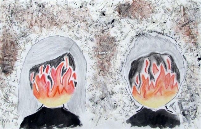
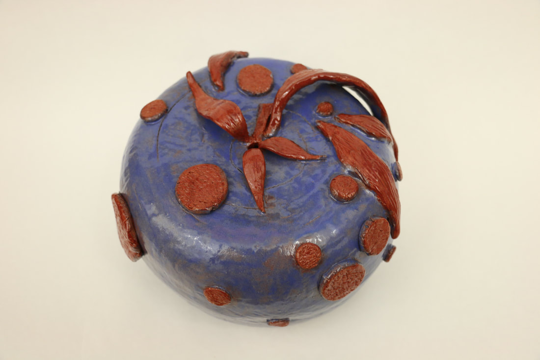
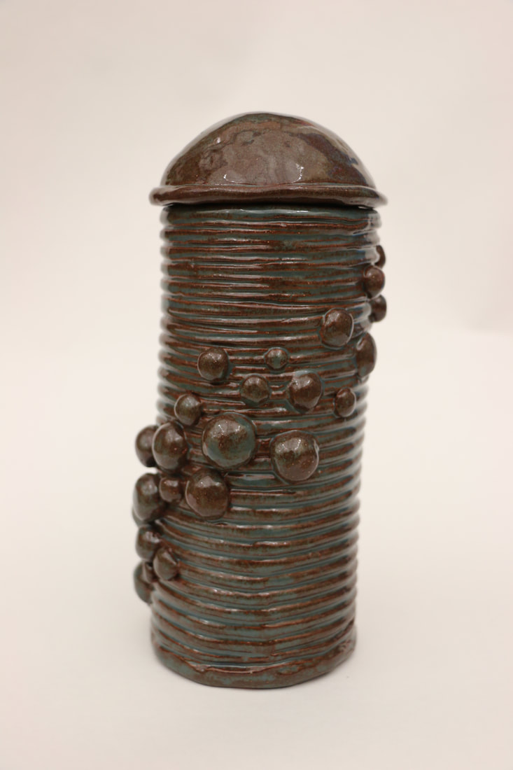
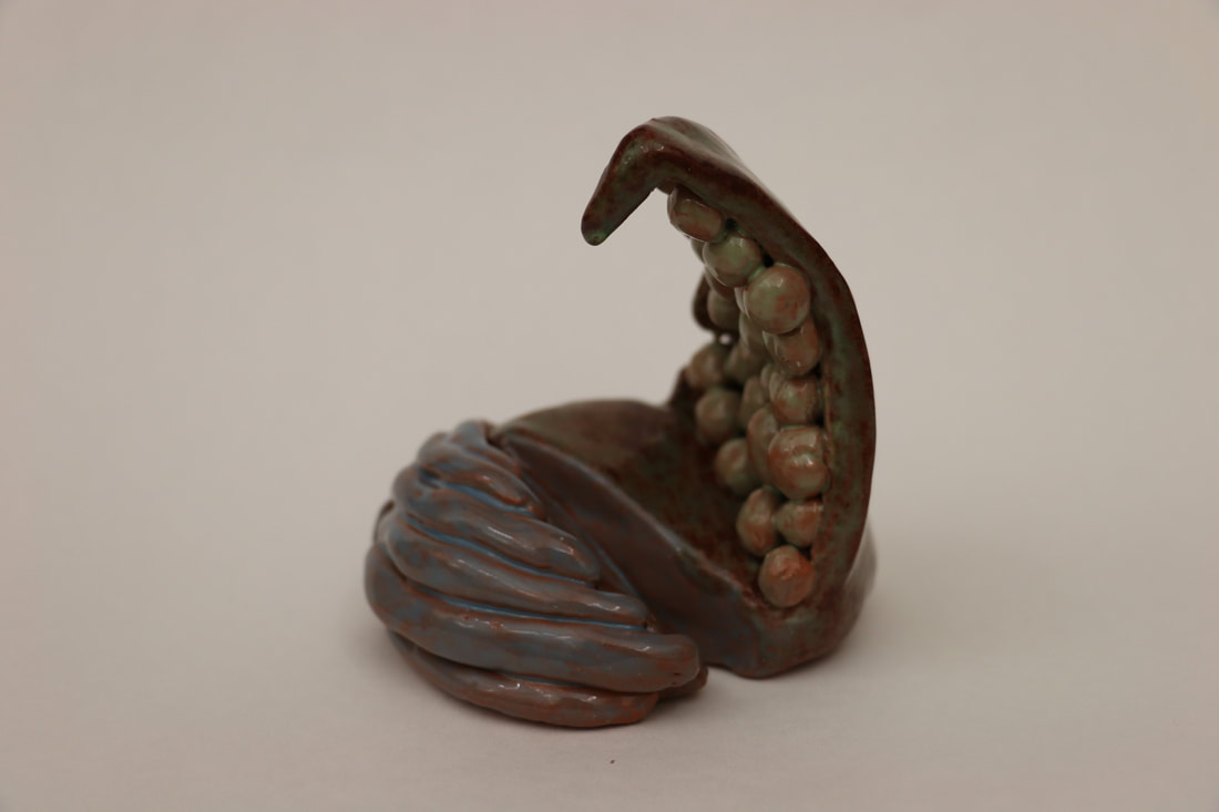
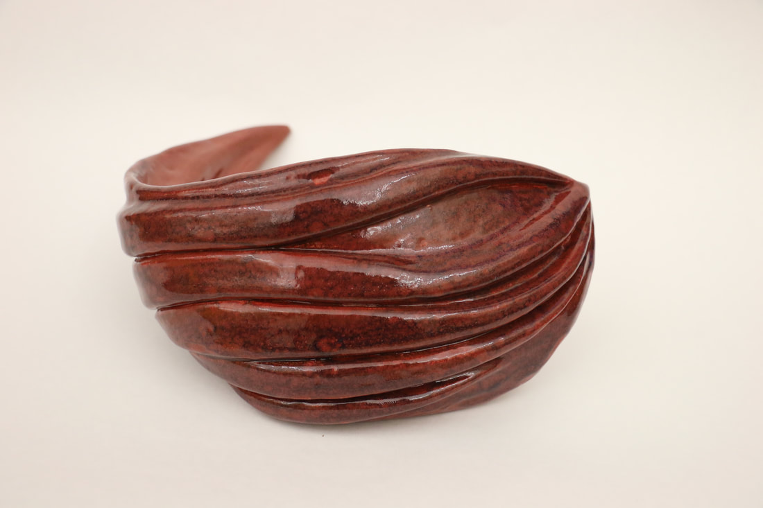
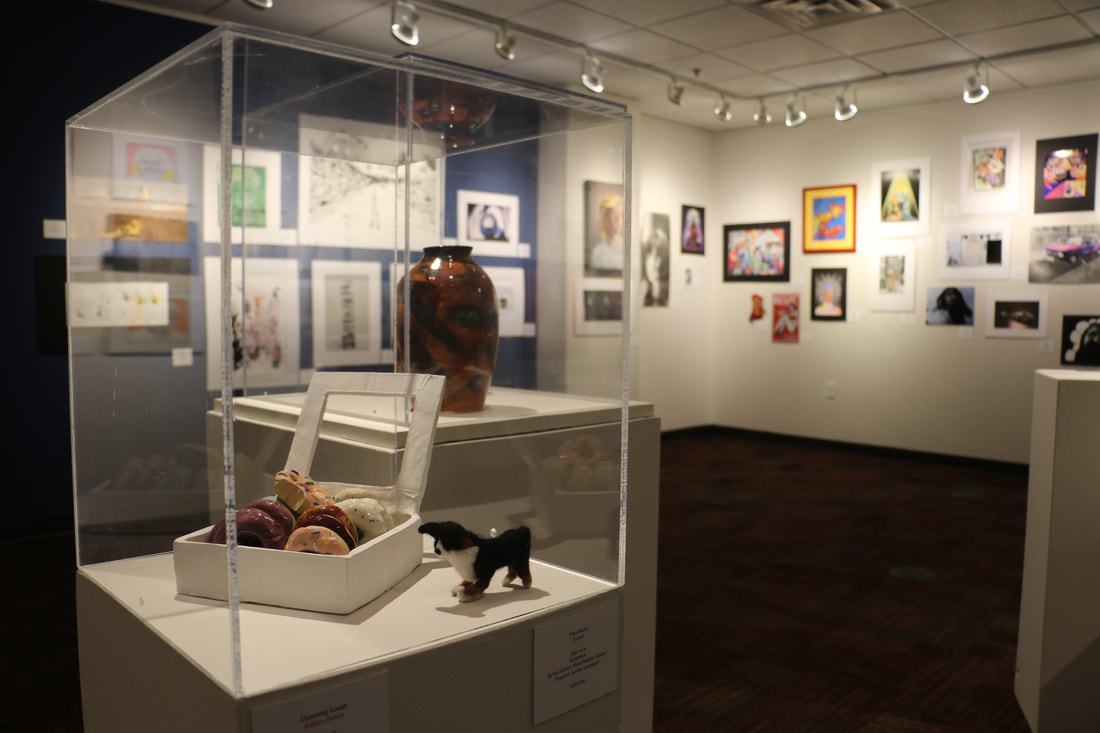
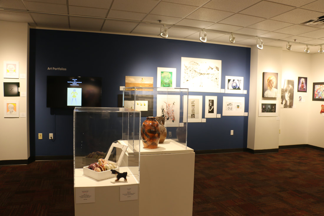
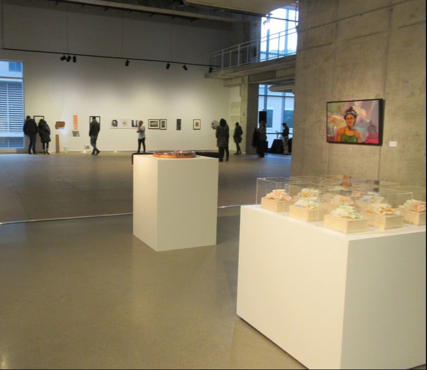
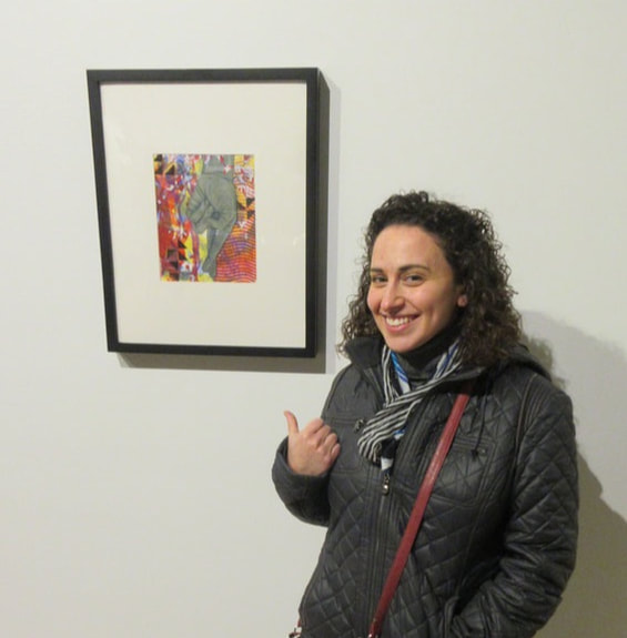
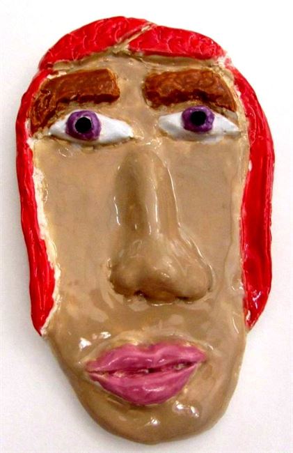
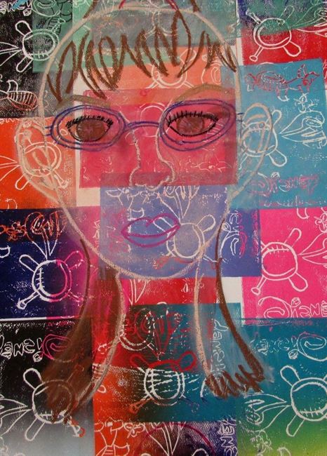
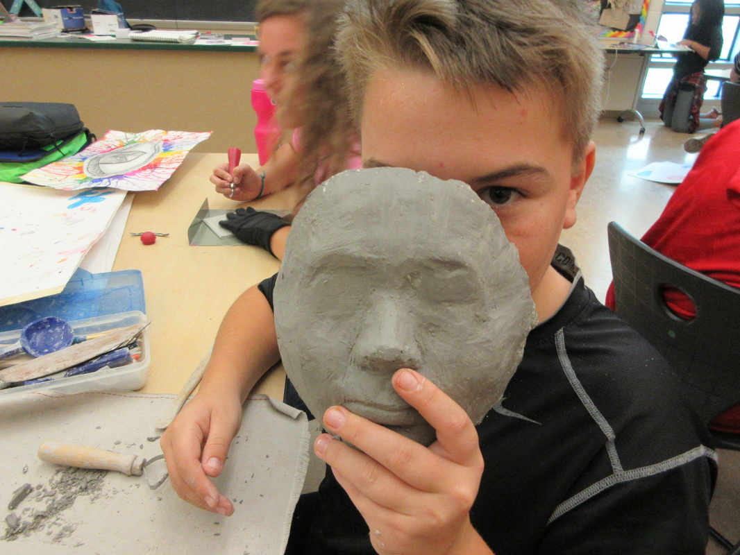
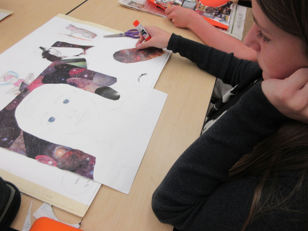
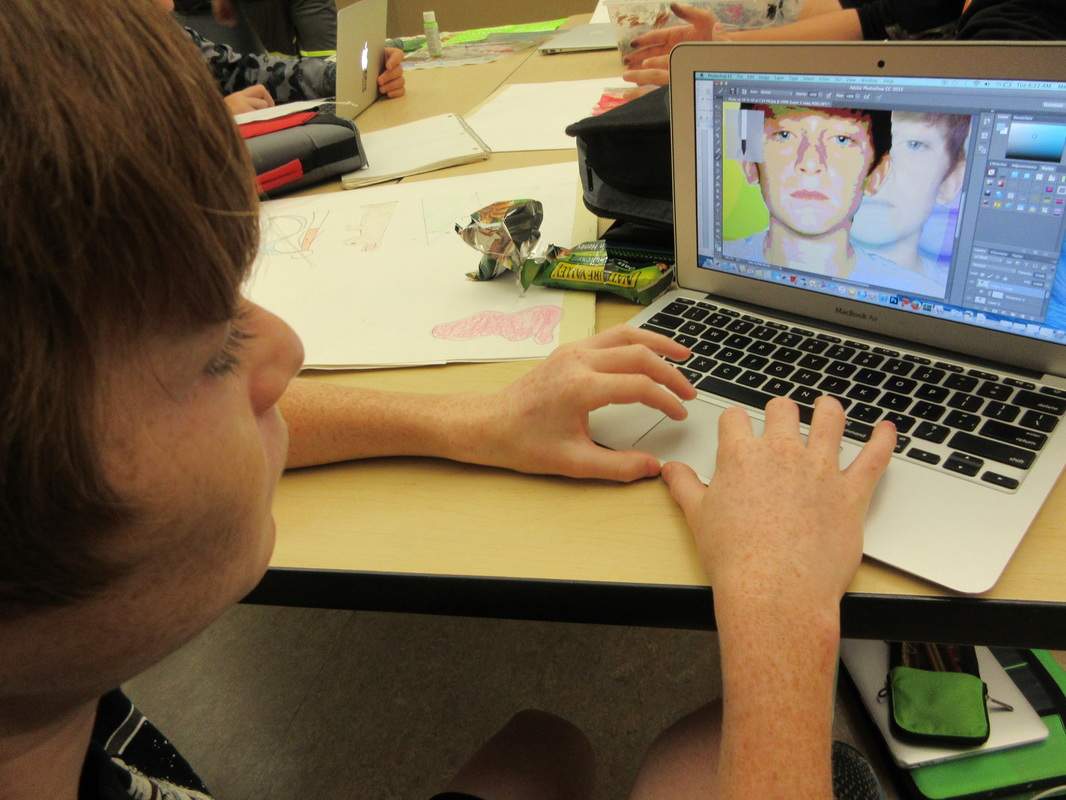
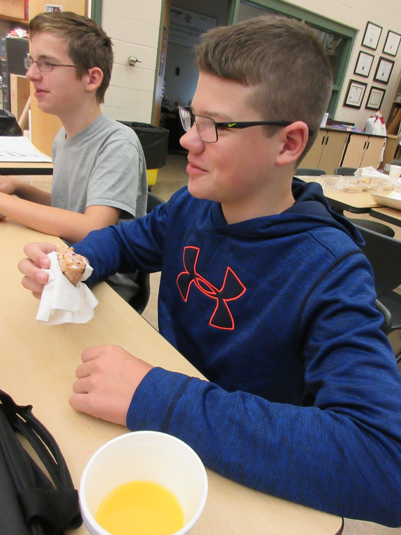
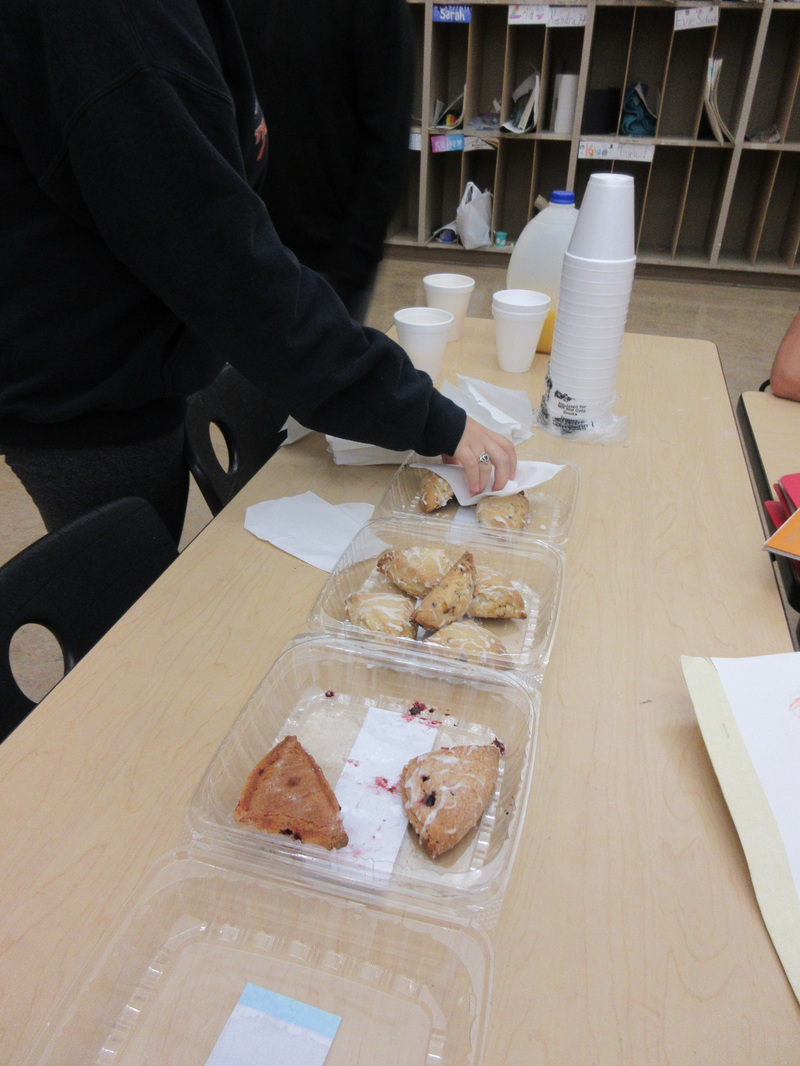
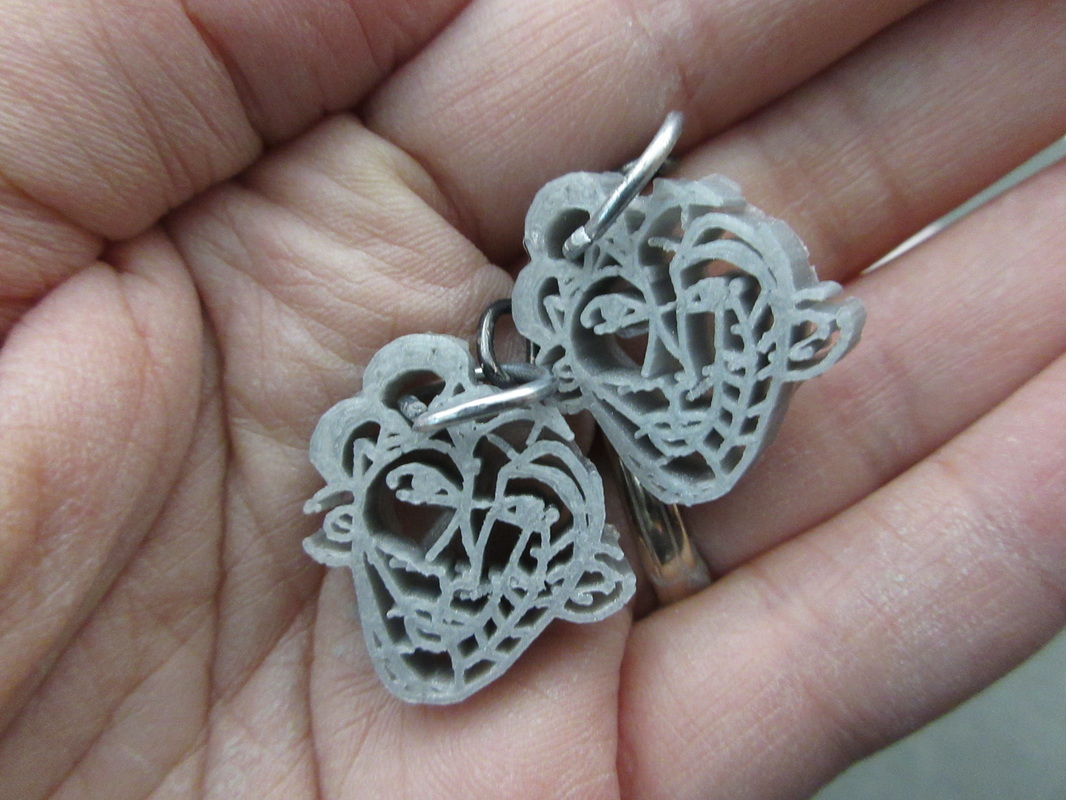
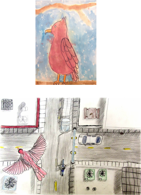
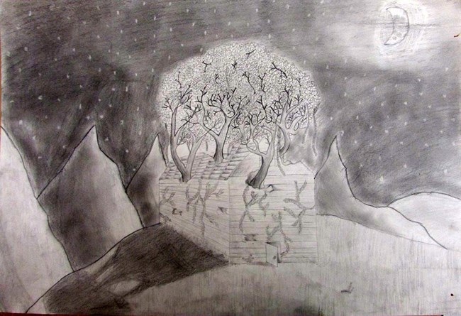
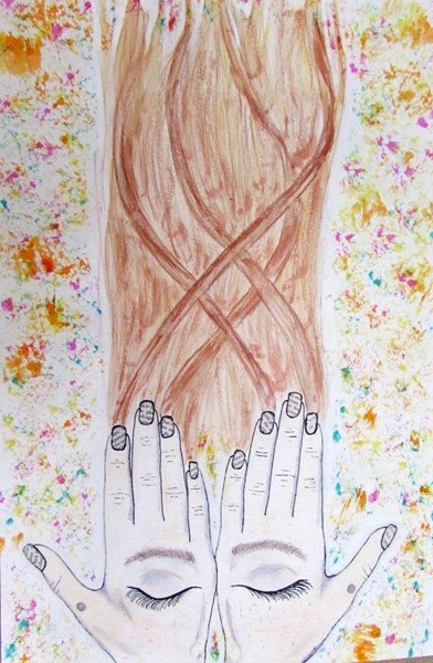
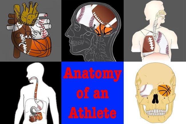
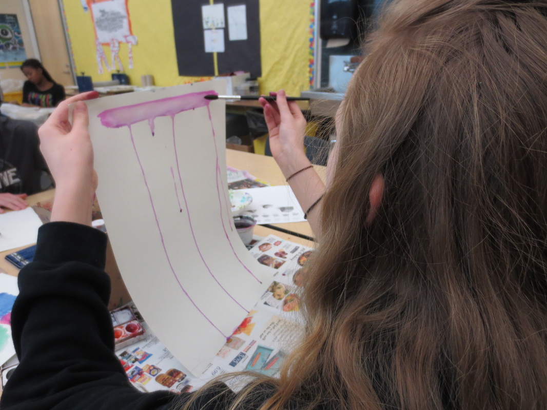
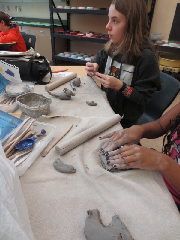
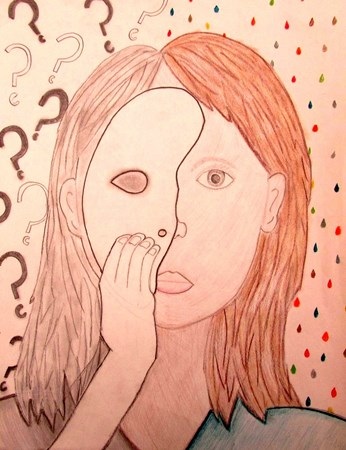
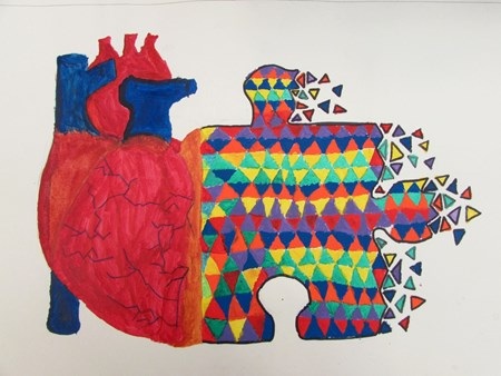
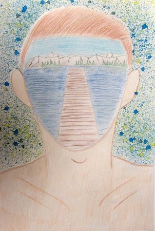
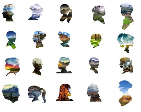
Finishing Up with DE

Picture
Picture
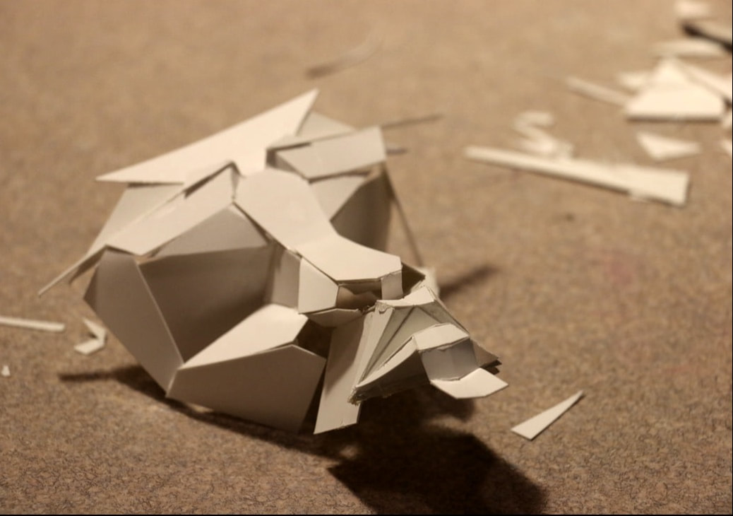
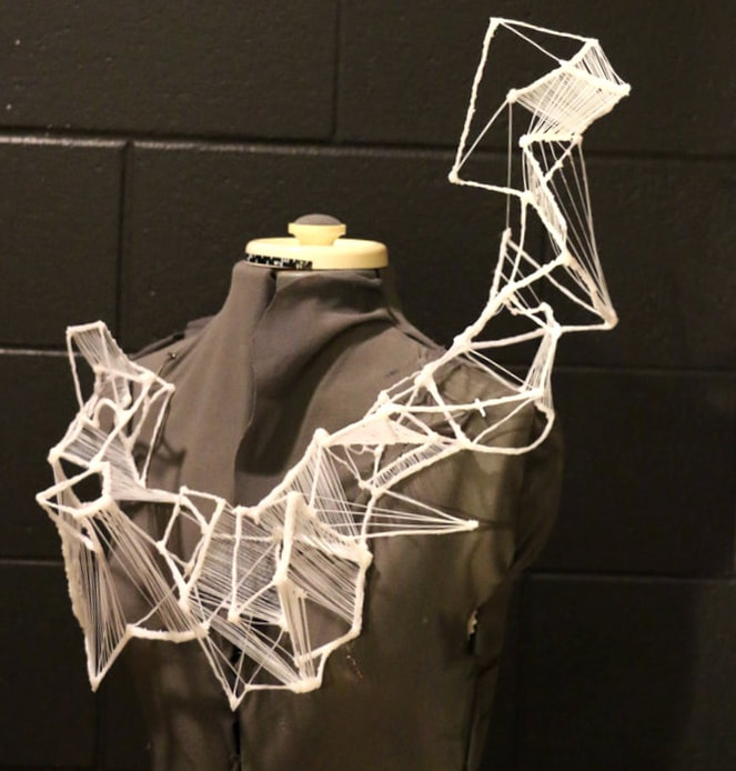
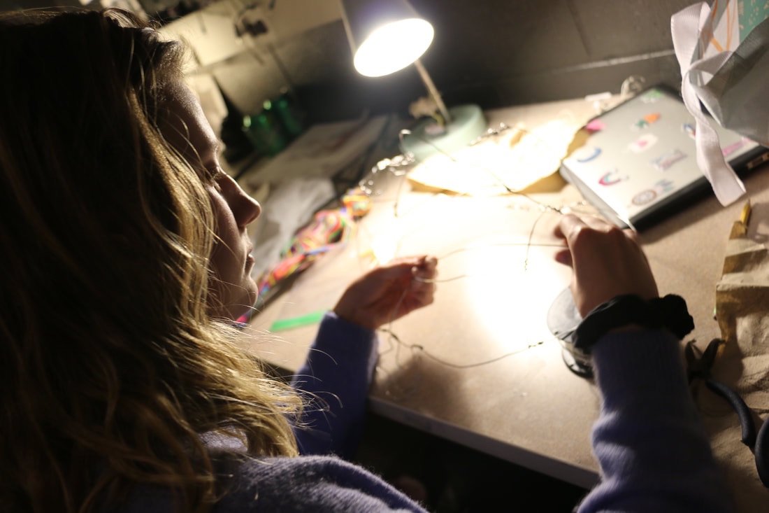
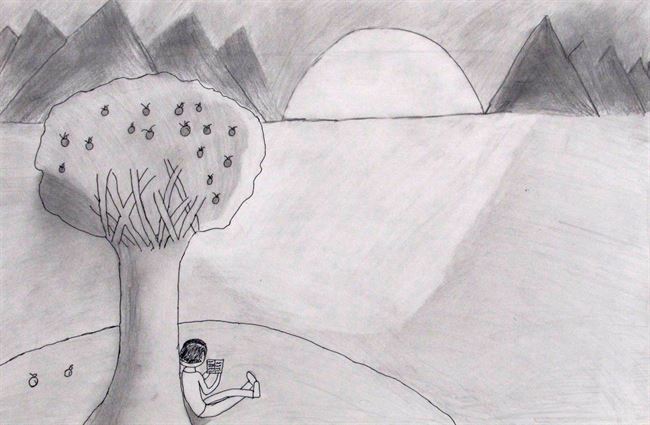
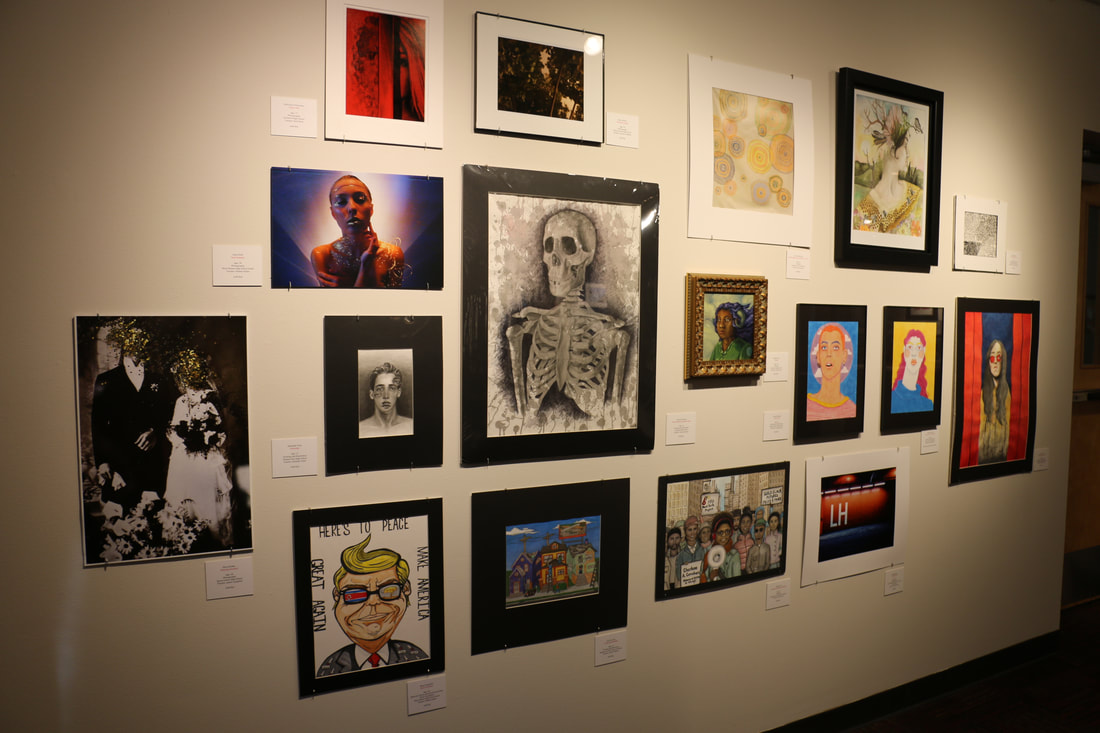
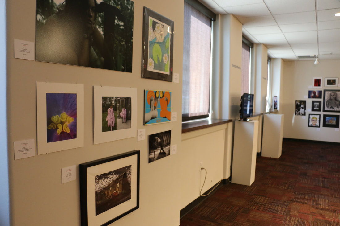
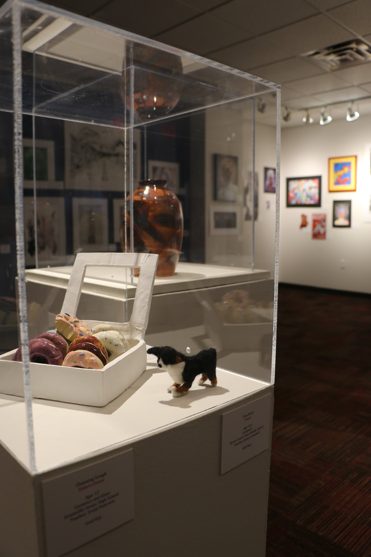
Students in my KCAD 3D DE class are working on their final exam projects as we get closer to the end of the course. With only a week left, students are at different points of progress when it comes to their final works. It has been an awesome time seeing students select what materials they want to work with for their final projects and how they can adapt the skills and ideas we discussed throughout the term into something that is uniquely their own making. 

I have been so impressed with the students from this term and cannot wait to see what they land on for their final works. I am also excited to see many of them return as a part of our program and even more excited and proud for those who will graduate and begin their next learning journey at the college level! 
Picture

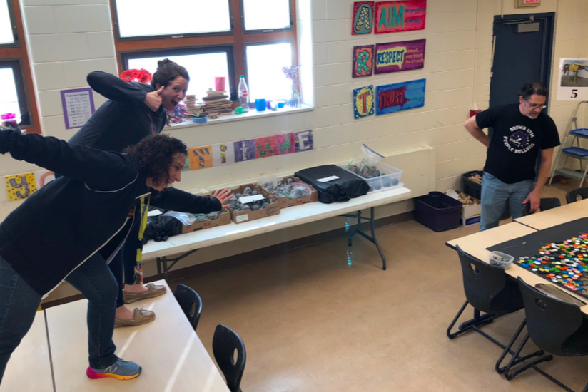
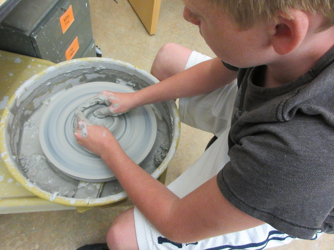
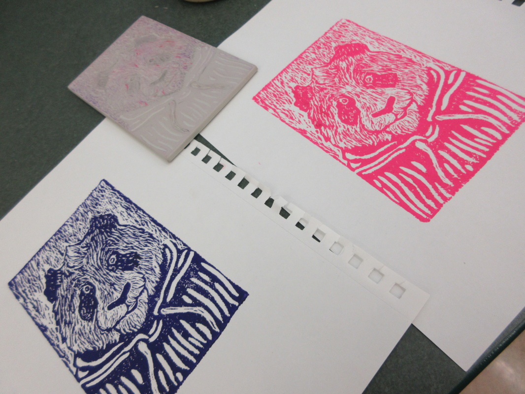
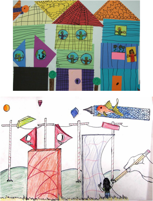
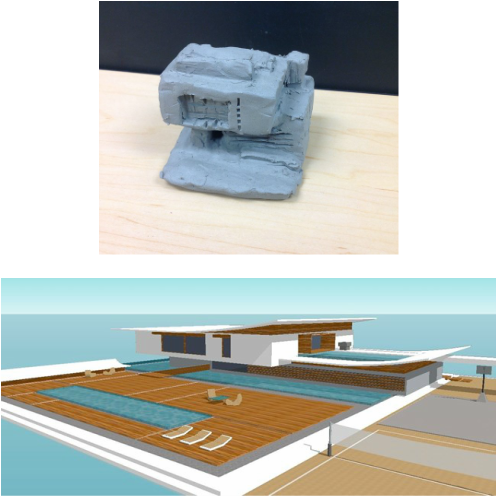
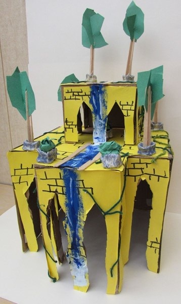
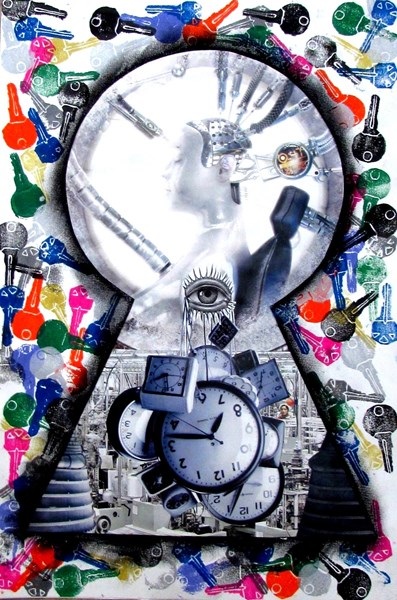
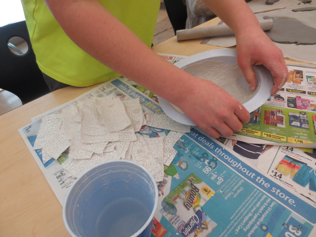
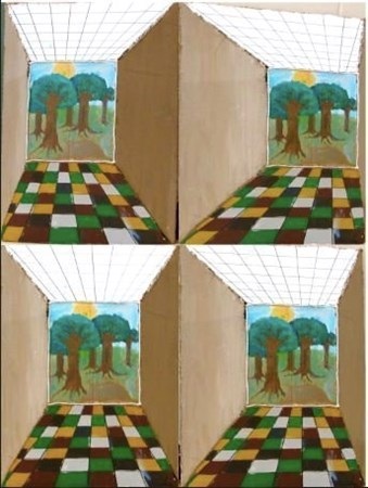
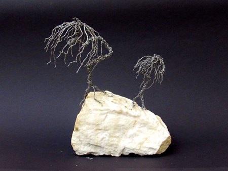
Architecture Almost Complete

Picture
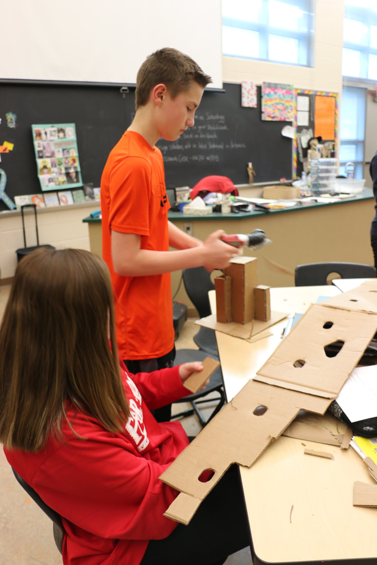
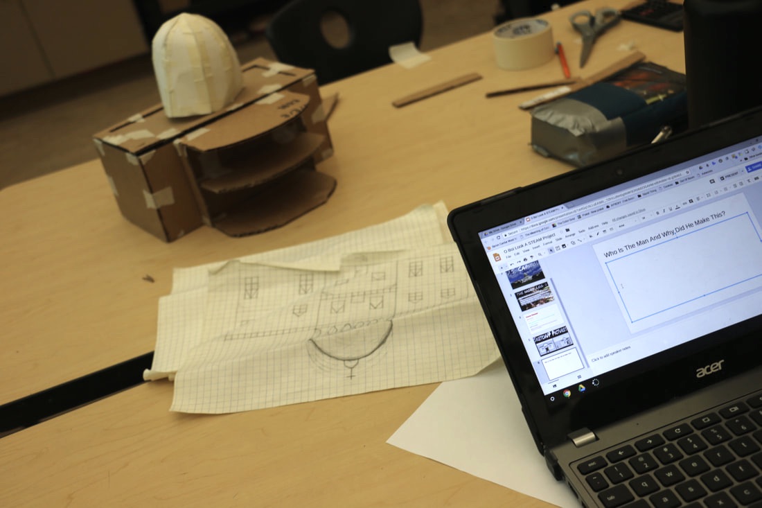
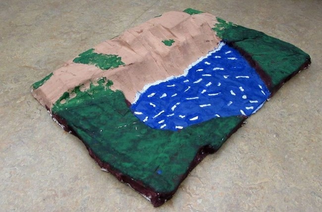
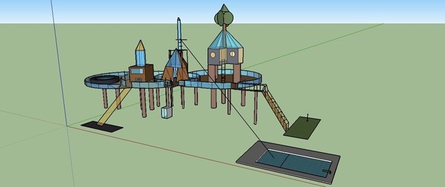
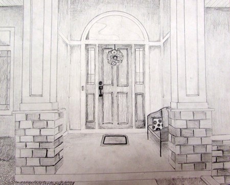
Students continued their STEAM projects this week that worked at designing an building models based on architecture. Students will finish up and present these works on Monday/Tuesday of next week. I have appreciated seeing students work together in groups for this effort and discover skills and talents using a variety of tools. 

These pieces will go on display in the Library of our school for the remainder of the school year and we look forward to keeping some as examples and decoration for our classrooms. 
Picture

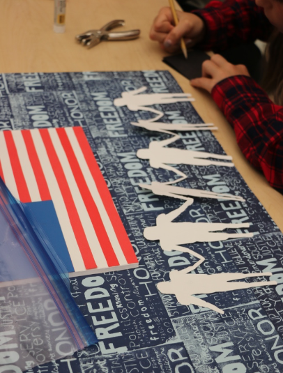
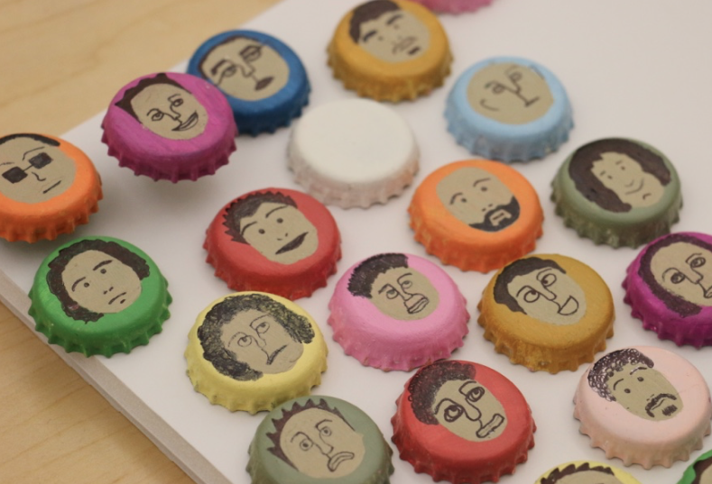
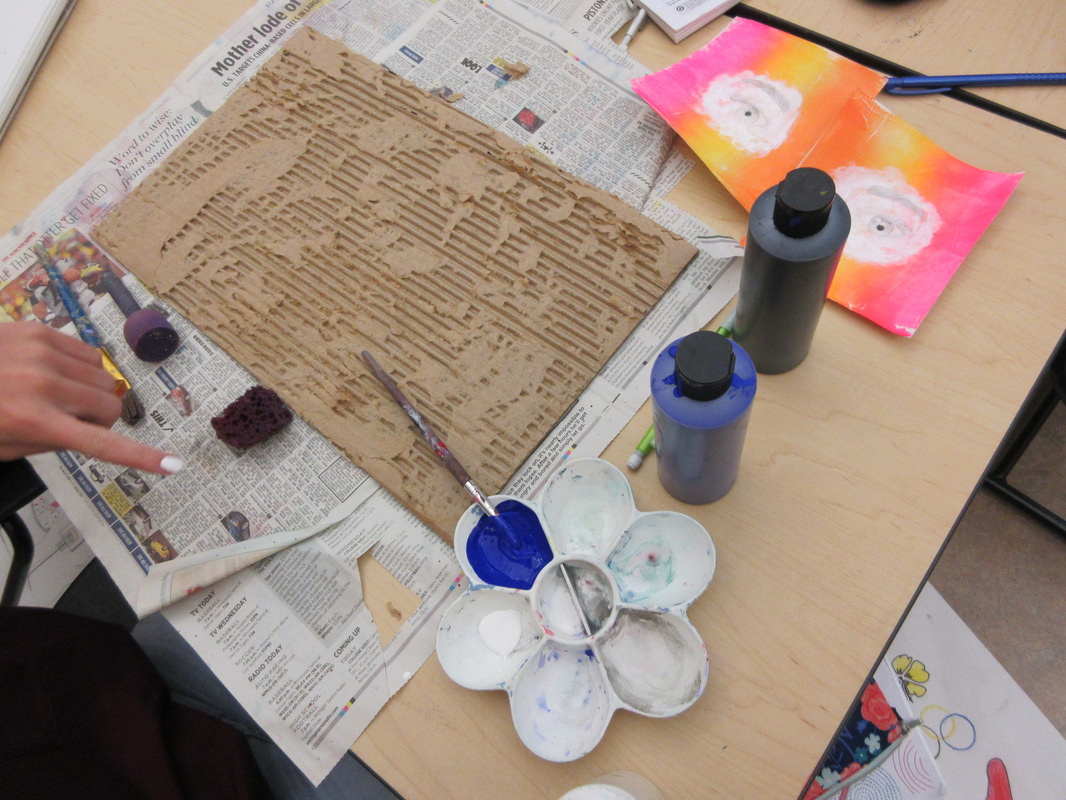
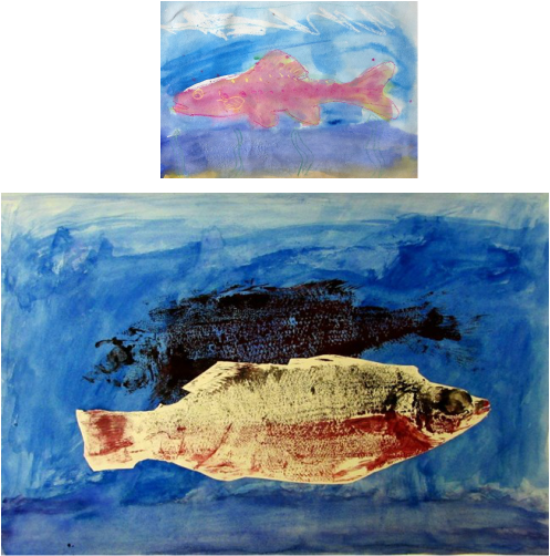
Working on ArtPrize10

Picture

Working on our @ByronCenterPS #ArtPrize10 Youth Collaboration piece for @ArtPrize collaboration today pic.twitter.com/YVc7kmdfDC

— Janine Campbell (@campbellartsoup) April 17, 2018
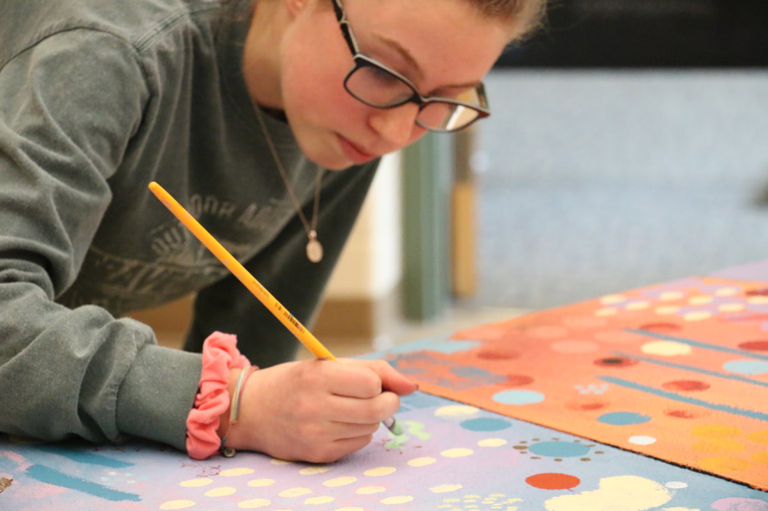
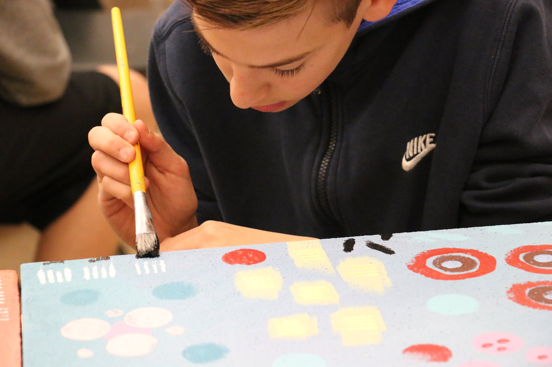
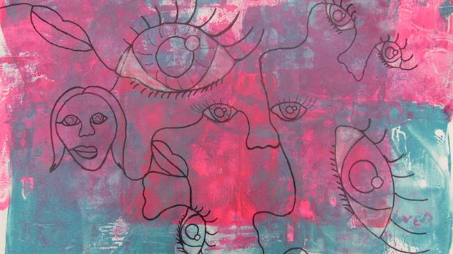
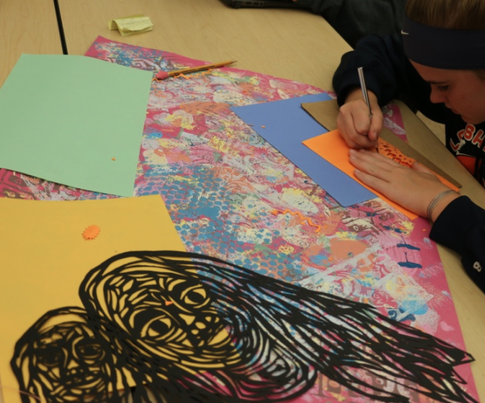
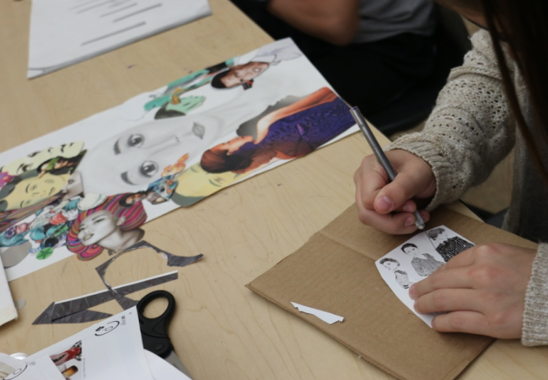
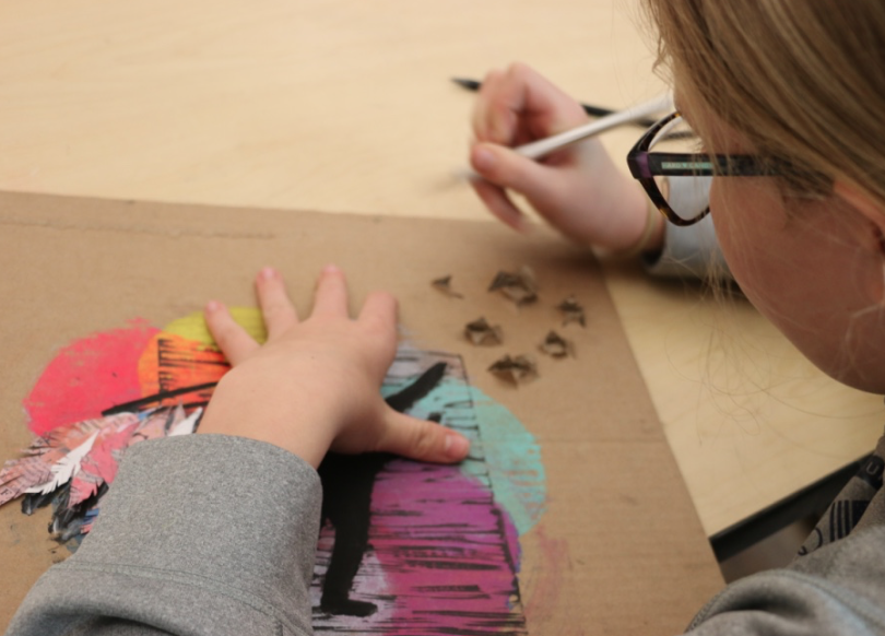
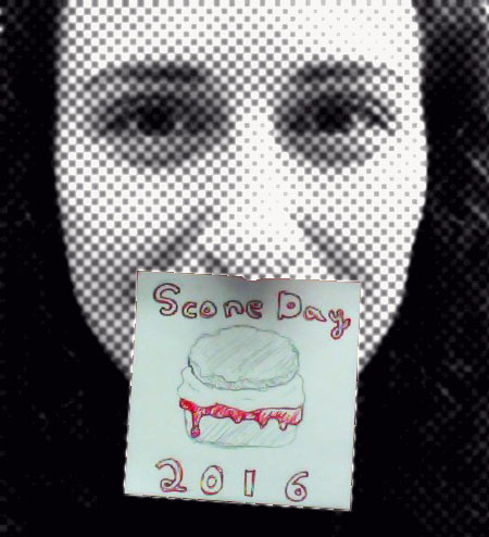
Students were busy at work last week getting the background for our panels painted for ArtPrize10. We are so excited about this installation that celebrates diversity and how we can come together as a community to work on this statement. Now that we have our backgrounds decorated, we need to finish up the portraits on the bottle caps and apply those to the panels along with reflective paper. 

It is going to be amazing to see the other schools' work, too. Especially when we put them all together. I am also looking forward to sharing our completed panels at our Arts a la Mode/Empty Bowls/Fine Arts Night celebration on May 22nd! 
Picture

LOVE the additions students made to our #artprize10 Youth Collaboration entry as a part of the @ByronCenterPS @ArtPrize work. Hoping we will find a venue this year to showcase our work! More to do tomorrow! pic.twitter.com/3NaBoCOBmh

— Janine Campbell (@campbellartsoup) April 18, 2018
0 Comments

Week Six

3/3/2018

0 Comments


Happy Youth Arts Month! 

March is Youth Arts Month! I am very excited about all of the things we have in store for Youth Arts Month, including the start of our ArtPrize10 piece. To kick off the month of artful festivities, we finished up some major projects, celebrated our Regional Scholastic Awards, and I even got to participate in an art show!

If you would like to help us celebrate Youth Arts Month, consider donating to our latest DonorsChoose.org project that is getting matching funds from AT&T for digital storytelling or voting for our student-made videos for the Meijer Great Choices Film Festival about Celebrating Diversity and Healthy Choices (you can vote once per day until March 23rd).

You, Me, Everybody

7th and 8th grade students finished their first major projects this week that focused on the theme "You, Me, Everybody." This is the first time that students got a chance to decide their materials and overall compositions for this semester to explore the theme. What is so awesome about this project is seeing the choices students make and reading what aspect of the theme they want to explore. 

What is even better is how they use the tools they have been empowered with through the skill-builders we have done earlier leading up to this project. It is always a little hectic not knowing exactly what students will make in my class, but it is so rewarding to see them make choices and reflect on the outcome of those choices in their artists statements. 

I am so thankful I adapted this teaching practice and built in a variety of ways to for students to find success. I am not saying that it is 100% perfect, but we are going to keep working on it until it is. 
Picture
Allison: I choose to use Photoshop because I felt personally the end product would look better using the program. My technique consisted of separation, having nothing in common with the other side. Separation assisted me in communicating the difference between adult hood and childhood. It connects to the theme you because all the people that I meet are either embracing their child side or attempting to cover it up, like in the picture when the adult had is trying to cover the child's hand.
Picture
Jared: I used pencil shading and I used a variety of pencils.I darkened areas so that it looks like shadow.I did this for the me part of the project and I like nature so I wanted to employ that into my art work.The sun is setting because I like to read at night as in the picture.I'm reading under the tree.
Picture
Alex: For this piece I used the printmaking technique, for this I started out by taking a picture and then tracing onto a paper which I then applied to a carving block. From there, I then carved out the pieces I didn't want to have printed and started the actual printing process. I took different inks and painted them on a bench hook with a brayer and also used it to put on the carving block. I repeated this process five times to make the five prints on the piece. This connects to the, "You, Me, Everybody" theme because this is expressing myself just like the artist Frida Kahlo and I only focused on myself through this project.
Picture
Avery: For the you, me, everybody project I chose to focus on child soldiers. After learning about child soldiers in English class, I realized that the topic deserved more recognition that it was receiving. By using chalk pastels, I created flames inside two faces. The flames represent children's identities being erased when they are forced to become soldiers. I also incorporated shredded paper into the background to add texture and to create the illusion of the paper being signed I added water color. This shredded paper symbolizes the destruction that the child soldiers are forced to witness and participate in. Relating back to the theme of the project, this piece connects to the "everybody" category. Everyone should be knowledgeable about child soldiers and everybody should do there part to help.
Picture
Chelsea: My earrings are related to the “You” part of the you me and everything project. It connects with you because there is one person hanging from the earrings and in the necklace the theme is everybody because there are other people hold each other up to make one piece of art. They are made of gold and colorful wire to show the detail in the arms legs and body. The colorful wire represents a bunch of different people that come together. The colorful wire was easy to turn and move but the little people took a lot of mistakes because it is so small.
Picture
Hunter: For you, me, everybody, I chose to do me, this represents me because this is something I am interested in doing and I like making different intricate designs. This consists of circles and like and weird shapes together making it into a big collage of shapes and lines.
Picture
Olivia: This artwork connects to the topic because the mug is a very simple person showing that in the end everyone looks the same without the small details. This kind of goes with the theme of everybody because our faces are all the same after you take off the freckles, hair, and more. To make this I used the techniques we learned about clay, like armatures. The materials I used to create this project were clay and glaze, and it made a beautiful mug in the theme of everybody!

Ceramic Forms

In my 3D class this week, students continued work on their miniature hideaways and were also able to upload their ceramic forms from earlier in the term. Not everyone's work has been glaze fired, but it was great to see these completed. It was also interesting to see what reactions were to the glaze choices students. made when completing their forms. I am so pleased with the work from this group so far this semester. 

Scholastic Awards

Picture
Picture
The BCPS Visual Arts program had another strong showing at this year's West Central Michigan Regional Scholastic Art Awards. With over 50 works recognized and one American Vision Nominee, we were able to celebrate this success on March 3rd with our students. 

Kendall College of Art and Design hosts our regional show and they did a great job of recognizing students and displaying the creative works of the 2018 Gold Key winners. 
Picture
Picture
Picture
It will be exciting to check back on the Scholastic Art and Writing website on March 13th to see if any of our Gold Key winners received National Medals. Good luck to WMS Gold Key winners Sophia, Bryanna, and Tara! 
Picture
It was also very exciting to see past students soar, like Emma McCloud (pictured above with our high school Visual Arts teacher Greg Reinstein). She received her first Scholastic Awards as one of my students and she is now an American Vision Nominee for our region as a high school student. I can't wait to see what she does next with her work! 
The show was a great one! I am so proud of our students and thankful I get to be a part of their art journey. These students are so inspiring and their work makes me want to be a better teacher and better artist. 

Art Show

Picture
To cap of this first week of Youth Arts Month, I got to see my own work on display as a part of the CAMPUS show at The Urban Institute of Contemporary Art. This is a group show featuring faculty members of Ferris State University and Kendall College of Art and Design. Thanks to my work with KCAD as a Dual Enrollment instructor, I was able to apply to be in the show. 

I feel pretty proud and overwhelmed to have been able to submit a work and have it on the same space as artists like Kehinde Whiley and Nick Cave (just last year)! One of my personal goals this year is to push myself to make more art and show my work more this year. This show was a great step forward in doing just that. 
Picture

ArtPrize10

We had a half day with students on Friday, which meant we had PD in the afternoon. I am so lucky I got to spend part of that PD with my fellow Visual Arts teachers to plan out our ArtPrize10 student collaboration. 

Before our meeting, we had a basic idea about what we were planning to make. Now it is much more clear and specific. I don't want to give to much away, but I am so excited to see how it all turns out in the end. I am so lucky I work with an awesome team! 
Picture
This is what hard work looks like.
0 Comments

Week Seven

10/23/2017

0 Comments


Finished Work

Students finished their work for the challenge "You, Me, Everybody" project. In this challenge students were asked to create a work that was either about someone else, themselves, or a larger community/culture. We looked at the work of Julian Opie, Frida Kahlo, and Do Ho Suh as examples of artists who use a variety of methods and media to tackle this prompt. Before students started their final works, they created a series of sketches to work out ideas and we also went through various materials and how they could be applied to their final works.

It was fun to see students work with different media, try new ideas, and change their pieces based on experience and feedback. I am always amazed when students are able to put feedback to good use and apply the concepts and ideas taught.

Application of ideas and methods to achieving those ideas is something I am striving to teach throughout the term. It always starts a little slow, but as you can see with the examples below, students are able to use the skills we have build to achieve their desired effects and create one-of-a-kind results that both meet the standards set as well as their own artistic vision. 
Picture
Kalynn: In my piece I am representing the idea of everybody. I have showed everybody be drawing different hands gripping a rope. This shows that we are all holding onto the same thing and are doing so together. In my art I used color for the rope to try to make it the center of focus, and add depth. Overall I have learned several new techniques and enjoyed overcoming the challenges to create my piece of art.
Picture
Serenity: I wanted to make this clay piece because I am not very good at drawing faces so I thought that I could make a face better using clay. I focused on the you part of the theme you, me, everybody. I didn't completely base it on a specific person, but it is not a drawing of me so I consider it a you part of the theme. I used different clay tools to make different textures in the parts that have hair so that it would become more realistic and look like a person. I left the lips in a neutral face to make the face look like the person was having an average day. I chose to do red hair and purple eyes because when I was a little kid that was who I pictured my self to be in our house games.
Picture
Cheyenne: First, I drew my own portrait and then I traced it with a permanent marker and put printmaking all over it. Then when I was done with the printmaking which took me about 4 to 5 days, I traced my portrait with chalk pastels and then it made it look 3D like the image is popping out. This connects to the theme "me" because I like to do artwork based on me what I like and what I like to look like.
Picture
Dylan: i got the idea to do this when i thought about how different me and my family are, but how we are all the same. so i went for a broken mirror effect on the many photos that i have to show how differences between us, but how we are alike.
Picture
Mary: In this piece, I did something very similar to a self portrait.In the middle is an artist persona of myself, and around is some fictional characters from some of my favorite franchises, except the two at the bottom, which are two characters of my own with their own stories.
Picture
Sophia: I originally was going to do the backs of peoples heads for my project, and when I was coloring the hair, I just started to doodle in my sketch book. After trying my head pictures twice, I decided I wanted a different picture instead, and I decided this picture was the one I wanted to use. I had a lot of fun with this project, I went out of my comfort zone with picking my own project with a very broad outline. It took a while for me to pick my final project, but I think I picked a good one. I learned about a paint that is water color, but it starts as a liquid! I thought that was really amazing, so I used it on my background! I also leaned a new technique form my art teacher Mrs. Campbell called feathering. I personally love this technique, and hope to use it in the future!
Picture
Kennedy: For my project, "you, me, everybody" I did more than one piece of art and i seemed to like this one the most. The project is focused of everybody, and the eyes represent everyone's eyes. i used a piece of Gelli plate to put on the background colors and mix them together, the colors i had used were pink and blue and the colors mixed together to make a purple color too. I used a black sharpie marker to draw the eyes and i used chalk to help the eyes stand out.

The Problem with Due Dates

Picture
Due dates are necessary. They help hold students accountable and set pacing of content for the term. With that being said, I really find them to be hard to follow with students who decide to go above and beyond with assignments. I do not count this against the final grade if work is late because of this. I do not think it is fair to punish students who want to take more time on their work because they are doing something special. 

I do have an issue with students who misuse their time and turn in work late or rush through projects without using their skills and understanding to show what they know. That is why I think due dates should be set, but be flexible. For the students who are unable to meet the deadline because their work is more complicated or in-depth, they have to find the time to finish outside of the set class time and that is usually not an issue. If you care about your work so much that you are willing to spend more time on it, chances are you want to see it to completion. 

Here are some works I am excited to see come to completion soon:
0 Comments

Week Six

10/14/2016

0 Comments


#WIP

Picture
Andrew created a plaster mask of his face so he could use it to get this clay mold for a piece of pottery.
Watching students works in progress (#WIP) has been very exciting this week. Seeing students finalizing plans and diving into their pieces has brought into focus both their understanding of materials and application of the theme's challenge as they see fit to interpret it. 

The theme for this challenge is Biography/Autobiography and students are using a variety of ways to explore the ways in which they can visualize this concept. Some students are being more direct in their tactics, using portraiture and figures in their work. Others are being more exploratory in the process, pointing to objects or artifacts or animals that resonate with theme. 

Either way, it has been fun to see them work through the ideas and how far some will push the concept and materials they choose. 

#SconeDay16

Picture
International Bring a Scone to Art Class Day was alive and well this 2nd Friday in October! Students did all sorts of things to celebrate. 

We had students bring in scones they baked or bought. Students also made some Scone Day art and poetry. 

Aron really summed up the sentiments of the holiday:
Picture

My Work

One of the best parts of my job, and something I made sure to write into my Goals for this year, is being able to also work on my art when my students are working on theirs. 

Early in my career, I would have never thought to do this. I would hover over students with a careful and critical eye on every mark they made. Over time, I have realized that my students actually do better when I give them the space to grow and they do better when they see what it means to work with purpose from someone who is authentically making art for themselves. 

​Here are a couple of things I got a chance to work on this week:
Picture
I did a printmaking demonstration earlier this week. I used an old sketch of a panda for this work. I am thinking about actually printing it on some fabric next week.
Picture
I did this modified contour drawing on Morphi, using the iPad we got from DonorsChoose.
Picture
Here is the print from Morphi. I think I might make these into some earrings...
0 Comments

Reimagining work

1/15/2016

0 Comments

 
Our last major project of the semester before finals is also my most favorite. I love seeing how students go back through their portfolios to recreate works in new ways. This also offers them a chance to demonstrate their advancement of ideas and ability since the first time they tried the image the are selecting to revisit. Here are some highlights: 
Picture
Jewel: My artwork is a newer improvised version of Rain Downpour, one of my favorite projects we did last year. This is an improvised version because it shows the techniques in stippling and the new techniques used in watercolor, like sponging and blowing. It shows similarities between the pieces like the water color back ground and the drawing in the center. Both of these pictures in Happiness at its Finest, show what make me happy, my best friends, and my puppy. :) I really wanted to revise this idea because I remembered how much fun I had the first time I did it and wanted to bring that joy back to me.
Picture
Eli: In my artwork, I decided to make a self portrait out of cut out cardboard pieces. I am redoing a piece that I made in 6th grade. That piece of work was a cardboard cut out that I painted on to. The piece I made recently is shows a lot of improvement because when I made the piece in 6th grade, all of my facial features were distorted and not placed correctly. In my updated image, I tried to make sure that all of my facial features were where they were supposed to be. I tried to be as detailed as possible in making this. For the background I took a blank white sheet of paper and I used a spraying technique to make the paint dots. I personally wanted to revisit this art piece because it was one of the first ones I ever made at Byron Center and I wanted to see how much I could improve since i've started coming here.
Picture
Gabby: My piece of art reflects a new version of a city I created in 2008. I grew as an artist in the past 8 years. I learned how to shade, draw 3-D shapes, got better at drawing people and objets, and I have more of an idea that goes into my drawings. In the old drawing there were a few people looking out of the windows, in my new piece there is a girl who is painting. The building she is painting on has a similar pattern to a building in the old drawing. The shapes I had cut out in my old drawing are now floating in the sky in my new one, along with the fish that was in the 2008 drawing (in the bottom right corner.) My art has a personal connection with Takashi Murkami because the triangles in it have faces like the little characters Takashi makes in most of his pieces of work.
Picture
Grant: I made this with a dead fish, watercolor paint, and regular paint. I made the watercolor background, took a dead fish, painted all over it with red and black. After that, I took the paper and surround the fish with it and made sure I got all the faint on the fish. The one with the white background, I put on a separate white paper and cut it out. The old thing I made this from was from 6th grade and it was a regular water color fish(not real) just painted on.
Picture
Ethan: I chose to redo my Clay modern home because I love creating house designs and I felt like I could do better with this house while still keeping the same "house" with the same design. I used the same window layout as the old house, and the same chimney, but added more exterior detail, and a roof, that would help make the house stand out.
Picture
Damien: I feel a connection with this piece of art because in 6th grade I did this piece of art and it is still really cool to me. I also just like birds in general. I did this piece of art again because it would be a great opportunity to prove that I've advanced as an artist. This bird reflects what I've learned in terms of shading and color and how it has the bird flying instead of sitting. That is why I chose this artwork rather than any other one.
Picture
Sarah: For this Project, I chose to remake/reimagine my Dot Project, mostly because I thought I could do a better job on it with more time. I decided to incorporate Mitchell Feinberg's concept of time into my work, and another student inspired me to make my piece only black, white, and grey. This piece has the concept of time because there is a young girl, and sitting next to her is an older woman. This could be interpreted as a grandmother and her grandchild, one girl as her older and younger self, or really anything you want. I personally have never used charcoal before so learning different techniques and discovering the cool effects was fun.
0 Comments

Finishing Up Environments

11/14/2015

0 Comments

 
This past week, we finished up our latest theme in class: Environment, Space, and Place. Students really pushed themselves with a variety of media and outcomes. It was fun to see the evolving pieces over time and how students adapted their pieces based on feedback and learning new skills in class. I am excited to move onto our next theme which will deal with objects, but before we do, here are some highlights from the completed works (all of which can be seen on our Artsonia gallery): 
Picture
Nate: For this project, I made a model of the silver lake sand dunes. I made this because I spend a lot of time up there in the summer and it is a really cool place to be. I made It with out any houses or building to show how it might look like without any people. To make this, first I made the shape of the sand dunes with foam. After this, I covered the whole thing in plaster. I then painted it with acrylic paint. To make the water sparkle, I mixed blue paint with sparkly silver paint. After that, I painted white in the lake to make it look like waves.
Picture
Gracie: For this piece, I chose to use pencils and experiment with different values. I think the dark values I used in the piece really made it different from other pencil drawing I’ve done before. I also used texture in my artwork. For example the bacon trees added a lot of texture to the piece and make it look different than what you would typically see. Lastly, I incorporated contrast between the elements to show my Ideas. There is definitely contrast between the smooth bone and the rough and ridged bacon trees.
Picture
Cheyenne: This was the most awesome project I have done this year! I'm getting better working on PhotoShop, this comic is about three animals wanted to save the environment. I hoping to start making more comics soon!
Picture
Corrina: I decided to use pencil dark and light colors. These shades had started out with a simply regular pencil shade and darken the sky as the drawing continued. I also used graphite sticks to shade in the drawing. This skiing wonderland has trees, snowblowers, ski lift, and yes skiers. The darker sky and clouds made the affect that it was snowing and the snow blowers added to the snowing effect. The girl on the ski lift is stopped and looking at the beautiful snowing ski with the absence of light.
Picture
Colton: For this projects I decided to use Google Sketchup to make an architectural piece. I used the computer again because I feel a lot more confident using it instead of a pencil and paper. Using the computer helped a lot because I can create 3D pictures and sculptures and use my imagination with the tools provided on the computer. I didn't use any tutorials or help to create this. I simply played around with the different tools until I got the hang of it. I decided to make a giant tree house with a main cabin,(Middle) and two guest cabins for visitors. On the far left deck there is also a hot tub. To get in/out of the tree house you can use the stairs, elevator, slide, or zip-line. The zip-line leads to the Olympic-sized swimming pool. The stairs lead you to a large putting green.
Picture
Josh: I used pencils because I felt they were an easy material to use for an early project. They helped me show many details and shading with ease which is what I was aiming for. Elements and principles I used mainly were value and texture. The value helps communicate by adding depth and shadowing to have a good point of view. Texture like the leaves and the grass helps the viewer by showing more detail of the environment and what it is like.
Picture
Jewel: I created this artwork to signify environment, space or place. I was trying to communicate that you can only run away from things and feel safe in your home, which is your environment of where ever you feel safe, you can call home. I choose these materials because I realized I couldn't get my point across with a simple drawing. I wanted to go beyond. The contrast and the colors help make the piece stand out and show the important parts of my piece. Like how the heart is pink and one of the only colors in the piece. I used the leaves on the roof to represent that your home doesn't have to be perfect to be you're home. Its just a place where your heart may find peace.
Picture
Damien: In my piece of art, used various materials to achieve the texture and balance I did. The materials I used were construction paper, clay, temper paint, hot glue, cardboard, and markers. I tried to achieve the concept of balance with putting the pots on corners and in multiples of three. I also tried to achieve the concept of texture with the bricks I drew on the walls and the vines sort of growing out of the ground and the waterfall even having bubbles. I wanted to make my mini replica of the hanging gardens of Babylon look almost alive even though it isn’t even made of living plants.
0 Comments

Identity Complete

10/24/2015

2 Comments

 
Students finished their first major theme last week, which involved how artists portray identity in their work. Students were given wide perimeters to create and they took advantage of that using all kinds of materials, even ice! After much planning, playing, and creating, here are some examples of their first finished works:
Picture
Ana H.: I took a photograph of myself on the standing by the window, through a reflection of a glassed framed door next to the front door of my house. Giving my photograph the illusion of a fading girl looking out towards the light behind the locked door, as if she has a dream to be in that place behind the door, yet she fading and see-through as if she were to be a locked up ghost. That's why I named it "A Fading Dream". I used photography instead of a drawn picture, because I wanted the illusion of a fading girl to look as realistic as possible, so a photograph would be best to do that. In addition in my photograph, it only presents half of the girl's face, not fully seeing who she is, what she looks like, but showing that she is a girl with a passionate dream.
Picture
Virginia D.: I used crayon and pencil to create the hands. At first I used had the skin peach and then I decided to add more depth and dimension to my work by using red, blue, and purple because your skin isn’t just one color. I thought it would be cool to make my face appear on my hands because all of our features are different and that is part of our identity. Then I thought it would make the picture look different and unique if I make hair come out of the fingernails and have a few strands wrap around it. You can use other artist’s work to inspire you or help you when dealing with identity. I think this piece turned out really cool and abstract. And when I first started I never thought it would turn out looking like this.
Picture
Clay L.: In my art piece I did print making and it is me doing the three pointer sign. Why I chose to do that for my art is because I like to play basketball so that is kind of symbolizing that I like basketball. I did this with the color green because I am a big Michigan State fan. I had the tint of the green go from darkest to lightest to give my art some detail. I had fun making this art and I think I did petty well on it too.
Picture
Alexis W.: by caution tape. I made this because I want to share who I am to the world, but there are things in life that act as caution tape that hold you back. I was very inspired by the artist do ho son, because he uses the theme identity by making many things put together to make a bigger picture, and I feel like I feel like I incorporated this theme in my art. To make this piece I mainly used watercolor. For the background, I painted the background with watercolor and put strips of duct tape over it and painted it black. I then peeled off the duct tape it revealed beautiful lines of color. For the thoughts around the head, I painted my hands, and put them on the paper, which made a beautiful background for the thought, and I then took sharpie and drew things that I had a connection to, and then cut them out and glued them on the paper. I then made the caution tape and painted it yellow. For the head, I purposely drew a straight face with no color to represent how I may look on the outside, but then, the background is beautiful and this represents what is inside of my mind. In my drawing of the face, I used a pen and I made single dots, which made a face when put together. My finished artwork is how I feel about who I am. This is my identity.
Picture
Zach F: The art work of my Ice Face shows my identity because Ice sometimes is transparent and thats how I want people to look at me not because of freckles but transparent so people don't not like me or like me because of my looks. I got inspired by Phil Hansen and how he did the frozen wine out of Amy Winehouse because I thought it would be a good idea to create a frozen portrait of me.
Picture
Sarah K,: My artwork applies to the theme of identity because I did three images; this one is of a girl shattering like glass, she represents the emotion of sadness. I used watercolor and salt on the background to make a crystalized look, and the glass on the left side of her face shows that she is a fragile person and she is falling apart because of her sadness. My artwork applies to the theme of identity because this is the second image I did, which is of peace and tranquility. She does not have negative emotions and thoughts, so she is growing and thriving, unlike sadness and anger. I chose the earth look because I find earth and nature to be calming and peaceful and I felt that the idea of thriving and growing as a person fit with nature. My artwork fits in with the theme of identity because this image is the emotion of anger. Her anger is burning her alive and causing ash to lift off from her skin. I chose the fire look because i felt that it fit best for the idea of anger and the negative emotion burning her apart.
Picture
Nick F.: My materials (pictures) represent my identity and the pictures mean something to me. I made my piece a collage with different parts of the human body and two pictures of me playing sports. The pictures represent my identity because it shows that my brain, heart, and stuff like that is filled with sports. All of my main internal body parts are and are filled with sports. That represents me because I love sports. Sports are my passion and my life. I probably couldn't live without sports. Sports are a main part of my identity. My piece is kind of like that of Frida Kahlo. It's like her work because in her work, she focuses on the concept of personal identity. In this piece, I am focusing on my personal identity. This represents my identity because I'm trying to show that my brain, heart, lungs, etc. are all about sports. Frida Kahlo makes different pieces centered around herself. Usually she's in all of the pieces. The pictures don't show me, but rather my insides.
Picture
Kasey L.: Identity is who you are or what make you you. With the different materials I used to create this art piece effected and change the piece dramatically. I used print making to give it a textured look so then it will standout. I used pastels to give the outline of the key hole so then it wouldn't blend in with the back. This art piece represents identity because there are many different keys that are different colors. Then in the key hole the girls represent us and how some all of us are created differently. then you have the lab where she was created. Also there is an eye with clocks hanging down to represent time. Do Ho Suh represents identity by making large sculptures that have people holding up his art pieces. He likes to say we are all in this together and this represents identity because there are many different people but we can all come together. Julian Opie shows identity by making people's faces as simple as he can but they still have their identity.
I am so proud of how hard students worked to push past their potential and really stretch their creative minds to make art worth making. I am equally excited to see what happens as we tackle our next theme: Environment, Space, and Place.
2 Comments

Interpreting Identity

3/25/2015

2 Comments

 
The images above are students working on various projects for the Identity assignment we finished last week. It was fun to see students experiment, explore, plan, fail, plan some more, and then reach results like the ones you see below. You can see the full gallery on our Artsonia gallery. 
Picture
Michaela: For this piece of artwork i used multiple different methods/patterns along with the materials. For the face of this person I used ripped up news paper articles and glued the together onto thick paper with multiple layers of modge podge, after the modge podge dried i used acrylic paint to paints the eyes, eyeliner, and nose. For the colorful splatter I used wet watercolors, i used a paint brush and dabbed it onto the paper and made an affect by blowing it up towards the end of the paper. I used zentangle, the way i used zentangle patterns by drawing it out with pencil, then going over it with sharpie mixing the designs together to make zentangle. The elements of art i used for this project is color, i used dull and very bright colors throughout my whole art piece. I used different texture by having the zentangle texture, paint texture, watercolor texture, and newspaper collage. The principles of designs i used was pattern, i used patterns by the zentangle, i used patterns such as bubbles, flowers, lines, stars, zebra, etc. The reason why i created this picture is because it expresses someones feelings through the water colors coming out of its head. I didnt draw a mouth because the watercolor art already has told enough, the zentangle behind it gives it a bright to dark effect.
Picture
Leah: In this piece of art I made, I decided to use a new technique that was introduced into our classroom. The materials I used were watercolor in a spray bottle and different pieces of paper to make a cool effect. A principle of design that is noticeable in this art piece is texture. This is used when I used the watercolor by spraying it and then added salt onto the paint to add an extra effect to it. This relates to identity because each face relates to someone’s true color and everyone is different. Using the spray bottle and salt is a new and creative idea that has not been used yet. I have reflected my artwork off of the art piece from Julian Opie. This is because he reflects off of the idea that everyone is different in their own way yet they all have similar features. Past artists have reflected off of the idea that everyone can get along because of similar features but they still have their own personality. I used this idea by saying that everyone has the same structure (paper faces) but his or her true color shines through. All in all, people shine through when they let their personality show what they are made of.
Picture
Jerimiah: For this project I created a gif. In the gif it shows a brain and sparks that come out the brain. The sparks represents personality and I think that is in the same category with identity.
Picture
Evette: Shading really allowed me to show what I was wanting represent in this project representing identity. On one side of my work I used different shades of regular pencil to get a darker and blander look, to represent the side of your identity that you don’t want to reveal 100% and kept a secret. Whereas the other half of my work is all colorful and shaded to fit in with the same technique as the other half, but this colorful half resembles the other half of person that shows their true identity. I personally love this artwork, because of the way it represents identity, and how similar to reality it represents peoples identify. Half open and truthful, and the other half locked shut, not revealing anything. Using art is a great way to show the concept of identity, and Frida Kahlo is a great example of an artist that showed identity in unique ways. Identity can be shown through history, social, and cultural ways, but in one of her paintings she used cultural identity shows the religious beliefs and cultural heritages she treasures. It shows two of her sitting in different chairs connected by the heart, but in two different dresses representing her main two cultures. Furthermore, identity can also be shown through history, like artwork of their lives leading up to then. While social identity can show how others see you as a person. Your true identity may still be showing but not all of it, because everyone has part of it kept a secret.
Picture
Emily: n this piece, I used watercolor paints for the triangles and the heart, I used sharpie to outline the puzzle piece, and I used color pencil to draw the veins on the heart. Using the heart as representing a person and the puzzle piece as representing the rest of society, I wanted to show how each person has a role in society. Though we are all different and we all have our own likes, personalities, etc., each person contributes to the world in some way, and every person is like a piece of the puzzle; When everybody is put together like a big puzzle, we all make up the human race.
Picture
Andrew: I chose to use colored pencils and and liquid spray paint. The reason that I chose those two materials is because I wanted to use a traditional material (colored pencil) but add some uniqueness and flare with the paint. These two together, I feel, make the piece pop. The lake drawing has deep connections with my family. We owned a cottage on Green Lake and make a ton of great memories there. We spent a whole lot of time out there together and with friends. My grandparents also have a cottage on a river that we enjoy. For this piece I used inspiration from Rachel Sierra's piece that is very similar to mine. I really liked the idea of another picture making up the face and wanted to use it because I had never seen it before but it looked great to me. In our culture, artists use their art to express identity. They may to too scared to express their opinion and use their art to do the talking. Look at any graffiti artist out there. Shepard Fairey for example used his graffiti to express his opinion. He was arrested multiple times but did it anyway so his voice would be heard.
2 Comments

Environments - Final Thoughts

10/27/2014

2 Comments

 
For project theme two, we worked on the concept of Environments, Spaces, and Places. It has been a rewarding experience for me to see the amount of creative ideas and variety of outcomes based on student interested and interpretation of the assignment. Before we move on from this completely, here are some final images created and posted to our online gallery on Artsonia. 
Picture
Anna P: I chose to create a 3D perspective piece based on the ArtPrize 2014 entry "Michigan in Motion," by Dominic Pangborn. I was very intrigued by the illusion of depth and perspective created by his piece and wanted to create something similar. While this piece may look flat, it is actually 3D and as you walk the perspective changes. I used images from several different angles here. The center rectangle is supported up by the walls. I used cardboard, hot glue, and paint to make my composition because they seemed like the most sensible materials to use to make this easily and realistic-looking. I chose to checkerboard the floor and ceiling to make the illusion harder to see through by making them look like they are going back into space. There are two other sections, or hallways, to this composition that I was unable to finish in time. At the end of the middle hallway was going to be a city and the last panel was to depict a destroyed city. This progression is meant to represent the past, present, and future. I hope to be able to complete these panels with as much success as I did this first one.
Picture
Keegan D: In order to build this project I used Photoshop and some images from Google. It has many elements of design. One of which is the rule of thirds I tried to place my fav pictures in the places where the would be more noticeable. After doing this it is supposed to show that our environments are a reflection of us. I also alternated the way that the faces were pointing to try to create a small variation between each.
Picture
Jon Z:This piece was created out of silver wire placed on a rock and a pair of pliers (along with the mind of me, the artist). I choose this bright white rock as my base because it would contrast with the dark, spooky, and twisted, eery trees. The concept of halloween and the deforestation of trees to make this work. The piece communicates how ugly, and dead it would be without nature.
Picture
Harrison K: I Made this mask for two reasons- one is because I love masks, and the other is to show that the environment you are in can change who you are and your identity, and depending on the different environments you are in, your personality or behavior itself may change. Again I chose to use the idea and create it into a mask, because mask are the easiest way to represent identity, which was an important role in the idea.
Picture
Kat w: This projects theme evolved around our environment (space and place). As one of my projects I decided to do two clay faces. One face represents what nature would look like if we if we constantly took care of it and kept it clean. Therefore the other face represents what happens to nature when we treat it like trash. I wanted to use clay because I felt it makes it easier to show the textures and small details of the faces. I also thought that by using faces it would make the viewer realize that when we don’t take care of our outdoors it also affects us. If we keep harming the organisms that give us oxygen, food, water, and shelter…then what’s going to happen to us if they all go extinct, because of how poorly we took care of them. I used a new technique to give this face color. I used oil red, orange, and yellow oil pastels to color the face, and then I used, watered-down, black tempera paint to give the face a dirty, antique look and feel. I wanted the other face to, not be perfect, but look more clean and elegant. I used glaze and followed the carvings in the face. I wanted the messiness to portray that there are going to be things wrong with nature, but if we take care of it it’s still beautiful.
Picture
I used pen do draw this piece. I used pen because I wanted to be able to get all of the little details into my drawing. I used crosshatching to shade the shirt and the arms. I used lines to shade the tree and the roots. I think that this represents people as one with their environments. People need to get off of their phones and computers and go outside and enjoy nature sometimes.
Picture
Picture
Picture
Picture
Jordan C: For this project, I used photography and a window cling I created to represent the environment and how it can impact a person. I decided to use the window cling because it added a twist to my pictures. My mom and I drove around Byron Center and placed the cling on the car window so it appeared to be on signs, barns, and in so many more locations. This project was a lot of fun because I was able to explore different compositions and angles. I also had to experiment with the rule of thirds and many different perspectives. The window cling had to be placed in a certain way, so it fit into the picture just right. The techniques I used included using different positions and camera angles. When I was taking these pictures, I had to pay attention to space and unity. The window cling is reminiscent of where I’ve been and how Byron Center has impacted my life. In conclusion, this project made me realize how blessed I am to live in a town with so much scenery and such a small town atmosphere.
Picture
Nolan B:This perspective drawing of the front door of my house represents environment in a variety of ways. I decided to use a pencil to create my work because it allows me to make more of a realistic and dramatic effect on my art. When people think of old they think of black and white. The black and white of my pencil helped me show that houses are environments that go back to the beginning of human kind. A home is an environment that should be it's owner's safest place to go. Since the place you sleep in at night is your house, you better trust that it will keep you secure. I used value in my art to show the places in the image that aren't exposed to as much sun as others. This gives a real look to my drawing. Also, I put emphasis on my front door by making it in the center of my piece and slightly darker than the rest of my art. Overall, this image of my front door represents environment in many ways.
2 Comments

Exploring Environments

10/22/2014

1 Comment

 
8th grade students are still exploring the theme of Environments/Spaces/Places this week and will be wrapping up their efforts tomorrow by publishing all of their work to our online gallery on Artsonia. As you can see from the process images above, there are some very exciting progress being made by students engaged in a variety of media and methods. 

The images below are some examples of work that has been posted online, along with their artist statements:
Picture
Kendahl D.: This picture I took while in Montana in the summer. At first it was a normal boring picture then I put the image into photoshop and edited it to make more colorful. Photoshop made the picture look really cool.
Picture
Blake H.: My photoshop picture is a part of Africa, the bottom, and Chicago, the top, to show what we live in and what Africa has to live in. I used my materials as pictures and objects by composing them together and making a whole new picture. I used this technique to show what we live like and what people live like but into one picture as if they are in the same country. The principles of photoshop that i used are to show a statement of what people don't get that they need our help.
Picture
Austin W. : In this picture, I like how the sun is seeping through in the corner of the photograph. I laid on the ground and took the picture even with the ground. The little seedling is blurred, making the piece look so intricate and detailed. I used a camera with high pixels to take this picture showing all the little details and the beautiful look of all of the little green plants just sprouting in the fall sunset.
1 Comment
<<Previous

    RSS Feed

    Archives

    August 2018
    June 2018
    May 2018
    April 2018
    March 2018
    February 2018
    January 2018
    December 2017
    November 2017
    October 2017
    September 2017
    August 2017
    July 2017
    June 2017
    May 2017
    April 2017
    March 2017
    February 2017
    January 2017
    December 2016
    November 2016
    October 2016
    September 2016
    August 2016
    July 2016
    June 2016
    May 2016
    April 2016
    March 2016
    February 2016
    January 2016
    December 2015
    November 2015
    October 2015
    September 2015
    August 2015
    July 2015
    June 2015
    May 2015
    April 2015
    March 2015
    February 2015
    January 2015
    December 2014
    November 2014
    October 2014
    September 2014
    August 2014
    July 2014
    June 2014
    May 2014
    April 2014
    March 2014
    February 2014
    January 2014
    December 2013
    November 2013
    October 2013
    September 2013
    August 2013
    July 2013
    June 2013
    May 2013
    April 2013
    March 2013
    February 2013
    January 2013
    December 2012
    November 2012
    October 2012
    September 2012
    August 2012
    July 2012
    June 2012
    May 2012
    April 2012
    March 2012
    February 2012
    January 2012
    December 2011
    November 2011
    October 2011
    September 2011
    August 2011
    July 2011
    June 2011
    May 2011
    April 2011
    March 2011
    February 2011
    January 2011

    Picture

    Janine Campbell

    Teaching Visual Arts since 2004 and making images since picking up a crayon.

    Picture

    Categories

    All
    2011 P B S Innovative Teacher Awards
    2011-P-B-S-Innovative-Teacher-Awards
    2011-study
    2013 England/France Trip
    2014 PBS LearningMedia Digital Innovator
    2017
    3d
    3Doodler
    3D Printer
    8th
    9/11
    Abstract
    Advocacy
    Africa
    After School Art
    Animals
    Animation
    Architecture
    Armature
    Art
    Art Exchange
    Artist
    Artist Of The Week
    Artist Rooms
    Artists
    Artist Trading Cards
    Artprize
    Arts A La Mode
    Arts-integration
    Artsonia
    ArtStart
    Atc
    Automata
    Award
    Awards
    Badge
    Balance
    Bcfab
    Bctv
    Before School Starts
    Blind Contour Drawing
    Blizzard
    Blog
    Blue-Lake
    Bookfair
    Boot Camp
    Camp
    Canada
    Casts
    Cats
    Celebrating Art
    Celebrating-art
    Celtic Knot
    Celtic Knots
    Ceramics
    Chalk
    Challenge
    Chickensaurus
    Choice
    Chuck Close
    Chuck-Close
    Class
    Clay
    Cleaning
    Cloud
    Coding
    Collaborate
    Collaboration
    Collage
    Color
    Comics
    Competition
    Conceptual Art
    Conference
    Contest
    Contests
    Contour
    Cranes
    Creativity
    Creatures
    Cubism
    Cyanotype
    DAFT
    Debate
    Demonstration
    Design Thinking
    Detroit
    Dice
    Digital
    Digital Art
    Digital Art Camp 2011
    Digital Collage
    Digital ID PSA
    Discovery
    Disney
    Display
    Donation
    Donorschoose
    Donors Choose
    Doodle4google
    Doodle Bomb
    Doodling
    Dot Day
    Drawing
    Dual Enrollment
    Einstein
    Elements-and-principles
    Empty Bowls
    Empty-bowls
    Endangered Species
    Endangered Species Day
    Environment
    Exam
    Exam Review
    Exams
    Exchange
    Exhibit
    Experiment
    Exploring
    Exquisite Corpse
    Exquisite-corpse
    Extra Credit
    Fashion
    Felt
    Felties
    Felting
    Festival-of-the-arts
    Field Trip
    Film
    Filming
    Final Exam
    Fine Arts Night
    Fine-arts-night
    Finished Work
    Finishing Up
    First Day
    Flip Books
    Form
    Friendship
    Funding
    Fundraiser
    Funds
    Games
    GAP
    Gif
    Gift
    Glaze
    Google-docs
    Graffiti
    Graffitti
    Gram
    Grand Rapids
    Grand-rapids
    Grant
    Grants
    Greek
    Greek Art
    Growth
    Guest Artist
    Hallway
    Help
    High School
    Holiday
    Holidays
    Idenity
    Identity
    Infomercials
    Inspiration
    Interview
    Invisible Art
    IPad
    Issues
    Japan
    Jewelry
    Jim Dine
    Jim-dine
    Kendall
    Kendall Dual Enrollment
    Learning
    Legacy Project
    Lego
    Lewis And Clark
    Line
    Logo
    London And Paris 2013
    Macul
    Maea
    Maeia
    Make Art
    Mancala
    Mandala
    Mandalas
    Masks
    Math
    Meijer Gardens
    Meijer-gardens
    Meijer Great Choices
    Memorial Day
    Memorial-day
    Mess
    Mixed Media
    Mixed Media.
    Mlk
    Molds
    Monster
    Monsters
    Moodle
    Motivation
    Movie
    Movies
    Mural
    Museum
    Music
    NAEA
    Nature
    New School Year
    New York
    Nick-cave
    Noli Novak
    Notan
    Objects
    OkGo
    Op Art
    Op-Art
    Oragami
    Organization
    Oscar
    Paint
    Painting
    Paper Beads
    Paper-beads
    Paper Cranes
    Paper Mache
    Paper Sculpture
    Pastel
    Patriotic
    Pattern
    Paul Flickinger
    Peace
    Perspective
    Perspective Drawing
    Perspective Drawing
    Photographs
    Photography
    Photoshop
    Pinwheels
    Pixels
    Plan
    Planet
    Plaster
    Play
    Portfolios
    Portrait
    Portraits
    Poster
    Posters
    Pottery
    Power Of Art Conference
    Presentation
    Printmaking
    Process
    Program
    Project
    Projects
    Promo Video
    Psa
    Published
    Qr Codes
    Railside Assisted Living Center
    Reading
    Recycle
    Reflection
    Reflections
    Region 9 Show
    Remix
    Research
    Resolutions
    Robotics
    Robots
    Scholarship
    Scholastic
    Scholastic Art Awards
    Scholastic Awards
    School
    Schoolarts
    Scone
    Scone Day
    Scratch
    Scratch Art
    Sculpture
    Sculptures
    Service
    Sewing
    Shawn Smith
    Shepard Fairey
    Show
    Silly
    Singapore
    Skeleton
    Sketchbook
    Sketchbooks
    Skills
    Skype
    Snow
    Snowday
    Social Contract
    Soft Sculpture
    Song
    Sooper Art
    Soundsuits
    Space
    State Film Festival
    Steal Like An Artist
    Steam
    Still Life
    Storyboards
    Street Art
    Street-Art
    Students
    Study
    Success
    Summer
    Sumo Paint
    Sumo-paint
    Sun
    Superbowl
    Support
    Surreal
    Surrealism
    Symmetry
    TAB
    Tagxedo
    Takashi Murakami
    Technology
    Tedxlivestream
    Tennesee
    Test
    Thanksgiving
    The Dot
    Transfer
    Travel
    Utica
    Valentine
    Value
    Van Gogh
    Van's Custom Culture
    Video
    Video Games
    Videos
    Vote
    Voting
    Website
    Websites
    Week Eighteen
    Week Four
    Week Nine
    Week One
    Week Seven
    Week Seventeen
    Week Six
    Week Ten
    Week Thirteen
    Week Three
    Week Twelve
    Week Two
    West Michigan Chalk Art Festival
    West-Michigan-Chalk-Art-Festival
    Winner
    Winter
    Wire
    Wrap Up
    Wrap-up
    Writing
    Year End Review
    Zentangle

    Picture
    Picture
Powered by Create your own unique website with customizable templates.