One resource we used to help us along the way was this video from The Art Assignment.
Here are some of those works:
Spacescapes
Graffiti Name
Photoshop Hallway
Here are some images of our process so far:
| BCWMS VISUAL ART & DESIGN |
|
|
This week we transitioned from thinking about what makes us who we are to exploring the places we inhabit. With the theme Environment, Space, or Place in mind, students examined various works by artists throughout history before coming up with their own ideas on how they wanted to tackle the topic. One resource we used to help us along the way was this video from The Art Assignment. In addition to this video, which explored the importance of the figure/ground relationship, we also did some demonstrations on one and two-point perspective, color mixing, as well as a few Photoshop Challenges that explored how you can create the illusion of space. It was fun to see students Here are some of those works: SpacescapesI can never thank Ian Sands enough for sharing this tutorial online. It has helped me in so many sick-day situations and I have continued to use it as a quick and easy tutorial to get kids to understand that Photoshop can be used for more than Google grabbing and pasting. Graffiti Name This is a very easy lesson on how to make your name on Graffiti Creator, screen shot it, and place it on something else in Photoshop. Photoshop HallwayThis exercise helps students understand how they can use the pen tool in Photoshop and also demonstrates the use of perspective in a digital way. It has been really rewarding to see students go through processes and select the materials and ideas that they want to explore with this theme in mind. I have had to do a little more conferencing with this theme, though, to get kids to dig a little deeper and go beyond the basic landscape. Here are some images of our process so far: To coordinate with our theme (and celebrate Halloween), I dressed up as Bob Ross today. It was fun to see the reaction of students and teachers alike!
0 Comments
Students finished their first major theme last week, which involved how artists portray identity in their work. Students were given wide perimeters to create and they took advantage of that using all kinds of materials, even ice! After much planning, playing, and creating, here are some examples of their first finished works: 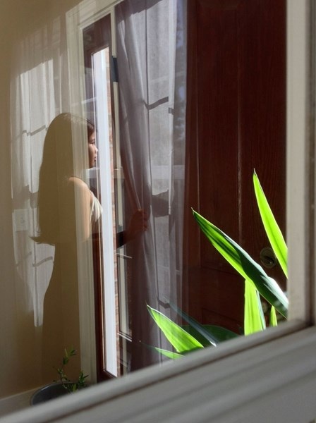 Ana H.: I took a photograph of myself on the standing by the window, through a reflection of a glassed framed door next to the front door of my house. Giving my photograph the illusion of a fading girl looking out towards the light behind the locked door, as if she has a dream to be in that place behind the door, yet she fading and see-through as if she were to be a locked up ghost. That's why I named it "A Fading Dream". I used photography instead of a drawn picture, because I wanted the illusion of a fading girl to look as realistic as possible, so a photograph would be best to do that. In addition in my photograph, it only presents half of the girl's face, not fully seeing who she is, what she looks like, but showing that she is a girl with a passionate dream. 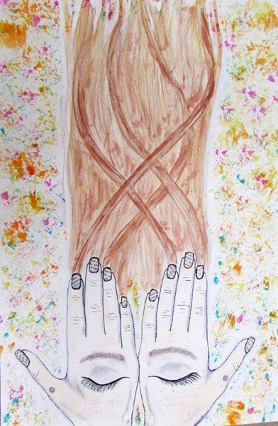 Virginia D.: I used crayon and pencil to create the hands. At first I used had the skin peach and then I decided to add more depth and dimension to my work by using red, blue, and purple because your skin isn’t just one color. I thought it would be cool to make my face appear on my hands because all of our features are different and that is part of our identity. Then I thought it would make the picture look different and unique if I make hair come out of the fingernails and have a few strands wrap around it. You can use other artist’s work to inspire you or help you when dealing with identity. I think this piece turned out really cool and abstract. And when I first started I never thought it would turn out looking like this.  Clay L.: In my art piece I did print making and it is me doing the three pointer sign. Why I chose to do that for my art is because I like to play basketball so that is kind of symbolizing that I like basketball. I did this with the color green because I am a big Michigan State fan. I had the tint of the green go from darkest to lightest to give my art some detail. I had fun making this art and I think I did petty well on it too. 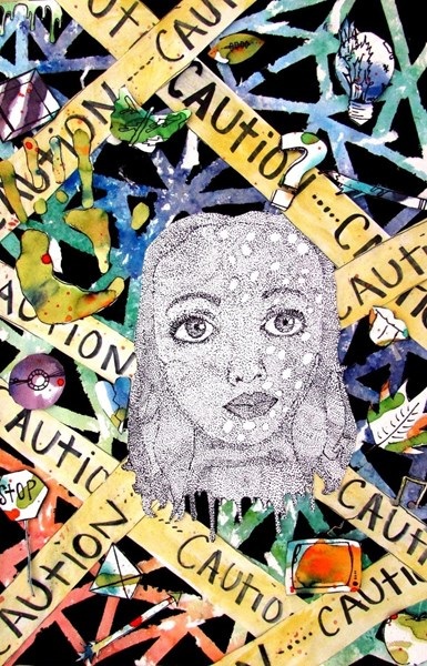 Alexis W.: by caution tape. I made this because I want to share who I am to the world, but there are things in life that act as caution tape that hold you back. I was very inspired by the artist do ho son, because he uses the theme identity by making many things put together to make a bigger picture, and I feel like I feel like I incorporated this theme in my art. To make this piece I mainly used watercolor. For the background, I painted the background with watercolor and put strips of duct tape over it and painted it black. I then peeled off the duct tape it revealed beautiful lines of color. For the thoughts around the head, I painted my hands, and put them on the paper, which made a beautiful background for the thought, and I then took sharpie and drew things that I had a connection to, and then cut them out and glued them on the paper. I then made the caution tape and painted it yellow. For the head, I purposely drew a straight face with no color to represent how I may look on the outside, but then, the background is beautiful and this represents what is inside of my mind. In my drawing of the face, I used a pen and I made single dots, which made a face when put together. My finished artwork is how I feel about who I am. This is my identity. 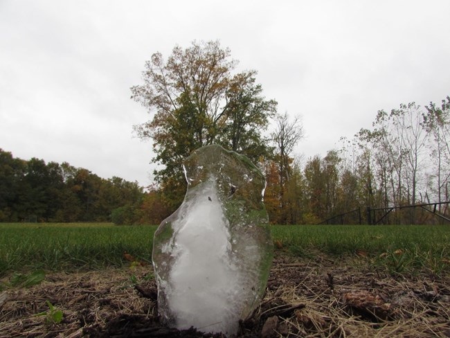 Zach F: The art work of my Ice Face shows my identity because Ice sometimes is transparent and thats how I want people to look at me not because of freckles but transparent so people don't not like me or like me because of my looks. I got inspired by Phil Hansen and how he did the frozen wine out of Amy Winehouse because I thought it would be a good idea to create a frozen portrait of me. 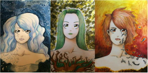 Sarah K,: My artwork applies to the theme of identity because I did three images; this one is of a girl shattering like glass, she represents the emotion of sadness. I used watercolor and salt on the background to make a crystalized look, and the glass on the left side of her face shows that she is a fragile person and she is falling apart because of her sadness. My artwork applies to the theme of identity because this is the second image I did, which is of peace and tranquility. She does not have negative emotions and thoughts, so she is growing and thriving, unlike sadness and anger. I chose the earth look because I find earth and nature to be calming and peaceful and I felt that the idea of thriving and growing as a person fit with nature. My artwork fits in with the theme of identity because this image is the emotion of anger. Her anger is burning her alive and causing ash to lift off from her skin. I chose the fire look because i felt that it fit best for the idea of anger and the negative emotion burning her apart. 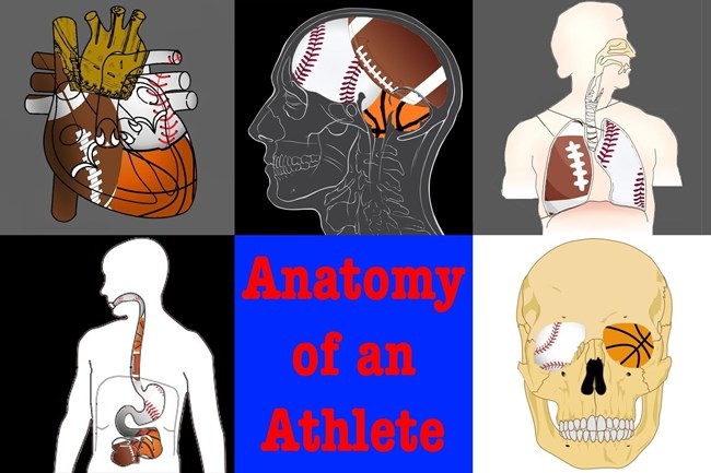 Nick F.: My materials (pictures) represent my identity and the pictures mean something to me. I made my piece a collage with different parts of the human body and two pictures of me playing sports. The pictures represent my identity because it shows that my brain, heart, and stuff like that is filled with sports. All of my main internal body parts are and are filled with sports. That represents me because I love sports. Sports are my passion and my life. I probably couldn't live without sports. Sports are a main part of my identity. My piece is kind of like that of Frida Kahlo. It's like her work because in her work, she focuses on the concept of personal identity. In this piece, I am focusing on my personal identity. This represents my identity because I'm trying to show that my brain, heart, lungs, etc. are all about sports. Frida Kahlo makes different pieces centered around herself. Usually she's in all of the pieces. The pictures don't show me, but rather my insides. 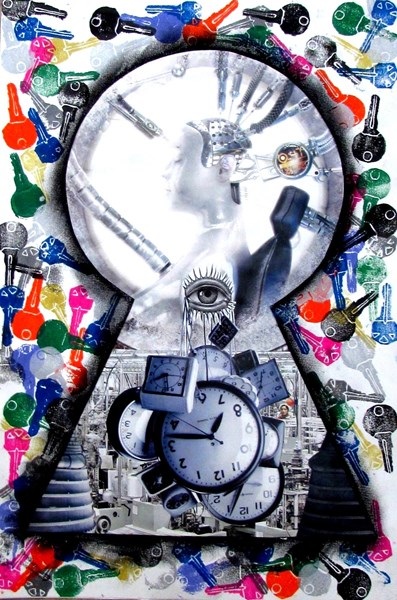 Kasey L.: Identity is who you are or what make you you. With the different materials I used to create this art piece effected and change the piece dramatically. I used print making to give it a textured look so then it will standout. I used pastels to give the outline of the key hole so then it wouldn't blend in with the back. This art piece represents identity because there are many different keys that are different colors. Then in the key hole the girls represent us and how some all of us are created differently. then you have the lab where she was created. Also there is an eye with clocks hanging down to represent time. Do Ho Suh represents identity by making large sculptures that have people holding up his art pieces. He likes to say we are all in this together and this represents identity because there are many different people but we can all come together. Julian Opie shows identity by making people's faces as simple as he can but they still have their identity. I am so proud of how hard students worked to push past their potential and really stretch their creative minds to make art worth making. I am equally excited to see what happens as we tackle our next theme: Environment, Space, and Place.
Today was the first day back in my classroom since last Thursday. I was busy presenting to teachers at the MAEA Conference in Grand Rapids as well as student teachers at Aquinas College on Monday. Even though I was away learning and sharing ideas with other educators, I knew my students would be hard at work in the classroom thanks to our use of Schoology, Camtasia, and Scholastic Art Magazine. As I often do when a sub comes to my room, I shift art-making activities to a material that is less messy in nature: Photoshop. Since we are working with the theme of Identity, I pooled together the resources I have compiled from over the years that seemed to lend itself to exploring those ideas. I am a believer in giving students choices, which is why they had three of them: Profile Collage, Exquisite Corpse, or Making the Unseen Seen. If students wanted to, they could do all three. Here are examples from each of the choices. Profile Collage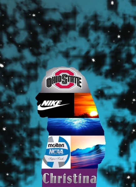 Christina: I decided to make a profile collage for my photoshop challenge. I used many tools to create this. A couple of the many tools I used were the gradient tool for the background and I also used a profile picture of myself and took the selection tool and deleted to rest of the background. The pictures that I have chosen to use for my picture are things that I like and I also added my name which was inspired from the video showing all the steps to create this. I also chose not to crop out the background to each picture because I like the lines that make it more clean.  Kolton: One basic tool that i used for this collage is the Quick selection tool. This tool allowed me to select the background of the image and therefor delete it in order save room and show the image i really wanted instead of the background. Another tool that i used in this collage is the Move tool. The Move Tool allowed my to drag and place the image after it was cropped into the spot i wanted it to be placed in. Also in a way in order to conserve room so i could fit the images i wanted into the collage. The meaning behind the images that i chose was the basketball, and football represents my passion of sports. Also the MSU, Lions, and Tigers sign shows my teams that i cheer for. Lastly the remaining pictures show the food and resteraunts that i love and love to eat at with family. Exquisite Corpse 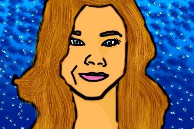 Jewel: It was very interesting using Photoshop once again. To be honest, I'm not terribly great at Photoshop but I am actually pretty proud of this piece. I used My face, Dylan O' Brien's face and Arden Cho's faces to create this girl in the photo. I had a lot of fun making this piece until my who thing deleted by accident, now I know better and need to save my artwork! My favorite part of "Drifting Slowly" is definitely the hair. I love the texture and balance of different colors I used, exploring different features in Photoshop.  Nick: To make this exquisite corpse, I used the element of color. I tried to use colors in the body to make it the most realistic. However, I created the background with many different bright colors. I also used the principle of pattern to create this piece. In the background, the different colors are in different patterns. For example, there are patterns of lines created by different colors. Finally, I used the element of shape to create this. Many different, odd shapes were used to create his head and face. I also used a few shapes in the background. Making the Unseen Seen 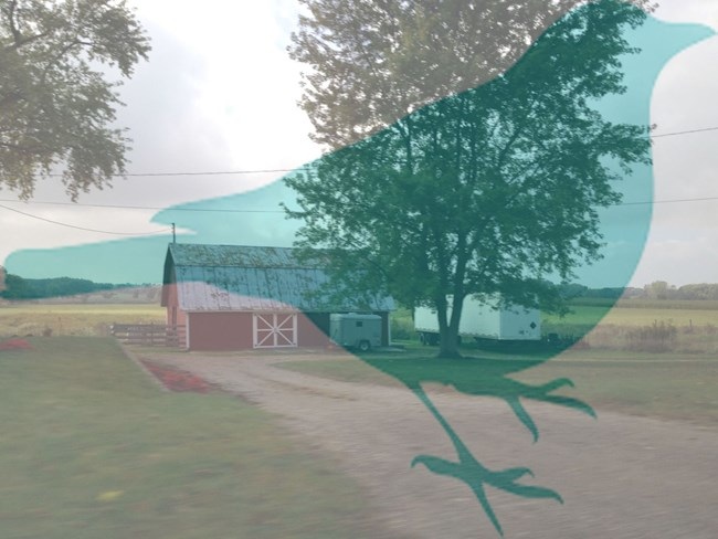 Corrine: n the background photo, I took it on my way to school one day, and the focus was great, and I knew it would be a great photo for this project. Next, the bird silhouette was found on Google under "labeled for reuse" under search tools, so I am allowed to use it. In Photoshop, I made the silhouette transparent and put it on top of the farm image. This is my finished product, and I am proud of it. 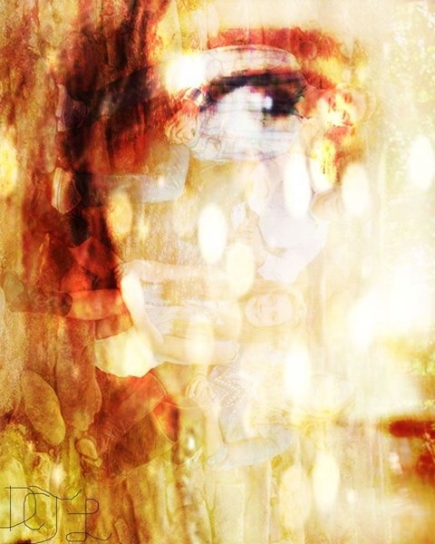 Denver: created this image by placing picture of my family and things I have seen. Then I overlaid them all and it created this, a mountain of bright colors and things that are apart of me. It created something beautiful something that is in my head all the time. This shows a partial part of it. The texture is my favorite part. It makes it look ruff and emotional, but also makes it soft and sweet. Last weekend, I had the opportunity to share with other teachers at the MAEA Annual Fall Conference. This year, the conference was in our neck of the woods in downtown Grand Rapids. I took advantage of that opportunity and presented at four sessions as well as attended all kinds of different workshops to help improve my teaching. 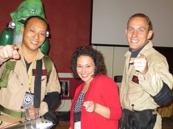 ComiCon was also in town and it was very entertaining to see fans dressed as their favorite characters around the convention hall. In additional to all of this, students who participated in the ComiCon art competition had their work displayed at DeVos Place. It was really neat to see some of my students' works on display and I am thankful for the teachers who took and posted these pictures on the MAEA Conference Facebook Page. Last Friday, I posted about how we started working with our first theme last week. In the process, I demonstrated various techniques so students would have an understanding of the types of media they could employ in their own work. We worked through sketches and planning out production schedules, as well as stumbling on other ideas as work progressed that changed plans along the way. This is probably my favorite time during an assignment because there is still so much unknown. The room is filled with activity and excitement; students stop turning to me for all of the answers, using each other to spark new ideas and jump into possible solutions. Here are some images from the work being created so far: Some students are even finishing their work and uploading it to our class gallery. Check out one of the finished pieces below: 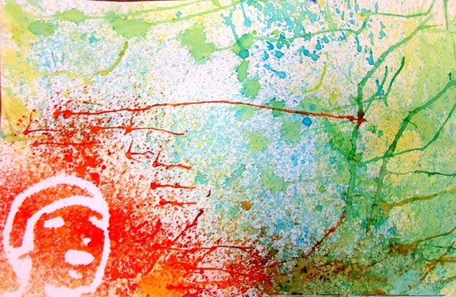 Eli M.: In this artwork, I used the spray bottle technique. I also used the negative space technique to get my face to show up in the sprayed part of it. I had most of it be cool colors, but then the part around my face I used abstract warm colors. Then I blew the wet colors and added salt to give it a sweet texture. I feel this represents my identity because of how the colors can represent emotions and how that all of them are mixed together with one another. It is sort of similar to Julien Opie because of how the facial features are extremely simple. The facial features only consist of eyes, hair, nose, mouth, and chin. Sketchbooks, scones, and testing out ideas - this week has been filled with fun and interesting moments framed with demonstrations, experimentation, and (hopefully) some serious ideas about art. To start the week out, students were introduced to the work of Phil Hansen. For those of you not in the know, he is an artist who gave an amazing TEDtalk in 2013 about creativity and "Embracing the Shake." I decided to share this artist and his story with my students for two reasons: 1. His work very much feeds into the theme of Identity, which is our current theme of exploration, and 2. He provides a message of overcoming doubt, fear, and failure to find your voice through your work. It was fun to see and hear the reaction students had to his work and how we can apply his experiences to our classroom endeavors. Afterwards, students turned to their sketchbooks and created thumbnails based on our investigation of the theme "Identity" using the artists Frida Khalo, Do Ho Suh, and Julian Opie. Each artist presented interprets identity in their works using different elements of the idea and with different media. Khalo is all about the personal experience, Suh is more about the communal and cultural aspect, whereas Opie works to simplify the human form, but still retain a sense of uniqueness. I then used each day this week to demonstrate various materials so students could apply them to their works and ideas. Students also had time to peer edit and critique along the way before beginning final pieces. We finished out the week by working through designs and getting more feedback. This is my favorite time during a project because there is so much excitement and possibility and what is being made. To wrap up the week, we also celebrated International Bring a Scone to Art Class Day. Students brought in scones (some to eat, some to simply admire) and to add to the delight, a pair of students wrote and performed these tasty sick beats: I hope you all had a spectacular week and a wonderful #sconeday2015!
Students worked on finishing up their Portfolios this week as we also transitioned into our first project theme of Identity. I am excited to see the innovative ways students used either substitution (finding objects that mimic letters), mosaic (combine multiple items to make a letter), or a combination of both to complete their names. Students first drew out multiple solutions before applying the design to their work, getting feedback from both their peers and me along the way. It was fun to see them use the design thinking process throughout this project and execute their ideas as a result of thoughtful planning in their sketchbooks. Can you figure out the names below?
|
Archives
August 2018
Janine CampbellTeaching Visual Arts since 2004 and making images since picking up a crayon. Categories
All
|