January
February
March
April
May
June
July
August
September
October
November
December
| BCWMS VISUAL ART & DESIGN |
|
|
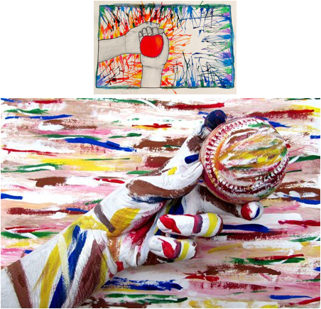
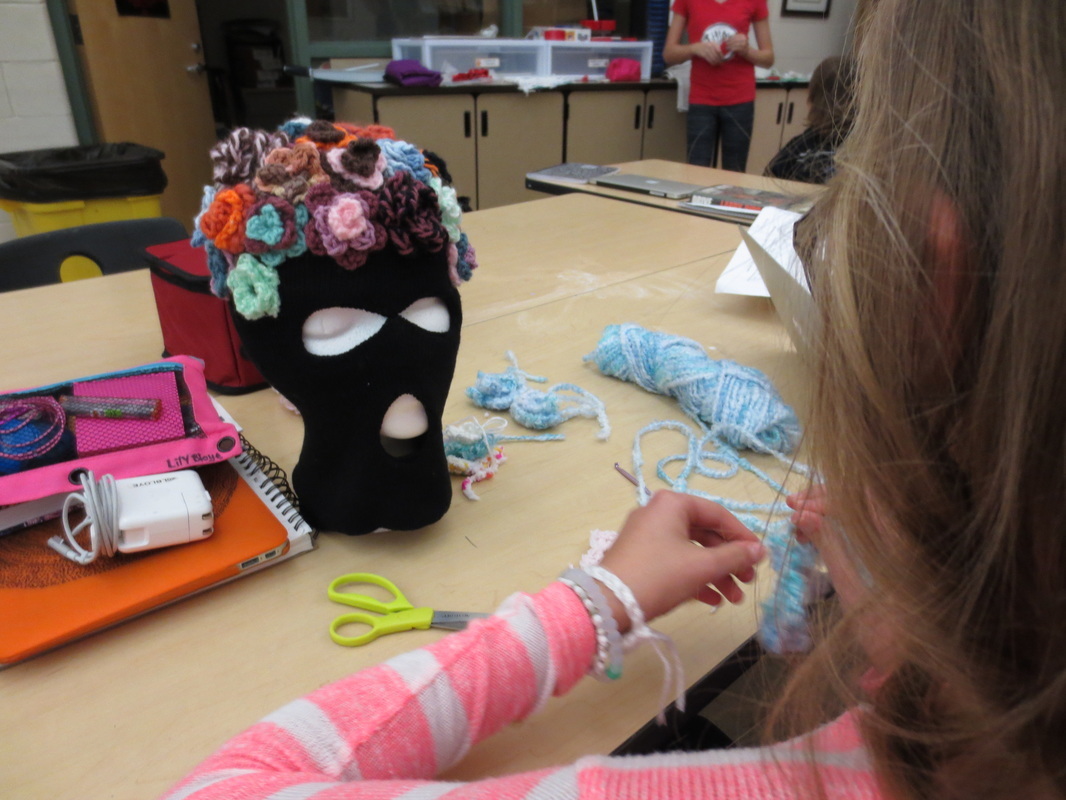
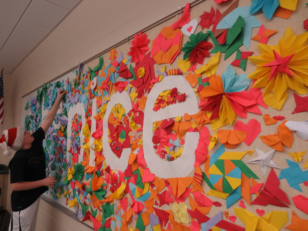
Every year, I think to myself, this is the best one yet. And I wonder how it could possibly be topped. Then the next year rolls in and does just that. Here is a month-by-month recap of our fantastic year in the BCWMS Art studio: January Something Old, something new: This was the first time I tried this theme with students and I was completely amazed with their new solutions to old works they looked to in their portfolios. Moving to theme-based units was new to me in the 2014/15 year and this last project with that first semester shows what is possible when you ask students to take control over their learning experiences. FebruaryMarchAprilMayJuneJulyAugustSeptemberOctoberIn case you missed it, International Bring a Scone to Art Class Day was a HUGE hit this year - so much so that couple of students wanted to spread the word in song. Enjoy and start planning for Scone Day 2016! November One of the most interesting and unexpected things from this year is the variety of materials students have selected as they explore themes. This work is related to the theme "Environments, Spaces, and Places." It was fun to see students push themes and abstract concepts to fit their artistic visions. December Our second STEAM collaboration is this be nice mural in our school hallway. It was a great way to finish the week before break and get kids thinking about how we treat each other as we learned about origami and collaborating to create a complete work. Hopefully all of the pieces will still be up when we return from break, in 2016!
0 Comments
We had our second STEAM collaboration this week, as we wrapped up 2015 at WMS. Students created an origami mural around the be nice campaign and then worked collaboratively to create larger structures. Some things worked well, others didn't. It was fun regardless and we learned a lot along the way. Below are some pictures of students in process.
The Scholastic Art Awards are right around the corner, with submissions due early next week. BCPS students have participated in this annual competition since 2008. Each year, I wonder how students will manage to top the year prior, especially since last year was our most successful with the third most pieces recognized in our region and three of our students receiving medals at the national level. I think our chances of topping the success from last year is as good as it could ever be, though. Students have stepped up to the challenge, creating some of the most innovative, evocative, and skillfully crafted works I have seen over my years of encouraging students to submit. The following works are not all of the pieces we are submitting, but a sample of some of the great work that will represent BCPS when we compete in the 2016 Scholastic Art Awards!  This week students finished up a shortened project where they were asked to select an issue or concern they have that could connect to a current of past event. It was interesting to see students narrow down ideas and explain them to classmates before selecting materials and creating their works. With all that is happening in the news, students ideas and art works ranged from athletic injuries to terrorism to climate change and how people engage with technology. Students started by brainstorming lists of issues they deem important, then they turned to PBS LearningMedia to research and find articles, videos, or images that would inform their topic; once they gathered their information they sketched out ideas, presented them to peers, and then they got to work with their final pieces. We had a shortened work time, so students were limited to working with 2D materials and I introduced them to the concept of Artist Trading Cards as a possible solution to the time crunch. I was happy to see many students take the opportunity of the limited time to try something new and push themselves with concepts and ideas. The images below show students works in progress as well as some of the completed works. 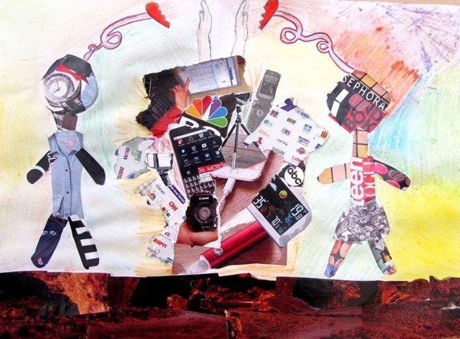 Paige: In my piece of art, I can show that my work connects with the school subject S.T.E.M. This is because S.T.E.M has technology and possibly social media. Overall, S.T.E.M has technology in it, and so does my artwork. In my art, I am showing how technology and the internet can affect people’s relationships and how it is separating some people’s special connections and friendships. When two people are married, for instance, the internet can get in the way of spending time with each other. For example, if two people were married and they decided to go out for dinner one night, they would most likely be on their phones checking their social media instead of talking to each other and having a conversation. I chose this issue because sometimes when I see people in a restaurant, they are on their phones the whole time, instead of talking to each other. In my opinion, I think that instead, people should be talking to each other instead of being on their phones. This is why I chose this issue. My art overall shows how technology is separating people’s love and relationships and is stopping people from getting to know each other better and having a real conversation without technology getting in the way. 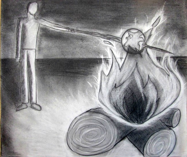 Ana: In my project I decided to choose the issue of Global Warming and how humans have impacted the earth for the negative which has increased the chances of global warming. I decided to choose this topic because it is a pretty big current event right now and most of the audience should be able to recognize the message that is being shown in this piece of art, quickly. In science class we actually studied Global Warming and debated about it in class, with group presentations and we learned about the greenhouse effects in our ecology Unit. My work does reflect the the issue of Global warming, because when I think go warm, I think fire. So my art is a depiction of a man roasting the earth, in the fire, sending a message that humans are warming or killing the earth itself. I decided to have my art in a gray scale because it show the dullness and the negativity of the issue of Global Warming at hand. Saying if we don't stop this warming, then we shall cease to exist, and that we are the only people who can decide whether or not to stop this. Because the life on Earth and the Earth itself depends on our decision to stop or not to stop. 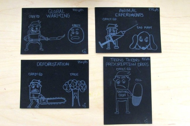 Cameron: In this piece, I chose a variety of different issues that impact the world today. I decided to choose these issues because they are things that I think are problems that could lead to bigger things. The global warming and deforestation cards relate back to science class and what we are learning about. My art represents the problems I chose in more of a funny way, but in all seriousness these are major issues. I gave the cards a point value on how I serious I thought the level of these problems are. I really enjoyed making this piece of art and hope we can do it again. 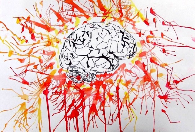 Eli: For my issue, I chose to do the issue of concussions in sports. I chose to do this because it is a big problem, where you will be fine one moment, then on the ground with a concussion the next. This could connect to science class, because of how it shows how if the brain is shook back and forth violently can cause bleeding and a concussion. We learned this in science class, which helps me relate to my project. One reason sports concussions are bad is "Concussions cause head injuries, which can lead to brain diseases."-(wgvu.pbslearningmedia.org) Another piece of evidence is "Highest risk of concussion sports-Football -Ice hockey -Lacrosse -Soccer"-(wgvu.pbslearningmedia.org) This shows the problems of concussions that we face in our world today, and how concussions are dangerous and should be stopped in order to stop injuries and deaths. 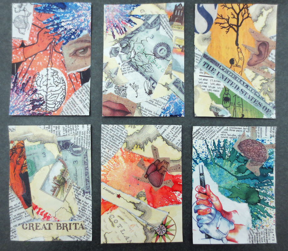 Jewel: I decided to create this set of artist trading cards because of the limited time that we have and the ideas that sprouted into me. I selected the topic about how some people think the government has been brainwashing us into different ideas and taking control of us. The United States is crumbling and we can't do anything to stop it unless we try to not give into the words of the powerful. This could connect to my history class, in which we learn all about the mistakes that the US has made and how we can't change it. Now, everything is being recorded, written down and labeled as one of the United States darkest times. Parts of my piece shows this problem by using the human hand and the gloved hand, aka the governments hand, controlling the others and how the lady is knitting her brain or making the decisions of the brain or how my work shows the different body part such as brain, eyes, mouth, ear. It also shows this theme by the use of the dollar bill which represents the US and how it is crumbling.  Adam: I made this piece to show paris peace. I used a video from the PBS site, and that was the only source they had about it. It told me about the pain, and that made me want to make something. This made me very happy to make art for a cause like this. I used the colors of there flag, and the peace symbol, to combine to make a great art work. The stars show the dead looking over the world, making sure it is ok! 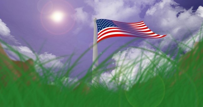 Ethan: This is a picture of an American Flag, I made this to represent the issue of Terrorism, and to show that no matter how bad it may become, the flag will always stand, and we will stand with it. This can also be connected to our history class where we are currently talking about the Americas, and how they want to remain strong and proud. The December Art Show is always one of the favorites! It is super fun to see parents fill the Gainey Gallery and view the work by our student artists grades k-12. This year was no exception. I selected the top 4-5 examples from each class and printed out artist statements as well as matted the work for a more professional display. This is the first year I have tried it and I have gotten a pretty positive response, so I will keep using this method in the future.
One of my favorite aspects of the show is being able to view the progression of skill and concepts as students age in the district. It is so fun to see the younger kids look in amazement at the older students' work and the older students remember their elementary experiences fondly when looking at the younger students' work. Overall, it was a great show and example of why BCPS is a premiere Visual Arts program! I am so proud to be a part of the Visual Arts team and I am especially excited about the upcoming Scholastic Art Awards competition, which students are finalizing work for this week! Check out some of the elementary crowd and high school work below: Students are almost complete with uploading their work to Artsonia from the last project. Here are some more pieces from students from this week. 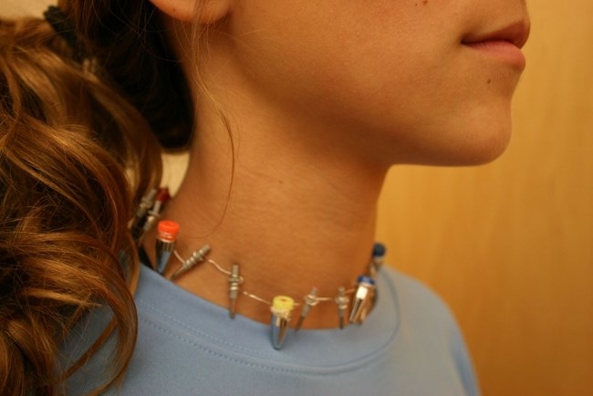 Ella: My piece is made from pen, and wire. It came as a difficult art work to make, it was a struggle at first with many hard collaborations we went threw. But in the end I would take the head or cap of the pen and the bottom, and would take one of them and wrap in with wire, and wrap one piece at a time. But after lots of try I finally got good at it, and it started clicking. I used pens for this piece for my lost idem, because if you are me, you use a lot of pens and pencils. But my art is not only that, it is a necklace. I had gotten a idea, or something of the sorts from the artist Mr. Wayne Thiebaud he has uses very feminine, so he persuaded me to make jewelry, so i made a necklace that may be different from others. But its my own master piece. 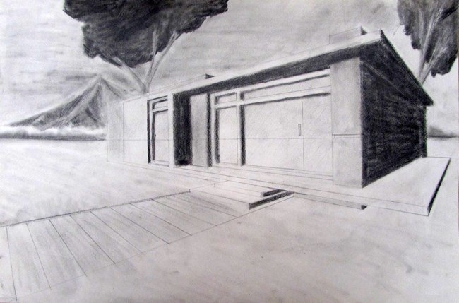 Ethan: This is a picture of a house on a scenic plot of land, this is inspired from multiple techniques of graphite drawing. This piece puts great emphasis on the horizon, and orthogonal lines. The theme of this piece is Objects Artifacts, and Things left behind, this theme is represented mainly by the fact that the house is all alone, with multiple largely grown trees, and mountains. 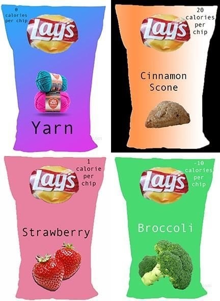 Lily: In my photoshop piece, I decided to make a collage of different potato chips that I have designed myself. To keep a hint of texture, I used the quick selection tool to select the area with only the logo so I could keep the logo identical for every bag I created. Plus, I attempted to keep the idea of unity in mind and make sure their was a lot of variety in the space. The artist, Jim Dine does a great job at keeping the theme of objects and things left behind included in his piece. For example, he has a couple pieces where he uses different hammers in different colors and sizes. In addition to finishing up this project, students got started on their next theme: We've Got Issues. Students brainstormed ideas around issues they would like to create work about before using PBS LearningMedia to inform their work. Student choices ranged in a variety of avenues from civil rights to animal cruelty to sports injuries to the recent attacks in Paris. After settling on ideas and doing some research, students sketched out ideas and worked in table groups to pitch ideas and get feedback. It was fun to see conversations that resulted as students asked clarifying questions about the work and gave suggestions to make it stronger. Most students finished up their preliminary sketches today and will complete their work next week. To finish out this week, the BCPS Visual Arts department worked together to create our Winter Show exhibit at the Van Singel Fine Arts Center. We will have our Artist Reception on Monday and I am very proud of the selection of work and am excited for many of those works who will proceed to compete at the Scholastic Art Awards later this month. Today was the last official work day for the current theme of Objects, Artifacts, and Things You Leave Behind. It has been a delight to see the array of works that have been passing through our online gallery as students complete, photograph, and upload their work to Artsonia. Students really pushed themselves this time because they were asked to use a material they had yet to create with. This limitation opened up a slew of new opportunities for students and here are some of the highlights: 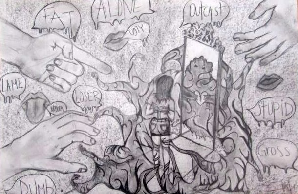 Alexis: In my artwork, I drew with a picture of a girl looking into a mirror and seeing a monster. I drew this to represent depression. I drew this to show that some people look in the mirror and see something that is a monster and they think they aren't good enough. But that’s not true because everybody is beautiful the way they are. Also, in my art, I drew the monster surrounding the girl as if the monster was a cage. In the background of my art, I drew hands pointing at the girl and I drew lips that are calling the girl names. If you look closely at the girl, you can see that she has no torso but instead it’s just a skeleton of a back. I drew this to show body image issues with some girls and I wanted to draw the girl this way to show how girls think they need to be as skinny as a skeleton to be pretty. In my drawing, I drew with drawing pencils, and graphite. I then erased parts of the pencil to give my artwork some highlights. My art relates to the theme because I feel like this is something left behind. I feel like this because this is a huge issue for many girls and I feel that people don't know how big of a problem it is. Also, the mean things that get said to you always stay with you, but these things are the underestimated problems that are left behind in your life, and you just have to let go and don't let the monster in the mirror get into your life. 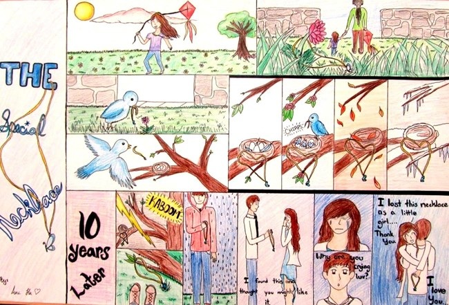 Ana: In my comic story, I mostly used color pencils, ink pens to bold out the details, color sticks, also some yellow marker to make the necklace more bolded and noticeable. My work does show the art concept of Objects, Artifacts, and Things you leave behind, because my story focuses on this necklace that is lost and left in an unknown place for a decade before being found and returned. It is also a object and artifact because it is a necklace that is forgotten, and this boys find it and gives it to his girlfriend as a gift, but it had treasured by her when she was a young girl, what makes it so valuable and even more dear to her now is that her love was the one who found it and given it back to her. This story also seems to deal with fate like the necklace was meant to be brought back, but only to be brought back by the right person. My story kinda goes along with Mitchell Feinberg's art of the chocolate treat and it projects and deals with time, as my comic in the part where the necklace is lost in the trees to watch as things around it, leave and come only it's missing its owner or someone who has not come to bring it back. In the beginning it project a little girl with her missing teeth, so that indicates she about 8yrs old, when she playing in an open field, then it shows her with another woman going out of the park leaving the necklace behind that had seemed to be dropped. This is where the bird flies into the scene, picks the little necklace up and drops it in a tree where it show of the little blue bird's nest, as the weeks pass for the hatchlings have hatched, too coming of fall and winter, then months then years it has been hung up in the nest. On a faithful the lightning hitting that particular branch that held the necklace for those long years, which soon a boy finally found the necklace after the lightning strike then only to give it back to his girlfriend as a gift. Where this girl was the prior owner, the little girl in the beginning of the story. 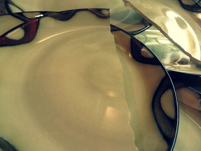 Denver: For this particular project I decided to take a picture using my experience as a guide. I used the rule of thirds to make the photo more interesting. I also took the picture in a area were their was two lights one that made a reflection off of the plates and one that lit up the photo. This piece goes with the project because I took just an everyday item and created a piece of art by taking a picture of a broken plate against whole plates. I made a normal household object into something with meaning. This fallows Mitchell Feinberg the most because like me we both use photos to show the story. 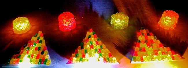 Nick: To make this piece, I used a ton of gummy bears. The 3 triangles are covered in gummy bears, and there's a flashlight shining up them to light them up. The cylinder-like things are also made of gummy bears. I hot glued gummy bears on top of gummy bears to create them. Then I placed a candle in the middle to light them up. I then photographed it in my dark garage. On iPhoto, I edited the picture a little to make the candle lights seem brighter and to take a little of the glare off of the bottom gummy bears on the triangles. My work is similar to that of Janet Fish because of the reflective qualities it has. The gummy bears on the triangles are reflecting the light, which is why you can see them. If they weren't reflecting the light, they'd just be dark and they wouldn't show up. However, my work is also like that of Wayne Thiebaud. That is because both my piece and his have things that are repeated throughout the piece. The gummy bears in my piece are the repeated objects just like how the pieces of cake are repeated in one of his pieces. Finally, my piece is like some of Jim Dine's work because some of his pieces and my piece are both sculptures. Mine is sculpture made out of gummy bears, like his are sculptures made out of tools. 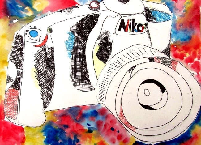 Corrinne: The reason I chose to do this for this project is because I really like photography. I thought that since a camera is an object, and could be an artifact in the future, it would fit in this project great. The camera was an observational drawing from a picture on my computer that I traced over in pen. Then, I decided to add texture and crosshatch the middle with a fine tip Sharpee, a regular pen, and gel pens. Finally, the background is a watercolor of only primary colors, because the colors of gel pens I used on the inside were just those colors too. An artist that inspired me originally was Audrey Flack because her paintings looked like real photos. So, I thought I was going to do a photography project. But, then I realized I could spin it around and draw a camera. 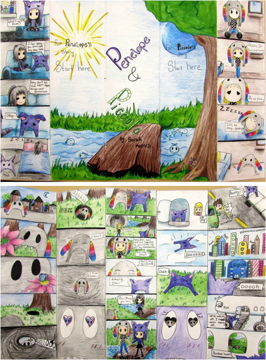 Sarah: My piece shows the theme of how objects are left behind because in the story, the character named Piccolo has a hat that goes on an adventure to find another hat. This hat ends up finding a girl hat and they fall in love, but their human owners are lonely without their hats so they try to find their hats. In the end, they all find each other and live happily ever after. This is, in a way, like the artist Wayne Thiebaud, who illustrations mostly clothing, such as a hat or shoes. 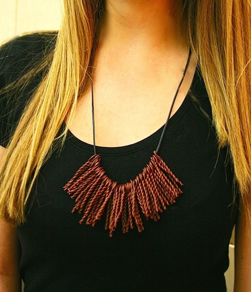 Lilly: For my project I decided to make a necklace, because I thought that it was something that not a lot of people do, and I thought that it would be fun. To make the fringe on the necklace, I cut small pieces of brown wire do to size. Then I twisted the pieces of wire and left a loop on the top, so that I could slip it easily on to the black leather. To twist the wire, I just gripped the top with my fingers to create the loop, and then just twisted the wire. After I was done twisting the wire, I just cut of the excess and looped it on to the black leather. To make the necklace be able to be different lengths based on your preference, I made two slip knots so that you could change how far down the necklace goes. Some elements of the art are shape, because the fringe are a different shape than necklaces usually have. Another element is texture, because when you feel the fringe it kind of feels rough but smooth at the same time. Some examples of principles of design are unity, because of how the pieces of fringe look together. One more example of principles of design contrast, because of how the brown and black contrast each other. This piece of art kind of reminds me of Mitchell Feinberg, because in his artwork he uses the same objects, such as shoes, apples, and bullets. In my piece, I used a lot of the twisted wire to represent fringe. Kind of like how Mitchell Feinberg uses many of the same objects in his art.  Brody: For my art I think I used good texture with the things I took pictures of because you can see what I took pictures of and how the would feel. Also, I think I used a good variety of things I took pictures of because not one of them are really close to one another. One thing that I used for every picture was the camera because it took good pictures of things. Another tool I used was the brightness tool in Artsonia to make my art have more texture. I would compare my art to Jim Dines art because I took pictures of things and put them together to make my name. 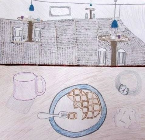 Paige: In this piece of art, I used many different materials, including newspaper and oil pastel. I used the newspaper as the floor of the room, along with a white oil pastel to lightly color over the newspaper. I also used metallic pencils to shade in and color the different objects in the room. In my art, I can show the concept of this theme because it is showing food, drinks, and some other objects that a person left behind at a diner. When looking at the artist Wayne Thiebaud, I can compare my art to his because he had food in one of his art pieces, and he had some drinks in another one of his pieces that must have been left behind from somebody. 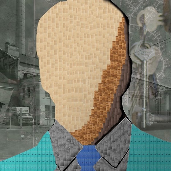 Kasey: Objects can represent many different things that we encounter in life or today's society. In Mitchell Feinberg's art piece that was made with shoe in the shape of a heart. Represents the Boston Marathon Bombing that happened a couple of years ago. Also in Jim Dine's art pieces he has tools that are outlined in black then has shadowing. This represents his life as a kid because his dad was an owner of a workshop. 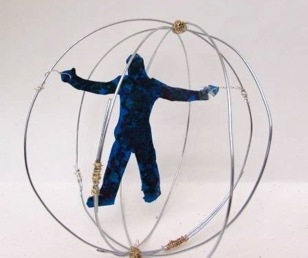 Clay: In my artwork, Force Field I have a metal ball made out of wire. That could represent the force field. Then I have a have a person in their that has the colors blue, green, and red. He is hovering inside the force field. How I made him hover was that I poked a hole in both his hands and slit a smaller more bendable wire that I wrapped around one of the sides of the big wire. I did that on each hand. I had a lot of fun making this and I am pretty proud of it. |
Archives
August 2018
Janine CampbellTeaching Visual Arts since 2004 and making images since picking up a crayon. Categories
All
|