Biography/Autobiography
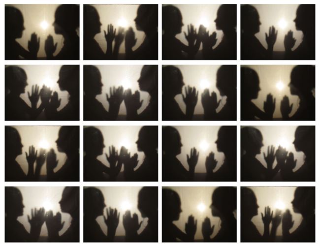
Photography
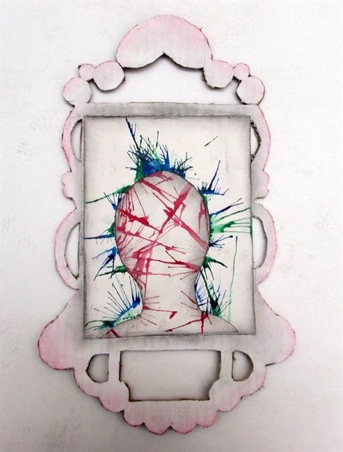
Mixed Media
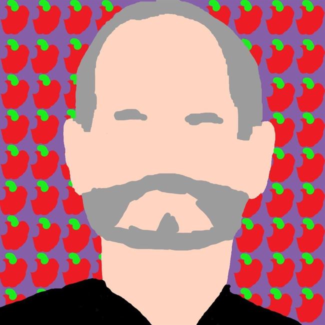
Digital Art
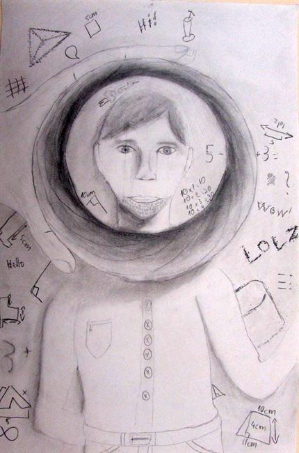
Drawing
Watercolor and Pastel
Printmaking
Collage
Paint
3D
| BCWMS VISUAL ART & DESIGN |
|
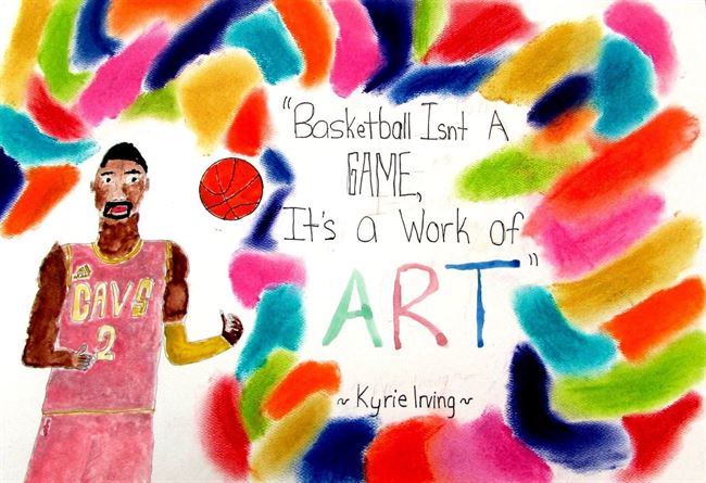
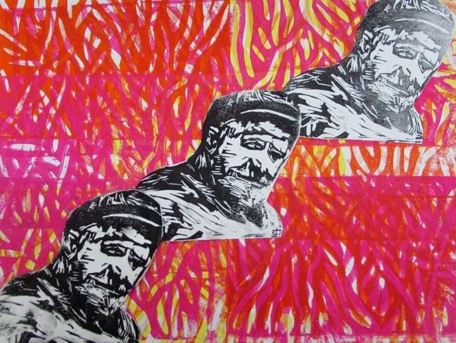
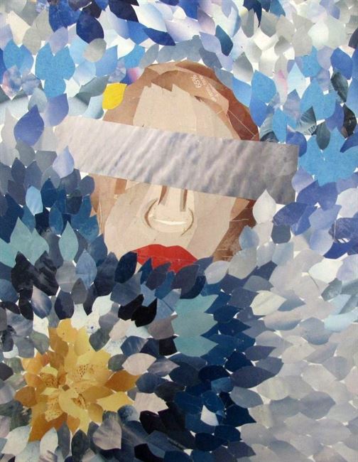
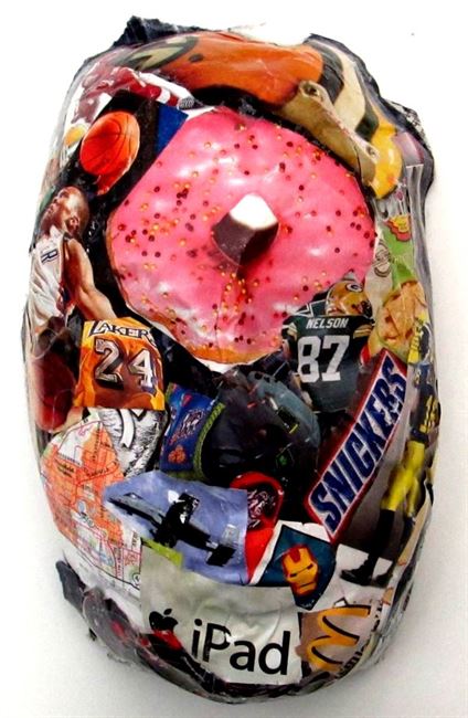
Biography/AutobiographyStudents finished up their work with their first major challenge this week. It was so fun to see the variety of tools and techniques they adapted to fit their vision. One of the biggest reasons I embraced a more open approach to teaching art is because of the outcomes below. Photography Marrisa M.: This challenge of Biography and Autobiography I have choose to photograph people's shadows. In this piece I have had people doing a handshake and during every movement I have captured it. I have put all of these photos next to each other to give the affect on the handshake. I have a made a connection to the piece with myself by showing the friendship between the handshake in the picture collage. Mixed Media Ella P.: With my framed piece I have put together a collage coming off of the colors as Andy Warhol uses in his pieces with pop art. I took the difference of warm and cool colors to create the human body framed to perfection. When looking at Andy Warhol's work you will also see lots of the outline of people not always being detailed to perfections just the person will stand out using the colors. The pieces overall creation was to show its viewers that we live in a eye sight world if something looks fascinating or is seen as eye candy it is treasured. So the art will be viewed as special for the frame makes it valuable and in society that is who lots of people are even seen as with out a doubt people will judge from clothing to the makeup of a person, it is all how you are framed. So I would like to show my piece as though I stole the colors from Andy Warhol. Leading to the frame in which it creates a catching effect that most of society uses in there daily lives. Digital Art Evan g.: The reason that I chose Steve Jobs for this assignment is because he is a main inspiration for me because he did not just make a product, he made it look good, and that is what I wanted to do with my piece I wanted to pay Steve a tribute for what he has done, and so I did. My drawing compares to Chuck Close's artwork because he draws his on real people, but he uses a grid to draw his, while I draw the whole thing at once instead of one part of the grid. Drawing Khiem N,: The assignment is to draw you or other person that you know so I chose my grandfather at first but I change my mind and chose my old art teacher because I'm in art class. My old art teacher teach me stuff but I can't remember but I remember some of my art work is mix with dark blue and light blue for the sky. I compare my art to Noli Novak because my work have only use shading pencil which make it look black and white just like her art work the difference is that her art work is made of a lot of dot and mine didn't use any dot . Watercolor and Pastel Isaac c.: Kyrie Irving is my favorite basketball player, so I decided to dedicate this artwork to him. I used water color for Kyrie, thin point sharpie for the words, and chalk pastel for the rainbow of colors around this piece. I combined the colors with my fingers and I am very excited about how good it came out. Printmaking Sarah W.: For my piece I decided to interpret the assignment as a biography. I decided to do a biography because I thought that it would be interesting if I focused on someone that I was close to and create a piece of art about them. I have a personal connection with my piece because it is about my great grandpa who I was very close to. During this project we studied many artists, including Andy Warhol. I think that my piece is similar to Andy Warhol’s because we both used multiple colors and printmaking as a medium. However, our work is very different because with every print of a person he changed the color he used and kept them bold. For my piece, I kept the person the same color for all 3 prints, but faded the prints as the prints . Collage Ruby S.: I interpreted this assignment by thinking about how others view you. The personal connection I have with this piece was that, many people try and kind of hide behind what they don't necessarily like about themselves. Which in those things, I know many people who have done this, and I have too. I was inspired by Patrick Bremer, even those his is pretty realistic. Mine does compare to his in the way that some of his pieces are abstract, and mine is too. Paint3D Alex: For this assignment I decided to do an autobiography. I chose an autobiography because I have always felt that you should not judge a person by what they look like but who they are. That is why a made a face of several of the things I like. Like basketball and football. I feel like my work related to Patrick Bremer. I thought my work was like his in the way we both use collage to create a portrait. But there was a difference in the fact that my work was 3D and also used pictures to create the face. He uses colored pieces of paper to create his work. You can see more on our online Artsonia gallery.
0 Comments
#WIPStudents really started applying all of the demonstrations we went over last week as they made final sketches before diving into creating the work for this Challenge. The theme this time around is Biography/Autobiography. It has been fun to see the different people students have selected to highlight in this work and the narratives they have shared and created to turn their ideas into concrete works of art for others to see. Here are some of the highlights as students make their work this week: I even got in on the fun and was able to bring in elements of a piece I have been visiting for the last two months and finish it. I enjoy demonstrating my process to students so they can see how I struggle through solutions and work with a variety of media to figure out exactly how and if something is done. Working side by side with my students is something I just started doing in the past few years (really since I adapted a choice-based or TAB studio). As my students were encouraged to become artists in their own right, I found it was more powerful if I did the same. This helps me practice what I teach and it helps students Artist of InterestThis week, we watched the TEDx clip of Austin Kleon's talk, "Steal Like an Artist." I show this to students to encourage them to gather ideas and use them to make new work. I even took part of one class period to do some independent research and writing about artists using Scholastic Art Magazine. I love using this resource in my classroom because it is easy to get students to use it and the content is so rich for our subject area. It is always fun to see what students select as being the work they want to write about and why. My hope through doing activities like these is that students will be able to "Steal Like an Artist" and use the ideas offered in ways that make sense in their own work. Here are some of the responses given: MovementThe second assignment in our DE Intro to Photo for Non-Majors course is all about capturing movement. Students worked on various methods and means to capture motion with most of the focus being on controlling the aperture and shutter speed. Here are some of the highlights from their work with this challenge: Do What You Love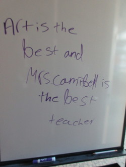 February is tough. At least it always seems to be for me. I wish I could say it was easy because it is so short, but it is not. I think that is why it is a shorter month. And although everything is starting to come to a fever-pitch with competition deadlines and notifications, it is nice to come back from lunch to a note like this on my board. I love what I do and am so thankful I get to go it. I cannot imagine anything other than being an Art Teacher to children, even when it gets a bit tough. Share The LoveI love to share what we do in the classroom with others. I talk to my students all of time about how their work is being viewed by teachers from across the country and that they are really the thought-leaders and models for what great Art Education looks like.
This weekend, the sharing continued as I participated in The Art of Education Online Conference. I shared how I transitioned my classroom to choice and I really cannot imagine a better decision I have ever made in my career. Demos for DaysThis week was spent planning and going through a lot of different demonstrations. Because students are selecting their media, it is important to me that they are exposed to a variety of tools they could use. I go through several different ways to demonstrate materials to students and this week was a perfect example of the trio in which they experience this. First is the "I do" method that basically involves me showing students what to do and then everyone taking notes on the basics of that I showed. We did this for clay stages and strategies using armatures and various molding tools. Then there is the "I do, you do" method, where I do something and then the students do the same thing. We did this for watercolor techniques. The last is something I have started toying with this year, which is more of a "you do." This is also referred to as "Speed Dating Materials" in my classroom. This allows students to be able to experience a wide array of tools in a short time to see if they like working with them. I did this for printmaking this time around. This is always the hardest part for me because I am anxious to see what students will make and I am excited to see the end result. MAEA Region 9 Highlight ShowWe had an awesome showing at this year's MAEA Region 9 Highlight Show at the Grand Rapids Art Museum. It was a packed house filled with artists, parents, and other members of the community to celebrate the accomplishment of these artists. I am very proud of the students who received recognition at our school and cannot wait to see how their work does as they move onto State.
Learning NamesFor our second week of class, it is important for me to start to learn about my students - and that often is starting with their names. I am a visual person and using their portfolio design, students crafted names that represent their interests. What is nice about this opening activity is how students are able to help me learn what interests them as well as actually learn the name. Because the names are large and on the front of their portfolios, I am able to easily see them and start to learn them. Here are some of the results:  Sarah W.: For my portfolio name I based all of the letters off of my favorite sport, volleyball. For my “S” I made a Nike headband because I wear those a lot especially to volleyball. For my first “a” I combined a volleyball passing sleeve and an ankle brace to form the “a” shape. For my “r” decided to draw a volleyball shoe. To represent my second “a” I made a volleyball on a side line. Lastly, to make my “h” I used a Under Armour water bottle and the FarOut logo. Combined they made the shape of an “h”. All of these objects are important to me because I use them daily for volleyball and if I didn’t have volleyball I don’t think that I would be me. 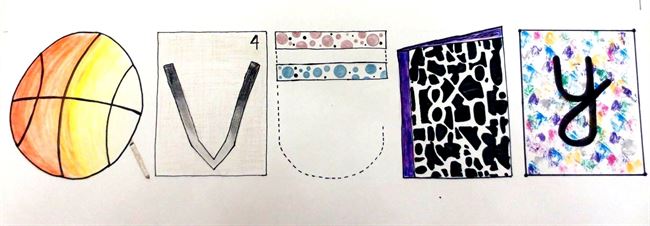 Avery Z.: I created this art piece to express me and my personality. The basketball was used to form an 'a' because basketball is my favorite sport and I love to play. Another letter that expressed me was the 'r'. The 'r' is in the shape of a book because I love to read. I also tried to incorporate new techniques that we learned in class. Those techniques are shown in the 'a' and the 'v' as the colors are fading.  Braylon B.: I chose all of these letters for a certain reason. I chose them because these things represent me as a person. The only exception is the letter B, I chose this because it looked really cool and I really like the fancy letter. I did the dot method with the marker inside the letter. I chose an upside down hockey stick for the R because I love hockey even though I don't play it. For the letter A, I chose to do the at sign in an email. I chose this because I would be a totally different person if I couldn't text anybody. I chose earbuds for the Y because I love to listen to music. The L in my name is a pencil. It represents me because I go to school Monday through Friday and if this wasn't in my life, it would change me. The O represents me because I love donuts so much, they are my favorite type of breakfast food. I chose to do a regular letter N with an American flag inside of it because I live in America and if I didn't, everything about me would change. I chose every single letter because each one represents something about me. MAEA Region 9 Highlight ShowTo finish out the week, I had the opportunity to enter student work into the Michigan Art Education Association Region 9 Highlight show. This is an adjudicated show that is juried by local artists and art professionals. It was great fun to see all of the winners and share in the success with my friends and colleagues. It was also a wonderful time to take in extra PD time with my fellow Art teachers as we viewed work on display at the GRAM, KCAD, and discussed all aspects of Art education. Thirty-three works were selected Saturday to represent Byron Center Public School students from 1st-12th grades. The work will be on display at the Grand Rapids Art Museum through February 23rd. All of the works selected will move onto the State adjudication next month. MAEA Winners |
Archives
August 2018
Janine CampbellTeaching Visual Arts since 2004 and making images since picking up a crayon. Categories
All
|