More Finished Work
Last week I pointed out that some students need a little more time to do their best work. Due dates in my classroom are firm, but flexible for those who would benefit from a little extra time. We need turn in dates to help hold students accountable, but we also need some ability to be flexible so that arbitrary dates do not hold back those who want to do something extra special.
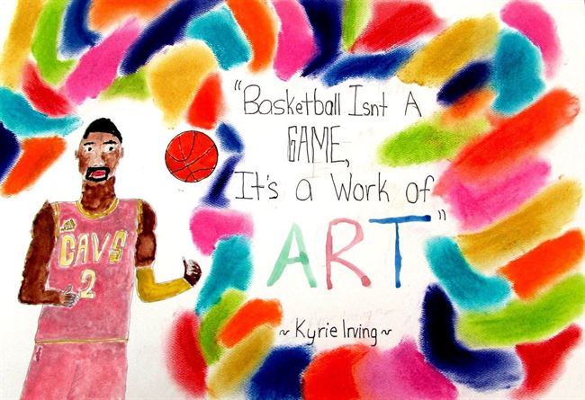
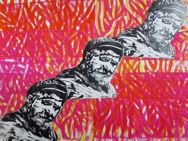
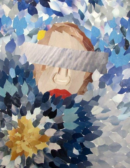
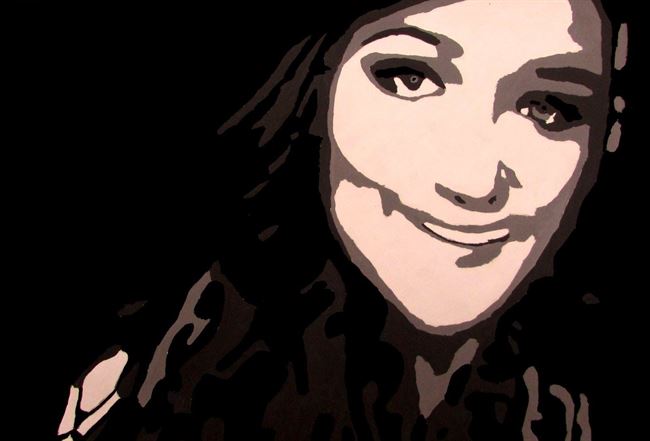
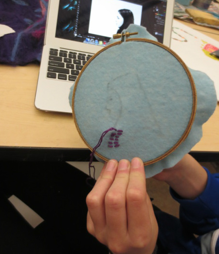
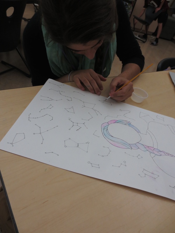
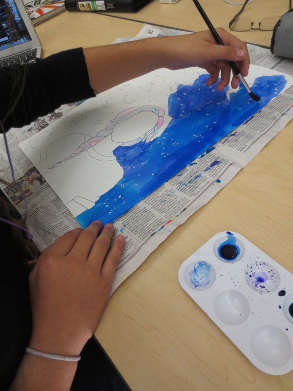
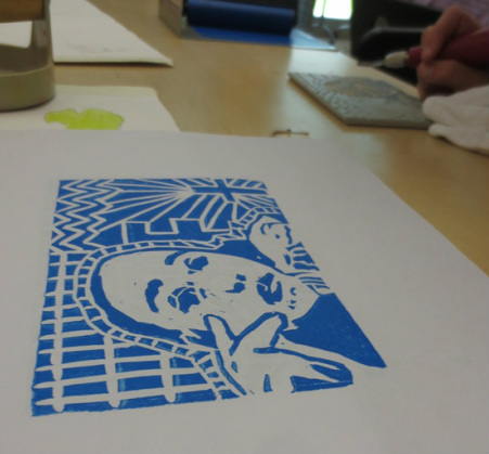
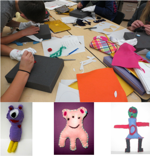
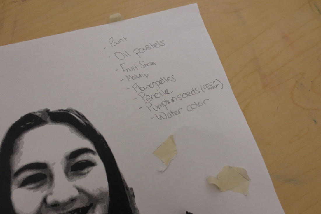
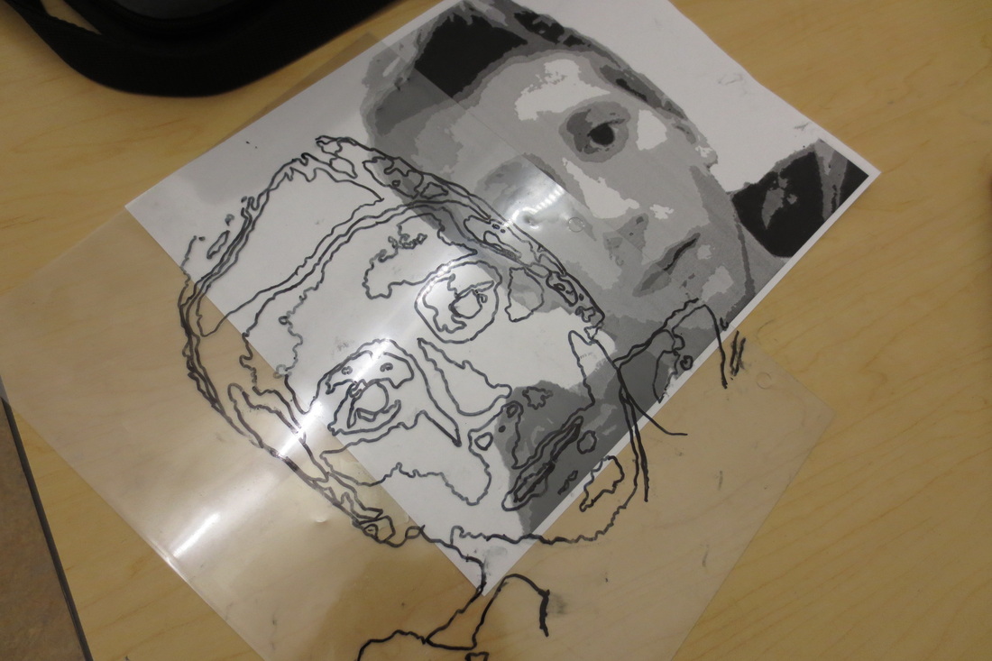
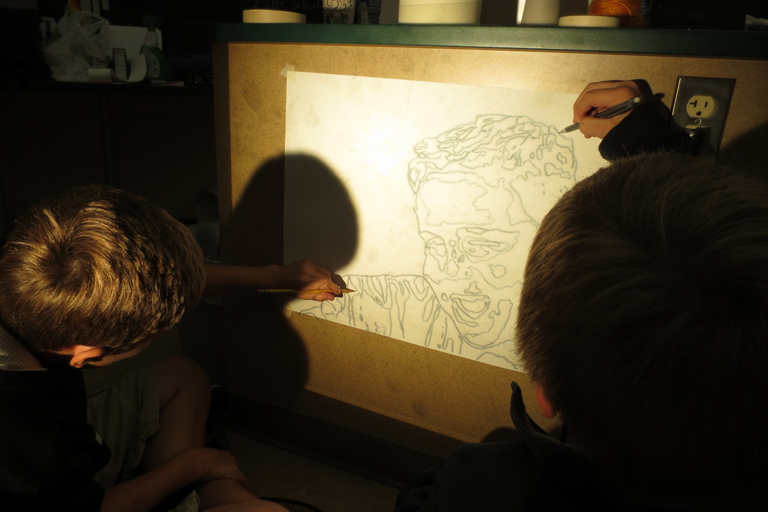
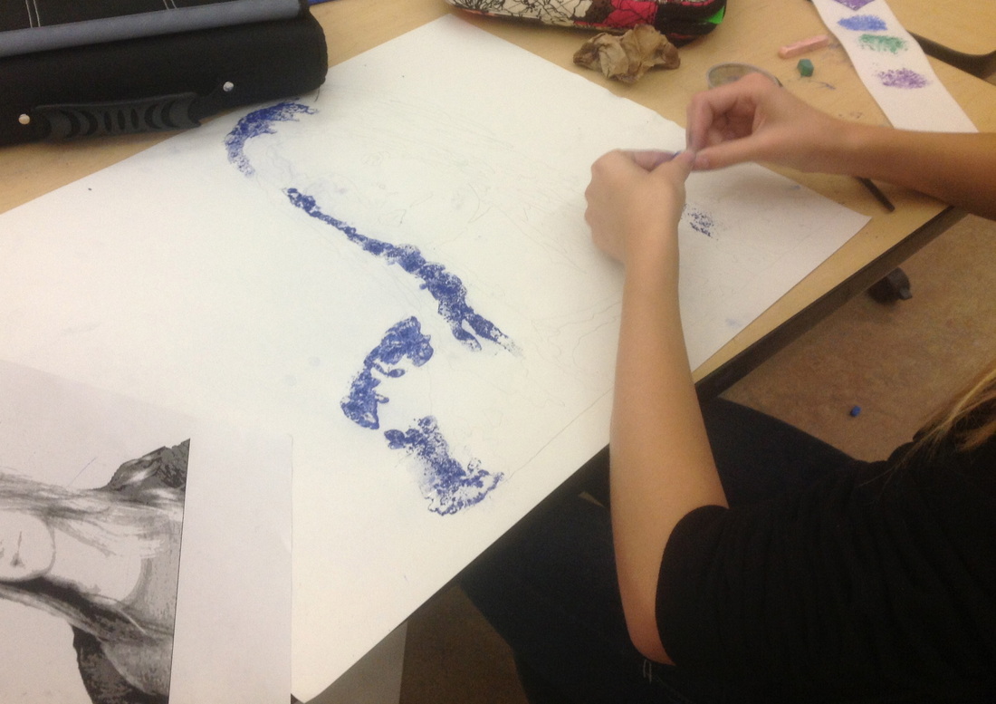
It was exciting to see the following works find their way to the finish line this week. I am very excited for how they turned out, but probably even more so for the process in which each student found their way to the best possible solution. I appreciated reading their learning statements and how many hope these works will make their way into competition at some point this school year.
It was exciting to see the following works find their way to the finish line this week. I am very excited for how they turned out, but probably even more so for the process in which each student found their way to the best possible solution. I appreciated reading their learning statements and how many hope these works will make their way into competition at some point this school year.
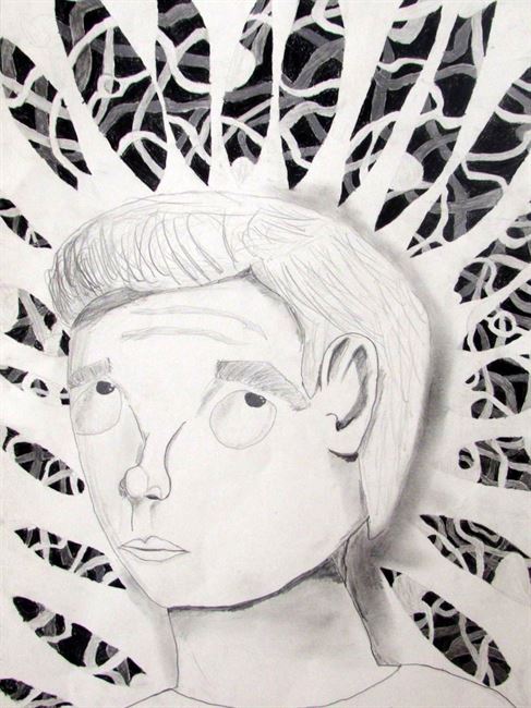
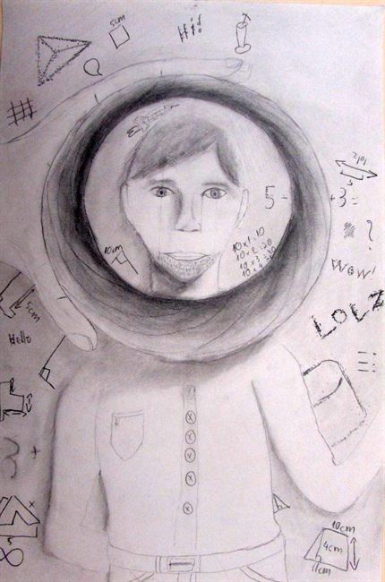
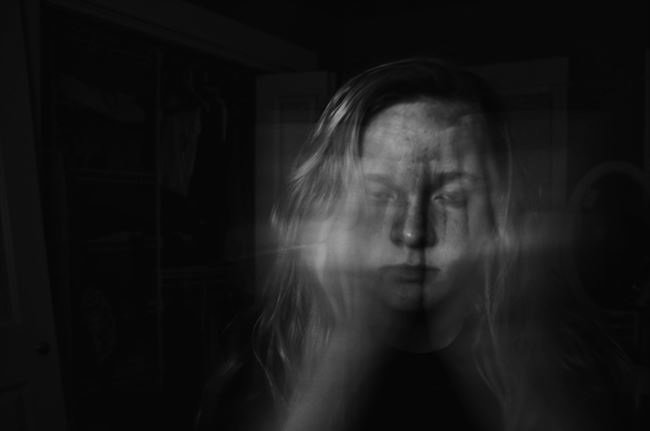
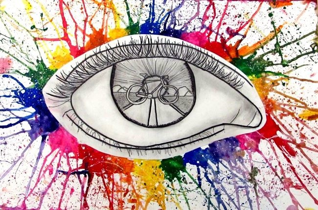
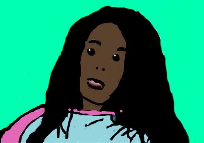
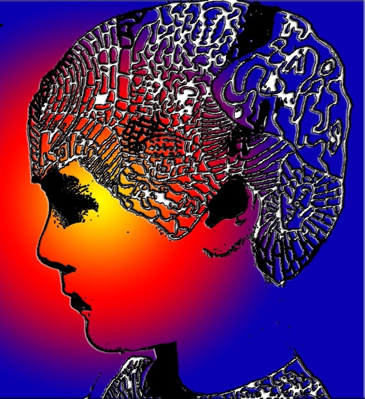
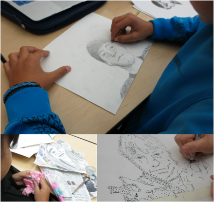
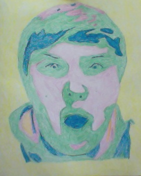
Oliver: In my artwork I was inspired by Julian Opie. But instead of doing a piece like his, I desisted to do the opposite of his art. I did a pencil and paper of a realistic face with lots of shadows. I used huge eye because Julian Opie's art has small beady eyes. My art relates to the theme of this project because it is of the "Me" in the project.
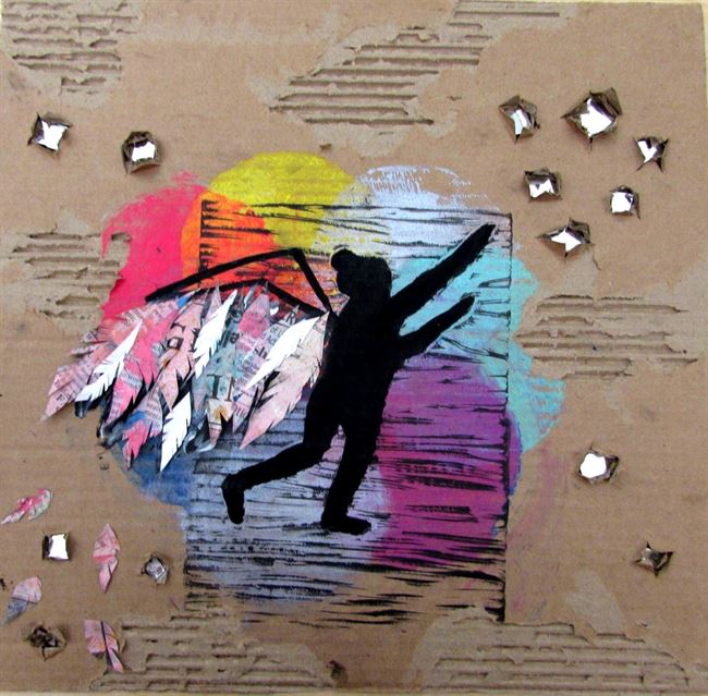
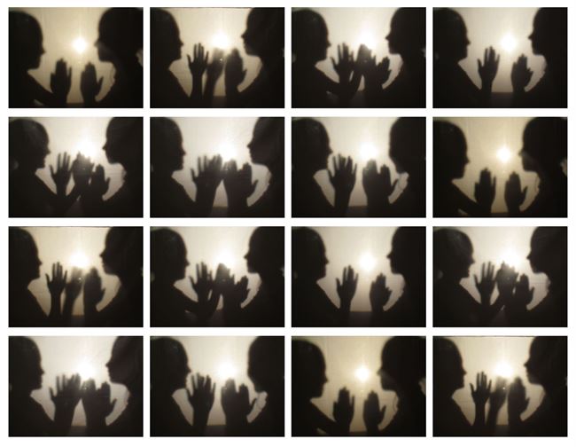
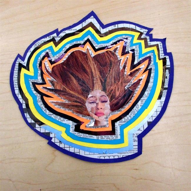
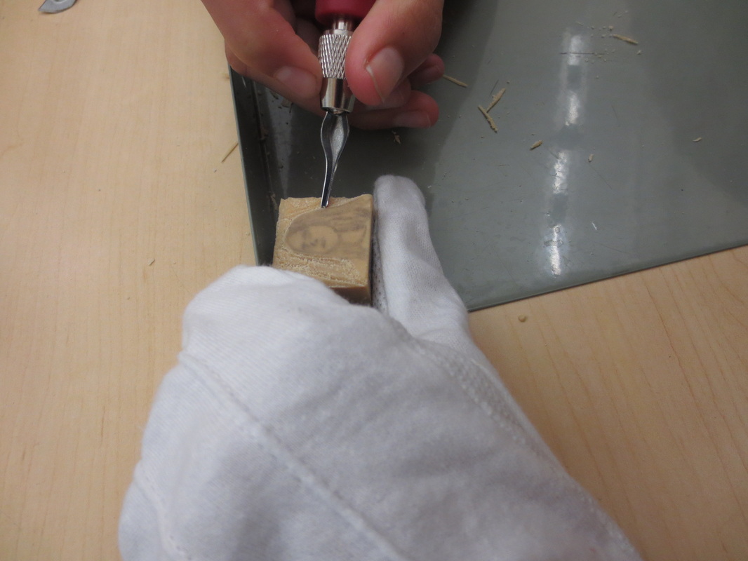
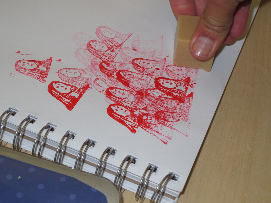
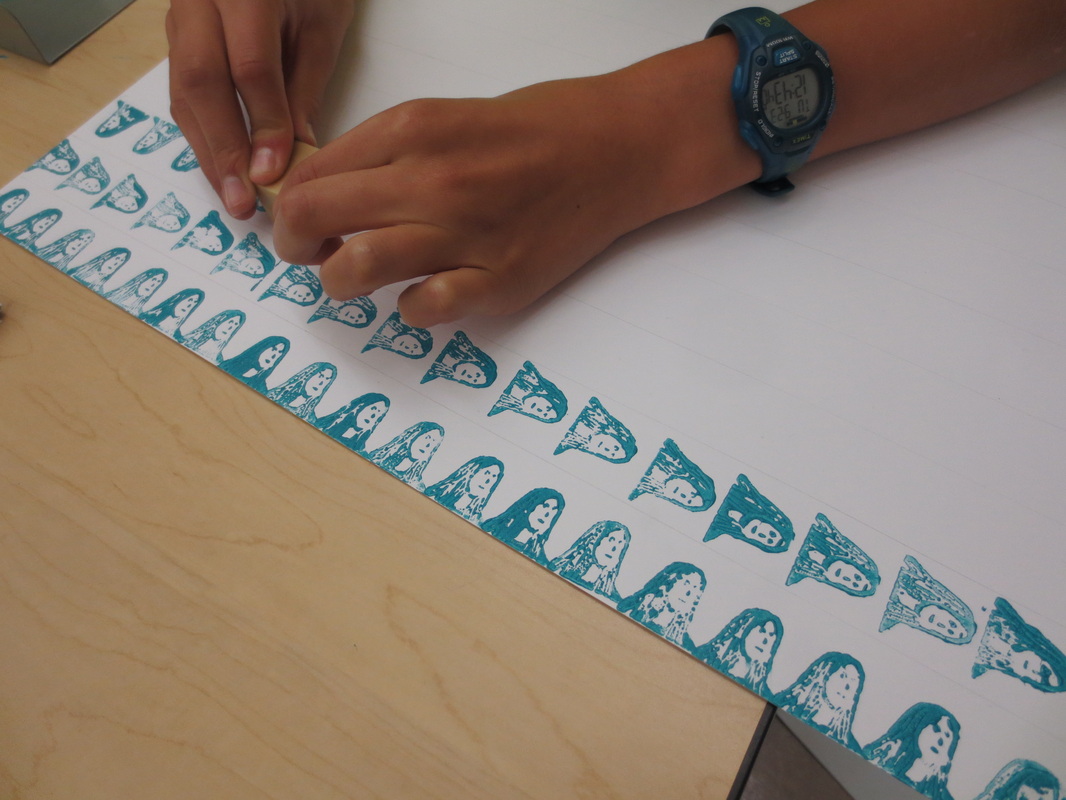
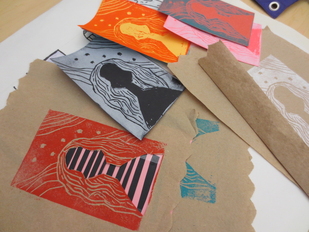
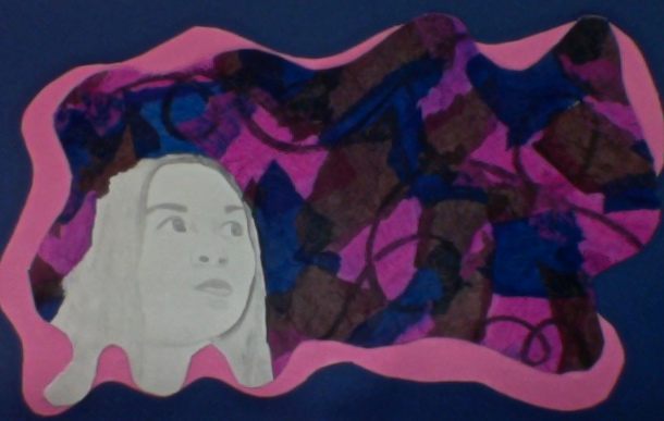
Leila: In this piece, I have a print of myself reaching for the stars. I literally took the saying, "Reach for the Stars", and incorporated myself. I decided to add wings to the figure to have a dreamy effect. I used newspaper that had been painted on for the feathers. For the stars, I opened up certain sections of the negative cardboard space and placed reflective material inside. I ripped parts of the cardboard off, so the piece would have a variety of different textures. In the end, this piece turned out really well and I hope to enter it in to Scholastic!
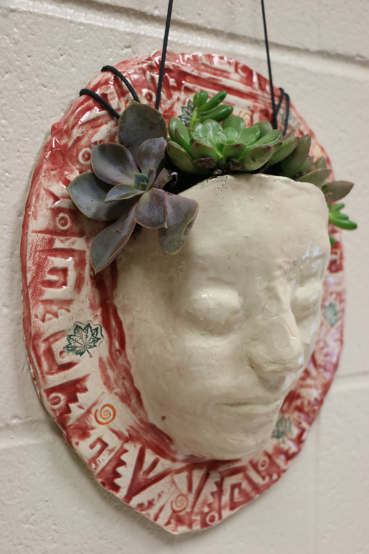
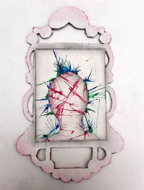
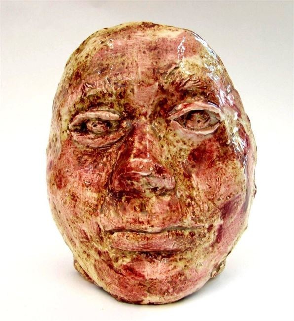
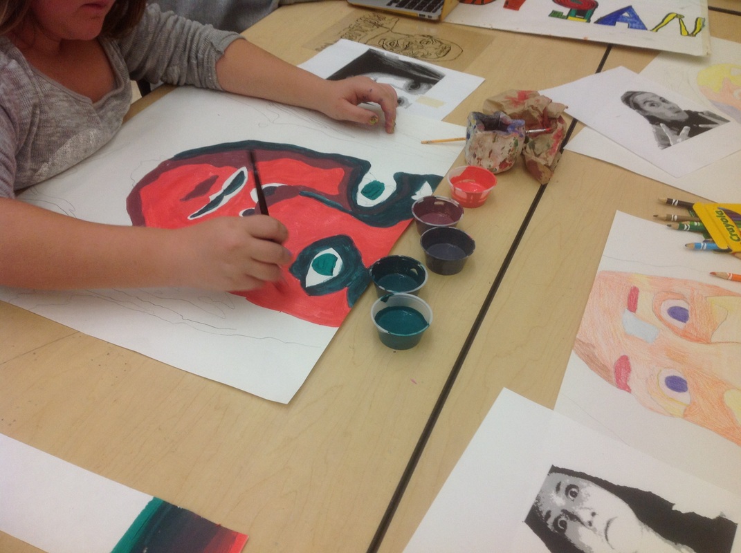
Mitchell: This piece has helped me learn how to use various techniques such a molding with plaster and clay and using many different colors to really help bring out my artwork.The art work connects to the theme of the project by symbolizing the ME in you me everybody,the project shows how my face can just be a plain piece of artwork but when you add different textures and visual elements such as unique indents into the clay and using a variety of colors you make or break a piece especially when it's clay.
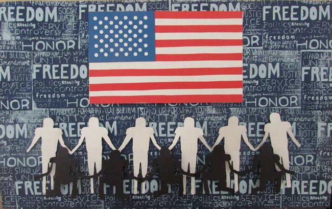
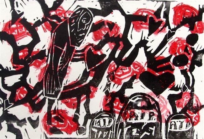
Tess: This work focuses on the everybody piece of the project theme. It deals with the current political issue of whether or not football players should be allowed to kneel during the national anthem in protest of equal treatment for all people. I chose to use mixed media to create this piece. For the background, I used block printing, and for the rest of the work, I used cut paper. These materials help convey the message I am trying to communicate because they are bold, and simple, making the message heard.
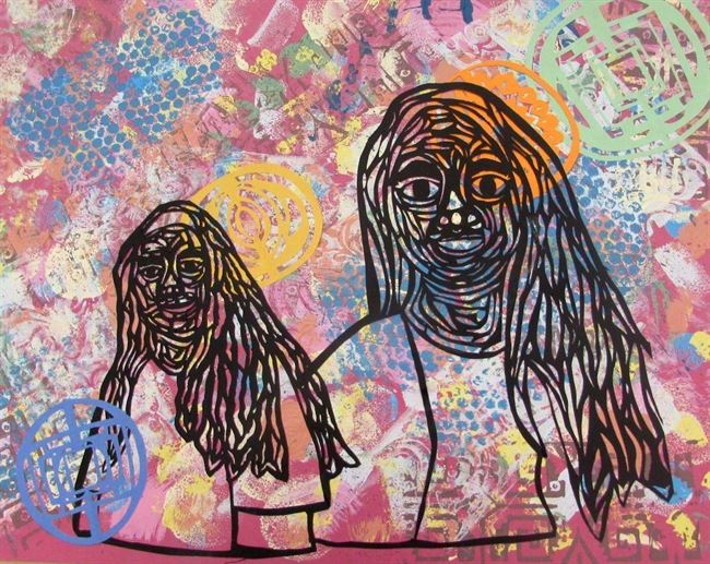
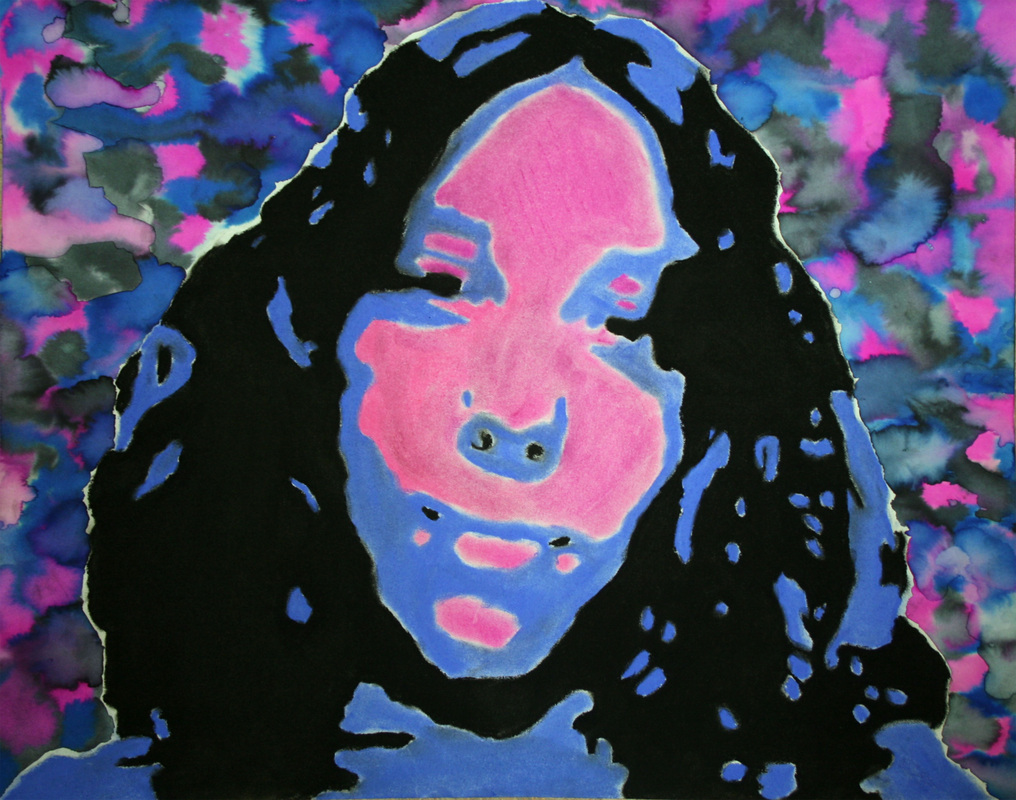
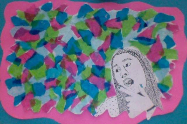
Chloe: In this piece I used mixed media and for the background. I used different sponges and techniques to make the background look the way it does. And then the people are made out of black construction paper and I used a xacto knife to get a lot of little details of the peoples faces and hair. This piece ties in with the theme you, me, everybody because I focused in on the people who are really mean a lot to me and these people are my friends so I decieded to do everybody.
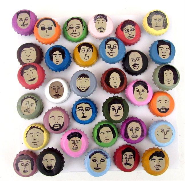
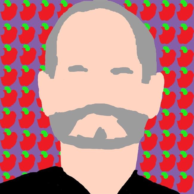
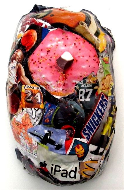
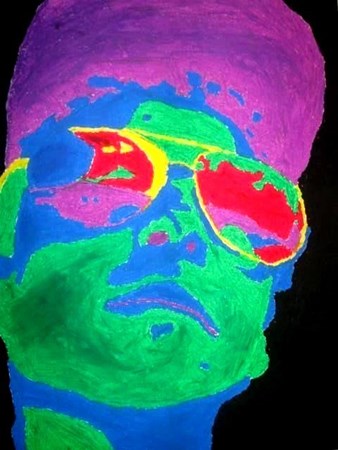
Marie: In this piece of art I chose to portray the idea of 'everybody' by using bottle caps and portraits. I intended that viewers would receive the message that everyone is different, and in a world of differences it is important that we find our own way to stand out. To help push this theme I placed one portrait out of place that had a different background, and a different skin color. By using bottle caps and randomized paint colors, I hoped to communicate this same idea of everyones differences. But by placing them all together, I hope to show viewers that we can come together as a community to create something bigger than our differences.
Building Skills and Understanding
Students were introduced to our next Challenge Theme: Spaces and Places (real or imagined). We looked at the work of Vincent Van Gogh, Ansel Adams, Georgia O'Keeffe, David Hockney, and Nathan Walsh before starting out plans for possible ways in which students could explore ideas surrounding the places we visit.
It was fun to see students dive into the sketchbooks right away and start planning out ideas without hesitation. The work we did for our first challenge has helped spark the importance of thinking through ideas and trying out various approaches in a smaller format before making a commitment on a larger scale. This shows me that students are able to generate ideas on their own, do the research they need to help inform their choices, and try out solutions before making a choice on what interests them most.
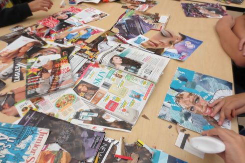
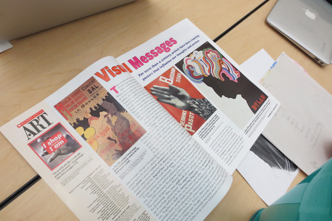
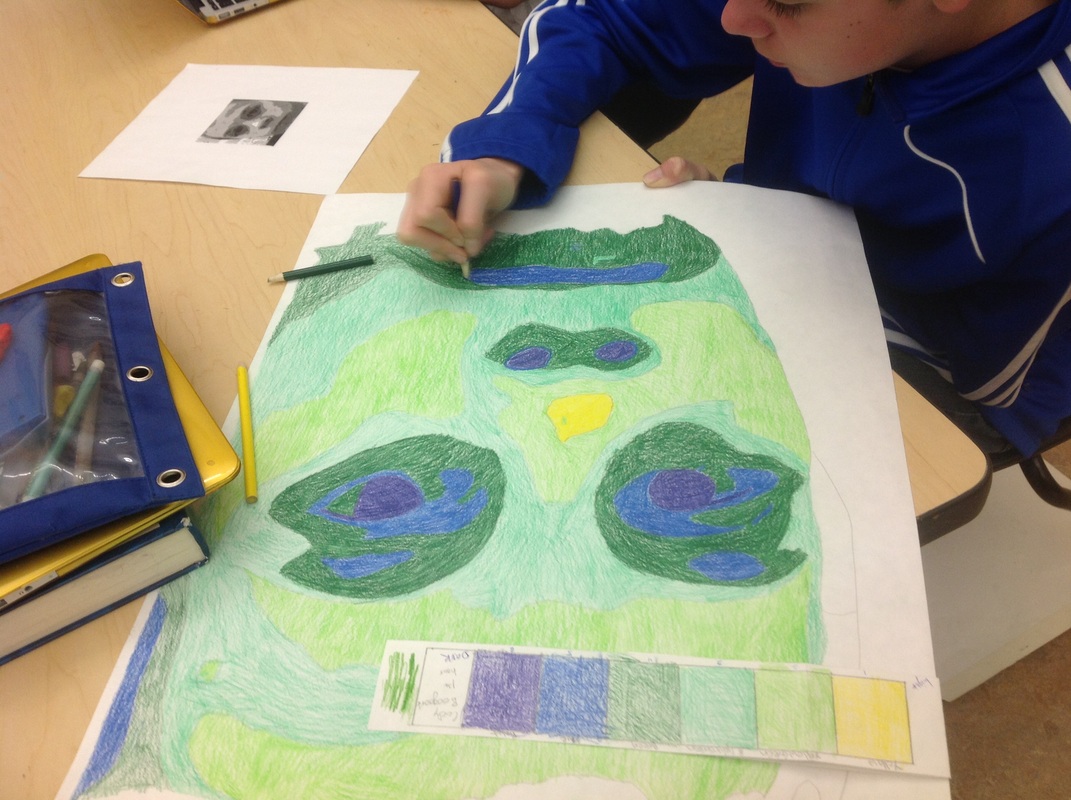
We also used this week to broaden our skills with various mini-challenges using collaged paper and digital works. Students learned about how to establish an environment by activating the foreground, middle ground, and background of a work as well as how to use various tools to achieve desired effects. It was fun to see students use these skill-builders as a springboard for generating ideas for their project and the results of their learning.
It was fun to see students dive into the sketchbooks right away and start planning out ideas without hesitation. The work we did for our first challenge has helped spark the importance of thinking through ideas and trying out various approaches in a smaller format before making a commitment on a larger scale. This shows me that students are able to generate ideas on their own, do the research they need to help inform their choices, and try out solutions before making a choice on what interests them most.
We also used this week to broaden our skills with various mini-challenges using collaged paper and digital works. Students learned about how to establish an environment by activating the foreground, middle ground, and background of a work as well as how to use various tools to achieve desired effects. It was fun to see students use these skill-builders as a springboard for generating ideas for their project and the results of their learning.
Landscape Fast Collage Challenge
Students created the following landscape collages to demonstrate their understanding of foreground, middle ground, and background while also using collage skills to complete a work. We started out by looking at The Art Assignment Video featuring landscape artist Robyn O'Neill before getting out the glue and scissors and getting to work.
What made this a successful challenge was that the size of these collages were kept to 6x4 inches big and students only had about 25 minutes to create them. Students sometimes struggled with the limited size and time, but by keeping it small they had to forget about being perfect with their choices and focus on demonstrating the various aspects of a landscape as well as the figure/ground relationship. Some enjoyed the process so much, they made more for fun.
What made this a successful challenge was that the size of these collages were kept to 6x4 inches big and students only had about 25 minutes to create them. Students sometimes struggled with the limited size and time, but by keeping it small they had to forget about being perfect with their choices and focus on demonstrating the various aspects of a landscape as well as the figure/ground relationship. Some enjoyed the process so much, they made more for fun.
Riley
Tobin
Cierra
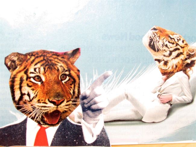
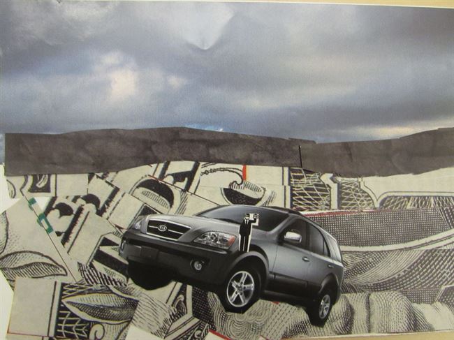
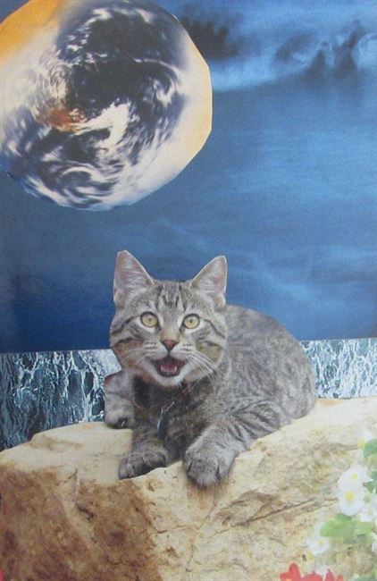
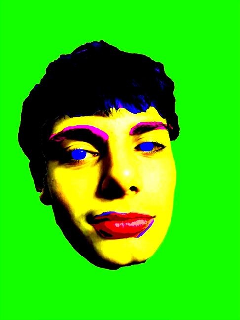
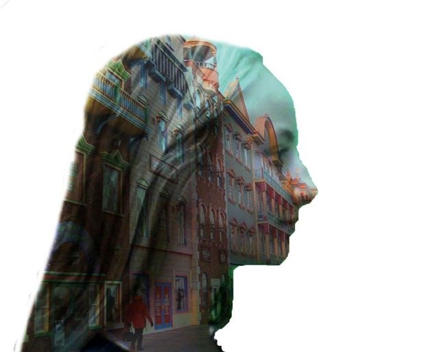
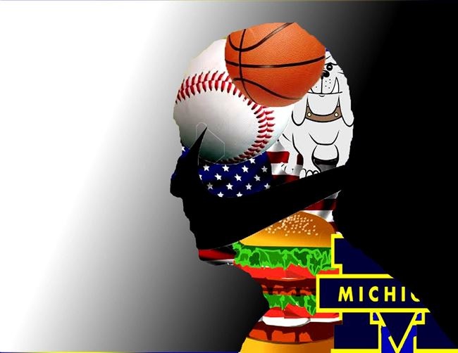
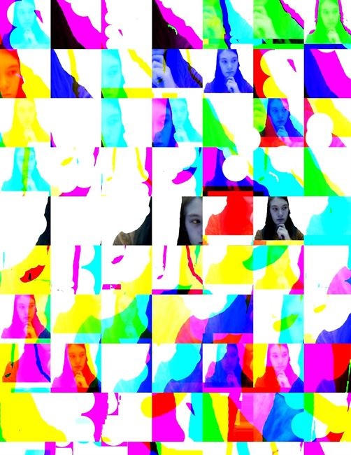
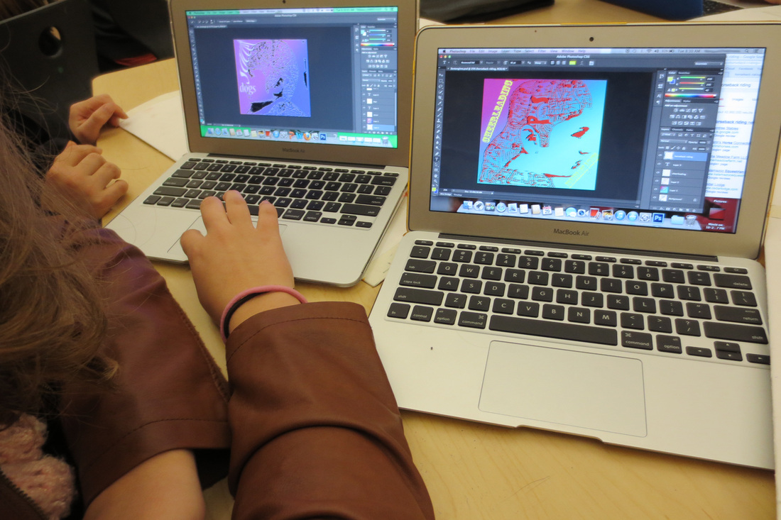
Photoshop Challenge 2
Students were given another Photoshop Challenge to complete this week as well. These works help build students skills while producing works they are proud of and that they were able to have a say in making. It has been fun to see some students really grow their understanding of how to digitally manipulate images and how to make images from scratch, rather than always relying on the internet.
Here are several examples to show the range of methods in which students created works to demonstrate their understanding of creating visual space while manipulating the methods and tools within Photoshop.
Here are several examples to show the range of methods in which students created works to demonstrate their understanding of creating visual space while manipulating the methods and tools within Photoshop.
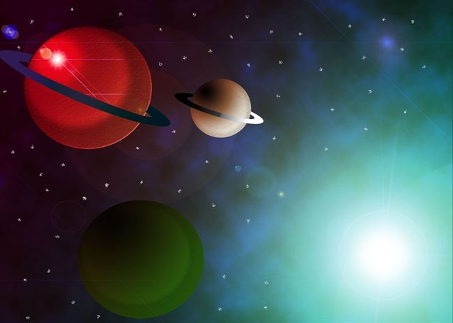
Finn
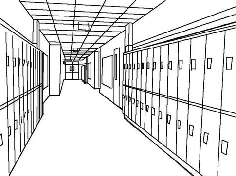
Jenny
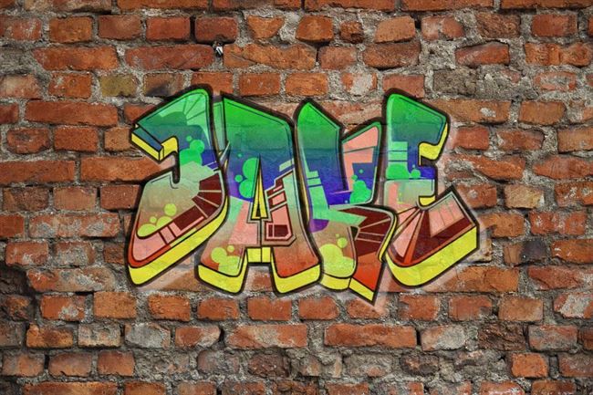
Jake
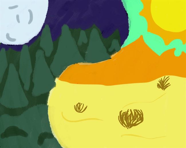
Emmie
Almost The End of the Quarter
With the end of first quarter next week, it has been such a delight to see students grow and shape their understanding of art in new ways. Students have been exposed to a variety of artists, methods, and tools to use as a starting point for their own creative journeys. I am excited to see this quarter come to a close and how students leverage their learning from this quarter to push themselves even more next!


 RSS Feed