Finish Works

Photoshop Frenzy
| BCWMS VISUAL ART & DESIGN |
|
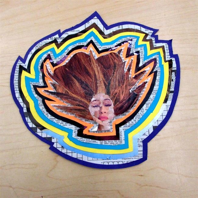
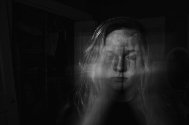
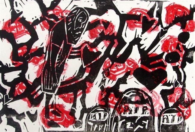
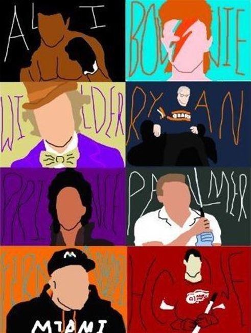
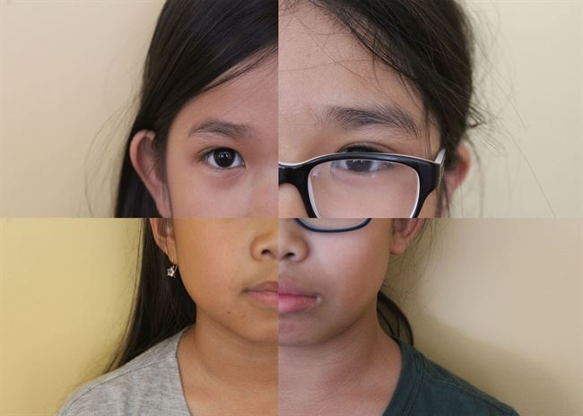
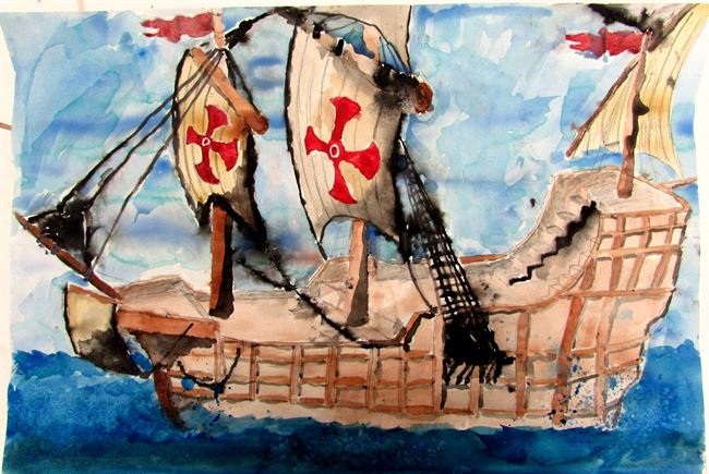
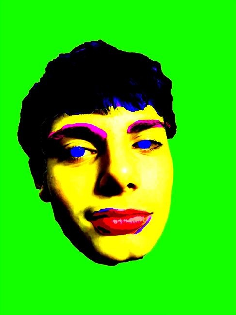
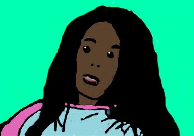
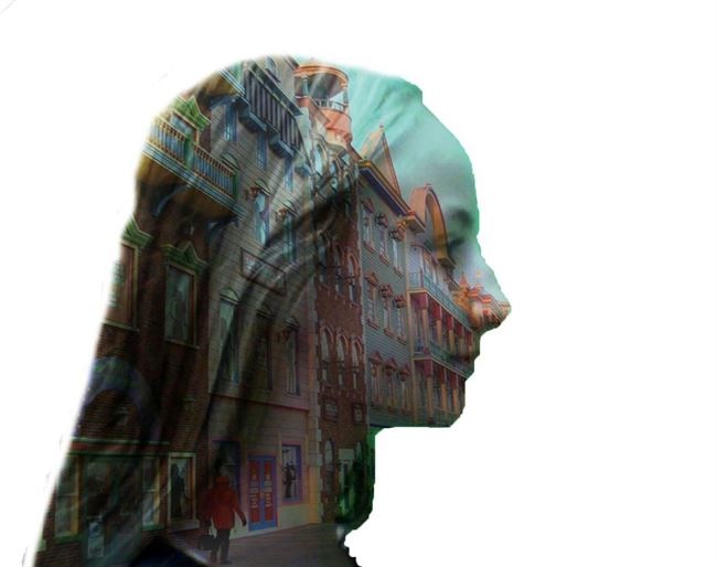
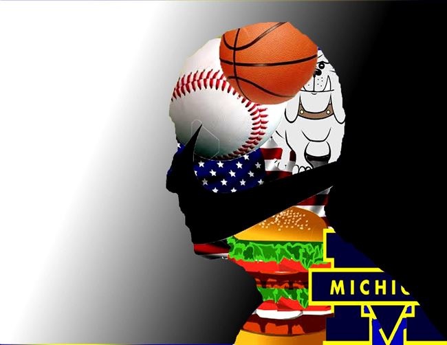
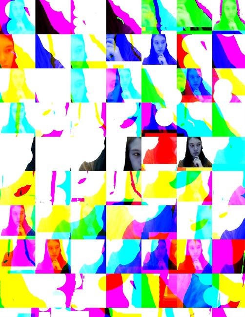
Finish WorksStudents finished up their work for the Biography/Autobiography Challenge and uploaded them to Artsonia this week. It was fun to see the very different outcomes from each student. So many different materials and methods were employed to get the work done. Below are just a few of the works completed this week.  Leila D.: My artwork, "Vibrant Girl", represents a friend of mine who is always positive and uplifting to be around. I wanted to make a piece that had a combination of bold and bright colors. I also wanted to somehow incorporate collage media into my artwork. I did this by taking parts of magazines and arranging them to look like my friend. After I did that I realized that it needed something more. I then decided to add multiple layers of newspaper, colored paper and magazines to the collage. I think that because I did this, the artwork seems more joyful. I can compare my artwork to Patrick Bremer because he also used collage media. He takes magazines and uses them to create realism and abstraction in a piece. There is also a difference between Patrick Bremer's piece and mine. He uses a grid to create a more realistic piece. I enjoyed making "Vibrant Girl", and hope to continue to learn different ways to make great artwork!  Lindsey P.: My artwork is for the biography unit is a photography piece that I took on my camera. In this I used a longer shutter speed and exposure to slow the picture down and make it look like my hands are moving. Also I turned the contrast up to highlight and darken certain parts of my photo. For example, my freckles stand out more when I turned up the contrast. My work connects to me because I love trying new types of photography. My artwork was inspired by photographers I see on social media and Andy Warhol because he makes his artwork look like it is almost moving also.  Ashley W.: This assignment I used two different block prints. One print was a small print of a car. The other print was a a girl looking down at a tombstone. It has something to do with my life, because when I was very young, three people in my family died in a car crash. The cars show you it was a car crash, and the tombs show that people died in it. This artwork means so much to me! My artwork compares to Andy Warhol, because he did colors that people wouldn't do often to their artwork. While he did bright colors, I did bright red in the background. Then, I did a darker color in the front, to show sadness. I took part of Andy Warhol's idea with bright colors, and mixed it up a bit!  Colton S.: This piece is a biography of Sports legends, singing stars, iconic actors, and etc. These people have inspired me, and many many other people to do the things they do, or love the things they love. This work is most like that of Andy Warhol. This is because it deals with repetitive portraits, that depict celebrities or iconic images.  My T.: In my artwork I took pictures of family members of mine in different spots of their faces. When I was done with it I put it together like a puzzle and made a new face. I have personal connections with this artwork because I took pictures of the people in my family. I think my artwork could compare to Chuck Close because of the square/blocks in the picture because I took the pictures separately. Even though it is a picture instead of a painting or drawing I think my artwork compares most to Chuck Close because of the squares on my artwork.  Damien A.: I made Christopher Columbus's Ship because I think it's cool that even though everyone told columbus that he was going to fall off the edge of the Earth, he sailed his ship forward anyways, and he found America. Because of him, we all live in america today. My artwork kind of connects with Chuck Close because he had dyslexia which was a problem for him, but he found a solution for it and it worked. At first when the paint on the boat started leaking out, I tried to hide it, but instead of that, I found a solution for it and I think it worked pretty well, I put them everywhere.  Abby B.: n the work of art I have presented, I created a piece with drawing pencils and magazine clips of outer space. I was inspired to create this piece, as I originally wanted to create something to do with Cherokee heritage. I always thought that their history was extremely interesting, so when I heard the theme of the project, that's what my mind immediately went to. While looking through my research, I found a group of people called the moon-eyed people. Apparently legend told that these people of Cherokee descent, could see during the day, but could see in the night. I thought this was extremely cool, and I choose that to be the model in my portrait. One artist that I think my artwork is similar to Patrick Bremer, as we both use some sort of college in our artwork, with his the actual portrait and mine the background. One thing different is that I also used drawing pencils, while he just used magazine cutouts. Photoshop FrenzyThe last two days of the week were a frenzy of Photoshopping as students worked to complete one work (out of five possible challenges). It was fun to see students stretch their learning, even when they had to struggle through some technical issues along the way.  Mark Z.: For my Photoshop challenge I created a digital print of me. I used the technique that Andy Warhol used when he made Marylyn Monroe with bright colors that stand out. I used this technique because I liked how the colors complemented each other. Also I liked how the colors stood out more than usual. This describes me to because I love colors that are bright and complement each other’s.  Irieca W.: I chose to do the one with it looking like a cartoon person because i thought it would be fun and cool to do at first i tried it and it was kind of frustrating for me to do. but then when i did it was easy for me to do so next time i might do some thing that will give me a challenge. because this was easy of i might do i for the next project that i have.  Kristina B.: I chose to do a city for my photoshop challenge. I used the principals of design by using unity because this piece shows harmony but also variety because of the different buildings. This photoshop challenge also uses different shape and also color because of the different shapes and color on the buildings in the city.  Trever W.: I used the quick select tool to create my artwork because I used it to get rid of the background of the photos that I used. I used the basketball and baseball in my artwork because I love to play those sports. The bulldog is in there because they are my favorite dog. The hamburger is my favorite food. That is why I choose to do a couple of those things  Alayna A.: In my artwork I used the element of design color by using bright and vibrant colors in my piece. I also used the principle of design pattern by using a square pattern that all have a picture of my face in different colors and locations. This photoshop challenge was fun to create, and the end result was very fun and colorful. This was a busy week, filled with new works and learning. I am excited to start something new next week (and to present at the MAEA conference in Traverse City)!
2 Comments
Mrs. Appleby
10/21/2016 12:55:56 pm
I am always impressed with your students artwork! They are truly expressing their unique artistic personalities. I love how deeply personal you allow their work to be!! Well done everyone!!!
Reply
Mrs. C
10/22/2016 07:27:34 am
Thank you for the comment! I will make sure to pass this along to my students. I am very excited for their progress so far this year and look forward to seeing what else they come up with along the way!
Reply
Your comment will be posted after it is approved.
Leave a Reply. |
Archives
August 2018
Janine CampbellTeaching Visual Arts since 2004 and making images since picking up a crayon. Categories
All
|