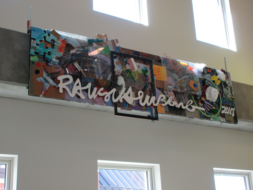
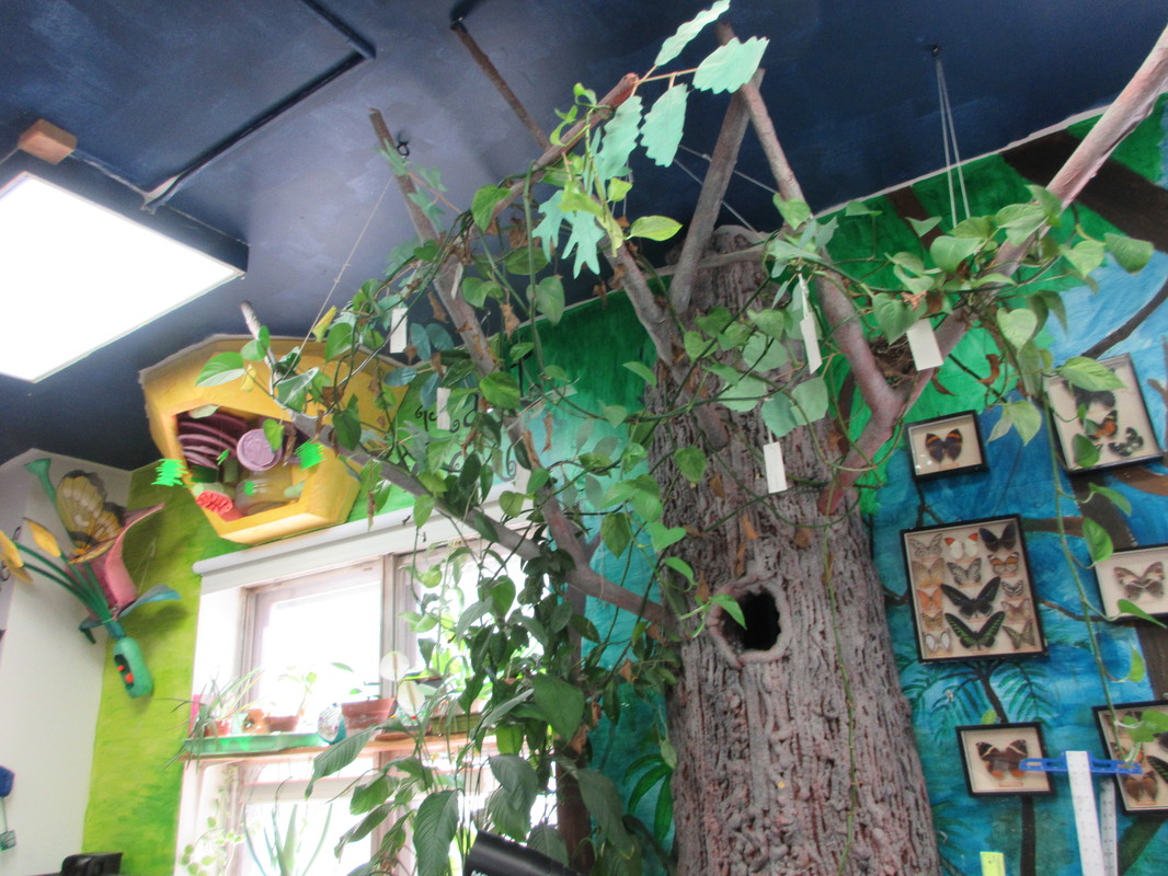
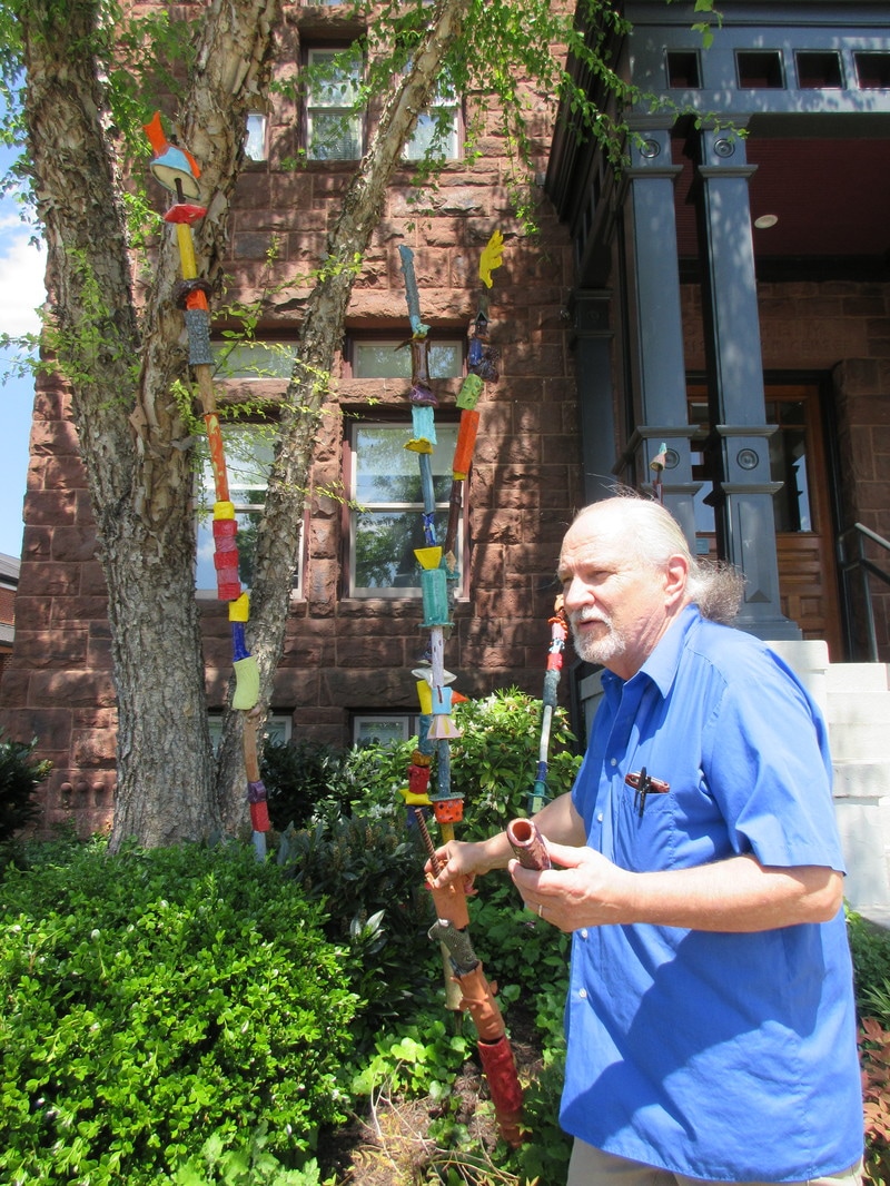
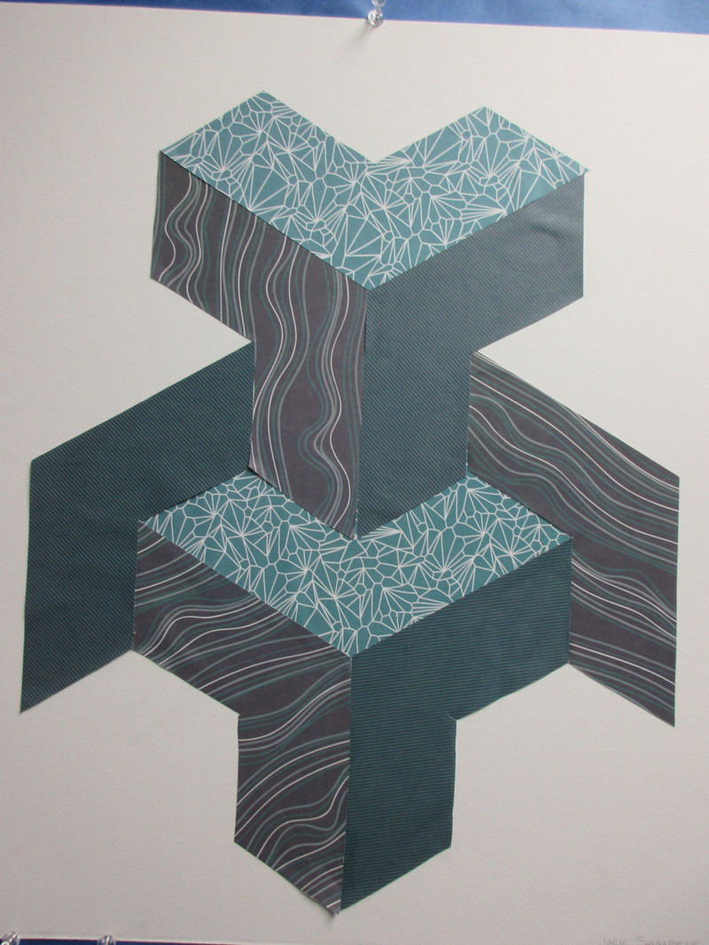
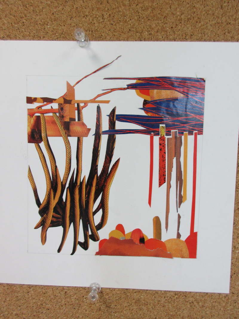
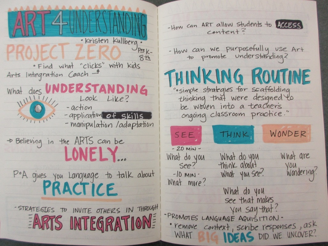
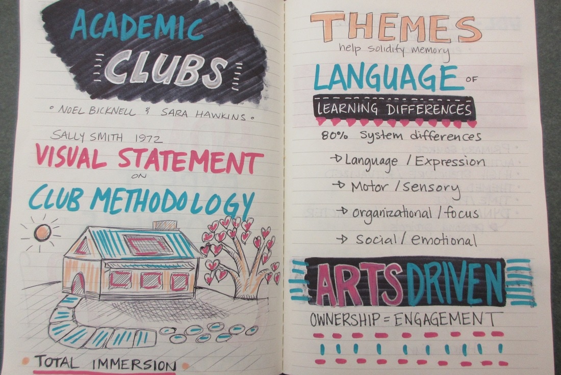
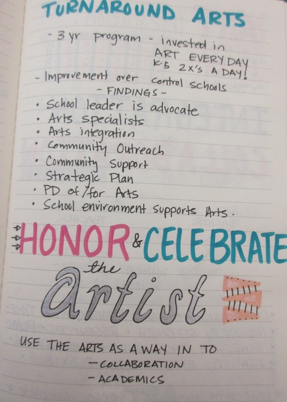
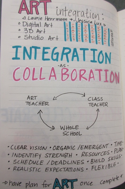
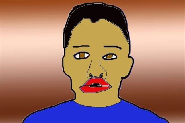
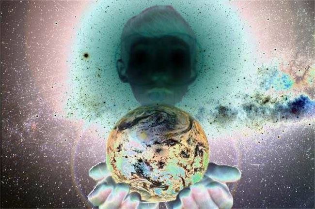
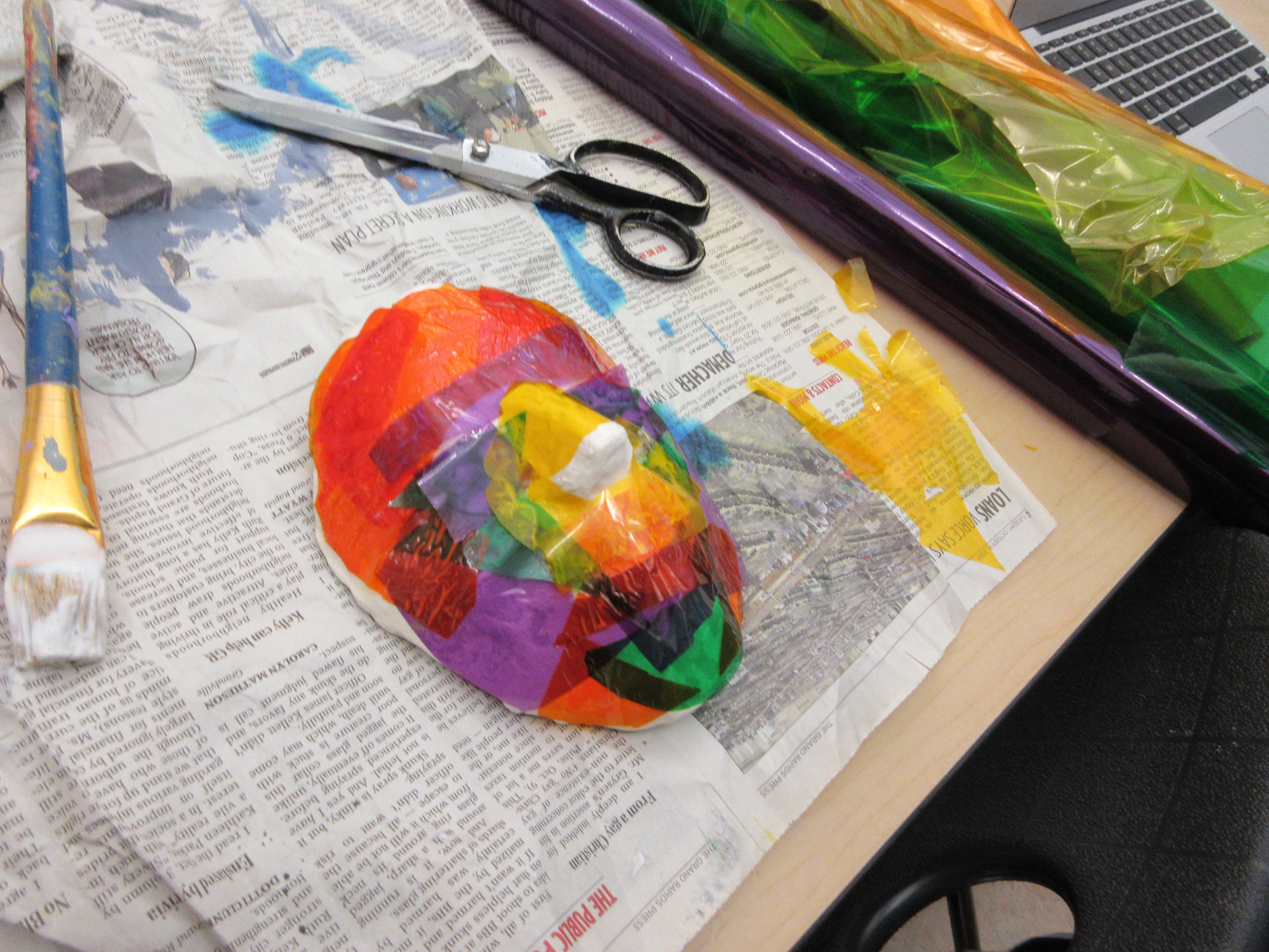
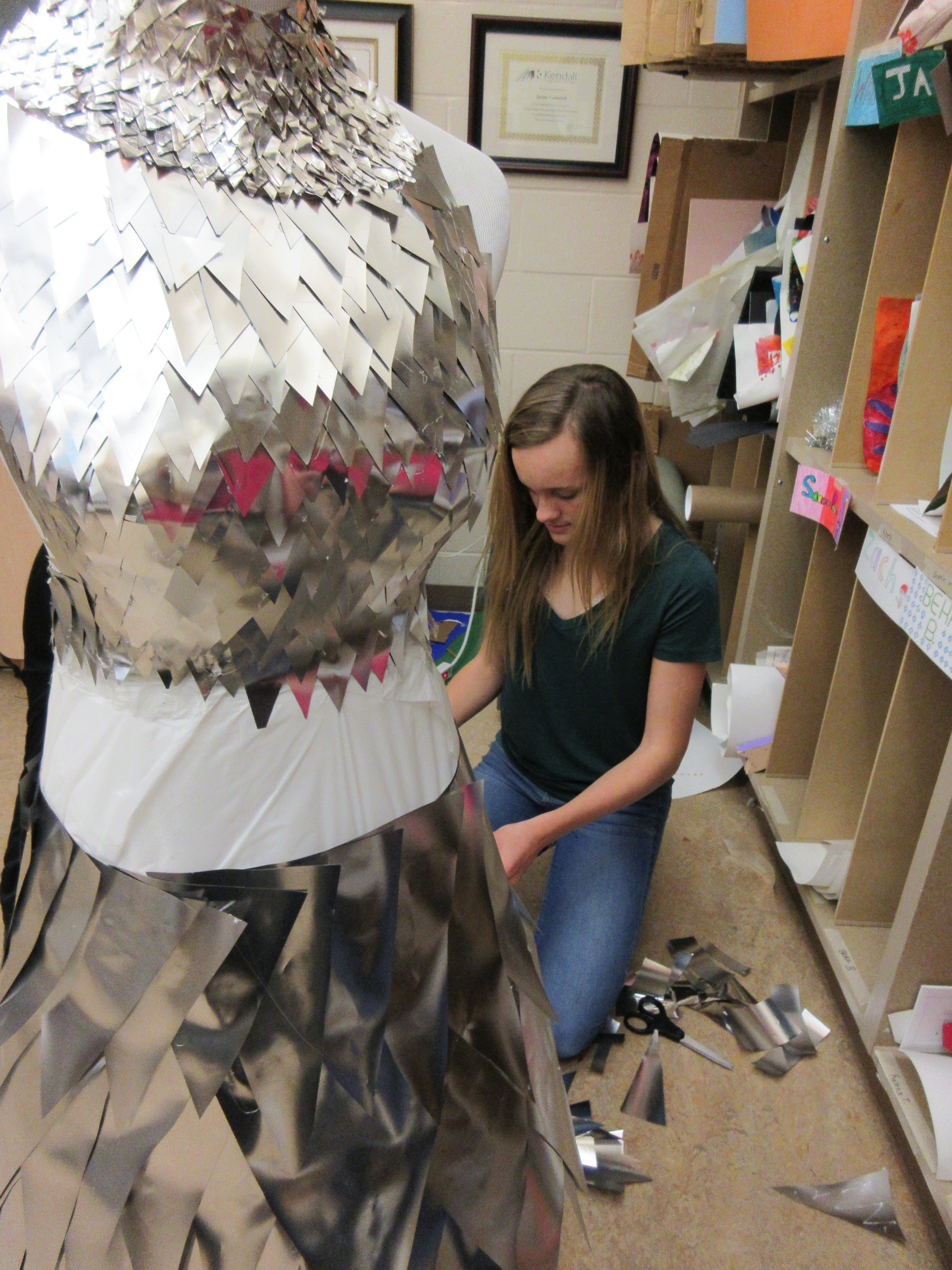
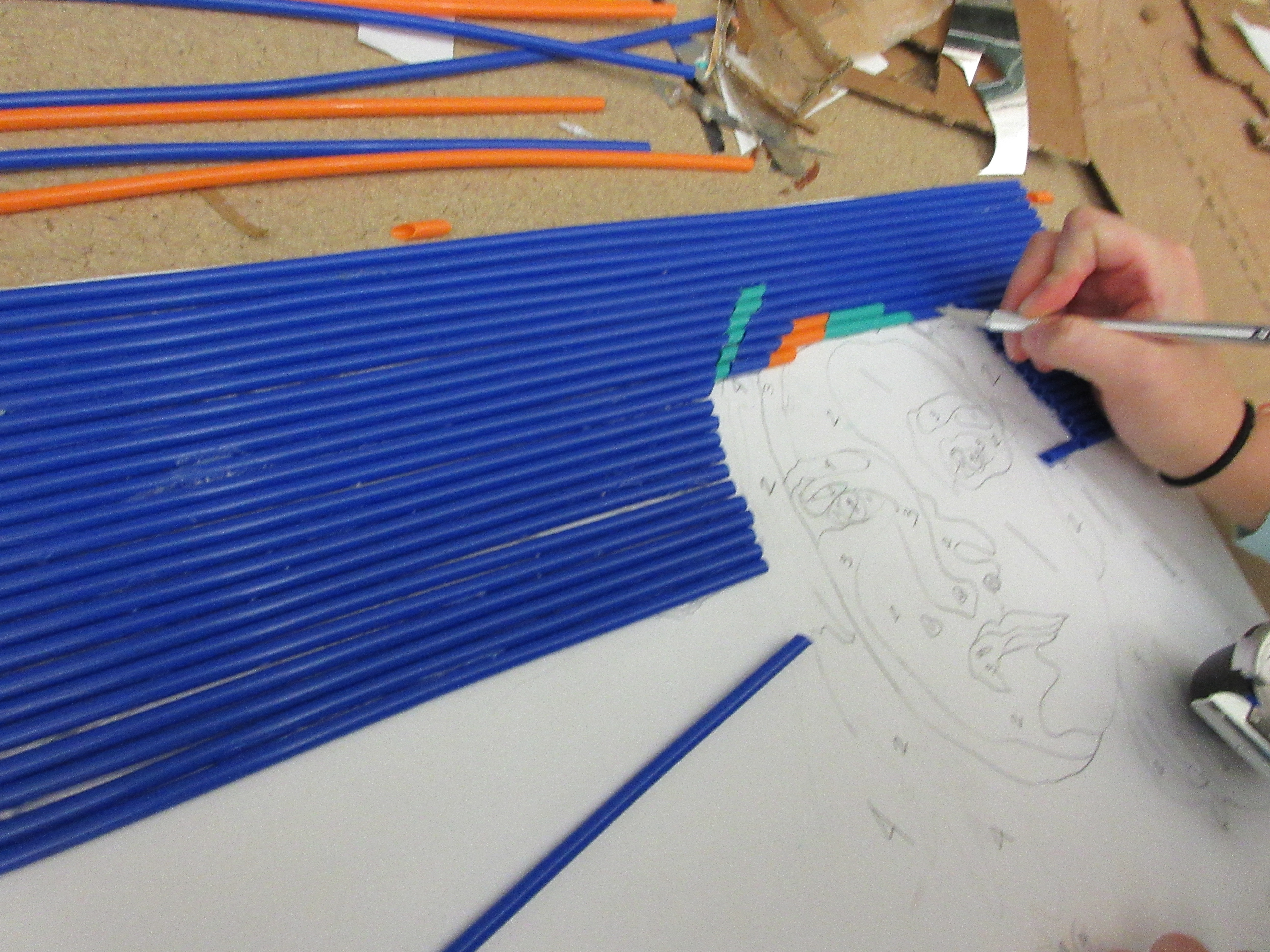
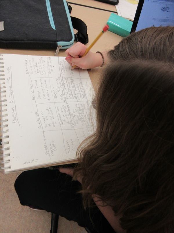
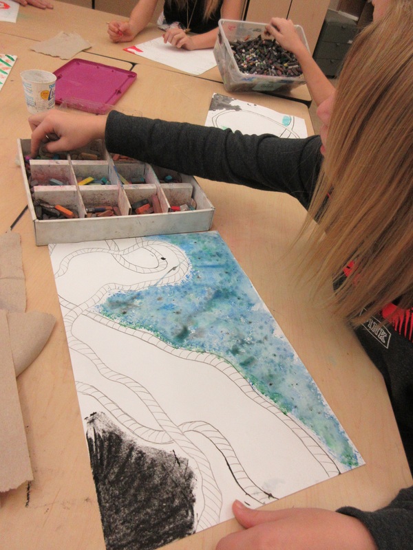
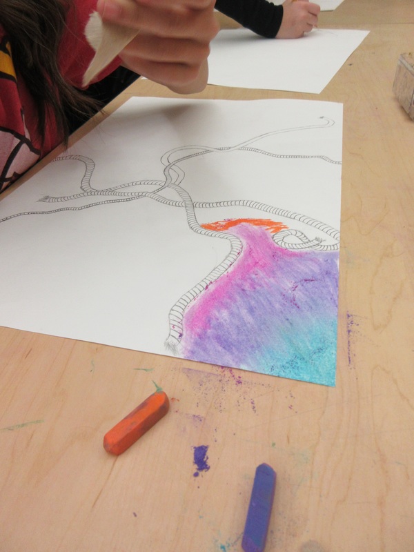
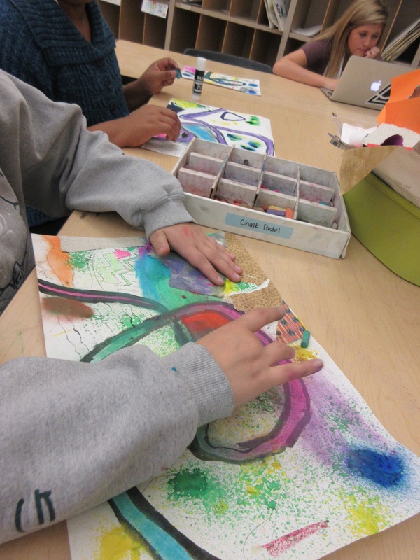
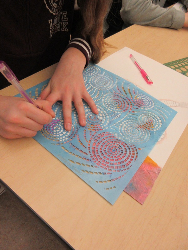
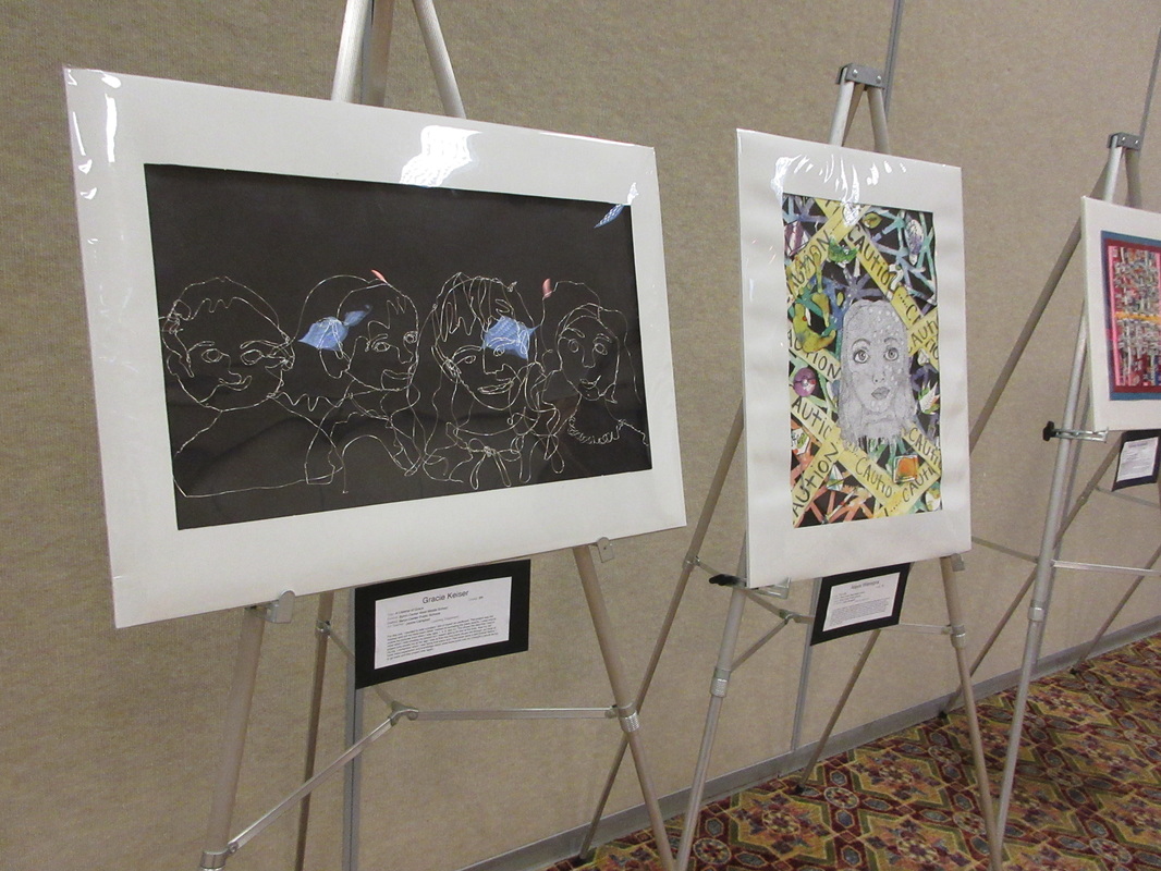
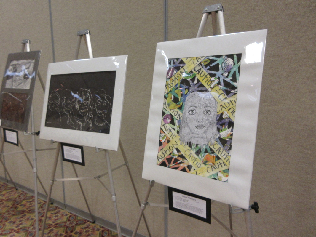
Spaces and Places Complete
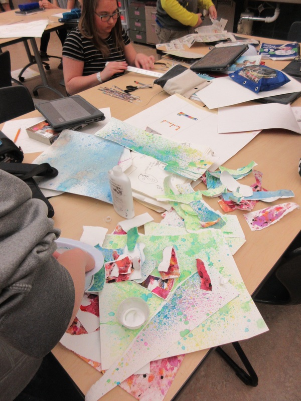
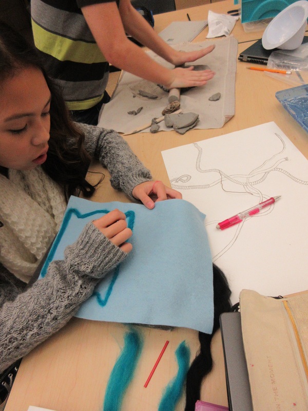
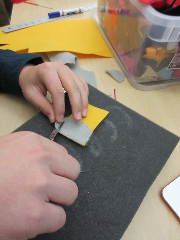
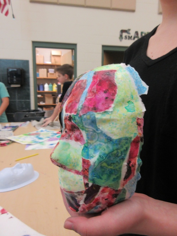
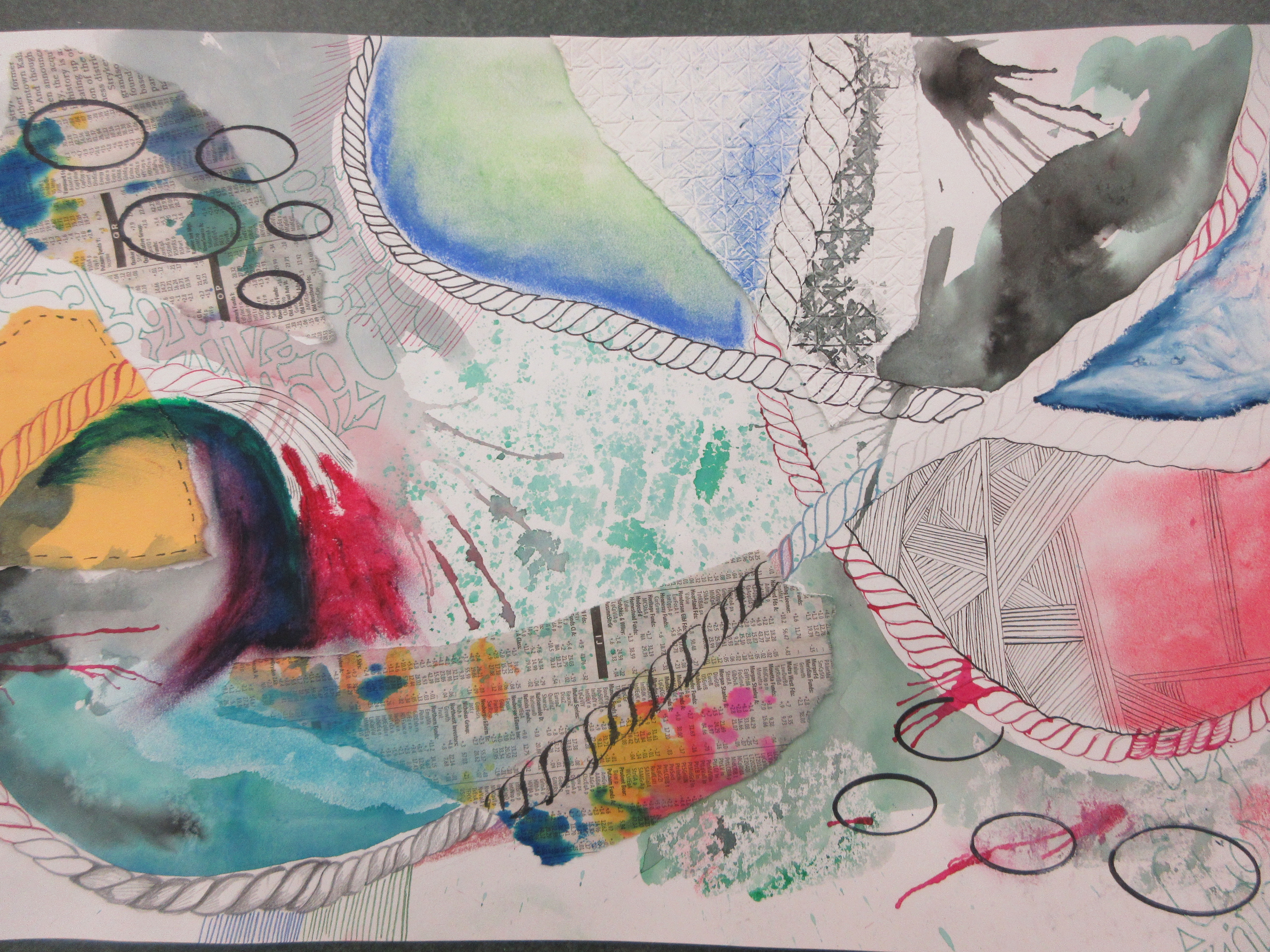
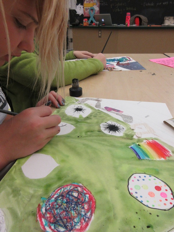
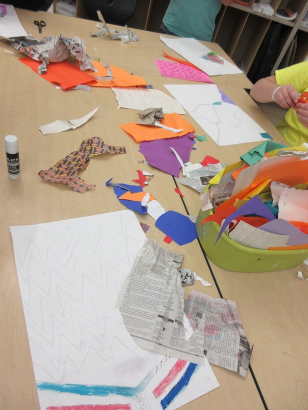
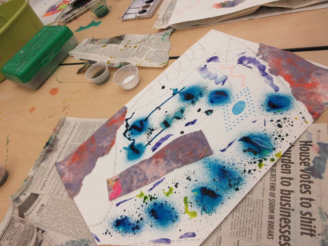
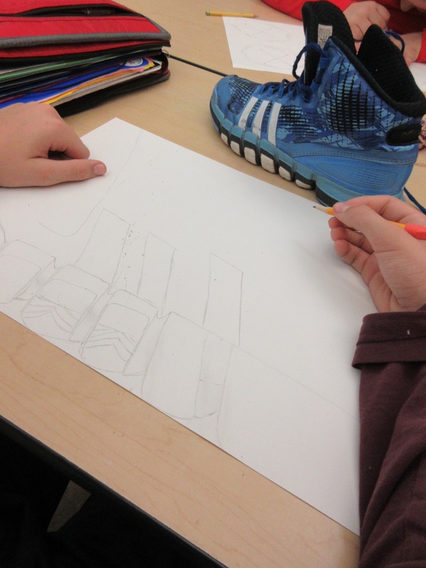
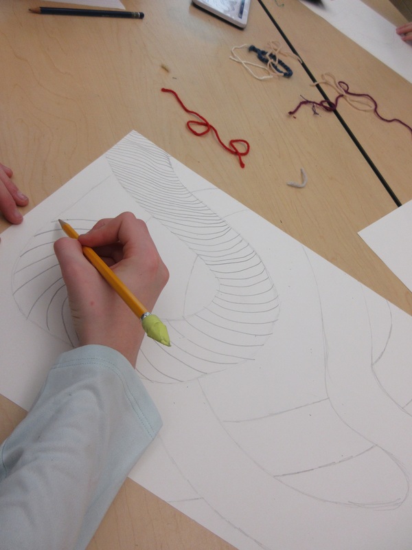
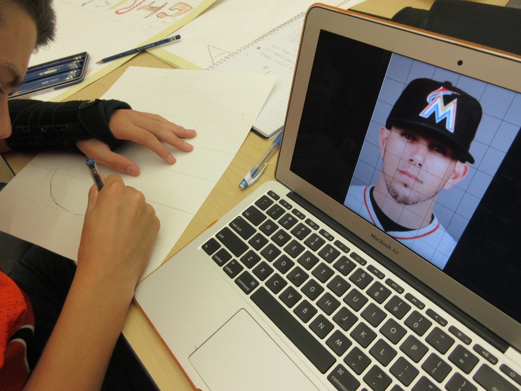
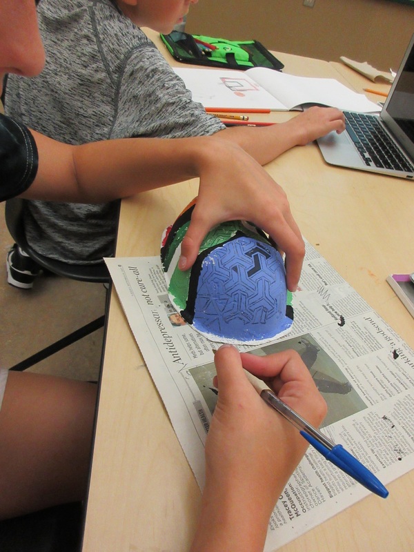
Students finished their second major challenge theme for the semester with the exploration of the theme "Spaces and Places, Real or Imagined." It was fun to see students go through the design thinking process and making choices about what aspect of the concept they wanted to focus on as well as the media they were going to use to do so.
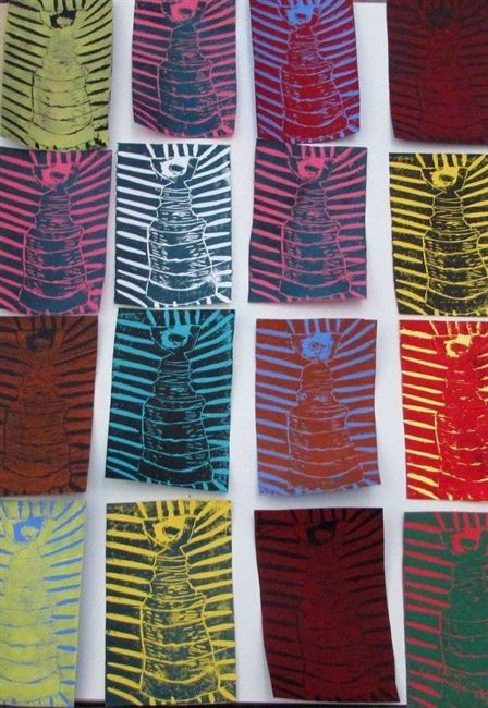
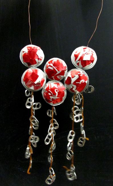
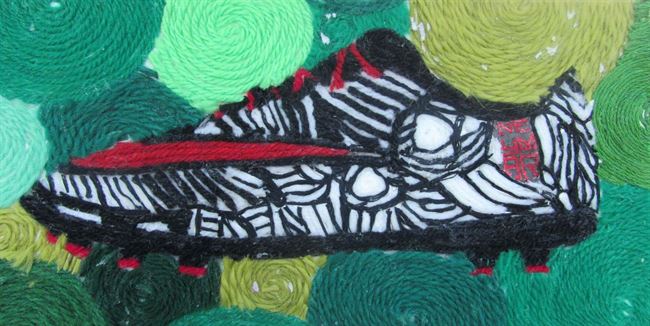
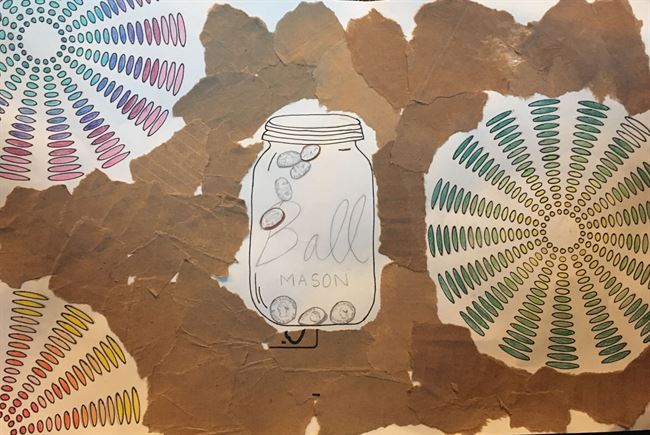
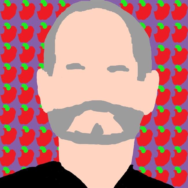
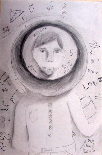
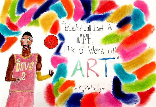
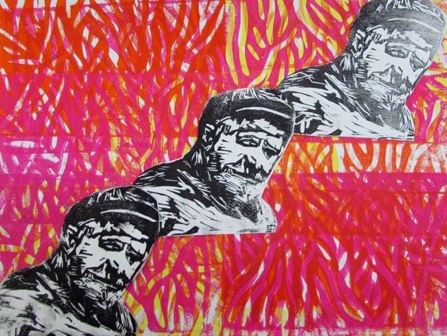
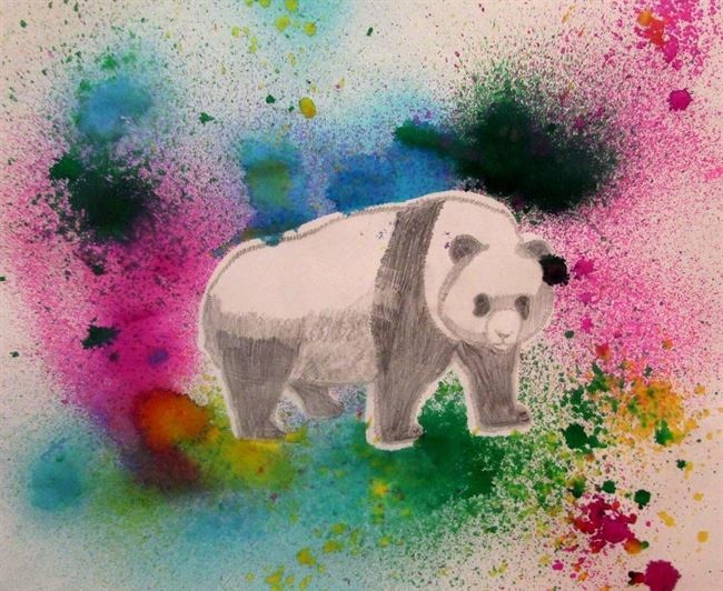
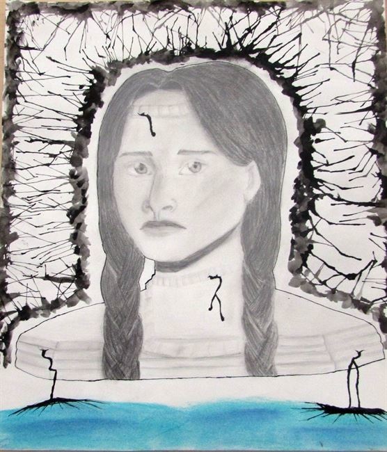
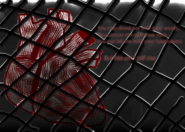
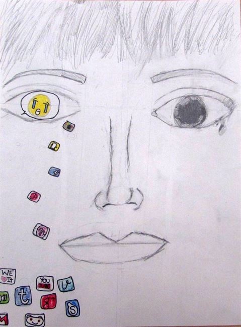
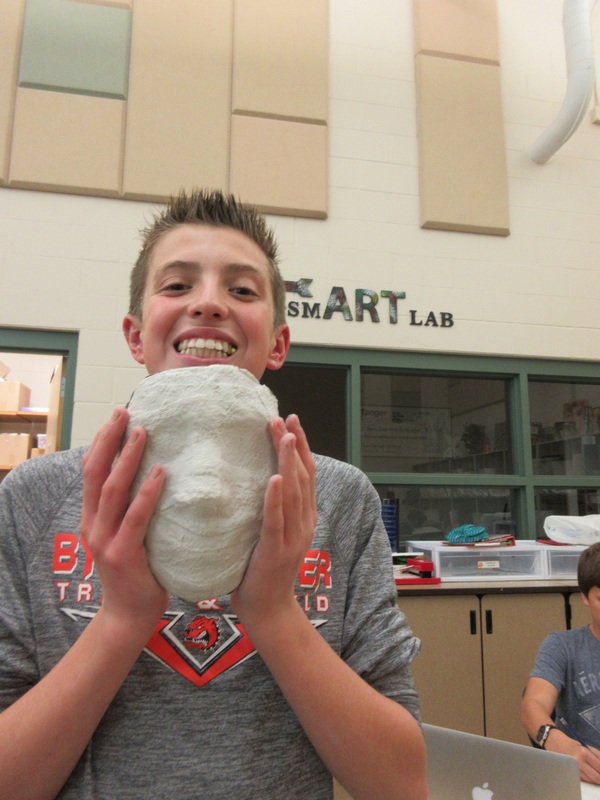
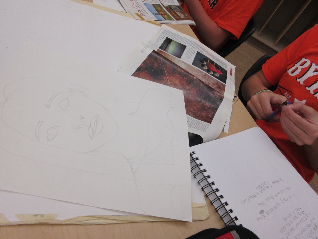
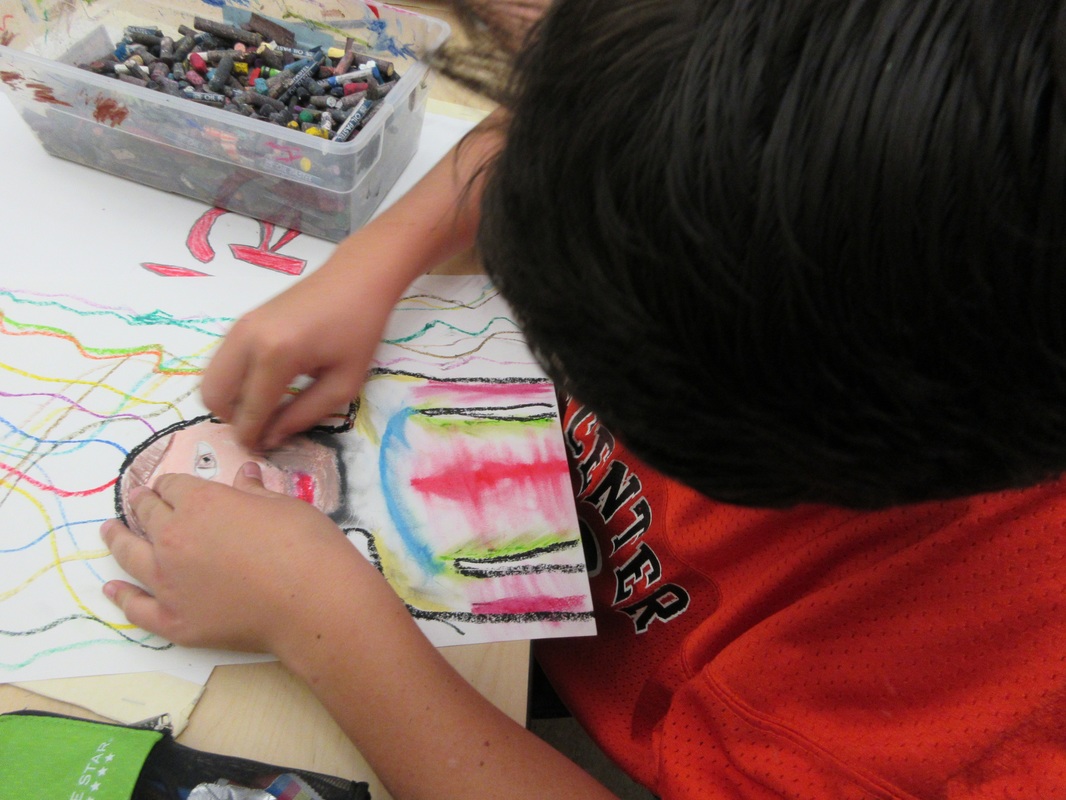
This week was just another chance for students to try new things, take visual risks, and work towards finding their own unique voice as they investigate ideas that can be found throughout Art history. Here are a few completed works to share:
This week was just another chance for students to try new things, take visual risks, and work towards finding their own unique voice as they investigate ideas that can be found throughout Art history. Here are a few completed works to share:
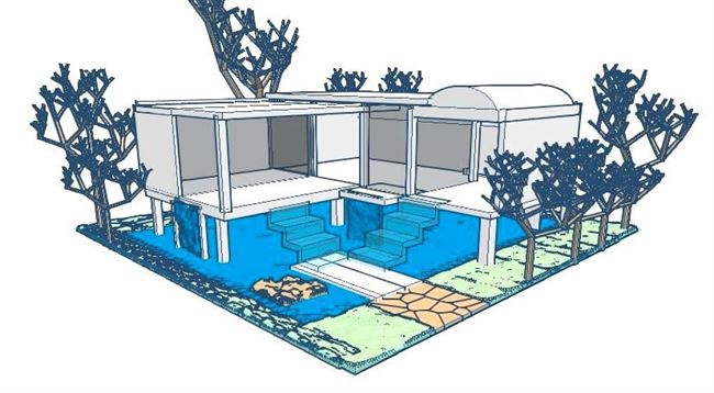
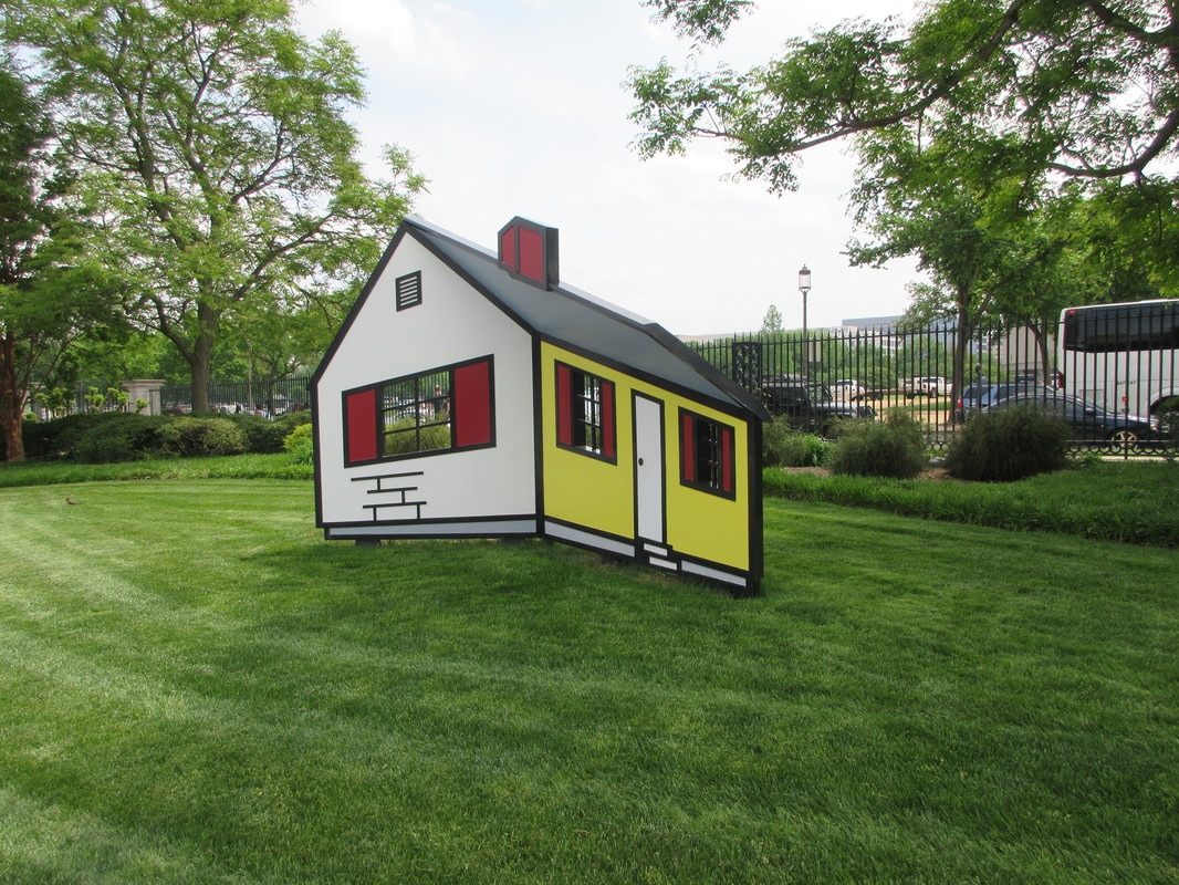
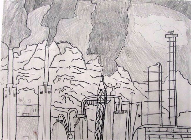
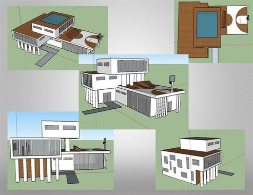
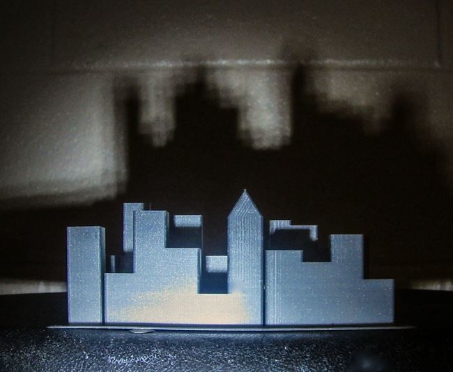
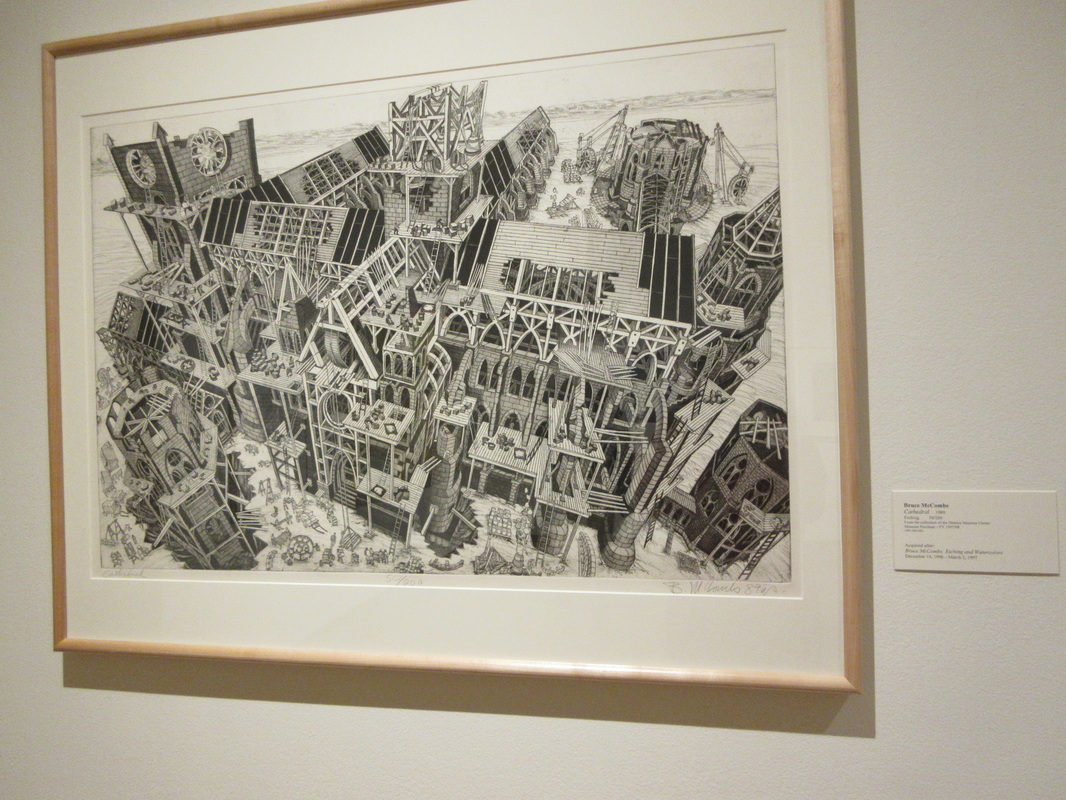
Cade: For this project I decided to 3D print a modern house. One artist my pace is similar to is Nathan Walsh. It is similar because both Nathan and this piece focus on buildings and architecture. We are also different because he decides to draw these building while I focus on designing and building them. One element I used was color. I used a white color to represent the house because most modern houses are built with white materials. Also I chose a smooth green color to represent the grass surrounding the house. Nathan also uses this in his work because he uses color amazingly. Nathan makes every single shade of color on his buildings seem so natural and reel. One principle I and Nathan use is emphasis. In my work I emphasized on the house in the woods and not as much as the woods around it. Nathan Walsh emphasizes all of the buildings in his art making them seem as real as possible.
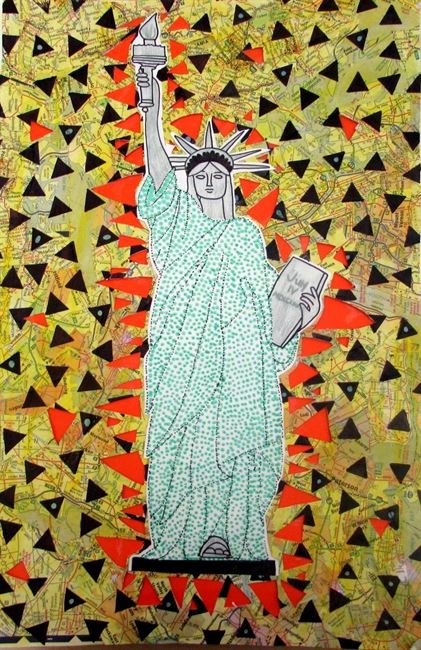
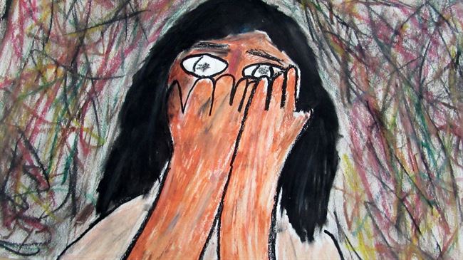
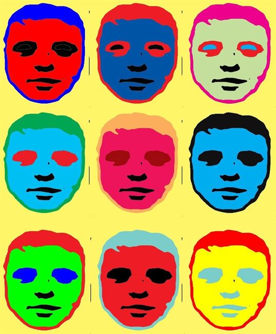
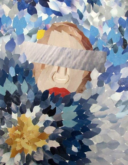
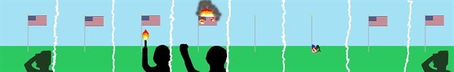
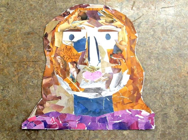
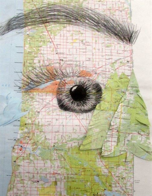
Chloe: I can compare my work to Georgia O'Keefe because she centered her skull in the middle of the painting which is similar to mine because I centered the statue of liberty in the middle. I also use the elements and principles of design in my work. For example I used shapes and texture. I used different size triangle as my shapes and then as the background I collaged pieces of map and the map was of New York and this represents my texture. O'Keefe also uses very bold colors just like mine.
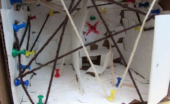
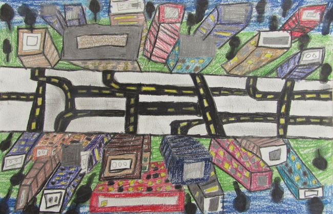
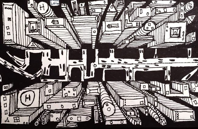
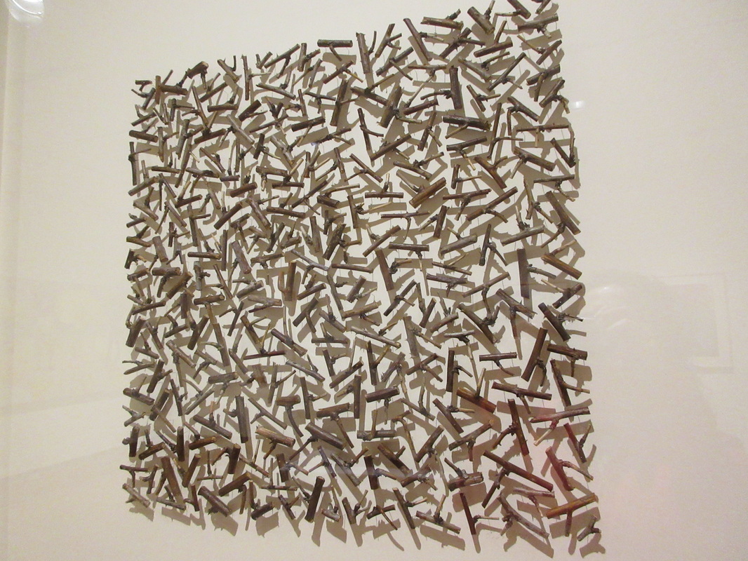
Khiem: I compare my art to Nathan Walsh art because he use a lot of line in one of his art and he also follow a certain patter. For example his art have line just like how my yard making a line that connect the memories. Another example is the pattern that i use . The pattern is the piece of paper that scattered around the room it goes from a lot to less and his go to two vanishing point. The reason that I use paper it because I want to remember what I use to do.
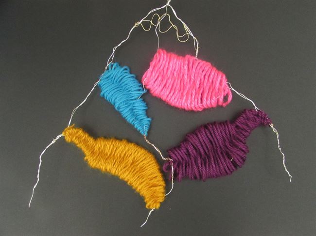
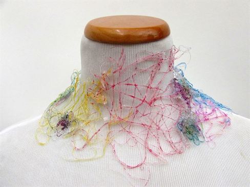
Lindsey: In this artwork, I chose to use these materials because I have not used them before together. I used the wire by forming it into the shape of a mountain and then I wrapped the different colors of yarn around the wire until it made a pattern that I liked. These materials helped me to communicate my ideas by showing depth and details rather than just creating an outline of a mountain. This artwork compares with Ansel Adams work because in his images he uses mountains, but it is different from his work because he doesn't have any color in his work. One detail that compares to Ansel's work is that the yarn on it shows depth and in Ansel Adams work he uses shadows that also show depth and add detail.
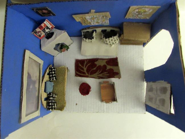
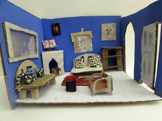
Oliver: I used a lot of different materials to make a smaller scale version of my living room because this is a space were I spend a lot of my time and I could make a lot of small details. My art work compares to Nathan Walsh's art because it is a 3D art peace of some wear like a my living room. This contrasts to his work because it is made of different materials.
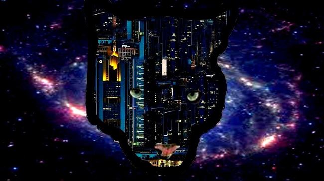
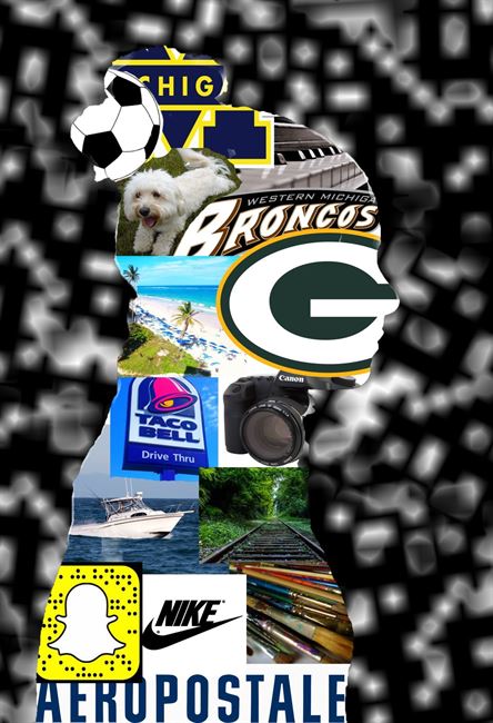
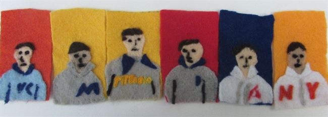
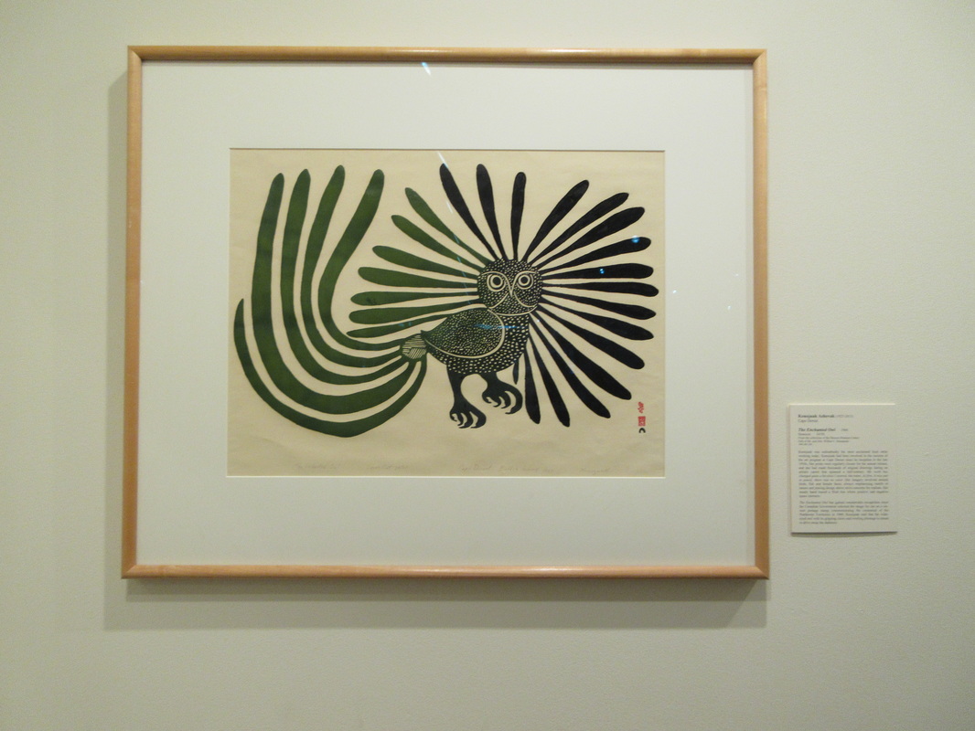
Ashtyn: For this art piece I choose to use Photoshop, because I could not figure out how to put spaces and place on paper without using collage. This art piece is kind of similar to David Hockney because he uses Photoshop in his work. Another way my art work is similar is we both have nature in our work, mine is the Cougar, and the space background.
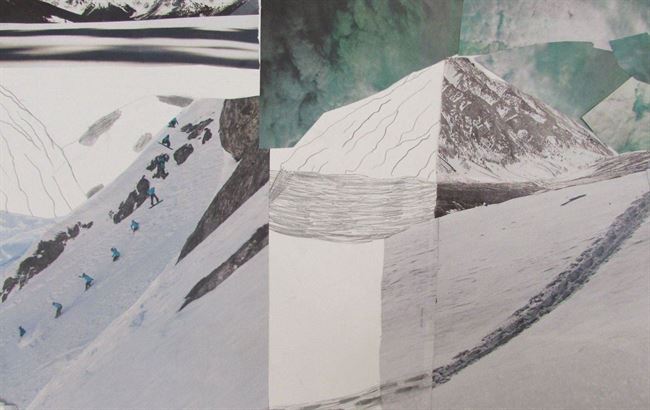
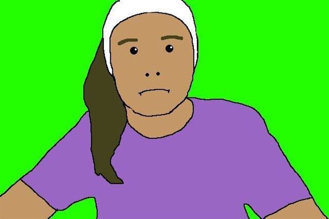
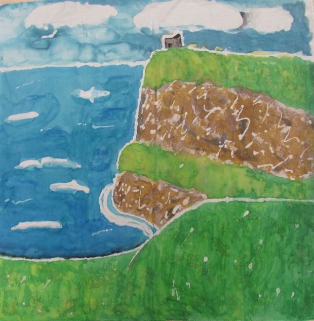
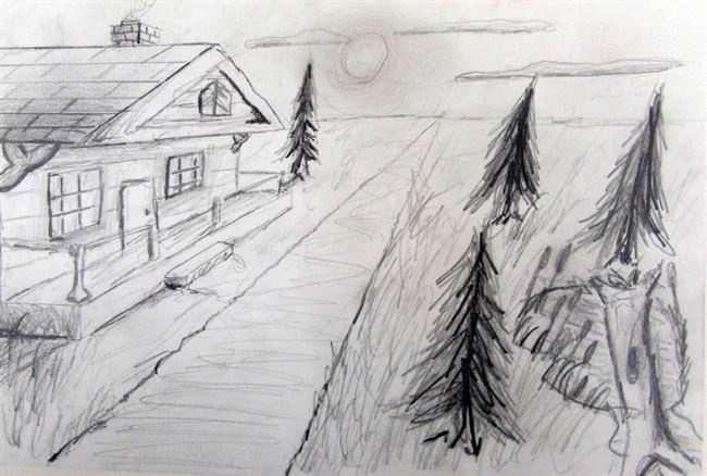
Ellery: My work relates to the artist Ansel Adams's artwork the most because we both have mountains in our pieces. Our works are different because in his pieces he takes real like photographs, and I use pictures and drawing skills to create my work. Ansel uses color in his work to create a shade, whereas there is some shade in mine but it is mostly just regular shapes. I chose the materials I did because I thought it would be a cool idea to see the contrast between the real thing, and a drawing. I also like the unity that is shown in my work between all of the mountains in the different grounds. In total, this was a fun project.
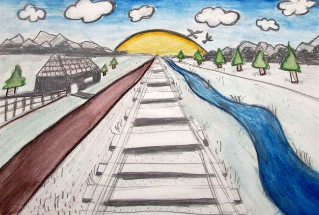
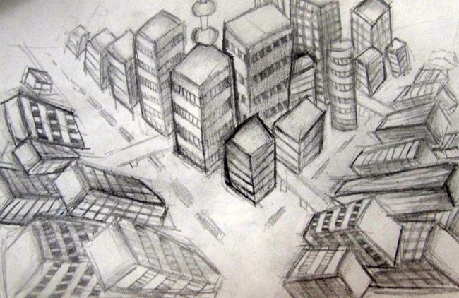
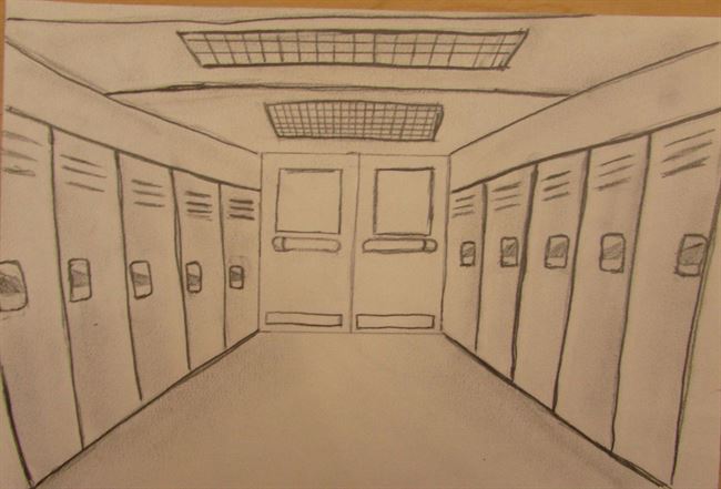
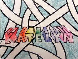
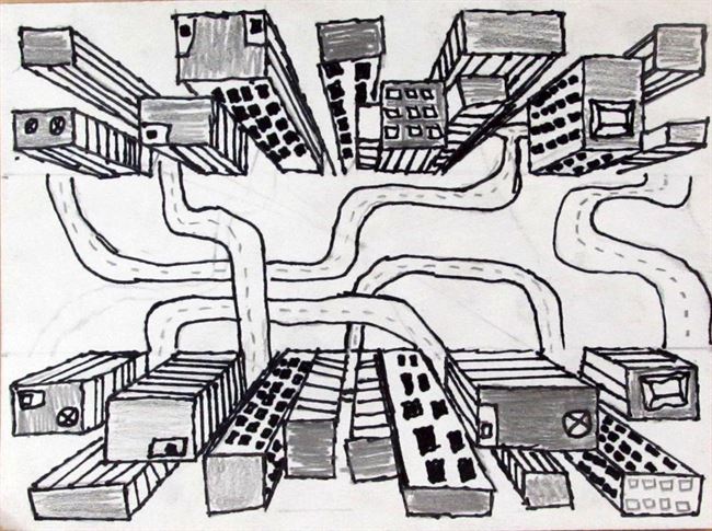
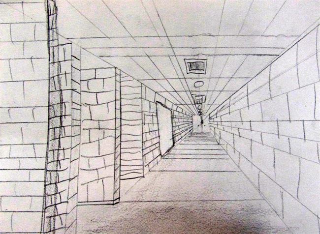
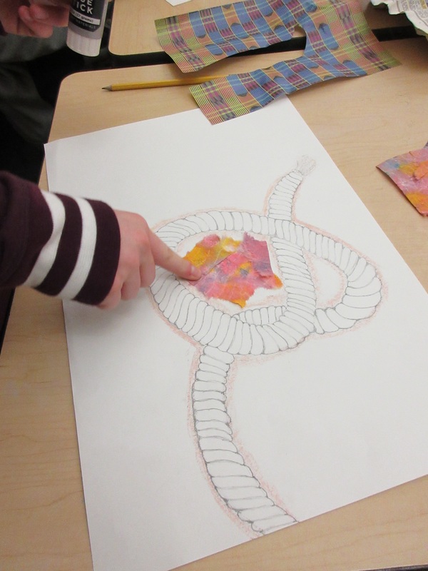
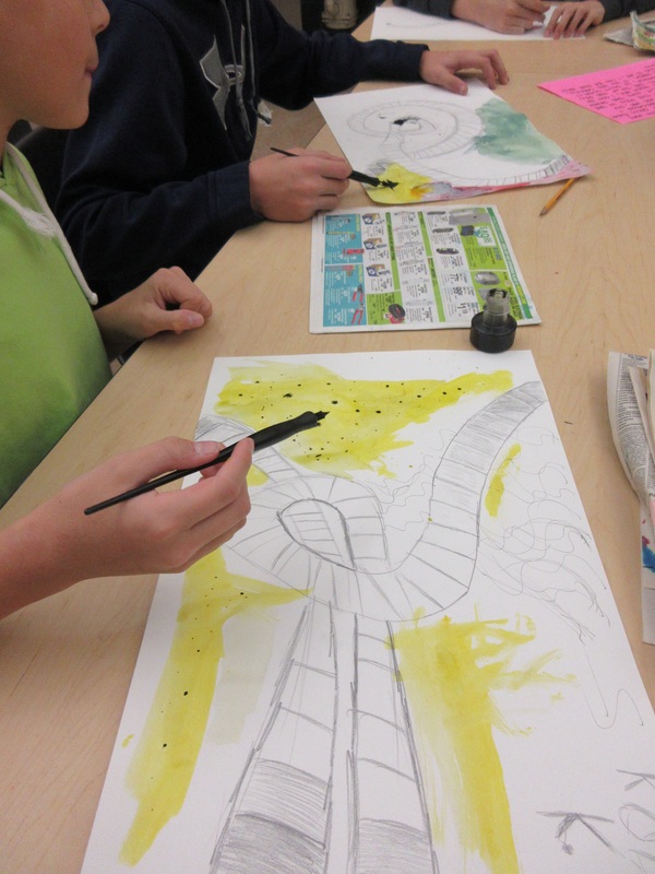
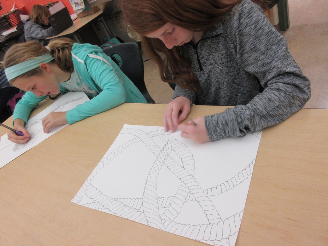
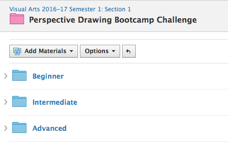
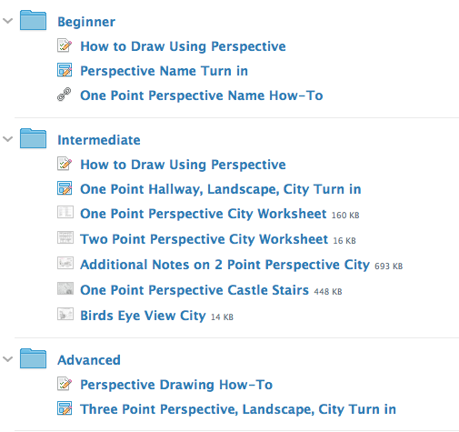
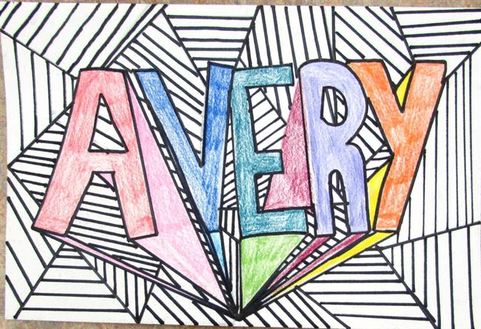
Perspective Drawing Challenge
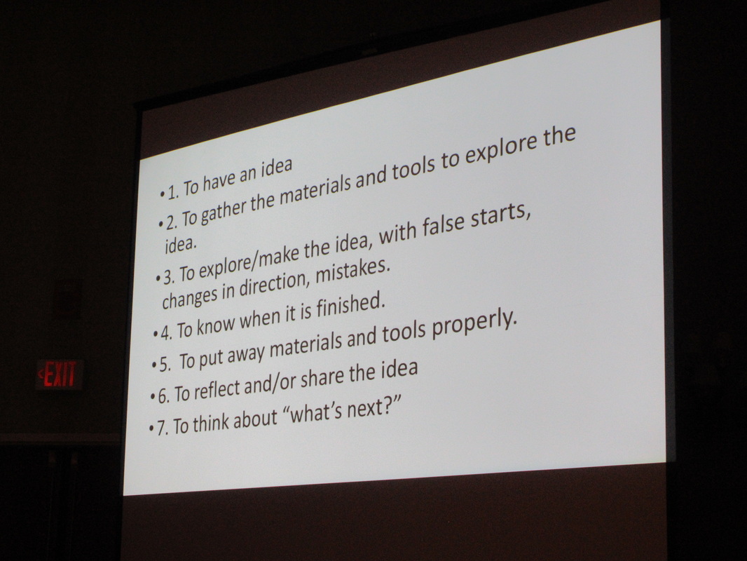
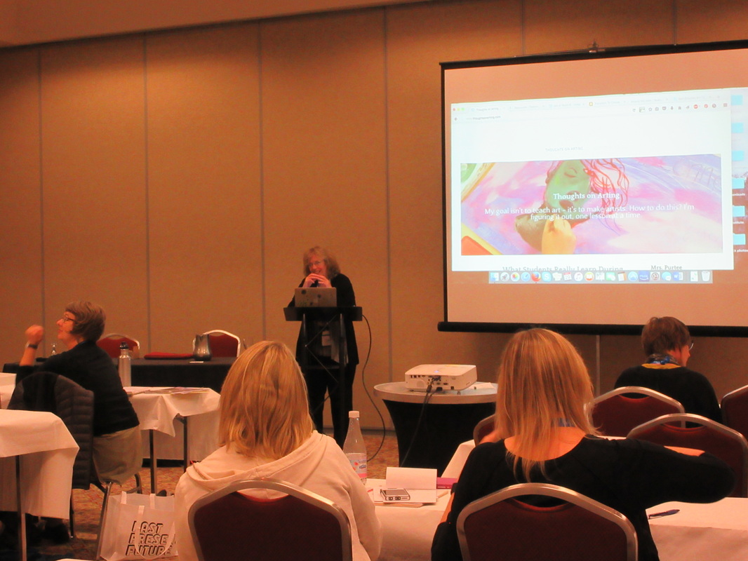
While I was away at MAEA last week, students worked on finishing their perspective drawings using a variety of tutorials and options posted on our Schoology page. I divided types of drawing exercises into beginner, intermediate, and advanced choices that they could select and create their own works from. With the help of the wide range of videos posted on The Circle Line School's YouTube page, my students were able to complete this challenge while I was away. This week, they finally posted the works to Artsonia. Here are a few to share:
Makenzie
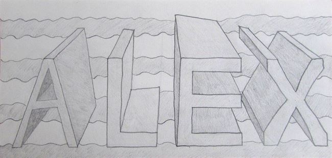
Alex
Kalynn
Reese
Ellie
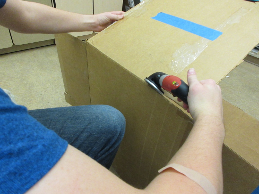
Can I do this for real?
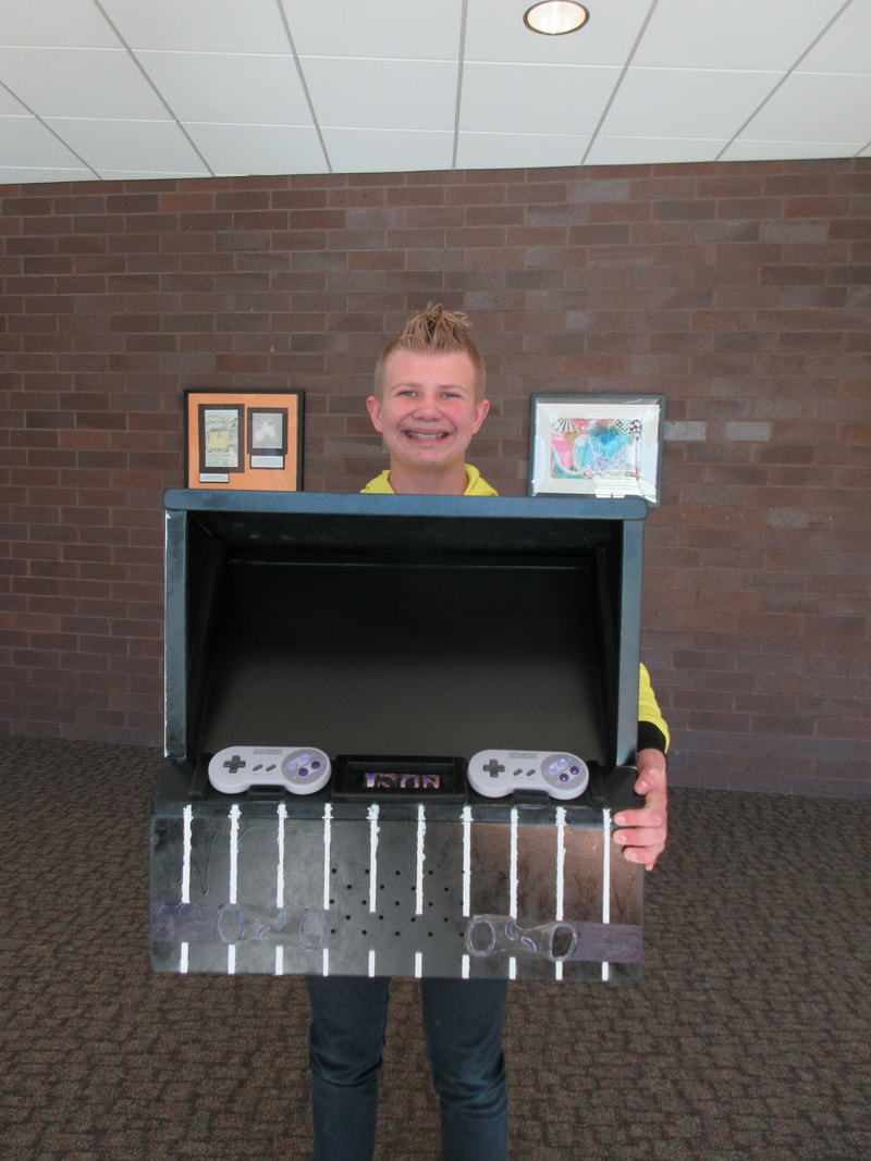
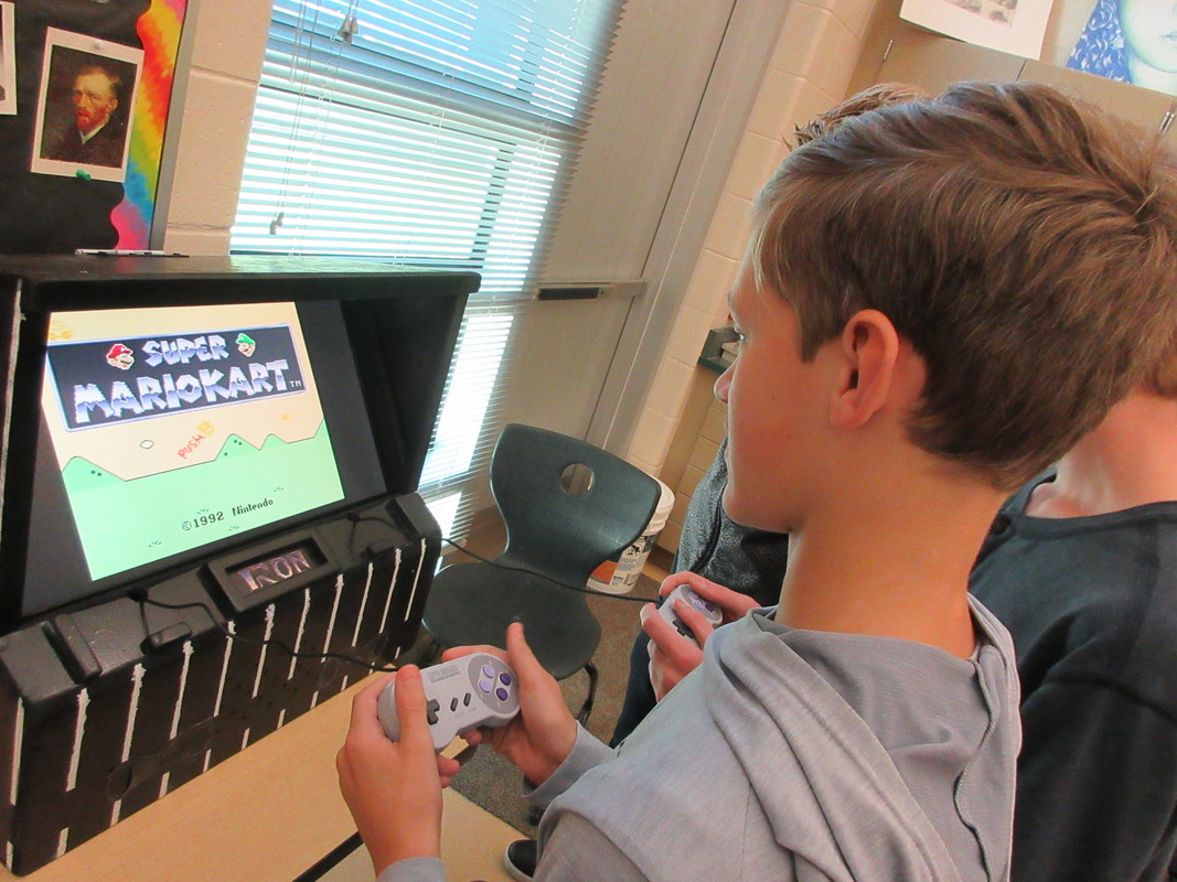
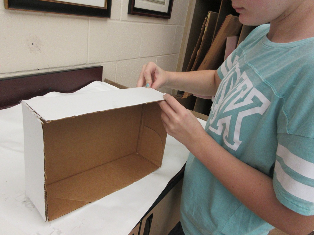
Earlier in the spaces and places project, I had a student start to create a cardboard arcade machine. They went home, talked with their dad, and came to school the next day asking me if they could make a real one at home and bring it in. I did not see why I should say no to such a request, so I gave it the green light and asked for the piece to bring it in when it was finished.
I wasn't sure what to expect as this student shared updates about the progress over the week, but it was awesome to see the end result when he brought it in on Friday. Not only did it look amazing, but it worked and students were able to play it.
It was fun to see so much energy around a work of art and I hope that his willingness to try something a little beyond the normal approach to a project will show others that doing so is not only okay, it is celebrated.
This is a great start to the second marking period. I look forward to seeing how we finish the term, especially as we start to gear up for competition season.
Stay tuned as we start to share more and more works getting ready for competition.
Stay tuned as we start to share more and more works getting ready for competition.


 RSS Feed