BCWMS VISUAL ART & DESIGN
Follow me
  • Creations
  • 2011-2018
  • ArtPrize Entry 2017
  • ArtPrize Entry 2018
  • Souper Stuff

Week Twelve and Thirteen

12/1/2017

0 Comments


Thanksgiving Week

Picture
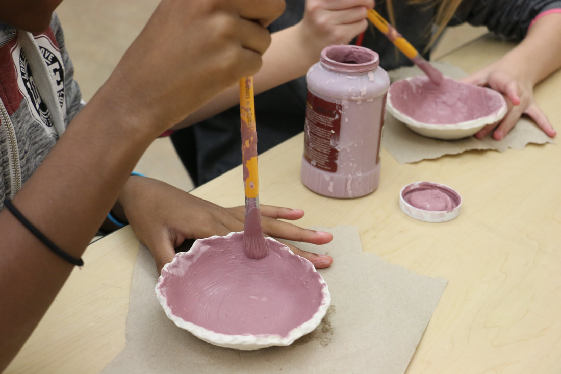
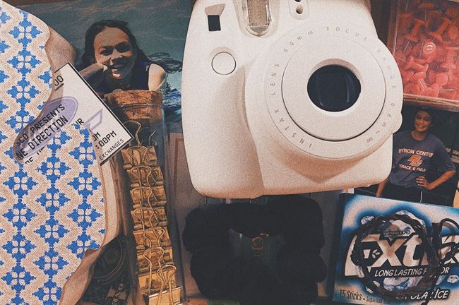
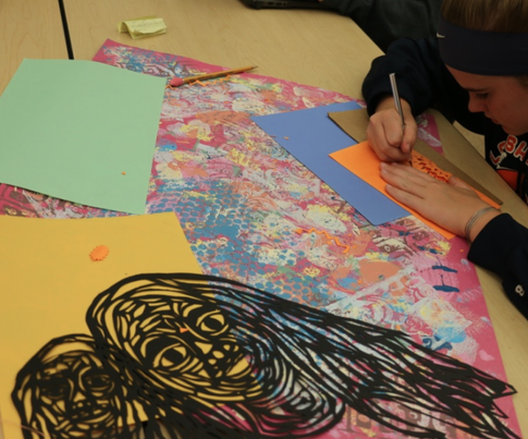
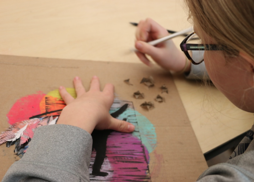
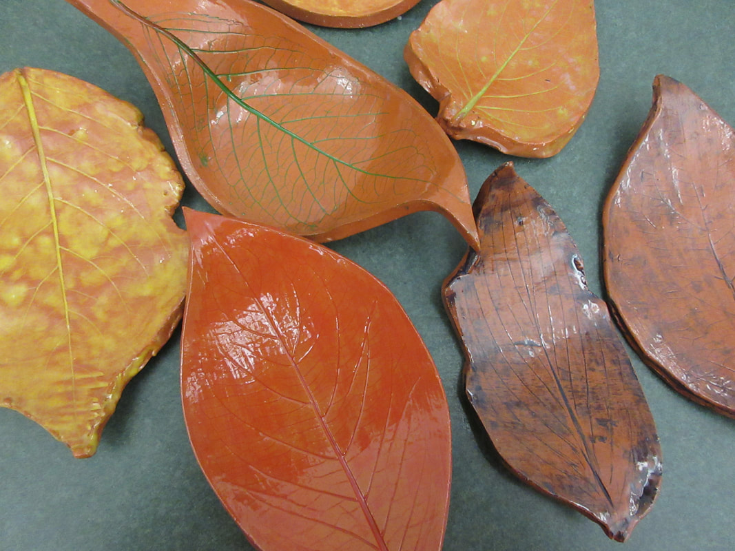
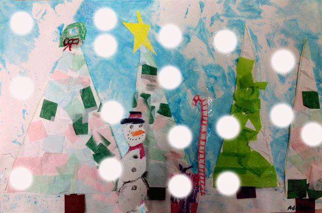
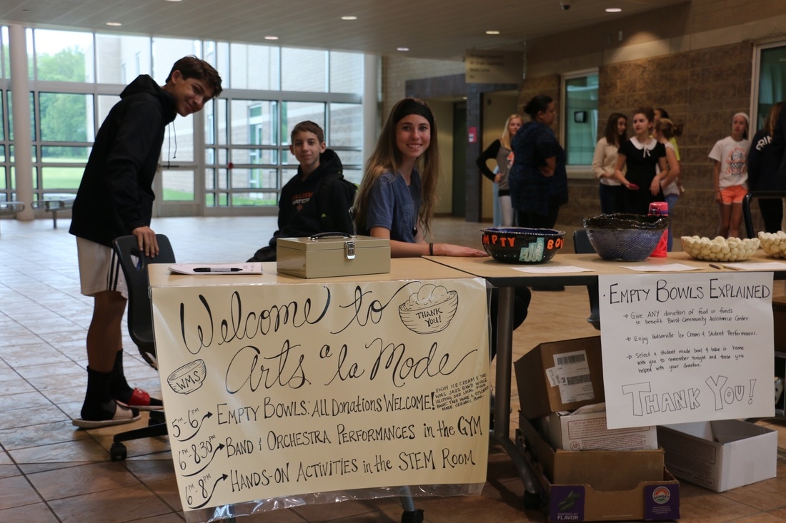
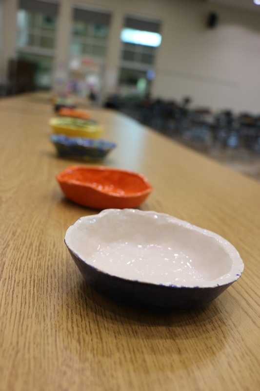
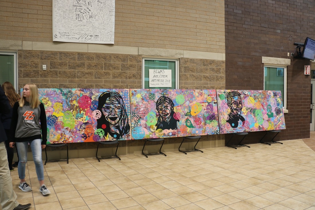
Because Thanksgiving week was only a two day school week, I decided to take a break from the weekly post and push the last two weeks together. The two days we spend together before break were filled with glazing bowls for our spring Empty Bowls event as well as critiquing our own work and prepping pieces for show at both The Van Singel Fine Arts Center for the month of December and at Barnes and Noble for our school Book Fair next weekend. 
Picture
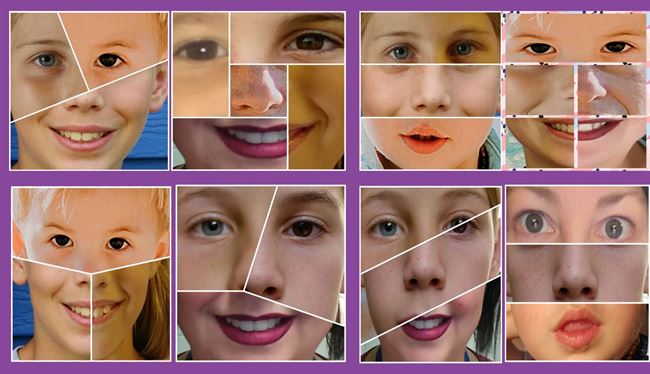
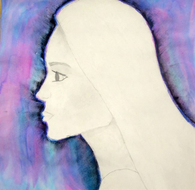
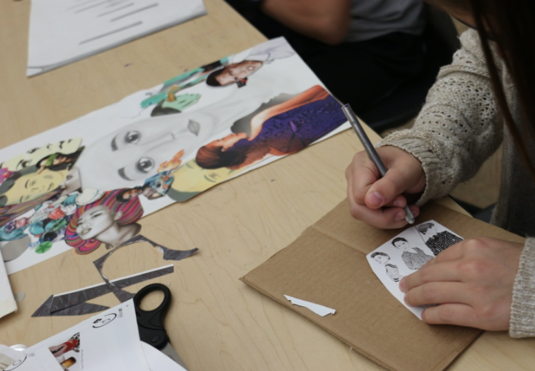
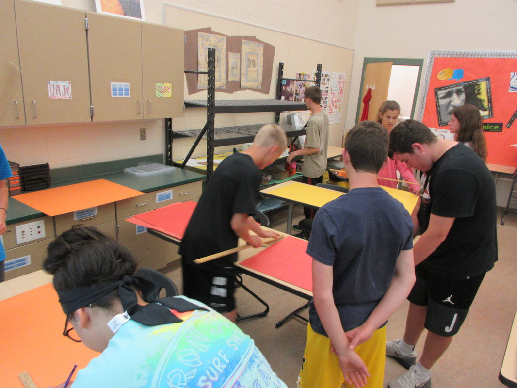
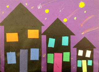
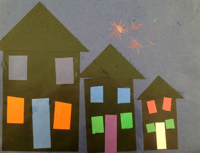
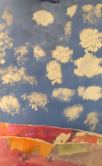
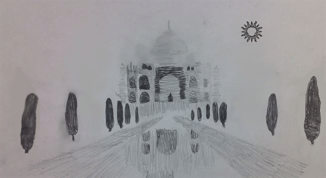
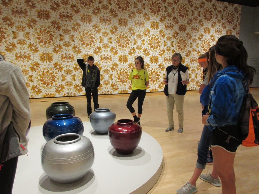
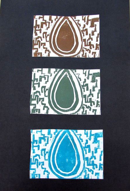
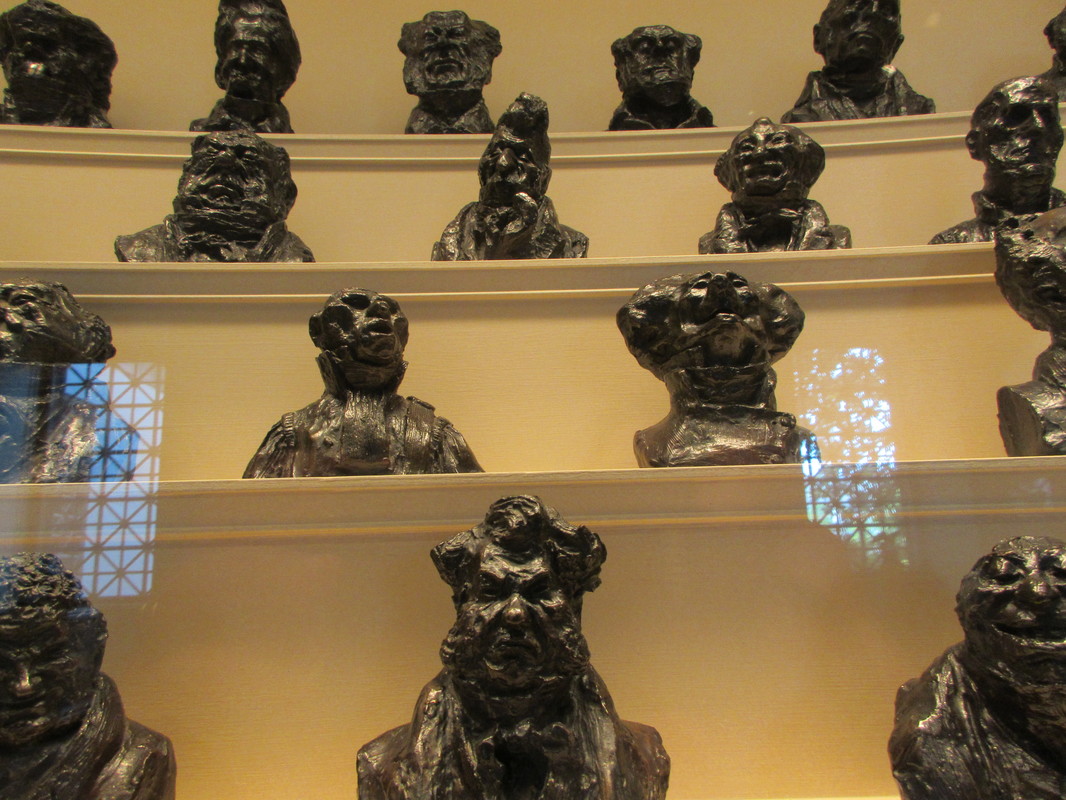
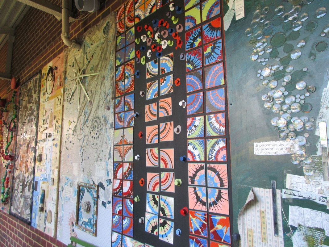
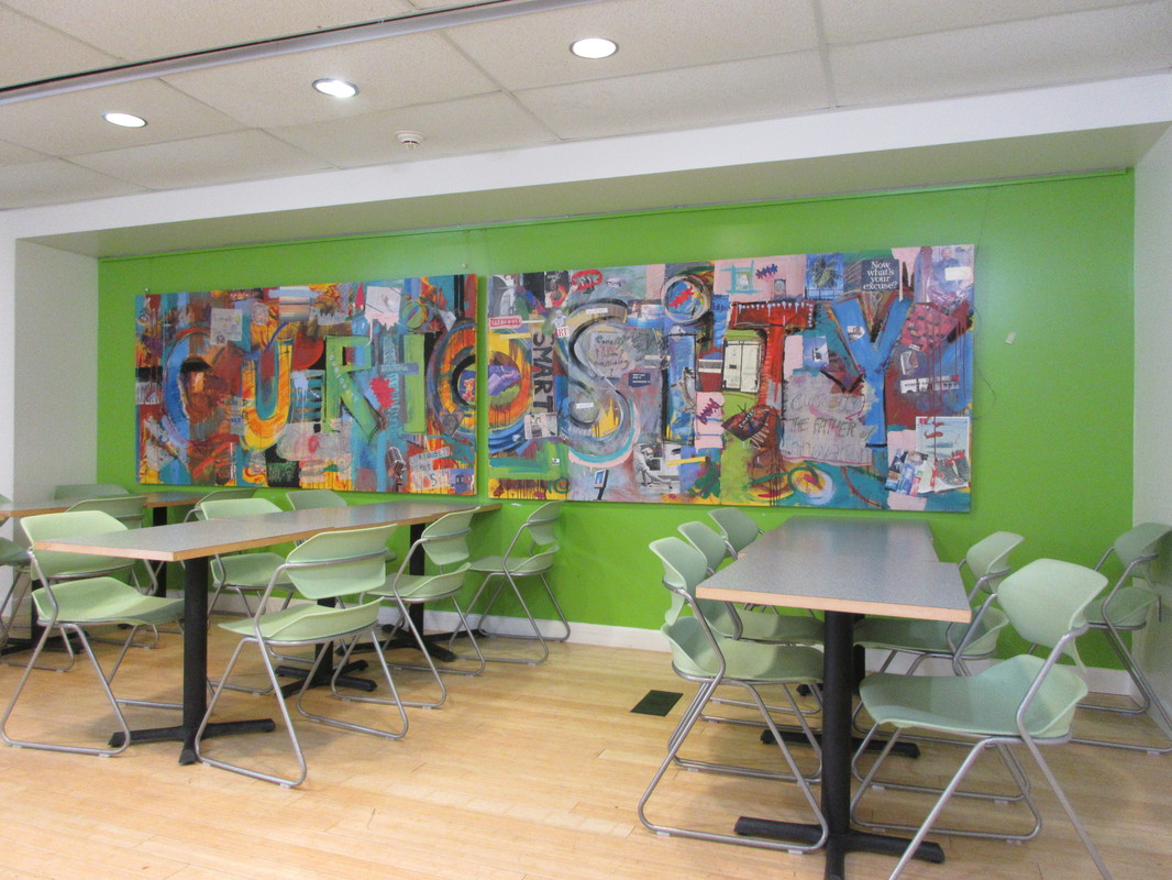
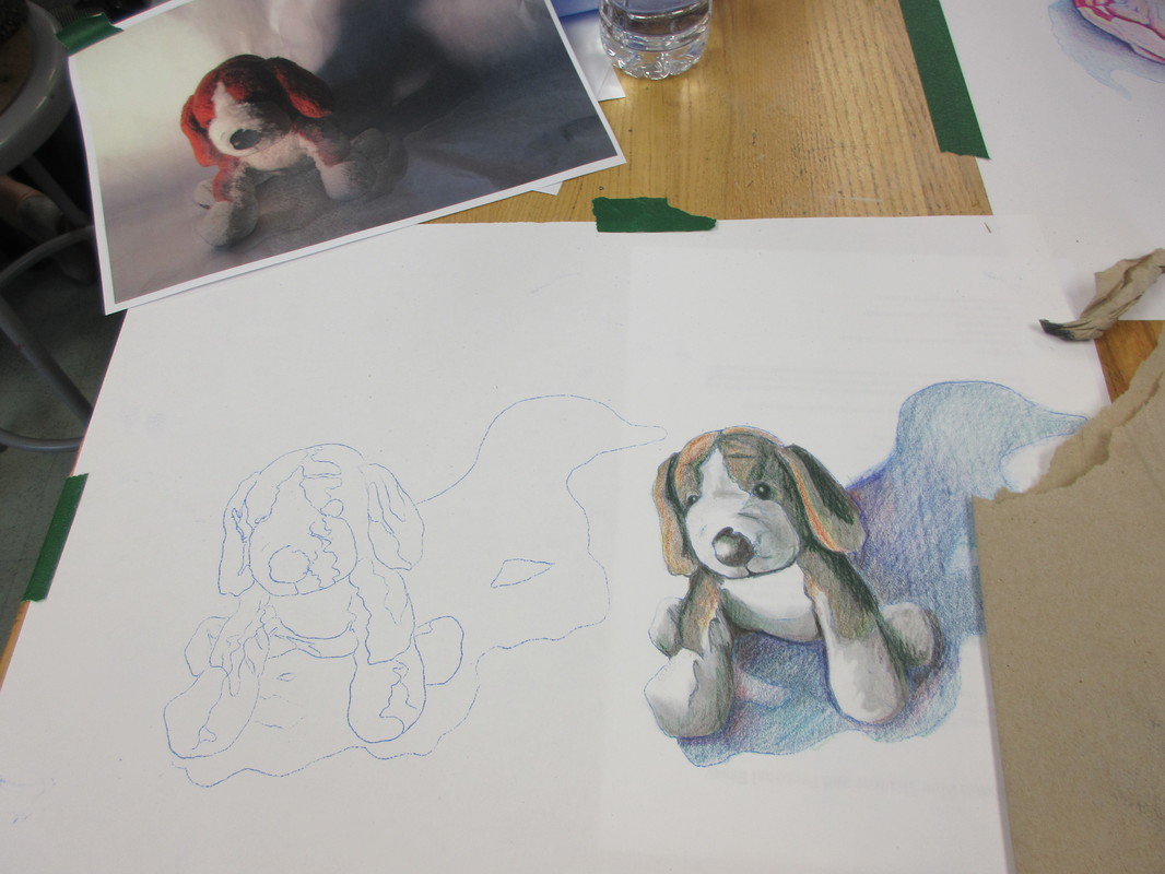
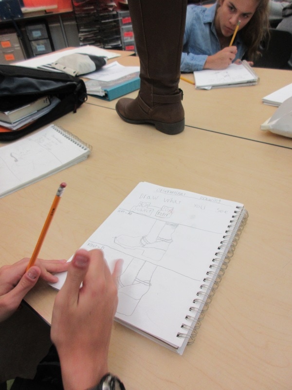
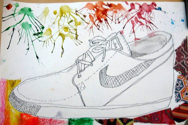
When selecting which works they would like to have considered for show, I have students sort their portfolios through a GAP process (make a good pile, an average pile, and a poor pile). Once done, they pick the best of the good and the worst of the poor to compare and contrast with a Venn Diagram. 

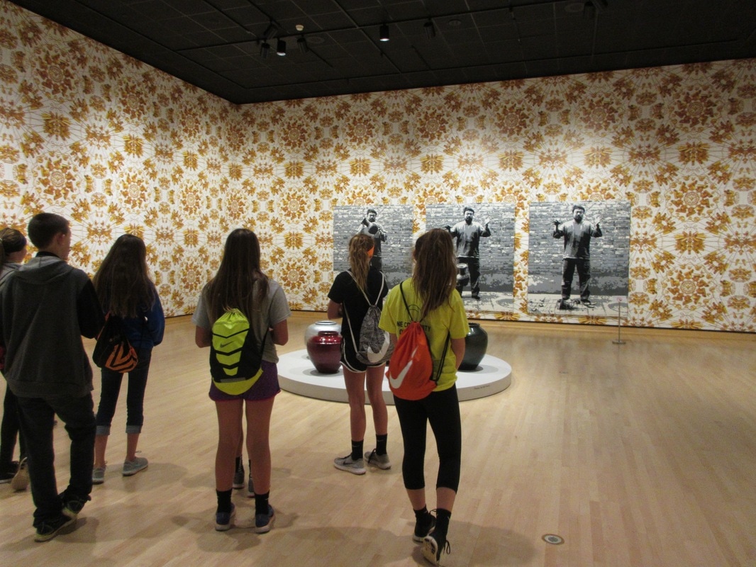
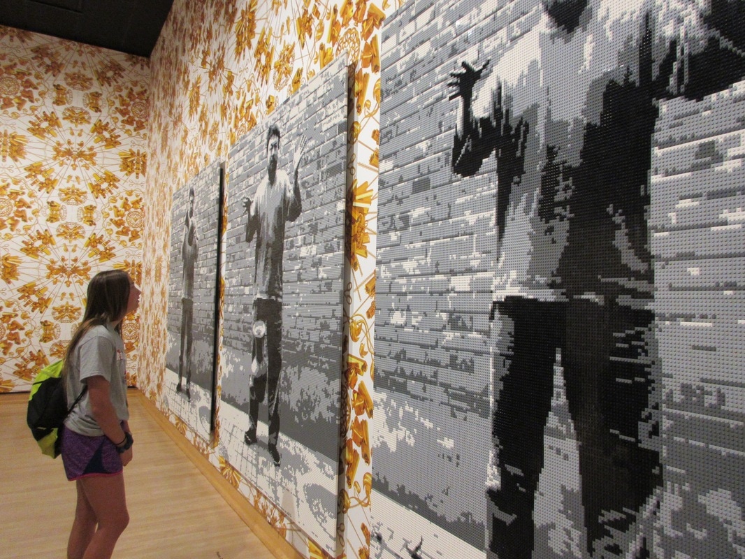
Afterwards, students do a gallery walk to see what others considered to their their best and worst works and discuss whether or not it was easy to tell the difference. This is a great introduction to personal aesthetic and how we view pieces not only based on how they look, but the experience we have with them. 
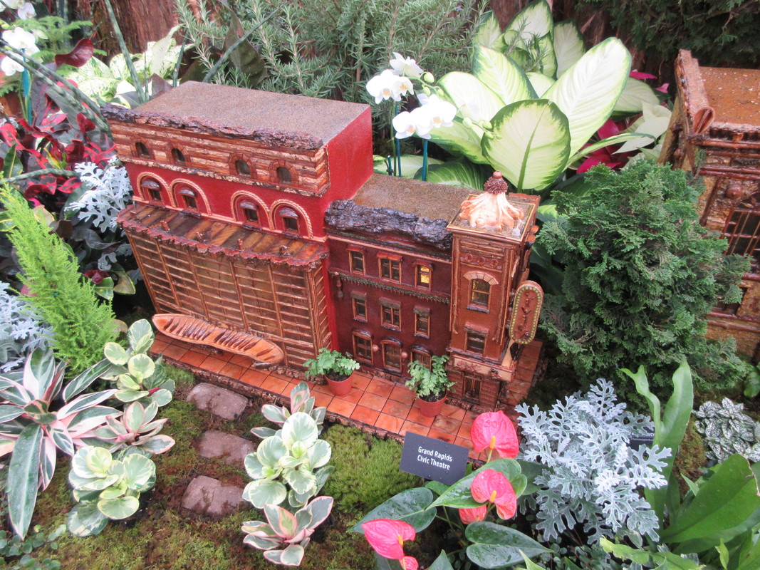
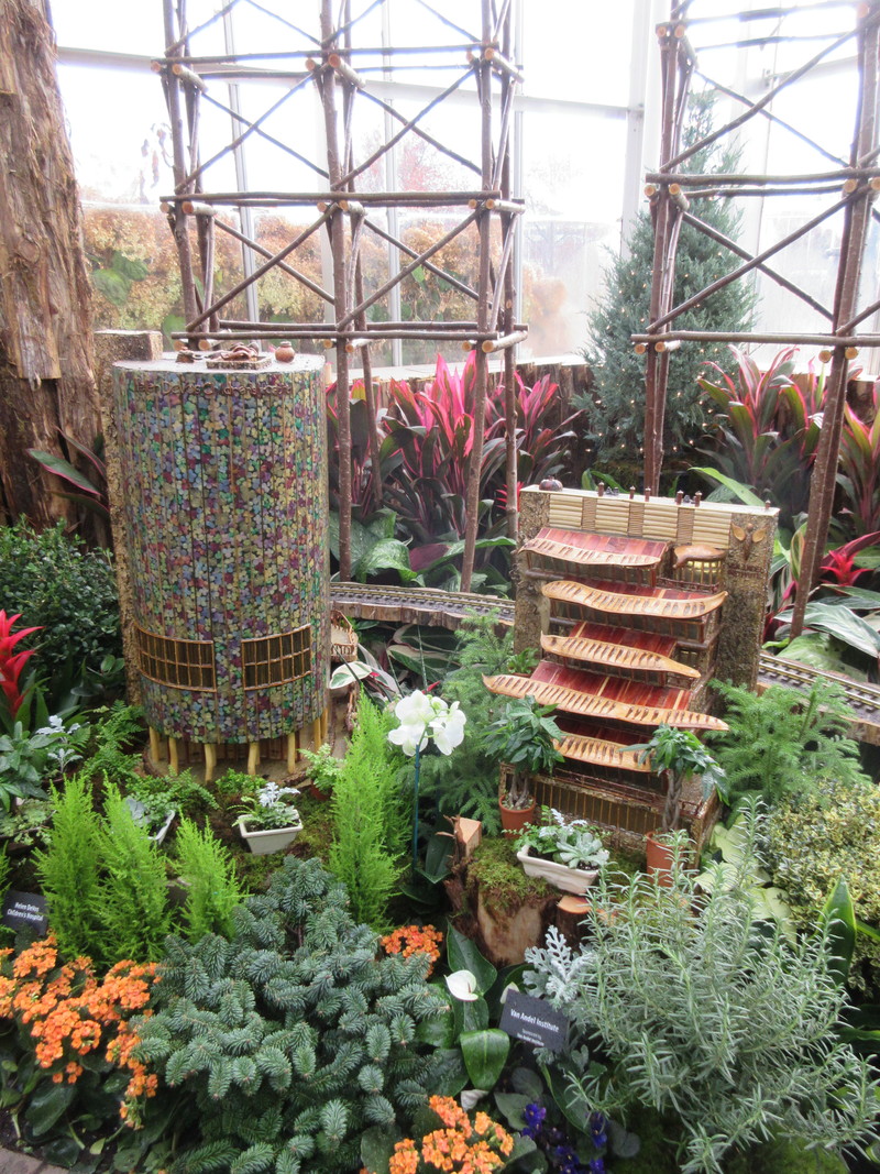
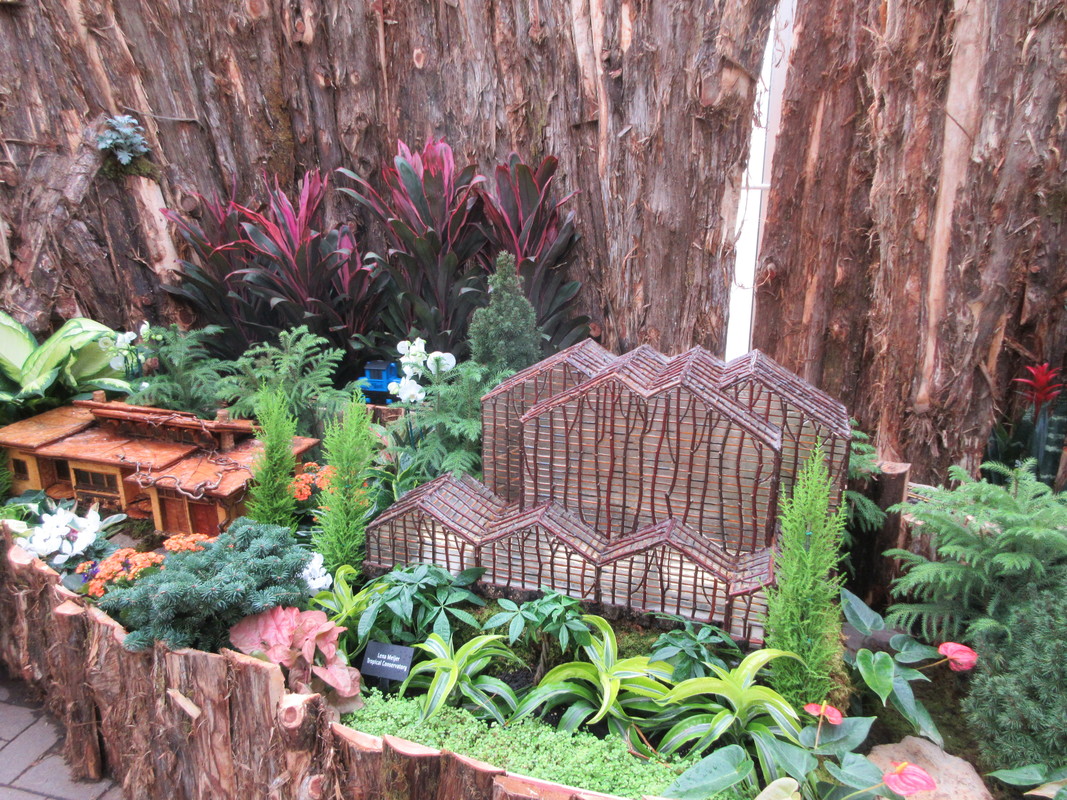
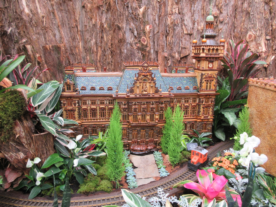
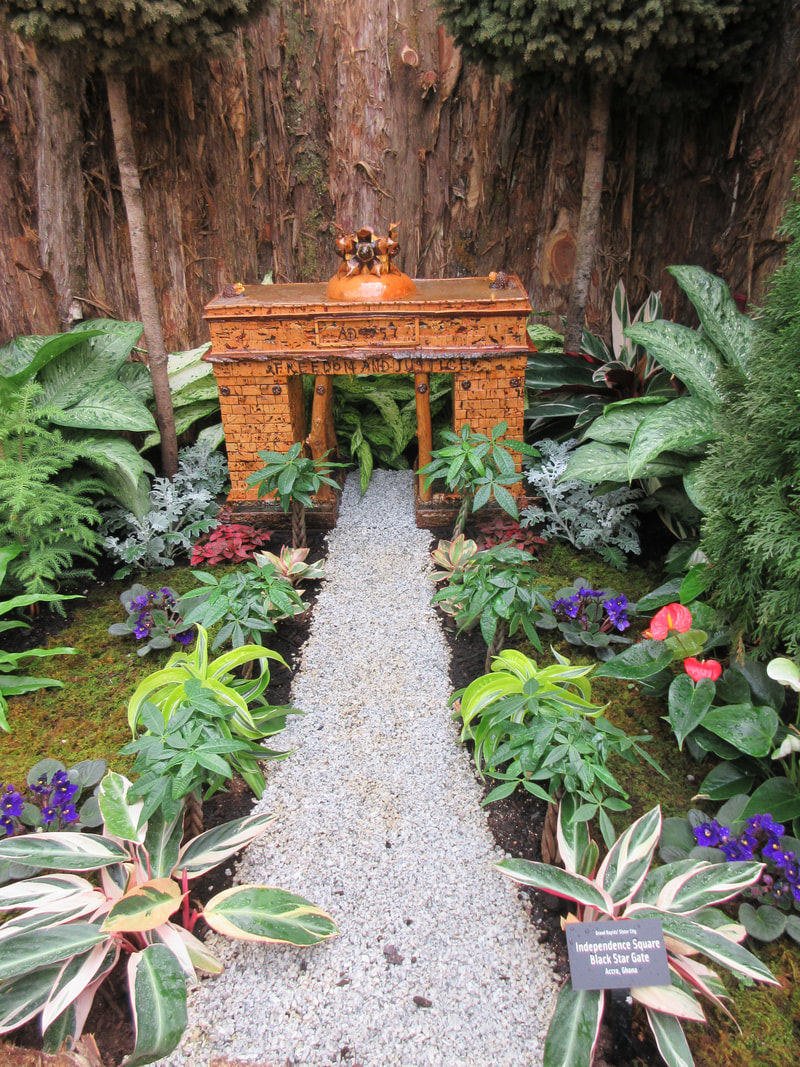
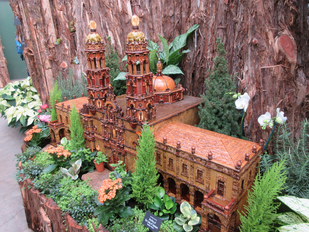
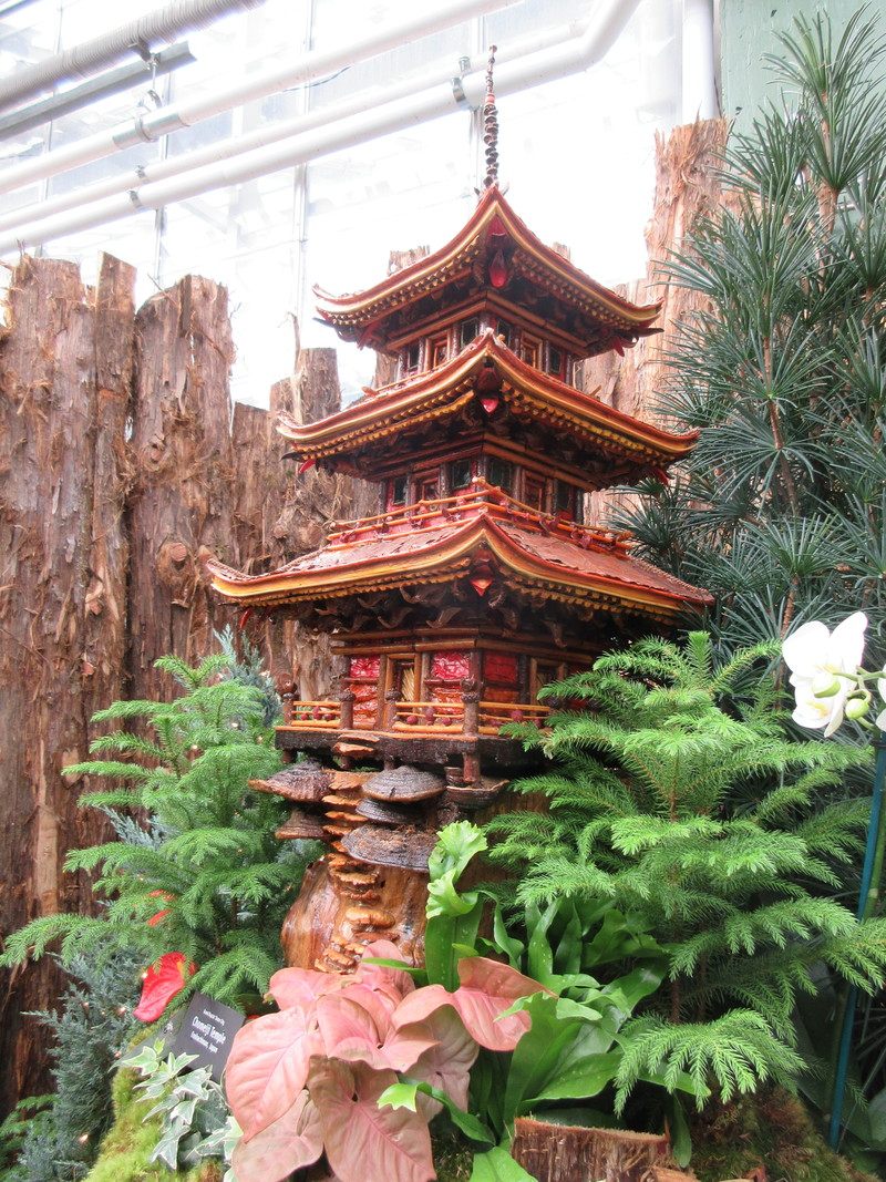
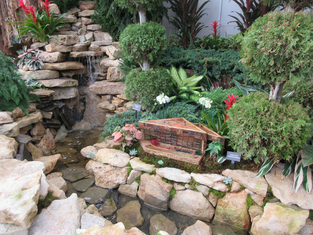
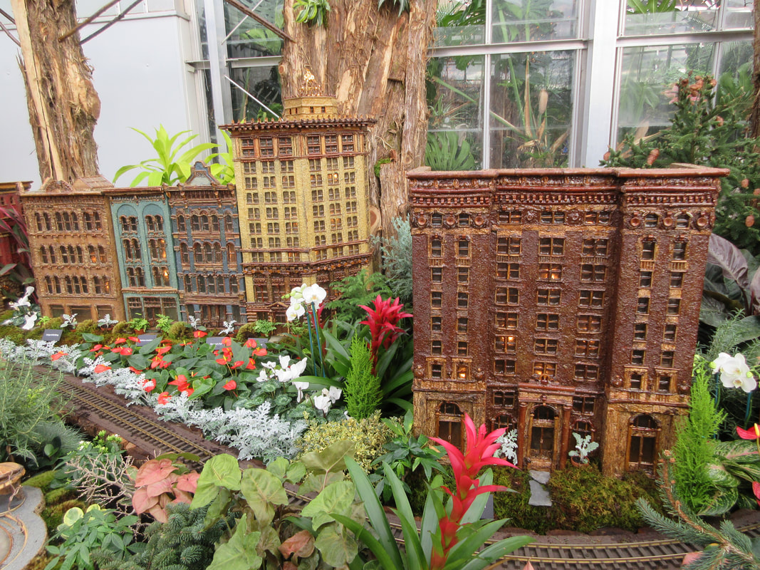
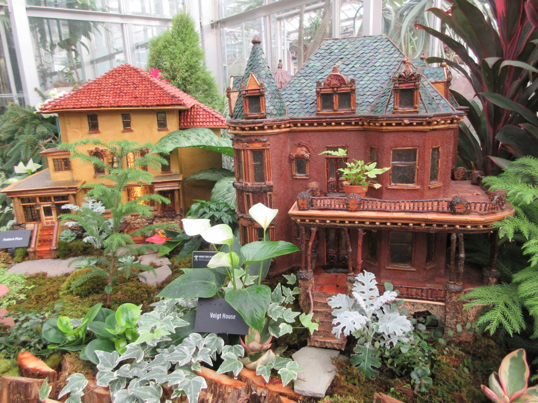
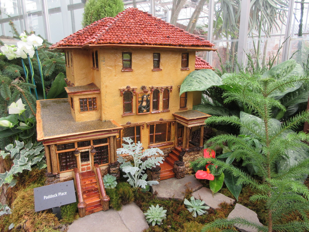
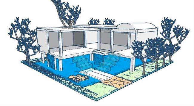
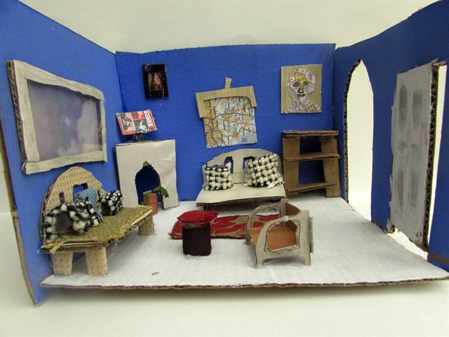
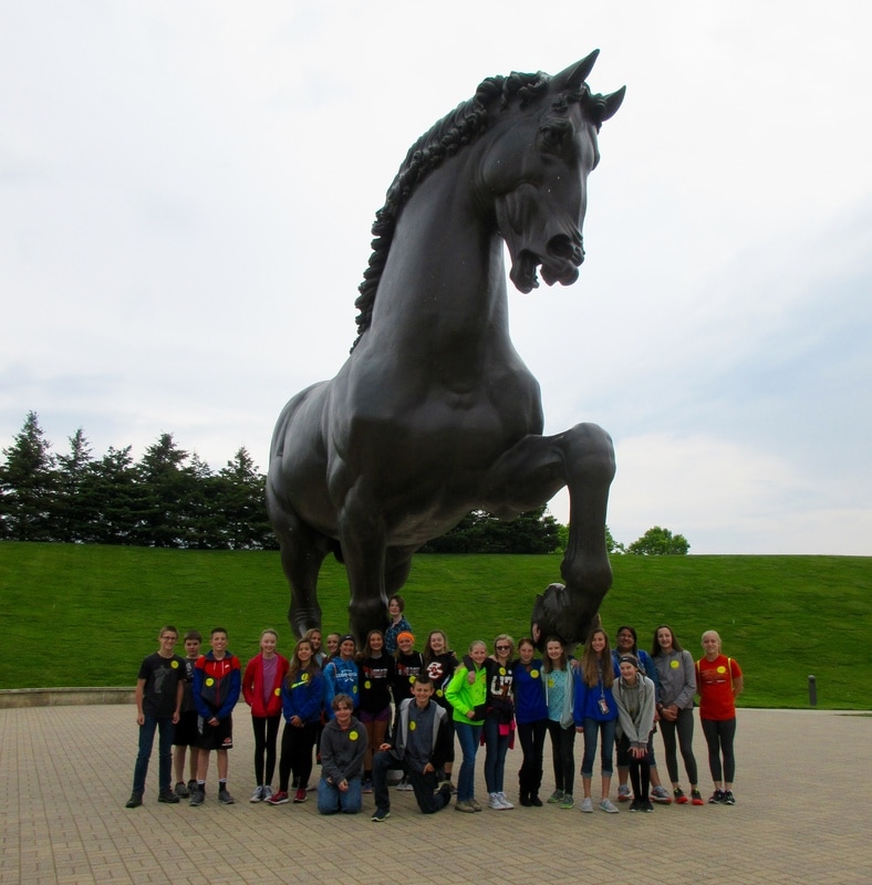
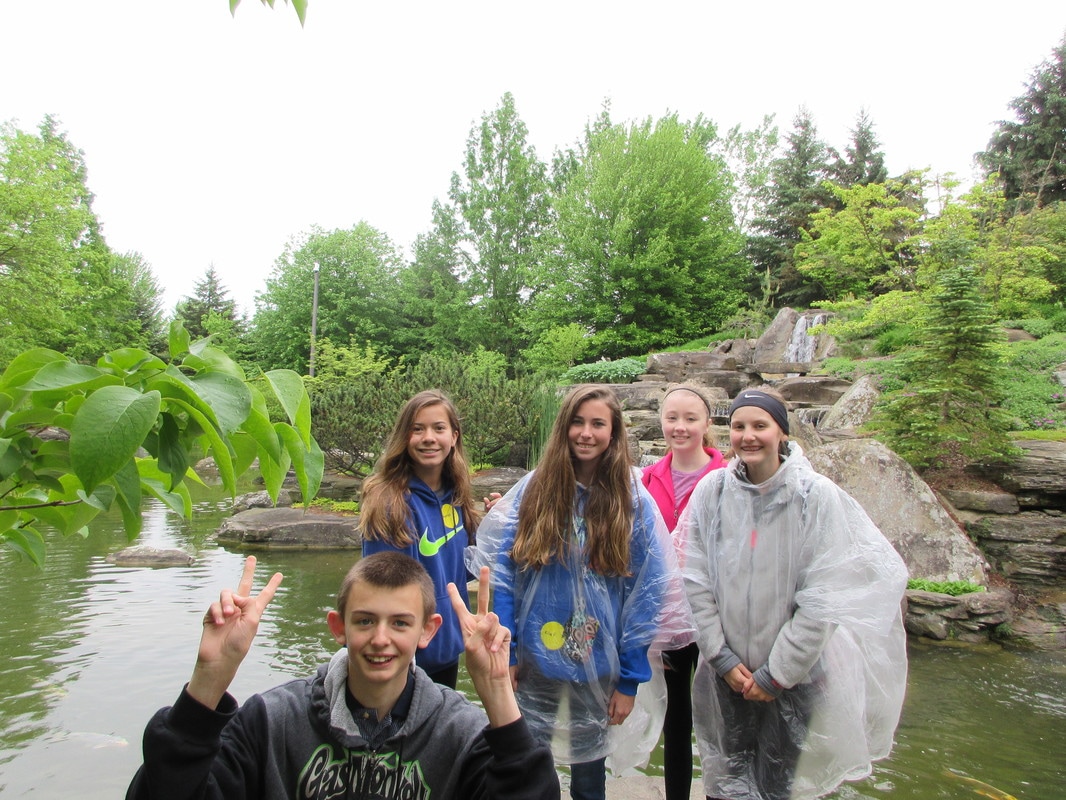
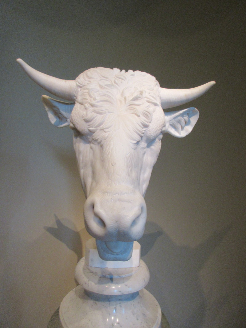
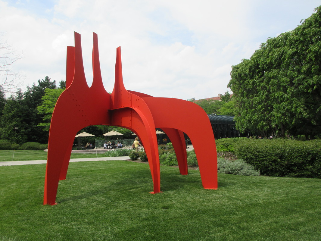
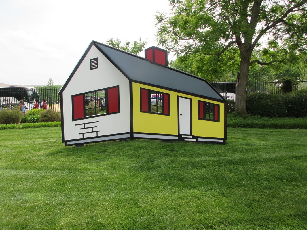
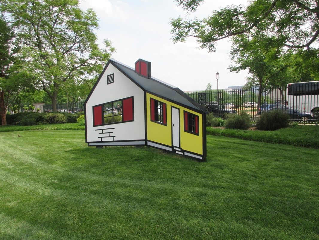
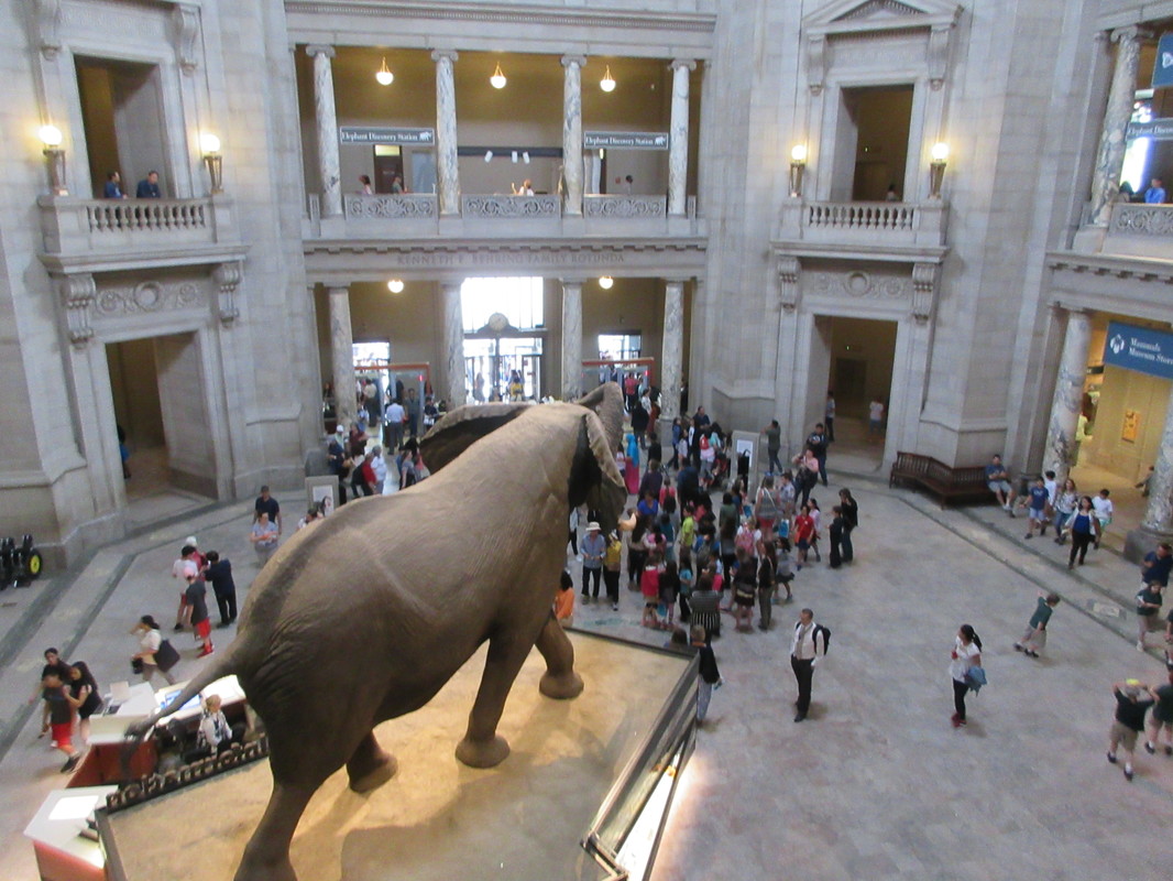
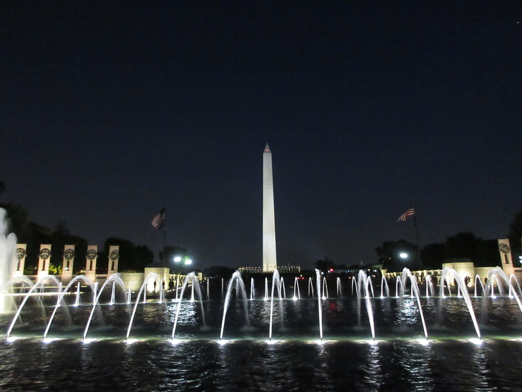
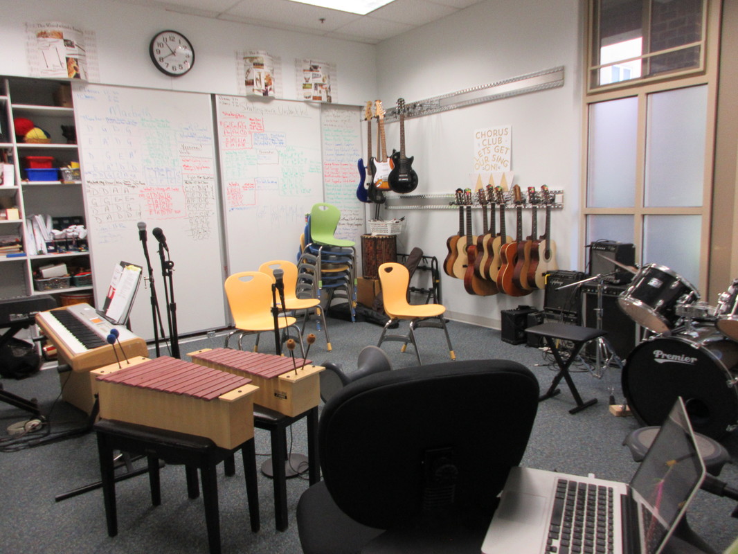
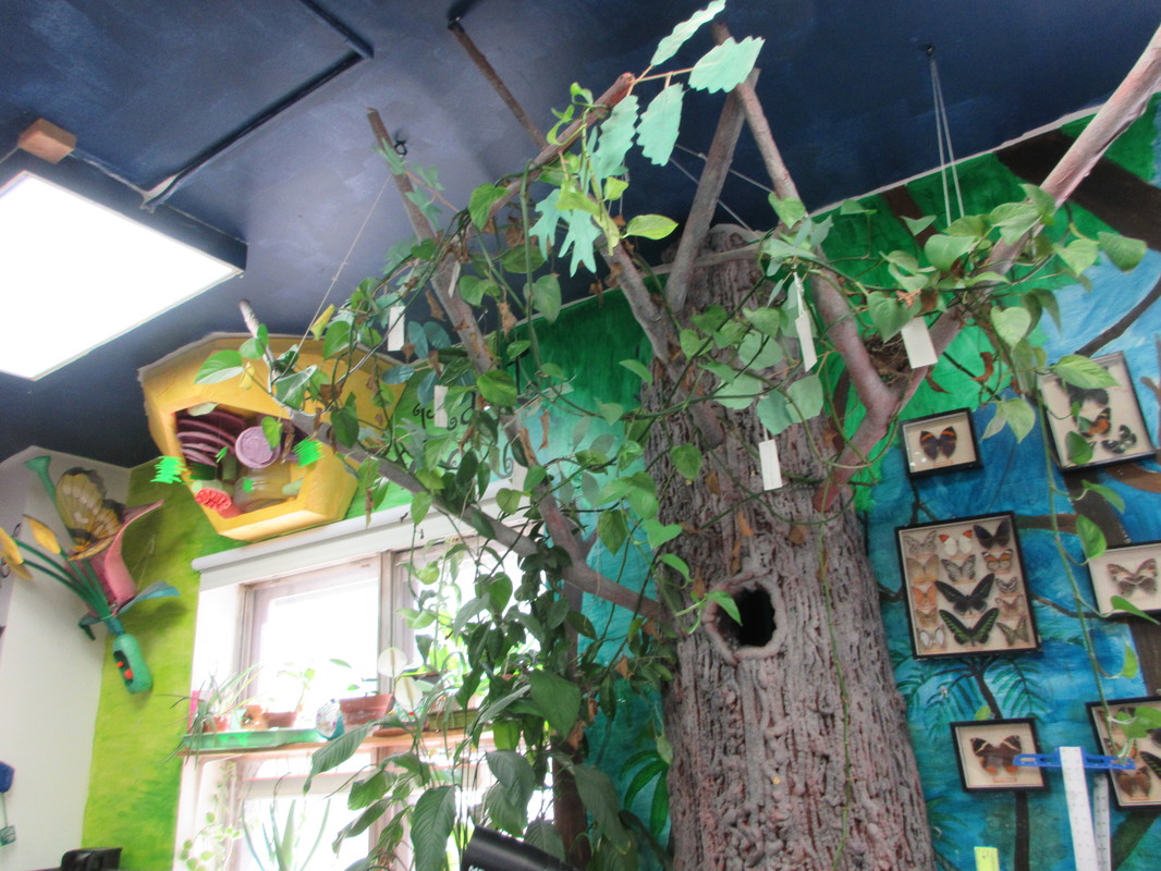
I like to travel, but this year I stayed close to home for the holidays. I did, however, make sure to go to The Frederik Meijer Gardens and Sculpture park and view their awesome holiday displays. I cannot wait to share these little houses and architectural pieces from above with students in the spring when we create our own models for a STEAM collaboration. 

Finished Challenge 3

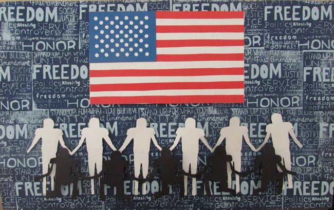
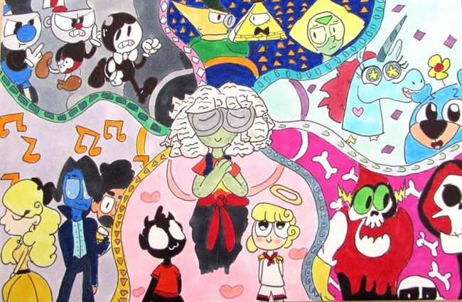
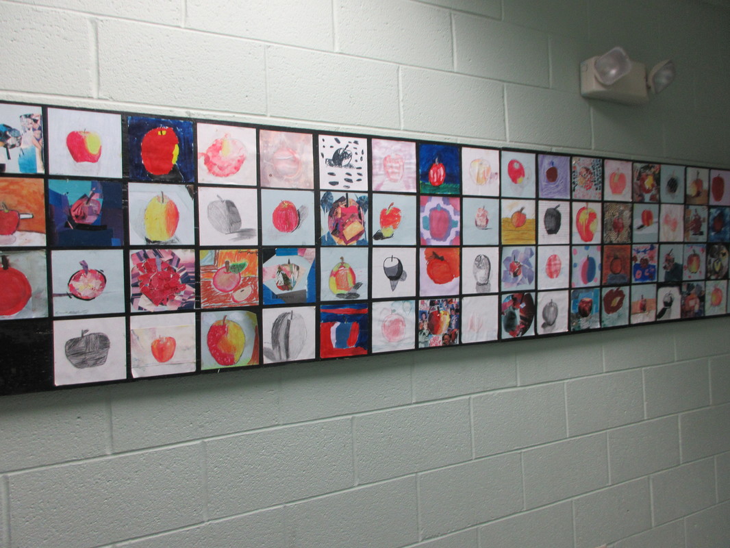
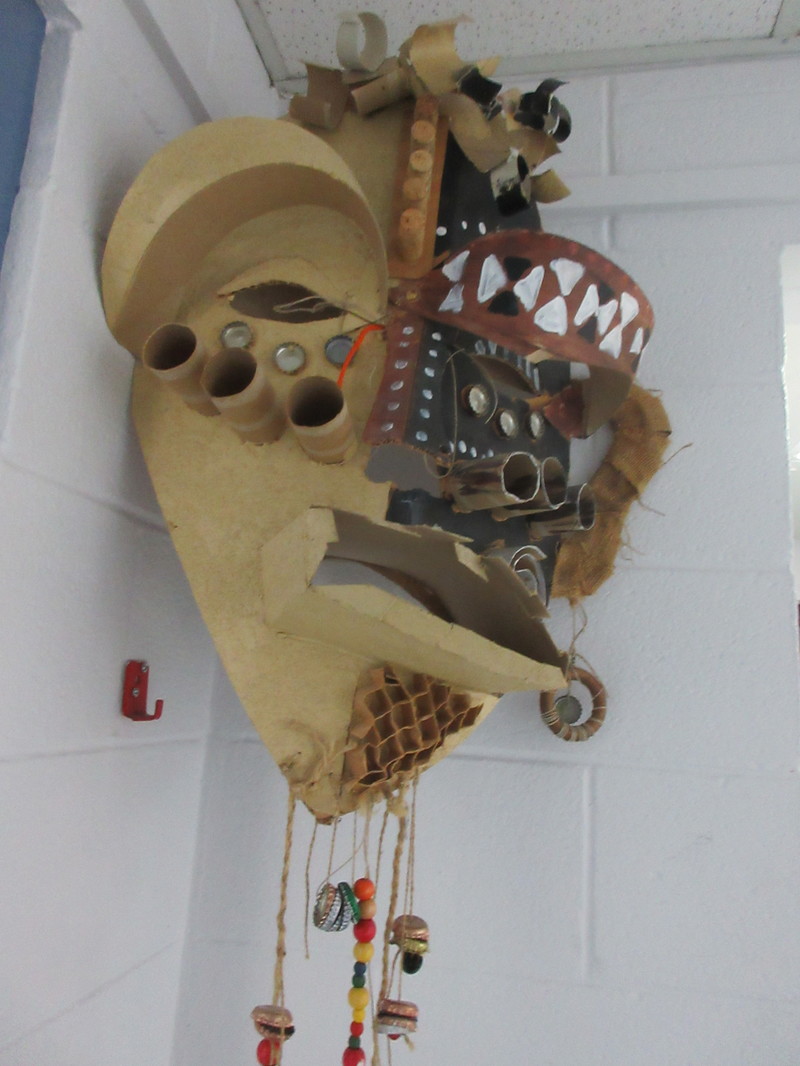
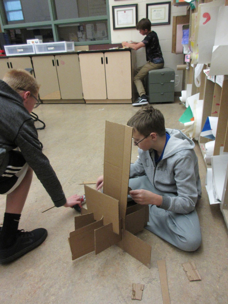
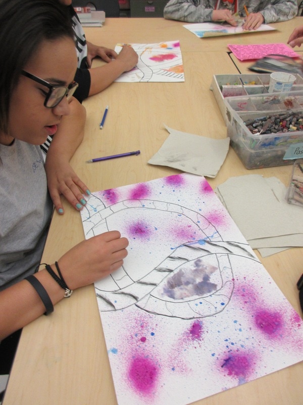
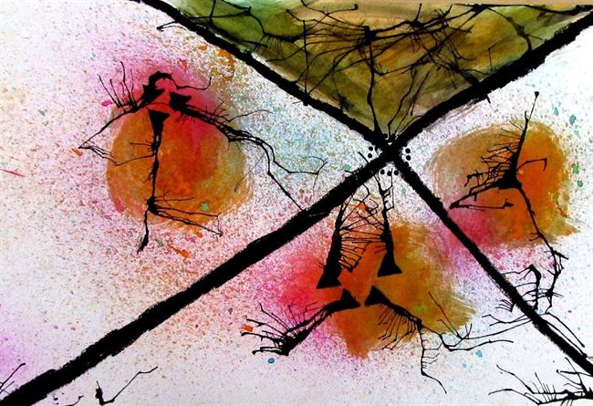
We have had a really productive round of projects for this past challenge. Students were forced to think beyond their comfort zones and discover new talents as they examined the concept of the things in our lives and the objects we interact with on a daily basis. 

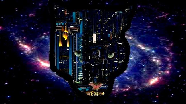
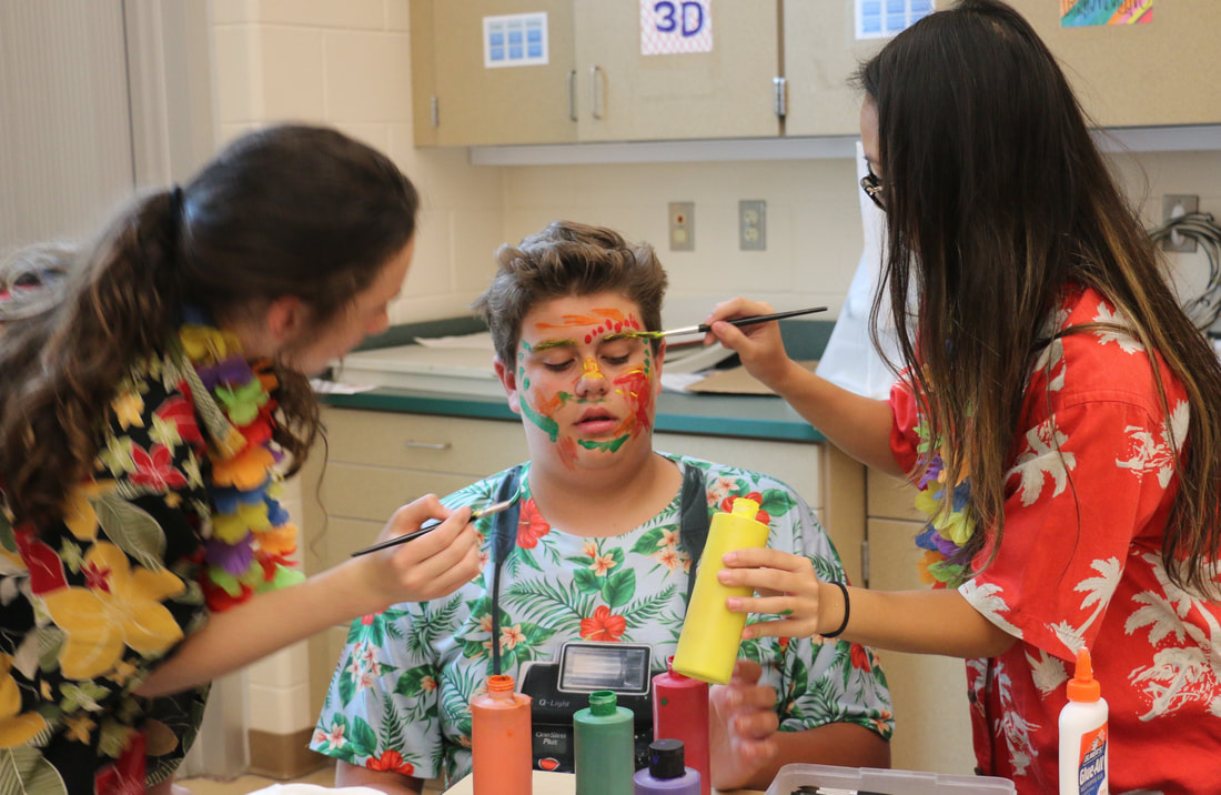
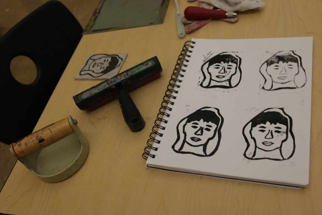
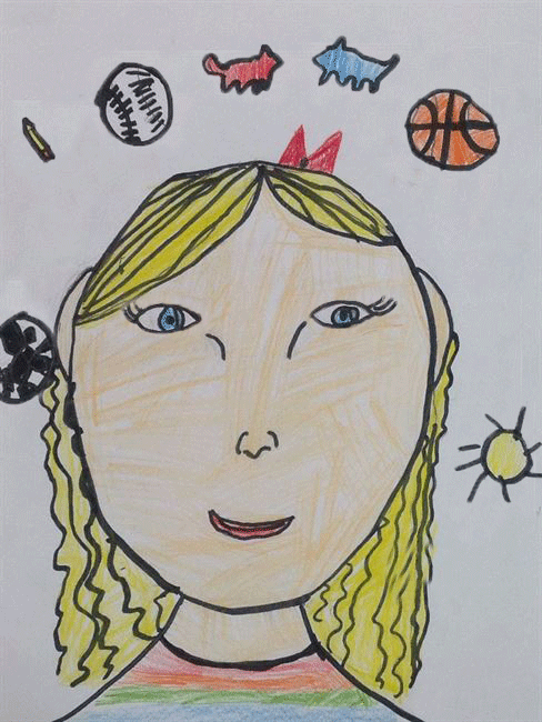
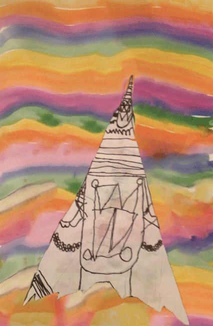
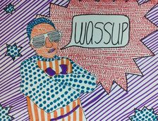
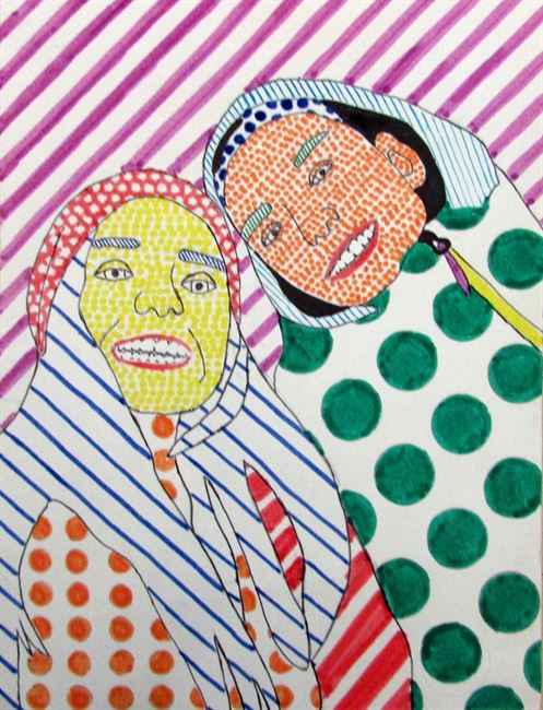
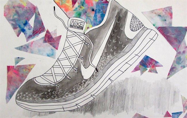
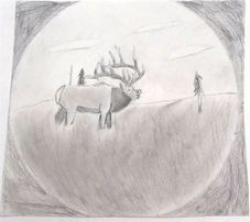
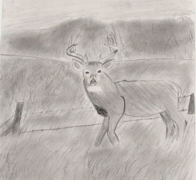
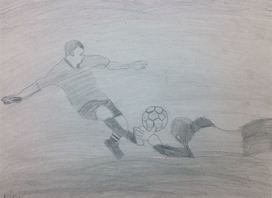
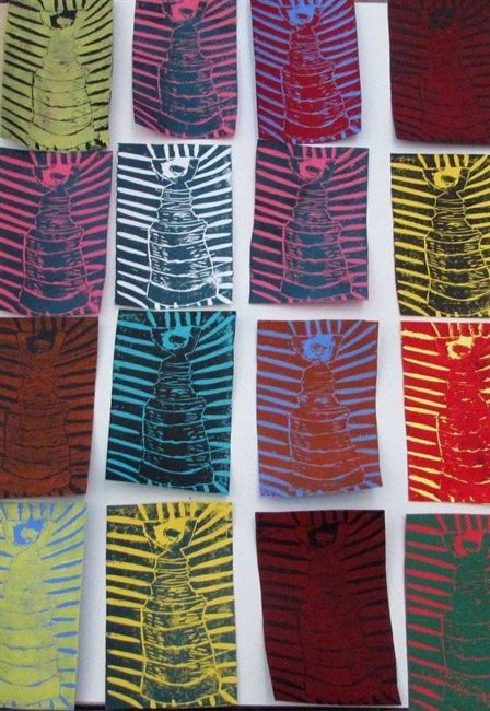
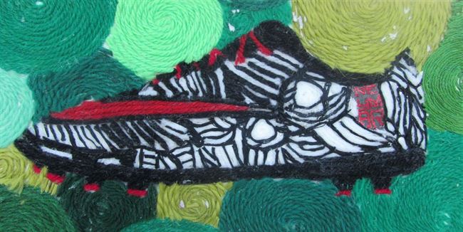
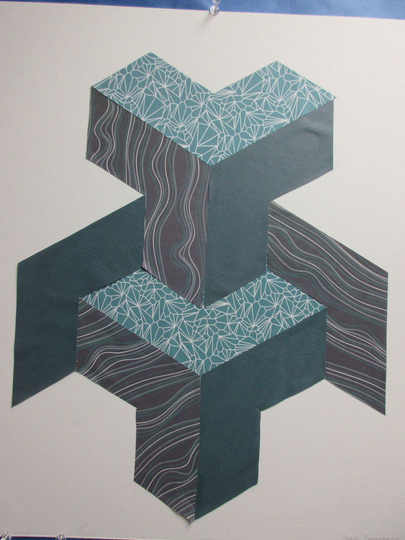
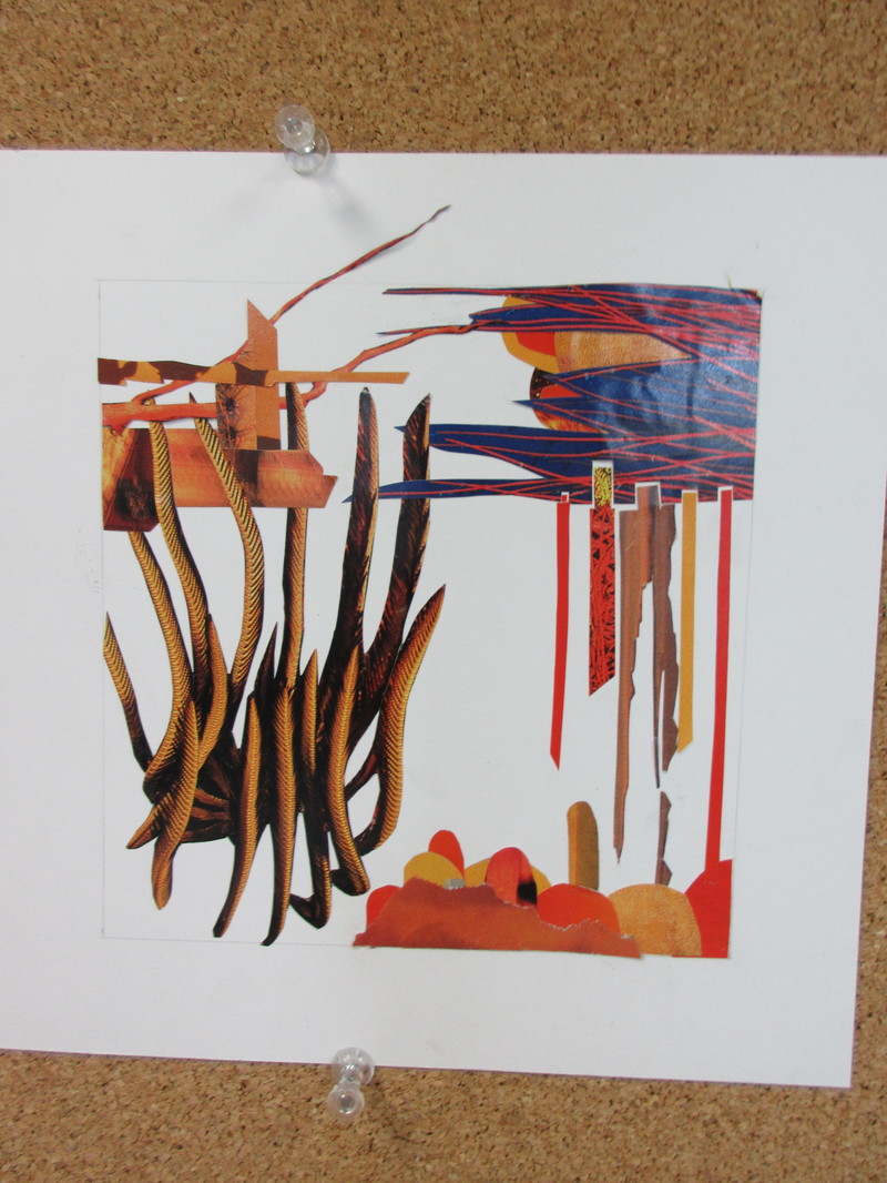
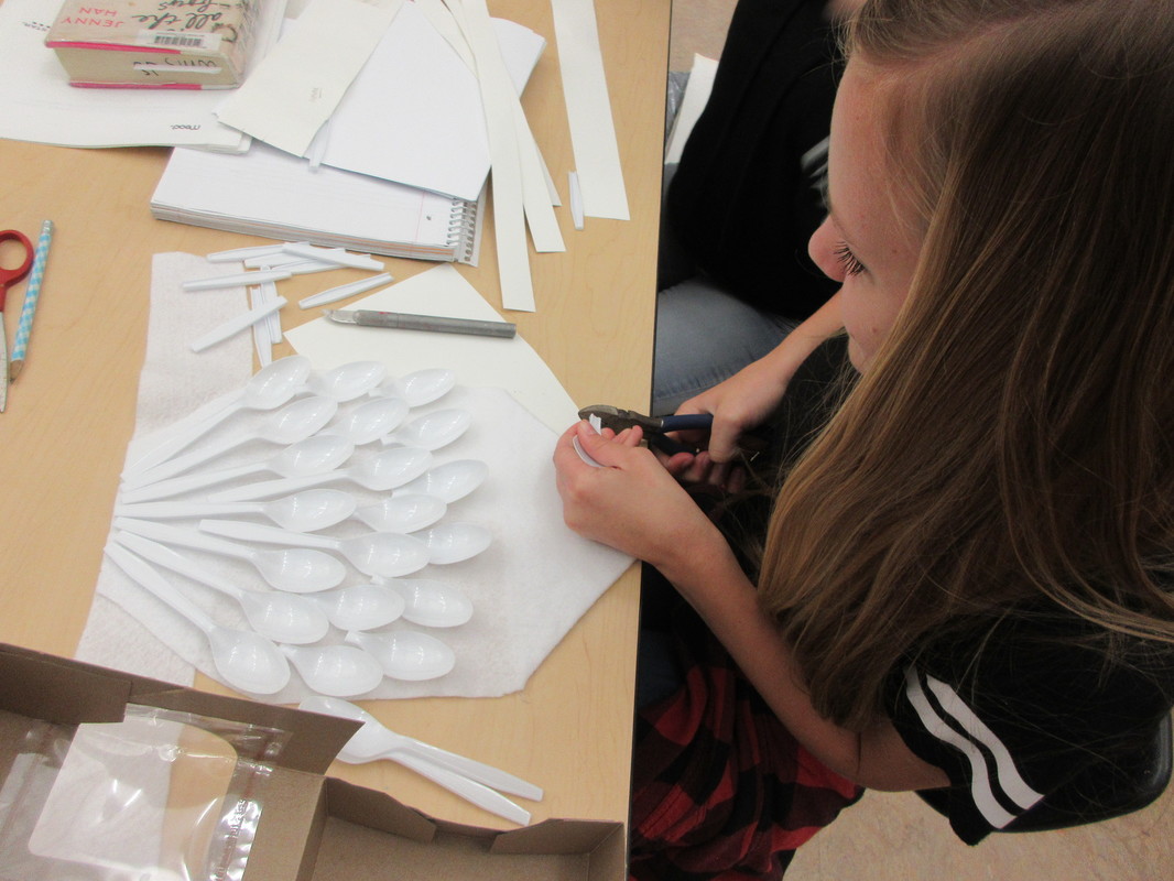
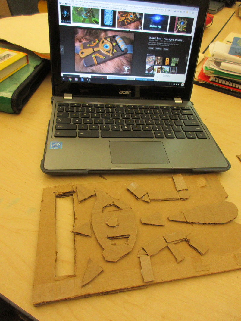
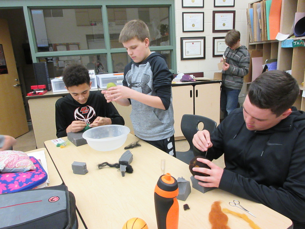
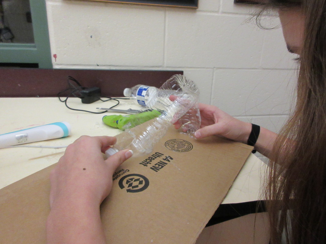
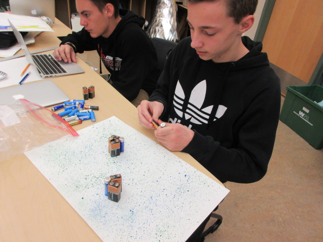
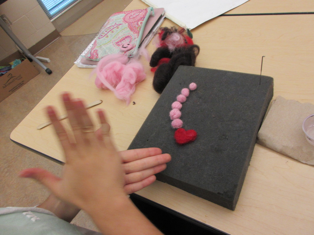
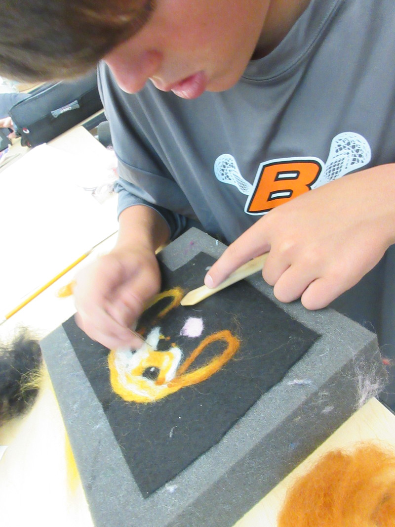
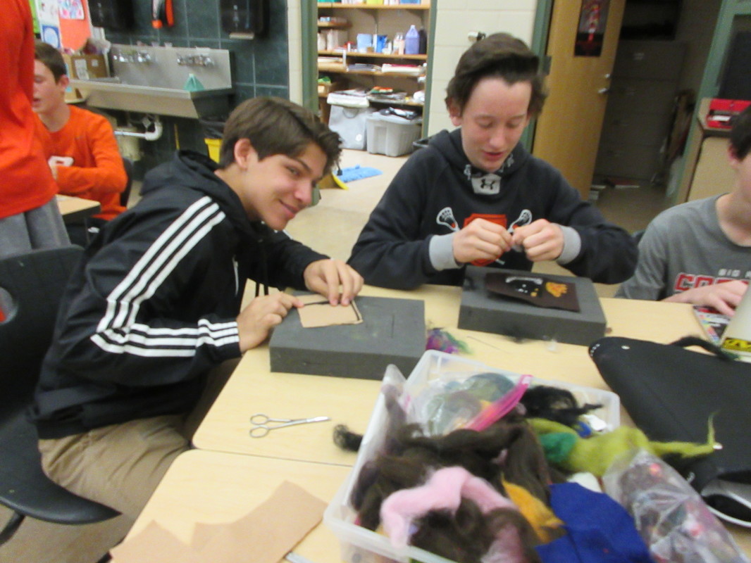
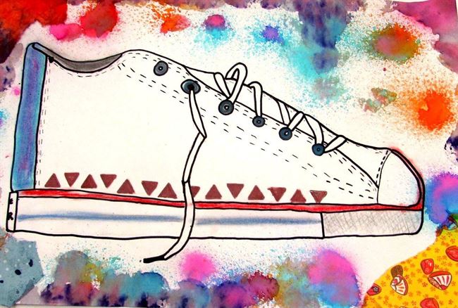
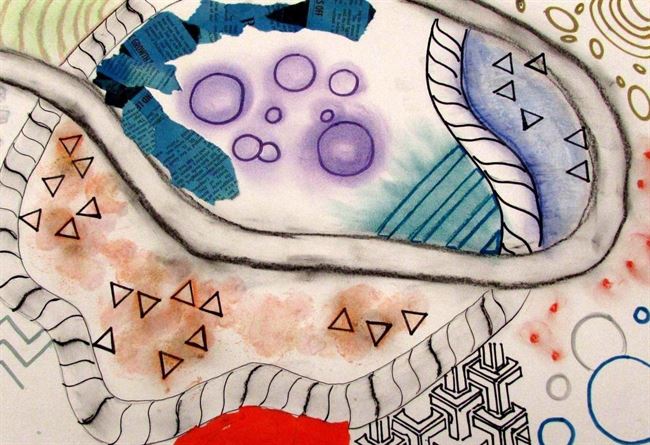
​In this challenge, students were asked to use a material they had yet to explore. The results were so diverse and exciting to see. Some students used tools for the first time to explore felting. Others explored clay, photography, making their own scratch art paper, and more tools to showcase their solutions to the challenge. It was impressive to see what they were able to create and a joy to see them develop new talents, as one student described in her artist statement below. 
Picture
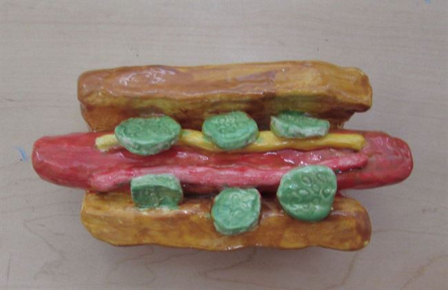
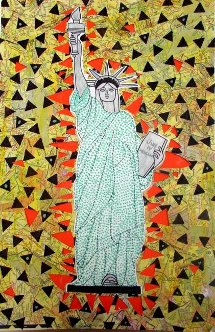
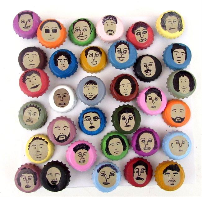
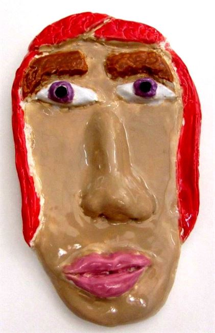
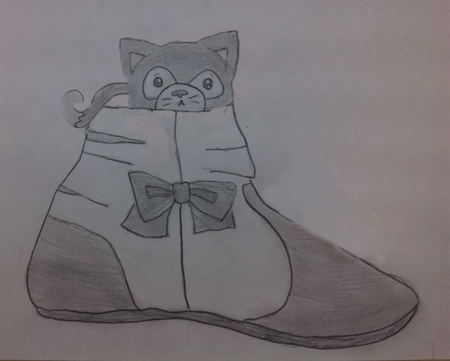
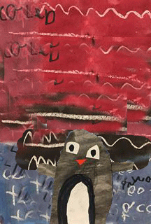
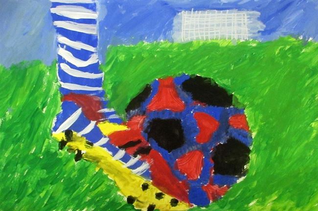
Cam: This is my art I did for project 3. I chose to use clay as a material because clay can sometimes be a challenge and I was willing to take on the challenge to create this hot dog in a bun with all of its ingredients. This connects with project theme 3 because it is an object. One artist that I used as a reference for this art was Janet Fish. I used Janet Fish as a reference because I was making food in my art and she also makes food.
Picture
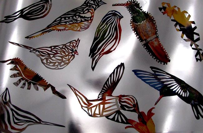
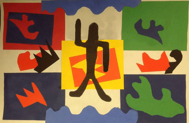
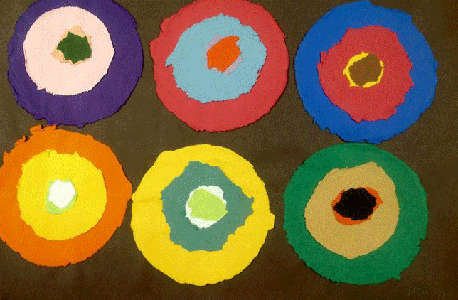
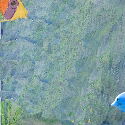
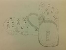
Lindsey: In this artwork, I decided to use the materials that I chose because I thought that making interesting cut outs on these birds would look good against a silver background. The materials that I used help me to communicate my ideas because I tried to use a lot of vibrant colors in the birds so that they would stand out against the background. This artwork relates to the theme because these birds are objects and something that I left in the past because when I was younger my grandpa and I would always fill up his bird feeders in his backyard, and we don't do it anymore. My artwork is similar to Wayne Thiebaud's work because he makes his artwork of different images of the same thing, which is similar to mine.
Picture
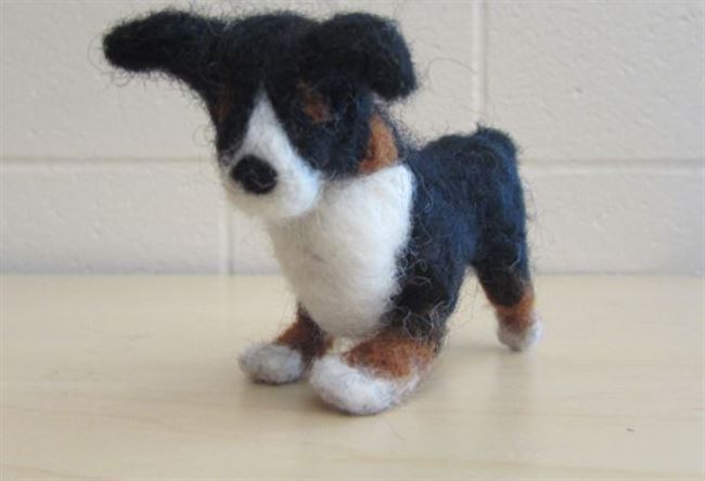
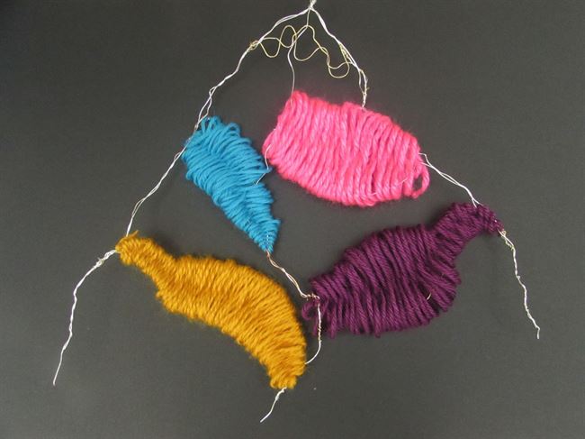
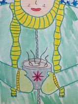
Tara: I LOVED making this art piece and I would gladly do it again! It was amazing to figure out I had talent in felting. If I can do this again, I'm gonna make ALL of my animals.
Picture
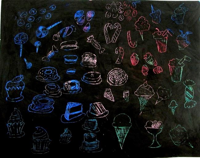
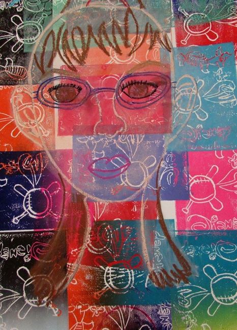
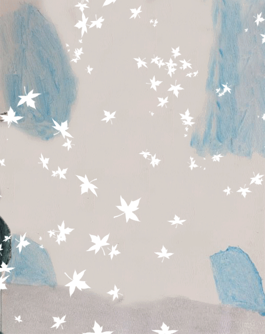
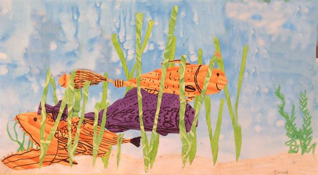
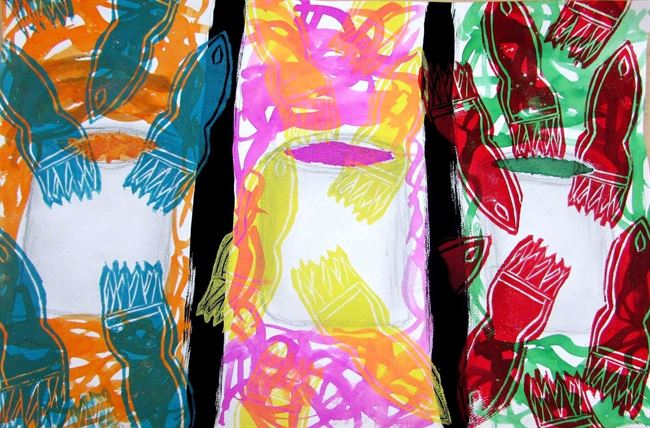
Emmie: I was inspired by Wayne Thiebaud and his image of the rows of cakes. The scratch art makes the desserts look inverted and like those neon signs on buildings at night.
Picture
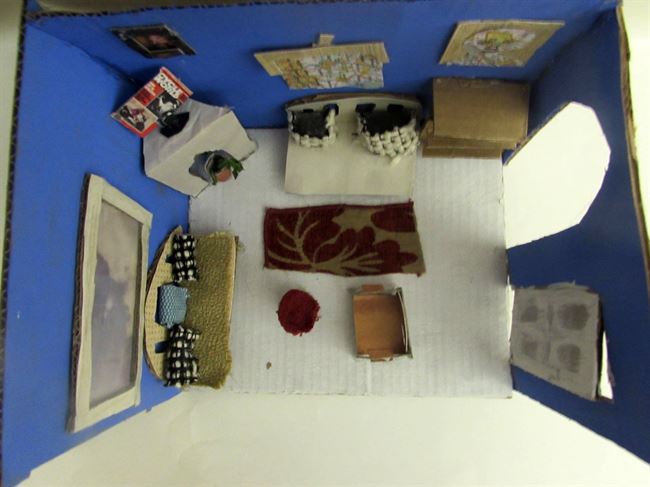
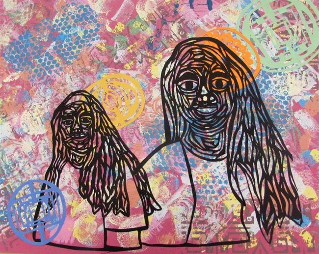
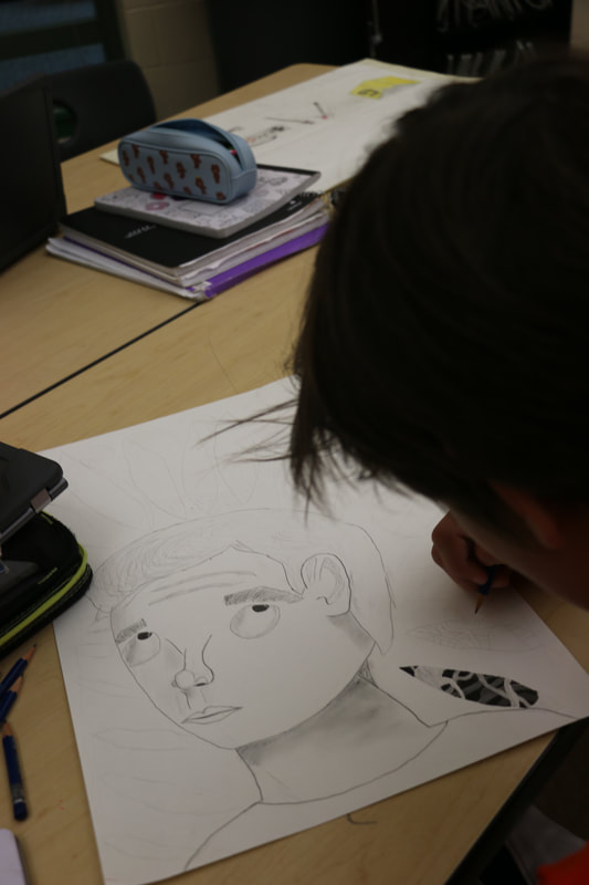
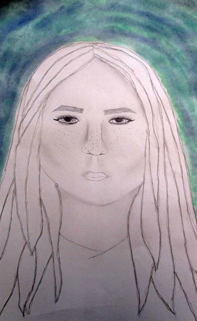
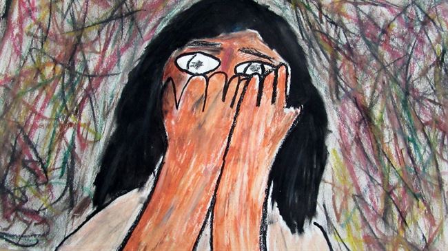
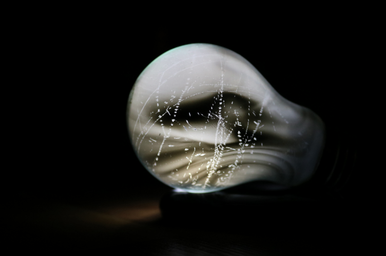
Anna: I used photography and things that are left behind in my life to portrait my ideas. I used these techniques and materials because a photo can say much more than a drawing because it is in real life. I used the things that are left behind idea because I was really inspired by Audrey Flack so I wanted to use that concept in my art project. Audrey Flack shows how things are left behind because she paints cluttered areas to show this.
Picture
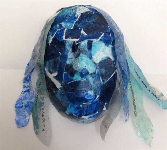
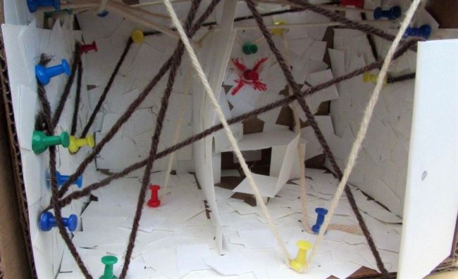
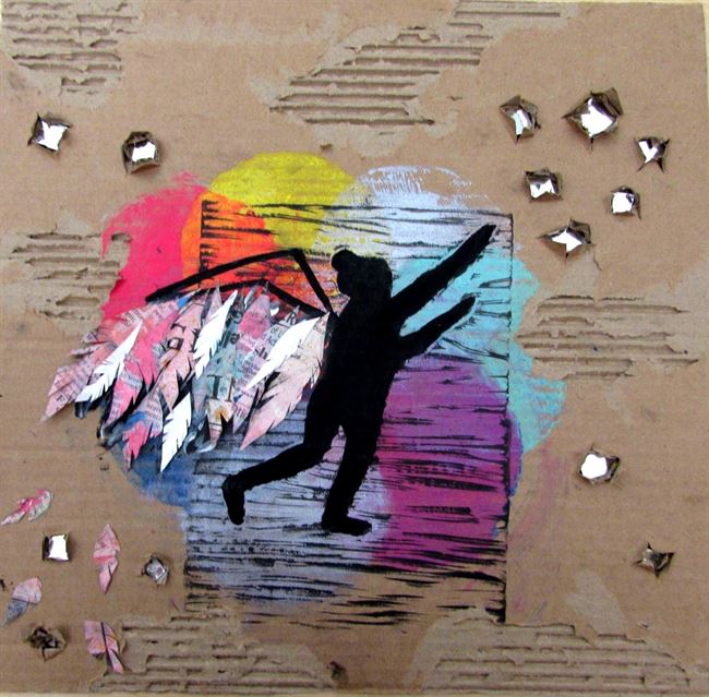
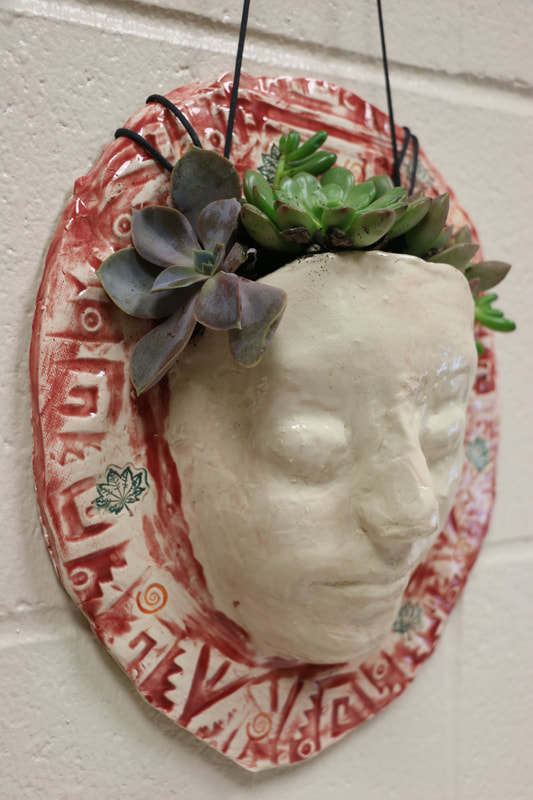
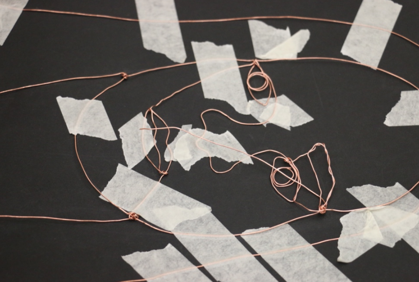
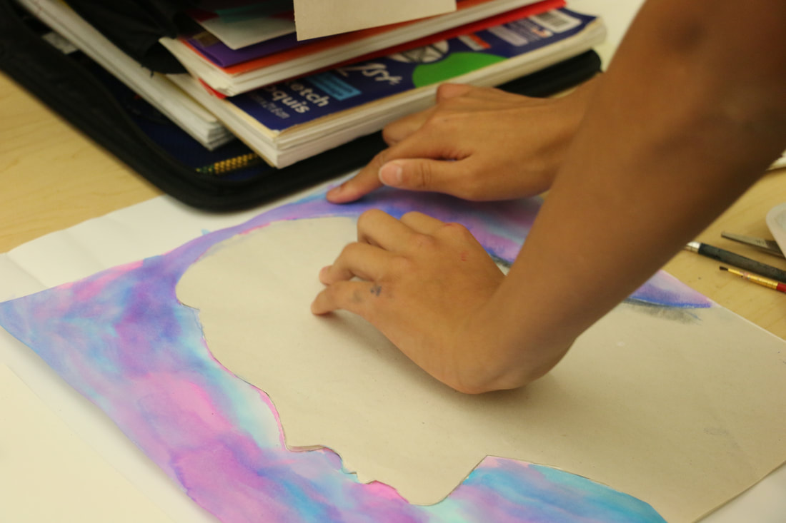
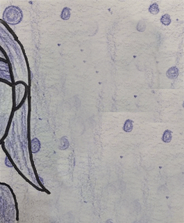
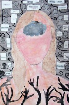
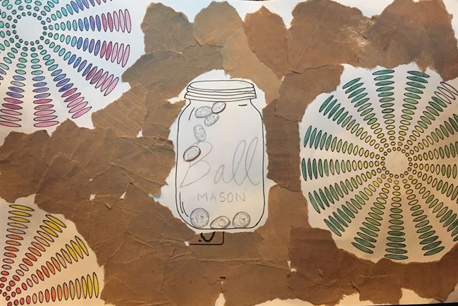
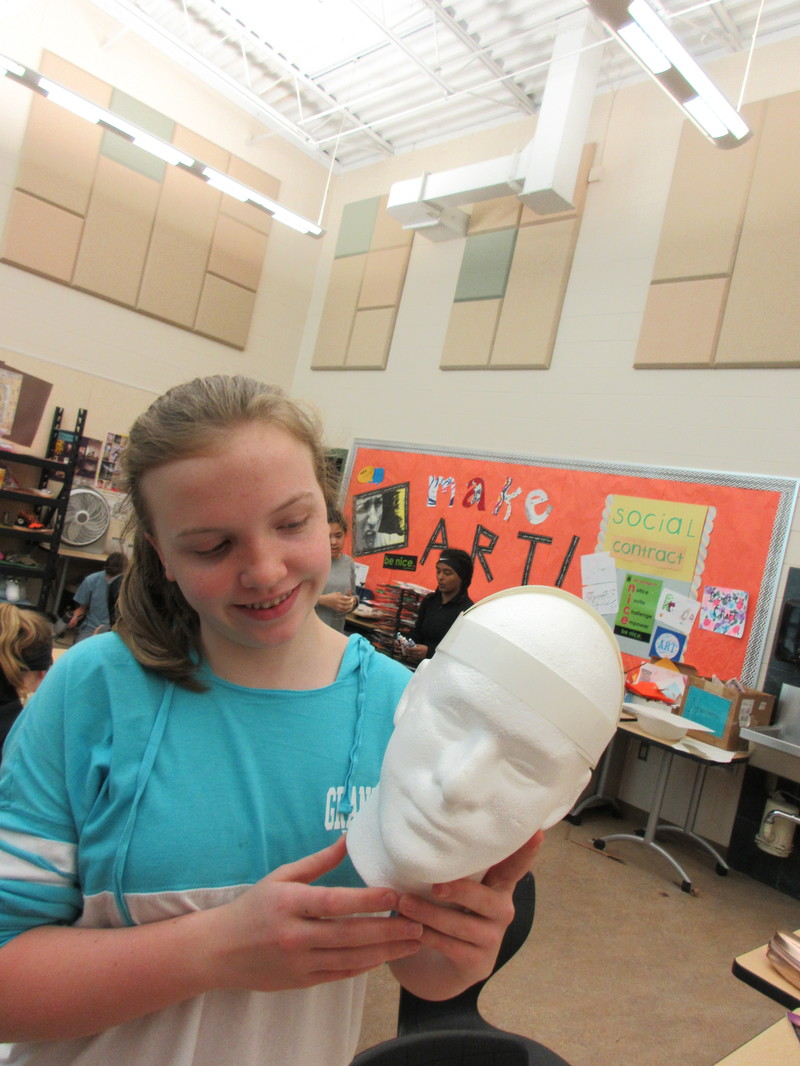
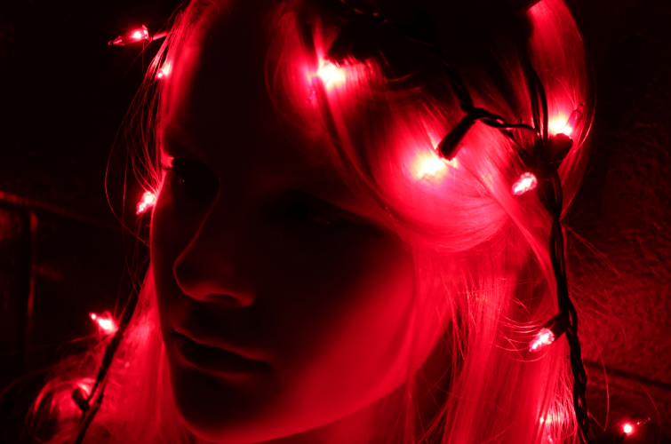
Zoe: For this project, a lot of people did physical objects that you leave behind, but I wanted to do something that you mentally leave behind. So, I chose memories. I took watercolor paper and splattered paint on it, creating the pattern. I used blue because blue represents sadness. Next, I tore up the paper, layered it into a face mold, and glued it all together. For the hair, I printed out my memories and then cut them out. I took tape and placed it over the cut outs. Then, I ran water over the tape, the paper rolled off but the text stayed. I layered the hair on top of the head. I used Do Ho Suh as an inspiration because he made a sculpture with deeper meaning in it, and that's what I did as well. Overall, I enjoyed this challenge even though it took me a while to make.

Feeling Thankful

Picture
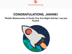
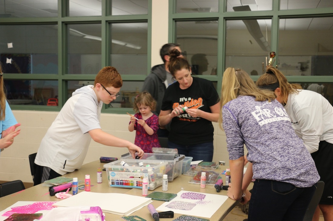
I am so thankful for so many things this year and these past two weeks are a great example of why. I want to thank everyone who helped us reach our goal for our latest DonorsChoose project! We were able to get it funded thanks to matching funds from the Carnegie Corporation as well as those who gave during Giving Tuesday! It was awesome to see that project receive support knowing it will be a super engaging activity at our upcoming Fine Arts Night. I am also so thankful and proud of my students who have worked hard this year to enter competitions, showcase their work in shows, and take risks with their work to discover new gifts and talents. 

​It is going to be a busy push to the end of the semester and I look forward to seeing where students go next with their work ahead! 

0 Comments

Week Ten

11/11/2017

0 Comments


Spaces and Places Complete

Students finished their second major challenge theme for the semester with the exploration of the theme "Spaces and Places, Real or Imagined." It was fun to see students go through the design thinking process and making choices about what aspect of the concept they wanted to focus on as well as the media they were going to use to do so. 

This week was just another chance for students to try new things, take visual risks, and work towards finding their own unique voice as they investigate ideas that can be found throughout Art history. Here are a few completed works to share: 
Picture
Cade: For this project I decided to 3D print a modern house. One artist my pace is similar to is Nathan Walsh. It is similar because both Nathan and this piece focus on buildings and architecture. We are also different because he decides to draw these building while I focus on designing and building them. One element I used was color. I used a white color to represent the house because most modern houses are built with white materials. Also I chose a smooth green color to represent the grass surrounding the house. Nathan also uses this in his work because he uses color amazingly. Nathan makes every single shade of color on his buildings seem so natural and reel. One principle I and Nathan use is emphasis. In my work I emphasized on the house in the woods and not as much as the woods around it. Nathan Walsh emphasizes all of the buildings in his art making them seem as real as possible.
Picture
Chloe: I can compare my work to Georgia O'Keefe because she centered her skull in the middle of the painting which is similar to mine because I centered the statue of liberty in the middle. I also use the elements and principles of design in my work. For example I used shapes and texture. I used different size triangle as my shapes and then as the background I collaged pieces of map and the map was of New York and this represents my texture. O'Keefe also uses very bold colors just like mine.
Picture
Khiem: I compare my art to Nathan Walsh art because he use a lot of line in one of his art and he also follow a certain patter. For example his art have line just like how my yard making a line that connect the memories. Another example is the pattern that i use . The pattern is the piece of paper that scattered around the room it goes from a lot to less and his go to two vanishing point. The reason that I use paper it because I want to remember what I use to do.
Picture
Lindsey: In this artwork, I chose to use these materials because I have not used them before together. I used the wire by forming it into the shape of a mountain and then I wrapped the different colors of yarn around the wire until it made a pattern that I liked. These materials helped me to communicate my ideas by showing depth and details rather than just creating an outline of a mountain. This artwork compares with Ansel Adams work because in his images he uses mountains, but it is different from his work because he doesn't have any color in his work. One detail that compares to Ansel's work is that the yarn on it shows depth and in Ansel Adams work he uses shadows that also show depth and add detail.
Picture
Picture
Oliver: I used a lot of different materials to make a smaller scale version of my living room because this is a space were I spend a lot of my time and I could make a lot of small details. My art work compares to Nathan Walsh's art because it is a 3D art peace of some wear like a my living room. This contrasts to his work because it is made of different materials.
Picture
Ashtyn: For this art piece I choose to use Photoshop, because I could not figure out how to put spaces and place on paper without using collage. This art piece is kind of similar to David Hockney because he uses Photoshop in his work. Another way my art work is similar is we both have nature in our work, mine is the Cougar, and the space background.
Picture
Ellery: My work relates to the artist Ansel Adams's artwork the most because we both have mountains in our pieces. Our works are different because in his pieces he takes real like photographs, and I use pictures and drawing skills to create my work. Ansel uses color in his work to create a shade, whereas there is some shade in mine but it is mostly just regular shapes. I chose the materials I did because I thought it would be a cool idea to see the contrast between the real thing, and a drawing. I also like the unity that is shown in my work between all of the mountains in the different grounds. In total, this was a fun project.

Perspective Drawing Challenge

While I was away at MAEA last week, students worked on finishing their perspective drawings using a variety of tutorials and options posted on our Schoology page. I divided types of drawing exercises into beginner, intermediate, and advanced choices that they could select and create their own works from. With the help of the wide range of videos posted on The Circle Line School's YouTube page, my students were able to complete this challenge while I was away. This week, they finally posted the works to Artsonia. Here are a few to share:
Picture
Makenzie
Picture
Alex
Picture
Kalynn
Picture
Reese
Picture
Ellie

Can I do this for real?

Picture
Earlier in the spaces and places project, I had a student start to create a cardboard arcade machine. They went home, talked with their dad, and came to school the next day asking me if they could make a real one at home and bring it in. I did not see why I should say no to such a request, so I gave it the green light and asked for the piece to bring it in when it was finished. 

I wasn't sure what to expect as this student shared updates about the progress over the week, but it was awesome to see the end result when he brought it in on Friday. Not only did it look amazing, but it worked and students were able to play it. 

It was fun to see so much energy around a work of art and I hope that his willingness to try something a little beyond the normal approach to a project will show others that doing so is not only okay, it is celebrated. 
Picture
This is a great start to the second marking period. I look forward to seeing how we finish the term, especially as we start to gear up for competition season. 

Stay tuned as we start to share more and more works getting ready for competition. 
0 Comments

Week Eight

10/24/2017

0 Comments


More Finished Work

Last week I pointed out that some students need a little more time to do their best work. Due dates in my classroom are firm, but flexible for those who would benefit from a little extra time. We need turn in dates to help hold students accountable, but we also need some ability to be flexible so that arbitrary dates do not hold back those who want to do something extra special. 

It was exciting to see the following works find their way to the finish line this week. I am very excited for how they turned out, but probably even more so for the process in which each student found their way to the best possible solution. I appreciated reading their learning statements and how many hope these works will make their way into competition at some point this school year. 
Picture
Oliver: In my artwork I was inspired by Julian Opie. But instead of doing a piece like his, I desisted to do the opposite of his art. I did a pencil and paper of a realistic face with lots of shadows. I used huge eye because Julian Opie's art has small beady eyes. My art relates to the theme of this project because it is of the "Me" in the project.
Picture
Leila: In this piece, I have a print of myself reaching for the stars. I literally took the saying, "Reach for the Stars", and incorporated myself. I decided to add wings to the figure to have a dreamy effect. I used newspaper that had been painted on for the feathers. For the stars, I opened up certain sections of the negative cardboard space and placed reflective material inside. I ripped parts of the cardboard off, so the piece would have a variety of different textures. In the end, this piece turned out really well and I hope to enter it in to Scholastic!
Picture
Mitchell: This piece has helped me learn how to use various techniques such a molding with plaster and clay and using many different colors to really help bring out my artwork.The art work connects to the theme of the project by symbolizing the ME in you me everybody,the project shows how my face can just be a plain piece of artwork but when you add different textures and visual elements such as unique indents into the clay and using a variety of colors you make or break a piece especially when it's clay.
Picture
Tess: This work focuses on the everybody piece of the project theme. It deals with the current political issue of whether or not football players should be allowed to kneel during the national anthem in protest of equal treatment for all people. I chose to use mixed media to create this piece. For the background, I used block printing, and for the rest of the work, I used cut paper. These materials help convey the message I am trying to communicate because they are bold, and simple, making the message heard.
Picture
Chloe: In this piece I used mixed media and for the background. I used different sponges and techniques to make the background look the way it does. And then the people are made out of black construction paper and I used a xacto knife to get a lot of little details of the peoples faces and hair. This piece ties in with the theme you, me, everybody because I focused in on the people who are really mean a lot to me and these people are my friends so I decieded to do everybody.
Picture
Marie: In this piece of art I chose to portray the idea of 'everybody' by using bottle caps and portraits. I intended that viewers would receive the message that everyone is different, and in a world of differences it is important that we find our own way to stand out. To help push this theme I placed one portrait out of place that had a different background, and a different skin color. By using bottle caps and randomized paint colors, I hoped to communicate this same idea of everyones differences. But by placing them all together, I hope to show viewers that we can come together as a community to create something bigger than our differences.

Building Skills and Understanding

Students were introduced to our next Challenge Theme: Spaces and Places (real or imagined). We looked at the work of Vincent Van Gogh, Ansel Adams, Georgia O'Keeffe, David Hockney, and Nathan Walsh before starting out plans for possible ways in which students could explore ideas surrounding the places we visit. 

It was fun to see students dive into the sketchbooks right away and start planning out ideas without hesitation. The work we did for our first challenge has helped spark the importance of thinking through ideas and trying out various approaches in a smaller format before making a commitment on a larger scale. This shows me that students are able to generate ideas on their own, do the research they need to help inform their choices, and try out solutions before making a choice on what interests them most. 

We also used this week to broaden our skills with various mini-challenges using collaged paper and digital works. Students learned about how to establish an environment by activating the foreground, middle ground, and background of a work as well as how to use various tools to achieve desired effects. It was fun to see students use these skill-builders as a springboard for generating ideas for their project and the results of their learning. 

Landscape Fast Collage Challenge

Students created the following landscape collages to demonstrate their understanding of foreground, middle ground, and background while also using collage skills to complete a work. We started out by looking at The Art Assignment Video featuring landscape artist Robyn O'Neill before getting out the glue and scissors and getting to work.

What made this a successful challenge was that the size of these collages were kept to 6x4 inches big and students only had about 25 minutes to create them. Students sometimes struggled with the limited size and time, but by keeping it small they had to forget about being perfect with their choices and focus on demonstrating the various aspects of a landscape as well as the figure/ground relationship. Some enjoyed the process so much, they made more for fun.
Picture
Riley
Picture
Tobin
Picture
Cierra

Photoshop Challenge 2

Students were given another Photoshop Challenge to complete this week as well. These works help build students skills while producing works they are proud of and that they were able to have a say in making. It has been fun to see some students really grow their understanding of how to digitally manipulate images and how to make images from scratch, rather than always relying on the internet. 

Here are several examples to show the range of methods in which students created works to demonstrate their understanding of creating visual space while manipulating the methods and tools within Photoshop. 
Picture
Finn
Picture
Jenny
Picture
Jake
Picture
Emmie

Almost The End of the Quarter

With the end of first quarter next week, it has been such a delight to see students grow and shape their understanding of art in new ways. Students have been exposed to a variety of artists, methods, and tools to use as a starting point for their own creative journeys. I am excited to see this quarter come to a close and how students leverage their learning from this quarter to push themselves even more next! 
0 Comments

Week Seven

10/23/2017

0 Comments


Finished Work

Students finished their work for the challenge "You, Me, Everybody" project. In this challenge students were asked to create a work that was either about someone else, themselves, or a larger community/culture. We looked at the work of Julian Opie, Frida Kahlo, and Do Ho Suh as examples of artists who use a variety of methods and media to tackle this prompt. Before students started their final works, they created a series of sketches to work out ideas and we also went through various materials and how they could be applied to their final works.

It was fun to see students work with different media, try new ideas, and change their pieces based on experience and feedback. I am always amazed when students are able to put feedback to good use and apply the concepts and ideas taught.

Application of ideas and methods to achieving those ideas is something I am striving to teach throughout the term. It always starts a little slow, but as you can see with the examples below, students are able to use the skills we have build to achieve their desired effects and create one-of-a-kind results that both meet the standards set as well as their own artistic vision. 
Picture
Kalynn: In my piece I am representing the idea of everybody. I have showed everybody be drawing different hands gripping a rope. This shows that we are all holding onto the same thing and are doing so together. In my art I used color for the rope to try to make it the center of focus, and add depth. Overall I have learned several new techniques and enjoyed overcoming the challenges to create my piece of art.
Picture
Serenity: I wanted to make this clay piece because I am not very good at drawing faces so I thought that I could make a face better using clay. I focused on the you part of the theme you, me, everybody. I didn't completely base it on a specific person, but it is not a drawing of me so I consider it a you part of the theme. I used different clay tools to make different textures in the parts that have hair so that it would become more realistic and look like a person. I left the lips in a neutral face to make the face look like the person was having an average day. I chose to do red hair and purple eyes because when I was a little kid that was who I pictured my self to be in our house games.
Picture
Cheyenne: First, I drew my own portrait and then I traced it with a permanent marker and put printmaking all over it. Then when I was done with the printmaking which took me about 4 to 5 days, I traced my portrait with chalk pastels and then it made it look 3D like the image is popping out. This connects to the theme "me" because I like to do artwork based on me what I like and what I like to look like.
Picture
Dylan: i got the idea to do this when i thought about how different me and my family are, but how we are all the same. so i went for a broken mirror effect on the many photos that i have to show how differences between us, but how we are alike.
Picture
Mary: In this piece, I did something very similar to a self portrait.In the middle is an artist persona of myself, and around is some fictional characters from some of my favorite franchises, except the two at the bottom, which are two characters of my own with their own stories.
Picture
Sophia: I originally was going to do the backs of peoples heads for my project, and when I was coloring the hair, I just started to doodle in my sketch book. After trying my head pictures twice, I decided I wanted a different picture instead, and I decided this picture was the one I wanted to use. I had a lot of fun with this project, I went out of my comfort zone with picking my own project with a very broad outline. It took a while for me to pick my final project, but I think I picked a good one. I learned about a paint that is water color, but it starts as a liquid! I thought that was really amazing, so I used it on my background! I also leaned a new technique form my art teacher Mrs. Campbell called feathering. I personally love this technique, and hope to use it in the future!
Picture
Kennedy: For my project, "you, me, everybody" I did more than one piece of art and i seemed to like this one the most. The project is focused of everybody, and the eyes represent everyone's eyes. i used a piece of Gelli plate to put on the background colors and mix them together, the colors i had used were pink and blue and the colors mixed together to make a purple color too. I used a black sharpie marker to draw the eyes and i used chalk to help the eyes stand out.

The Problem with Due Dates

Picture
Due dates are necessary. They help hold students accountable and set pacing of content for the term. With that being said, I really find them to be hard to follow with students who decide to go above and beyond with assignments. I do not count this against the final grade if work is late because of this. I do not think it is fair to punish students who want to take more time on their work because they are doing something special. 

I do have an issue with students who misuse their time and turn in work late or rush through projects without using their skills and understanding to show what they know. That is why I think due dates should be set, but be flexible. For the students who are unable to meet the deadline because their work is more complicated or in-depth, they have to find the time to finish outside of the set class time and that is usually not an issue. If you care about your work so much that you are willing to spend more time on it, chances are you want to see it to completion. 

Here are some works I am excited to see come to completion soon:
0 Comments

Week Six

10/14/2017

0 Comments


Working Artists

Picture
Students will often find collaborators to help them achieve works that may be outside of the normal perimeters. It was fun to see this student recruit others to help him paint his face (with a note of permission from mom, of course) to use in a digital work. Before cleaning his face, he also made sure to get a monoprint of the work.
Students spent most of this week working on their pieces which explore the theme "You, Me, Everybody." In this first challenge, students are asked to consider how individuals form a sense of self and what makes us similar as well as distinct. We have spent much of our time up until this point working on getting used to various media application so that when it came time to really get into a concept, students would be able to apply what they thought would work best to finish a work they developed on their own. 

Inspired by artists of note for this assignment (Julian Opie, Frida Kahlo, and Do Ho Suh) as well as other works I show them from past students and a great TED talk by Phil Hansen, I ask for students to think about how they can use what they know about manipulating art media to say something about the theme that makes the most sense to them. Before beginning on final works, students are asked to create a series of thumbnail sketches of possible solutions as well as list the materials they think they may need to complete the work they would like to create.

This can be a big challenge for many. In order to avoid some of the pitfalls of feeling like they may never be able to come up with an idea, I saturate our Schoology page with old lessons/solutions from former students and step-by-step how-to's to help those who may be stuck with what to do. I also make sure and refer to artists that can be connected with the work they settle on doing for this project as well and use their sketchbooks as a place to explore and play with ideas. One of my favorite resources to use is the Scholastic Art Gallery of former student winners from around the country. Using student work that is both age appropriate and aspirational helps push students beyond simple or basic solutions and challenges them to think in a larger scope and to reach further than they have previously.

We will be finishing up this theme next week and I am very excited to see where we go next. There is a nice variety of materials being used and approaches to the topic that are making me think about the stories my students have to tell. It will be fun to share this work with parents at conferences next week. 

Here are some images of students working:

Leaves for Sale

Picture
These leaves will be available for purchase during Parent Teacher Conferences on the 16th and 18th. 8th grade students made these on the first day of school and we took the time to glaze them this week. They were made by rolling out slabs and imprinting leaves before being bisque-fired and then glazed with one coat of a color. We rubbed some of the color off before putting on a clear coat and firing for a final time. They get that reddish look because of the type of clay that is used to create them.

​I love the results and think they would make a great addition to any fall themed table scape. Any leaves not sold will be available for purchase at the upcoming Byron Center Fine Arts Boosters craft fair at the high school on November 11th. The funds will be used to help offer additional opportunities for students to perform and participate in the WMS Art and STEM program. 
0 Comments

Fin

6/9/2017

0 Comments


Finishing Up

Picture
I tried something new this year to finish up learning in my classroom. In addition to review guides, games, and an active project-based part of the final exam, I also asked students to help me close out my classroom prepare for the fall. 

This is something I have traditionally done myself over the years. As I was thinking about how to end the school year, I started toying with the idea of having students who were earlier finishers to help with many of the tasks that help inventory and organize tools so that the next year begins smoothly.

Some of the important things students helped with involved labeling 3D stations with student numbers, refilling paint, emptying glue bottles, cleaning out student storage, and checking/sorting markers. It was such a good opportunity to teach students care of classroom materials, creating an inventory, as well as the process of how we go about making choices for ordering supplies for next year. 

I cannot remember my classroom being cleaner or more organized at the end of the year and that means instead of focusing on that when we start in the fall, I can get right into the material and means of teaching my students. 
Picture

GIFs

To finish out the year, we worked on part of our exam that piggy-backed on the idea of remixing from the last challenge. Instead of remixing work from our past, we looked to the students from our three elementary schools and intermediate school for inspiration. 

Students in my class went to the Artsonia galleries of Nickels, Marshall, Brown, and Countryside and selected a piece of their choice that they would like to animate. Some picked family members and others picked randomly from the galleries. 

Using Photoshop's tools and functions in the Motion workspace, students used the clone stamp, layers, and other tools to create the pieces below:
Picture
Picture
Picture
Picture
Picture
Picture
Picture
Picture
Picture
Picture
Picture
Picture
Picture
Picture
Picture
Picture
Picture
Picture
Picture
Picture
Picture
Picture
Picture
Picture
Picture
Picture
Picture
Picture
Picture

Final Exams

In addition to the project above, students finished my class out with a final exam that includes multiple choice, fill in the blank, matching, and ordering questions. I have been giving a test to finish out the course for years.

At first, it was the only test I gave to students and because of that, the results were really hard to track in terms of growth. Then, I did the pre and post test model, but I still felt that it was too difficult to gauge learning with only administering two tests during the term. That is when I decided to start giving smaller quizzes after Challenges and then use questions from those to formulate the exam. The questions range from art identification, material usage, and other art terminology and application.

I am not sure I quite have it right yet, but so far this has been the best way for me to track student understanding and retention of content in addition to using student work and artist statements to document student learning. It is also quite satisfying to both the students and myself when we review the difference in pre and post test scores and see students have made some kind of gain over the school year.

Final Reflections

The VERY last thing I do in my classroom is ask my students to give me feedback on the semester with the understanding I will use that feedback to help plan for the next time I teach the class. 

First thing I ask in the survey is why students signed up for Art. Here is a breakdown of responses:
Picture
Then I ask them what they learned about in class:
Picture
Then I ask about what they wish they could have learned more about:
Picture
What is interesting for me to see in these responses is what students hoped to learn, what they think they learned, and what they wish they could learn more about. It offers me a nice recap and understanding of the students I serve and what their goals were for their learning and if they were met by my goals for their learning, too. I think I am happiest with the middle chart and the consistency I see across various aspects of art making that students felt they learned. It is validating to reflect on these responses and teaching practices and see that my goals were met for students (but I am always looking for new things to make it better).

In addition to this kind of data, students are able to give me feedback on what they thought the best part of class was, what could be changed to make it better, and any other final thoughts they had for me. This is probably my favorite part of the end of the term because it allows me to see the good in what we did, the things we can make better, and anything else that is on students' minds. 

Here are some of reflections on what students liked the best this year: 

STEAM Collaborations

​"I really loved building rooms with the Stem Class, and getting design and create the spaces using different materials that reflect off of an artists work. ​"
"I loved the group projects with the other class because it let us get together with other people."
"I liked the video making collaboration. It was fun to make the game and fun to learn to work with coding. I also liked that we had the freedom to use whatever material we wanted for our art."
"I really liked being able to collab with the stem students and I loved making the artprize piece. I also enjoyed having the same theme but everyone getting to do each project in their own, creative way."

Student Choice

"I really liked how we got to make stuff that we wanted to. It was nice to not make something that looks exactly like everyone else's work."
"Saying good things at the beginning of class and being able to choose materials."
"The freedom to choose what your art will be and what it will be about."
"I enjoyed the fact that we got to pick our own art work. ​"
"The freedom of what kind of materials you get to use for the projects."
"Getting to choose what we wanted to do for each project instead of the teacher telling us what we had to make."

Love of Learning

"Trying all the materials."

"I like this class because you learn a lot new stuff."

"Getting to learn something new every day."

"I enjoyed the trip to Fredrick Meijer Garden. That was really fun, I enjoyed that very much and learned more about my favorite artist Ai Wei Wei."

The survey is anonymous and the nice thing about it is that it gives me feedback I can reflect on to improve practice for the future. A few students questioned whether we needed to learn 18 different artists over the term and if they could have more choice on the artists they studied. This is something I think I will revamp for next year.  

I also appreciate the response to "Anything else you think I should know" part of the survey. I have really nice students and many offered thanks for a great year.

My favorite thank-you's are the ones that reflect what I try and offer all of my students and I hope resonate the most once they leave my classroom: 

"Thank you for teaching me so much about art this year and helping me advance in my skills and learn that everybody can be good at art."

"I wanted to thank you so much for everything you have taught me. I honestly feel like I have really improved as an artist. I really enjoyed this art class, and getting to experience and work with so many different materials, that I have not had the chance to work with before. I really hope to continue art in the future, and wanted to say thank you for pushing me to be the best artist that I can be."


"I enjoyed being in art so much. I loved how nice and kind you were and how you gave back feedback to people. I really enjoyed that we had a project challenge to do and I loved that we could come up with some exciting things. I really also enjoyed the field trip, and making art work for Artprize. Learning more about artists I didn't even know about was fun as well. I was so excited to finally figure out I was doing Art and once I did I was never so happy to go to school everyday and starting out my day with my favorite subject, Art. Thank you so much for being my art teacher I enjoyed every second of being your student at Byron Center West Middle School."

"Thank you so much for teaching me about art, and showing me that art is a lot more than people act like. I loved being able to be creative and create my own art this year!"
​

Although it was the best year ever (for so many reasons), I know I can use their feedback to improve and help 2017/18 to be even better! 

​Happy Summer! 
0 Comments

Two Left

5/26/2017

0 Comments

 
There are only two weeks left of school. And to say that there are two weeks left is being kind of generous. There is actually only seven more times I meet with my students from each of their hours before we say good-bye for the summer. With two more weeks left to go, here is a recap of what we did this week (which was a big one).

Arts a la Mode 2017

Picture
We had another great year celebrating the Arts in our school with our culminating activity: Arts a la Mode. This evening that begins with our annual Empty Bowls event and ends with performances and making opportunities for guests is something special that I am proud to be a part of for over 10 years. 

I want to thank Hudsonville Ice Cream for helping us with the ice cream through their Fusion program and all of the volunteers who helped set up, clean up, and help out during the night. It was a great time and we were able to raise over $450 in food and funds for Buist Community Assistance Center which will be used to help feed those in need in our community. 

It was fun to showcase the student talent this year through our large ArtPrize entry (we are still waiting to secure a venue). I also really enjoyed seeing students take leadership roles in the maker space this year and lead printmaking, lego building, and cardboard creating in the STEM room. 

Meijer Gardens Field Trip

Picture
I have been taking students to the Gardens almost every year since I came to BCWMS. I love the space and the sculptures offered and the current exhibit of Ai Weiwei was perfect for linking to the learning back into the classroom.

Each year we try something new for our field trip and this year it was all about a scavenger hunt! I have to thank another teacher for this idea (like most I post, it seems they were sparked somewhere else). We did this hunt as a group activity with 5 groups because of the rules of the gardens. Each group was shared what to find in a Google Doc and then they were to upload their responses to the shared document. 

It was fun to see the different things students found and what areas of the park they were able to go to. We also were stumped on a few of the items and appreciate the on-site librarian who helped us track down the answers (yes, I did not know some of the answers when I formed the questions). It was great fun and everyone was a good sport about it. 

The current exhibit was also great and it was really nice to have the space almost to ourselves for it. 

Sometimes I think it is crazy to plan this trip the day after our Fine Arts Night, but it seems to work out great and something I will plan to do again next year. 

Challenge 5: Everything is a Remix

For our final Project Challenge, students worked on rethinking past pieces to make new work and show new skills and ideas. We looked at the concept of a remix and how artists and others have used remixing various ideas to make something new. It was fun to see the variety of ways in which students selected works they were interested in revisiting and how they were going to adapt their new ideas and skills learned from the semester when creating their new work. This is my 
Picture
Picture
Evan: One similarity that I used in this artwork is that it is the same shoe used in the last nike shoe artwork. One difference is the medium I used is photoshop instead of mixed media. The reason i selected this piece was because I didn't think it looked visually pleasing to look at and I thought I could make it better. One think I did to change it was I mad it more like a piece that Jenny Van Sommers did on a shoe.
Picture
Picture
Tess: One similarity between this piece and my original Pop Art Piece is that they both use many colors, and they both use a combination of both stripes and dots. One difference between this piece and my original piece is that in this piece there is two people, and in the original piece, there was only me. I chose to remix my Pop Art Portrait piece because I love that it uses a lot of color and that it overall is just a fun piece to make. To change this piece from my original Pop Art Portrait, I chose a picture of two people, me and my friend, to use for the graphite transfer rather than just one person, and I did the entire face, including the eyes, while on my original piece there was glasses over the eyes so I did not have to do them.
Picture
Picture
Ava: For this challenge I decided to recreate the project I did for the Biography/Autobiography challenge. I mad a face with water color in the background but this one was simpler. I made the background with different colors also and I actually showed the entire face of this girl compared to the other girl in which I did not. I chose that piece to remix because I thought I could best portray and show how I improved on making a face, last time I was too afraid to make the face but this time I did shadowing and made it look way better than my last piece.
Picture
Picture
Sam: In this piece I showed how I grew from my previous piece of coffee cups. I grew because I showed my understanding of new materials and how I can use then effectively in my art piece. I also grew from my last piece because I chose a more effective topic. Instead of simple coffee cups I told a story with pain buckets that make the audience think about the story. One similarity between the two pieces is that I drew objects are can hold a lot of different things such as coffee, paint or anything in your imagination. Overall that is how I have grown as an artist in this work compared to my coffee cups piece. I selected the coffee cup piece to remix because I did not tell a very good story and with my paint buckets it shows that I can use materials better and that I can show a story through my work instead of just drawing a piece. Overall that is my growth throughout the challenge "Everything's a remix".
Picture
Picture
Marie: This artwork is based off an observational drawing I did in 6th grade. Growth over the years can be shown by recognizing my increase in observational skill. I chose to remix this piece of art because I thought that the previously made artwork didn't portray my own interest and style. But in this specific piece of work I used a material that I have grown to enjoy using, that being collage. Compared to the work made in 6th grade, this work is different because it provides elements of color, different shades and shape, while the 6th grade work was just simple lines.
Picture
Picture
Cam: This is a drawing of a whitetail deer by a fence. This is a piece of art I based off the elk I did earlier in the year. I really liked how the elk turned out so I wanted to try and do a whitetail deer. I used the same material as the elk and everything, its just not an elk this time. I used many different pictures off the internet to draw this deer.
Picture
Picture
Lukas: I created this artwork off of a picture of me kicking a soccer ball into a goal. I used many different colors than they actually were, because the colors of everything didn't pop put as much so i changed the colors so they were brighter and more radiant than the original. I used Tempera paint instead of water color because sit was more easier to use and not as messy.
0 Comments

Five to Go

5/5/2017

0 Comments


Challenge 3 and 4 Complete

Students finished up two challenges that I did not get a chance to post about until now. As we finish up the school year, I am trying my best to keep up with every fast-paced movement forward. Here are some of the results from the last two Challenges: 

Challenge 3: Treasures and/or Trash

For this assignment, students had to think about the objects in their lives that they cherish or not. They also were challenged to use a material they had yet to try and that offered for some fun experiments. 
Picture
Alex: In my work I decided to use photography. I took a photograph and reduced the shutter speed to add the movement affect. I used a contrast of color to make the picture more in-depth. I also used contrast to give more boldness to the colors in the pictures.
Picture
Luke: For Challenge 4, I used printmaking for the 16 teams that are in the NHL playoffs, As you see there is only the Minnesota Wild because I have not finished yet so I will re-submit with 16 teams on a white sheet of paper. I used space to fill up the space in my artwork and I also used variety so I used a variety of colors and ink to make the two main colors of each team. I love to watch the NHL Playoffs and I had to use a different material so I printmade the NHL teams.
Picture
Sophia: In this artwork I made a necklace out of pop cans. Some of the elements of art and principals of design that I used in this piece are shape, color, and pattern. I cut out the circle parts of pop cans and put them in a "U" type pattern to fit around the neck and I used the red from coca-cola cans to add some bright color. I like the artwork I made because it is very unique, different than anything I have done, and I used recycled materials.
Picture
Tess: In this piece, I used the elements of texture, the material yarn made for a very unique texture for the art, and line, the piece was made out of a lot of lines put together. to make my artwork I also used rhythm in the fact that the black and white lines were repeated throughout the cleat. Personally, I think that this piece is very aesthetically pleasing. The cleat is very detailed and I think that the colors work very well together.

Challenge 4: What is your issue?

For this challenge, students were asked to create work about a cause they cared about. It was interesting to see what they made, especially since they only had a week to do it. 
Picture
Marie: In big cities like Chicago, or New York, it becomes more and more popular to see people without homes begging for money on the roadside. Myself, having been to both of the cities experienced seeing this, as well as in my home town. Many people put these people aside, and expect someone else to help them. Supporting homeless people as well as shelters is important. This artwork supports this idea of people without homes, because of the jar with a small amount of money, and the collage of cardboard. Both relate to the idea of homelessness. The vibrant colors support the idea of supporting homeless organizations, as well as people.
Picture
Kylie: I made this artwork because it shows how overwhelmed she is. It shows everything that is going on and how stressed she is with the world. I know from experience how it feels to be very overwhelmed with everything that is going on. I thought that with the distortion it shows how overwhelmed she is better. Also the eyes are big so that you can see what is going on. There is a saying "The eyes are the window to the soul."
Picture
Evan: This issue is important to me because I think that everyone is equal and should have the same rights. I had put different things that should be equal or are equal to show that we should be equals.
Picture
Chloe: My artwork is dealing with the Flint water crisis. In my work I represented how this issuse can affect us in the future but in a good way. Eventually the water is going to become clean enough to drink. In the background I used a pipes showing how it all started from the pipes. This is important to me and other people because people NEED clean water to drink and they shouldn't have to go to the store to do so.

Mrs. Campbell Goes to Washington

Picture
I had the most awesome opportunity to apply and be accepted to participate in The Power of Art Conference at The Lab School in Washington D.C. This three-day conference allowed teachers from across the country to come together at The Lab School and discuss one of the most important topics in Arts Education, which is Arts Integration. I was fortunate enough to arrive early enough on the first day to make my way to several important spots around our Nation's Capitol and take in the history and the art (often times at the same moment). 

The Power of Art

Picture
I had an amazing experience learning more ways to integrate the Arts at this conference. I am very passionate about this topic and actually wrote my Thesis on this for my MA in Art Education back in 2010. As a teacher who is also certified in English/Language Arts, I try and cross other content curriculum into my Arts lessons and it was really eye-opening to see an entire school use the Arts in their content curriculum throughout grades and subjects. It was also really inspiring to see the various collaborative works students did around the school, many of them hand-in-hand with Robert Rauschenberg! 

Notes from the Conference

Picture
Picture
This annual conference is available to teachers and administrators from schools all over the country. I highly recommend going and applying with other teachers and school leaders from your district! 
0 Comments

Seven Left

4/21/2017

0 Comments


#WIP

Picture
Students worked on a new challenge this week that asked them to consider the items we value and those we do not. In doing so, they also were tasked with using media or materials that they have yet to use in their work. In addition to viewing artists' works that focus on objects and items as their subject, students were introduced to the idea of repurposing materials that are not usually thought of when making art or using materials they have yet to try this semester.

In the middle of the week, I demonstrated felting and used the wonderful resources of Cassie Stephens to my students. Many decided to try their hand at it (as you can see in the images below). 
This project has been one of my favorites for years. It has also been pretty successful in yielding unique pieces that have done well in competition. I am excited to see where students end up with these works and which we might be able to save for next year's competition cycle. 

Class Banner

Picture
After School Art students have been hard at work making the banner to represent their class that will hang with the others in the cafetorium. After months of sifting through ideas, plans, and lots of cutting and arranging, students started to finalize their work by actually putting the pieces together. The hope and goal is to have this complete and ready for display by our May 23rd event, Arts a la Mode! 

0 Comments

Start of 4th Quarter

4/16/2017

0 Comments


Back from Break

In addition to motivational messages written on my whiteboard in the hall to meet students that included "It's the beginning of the end" and "Be like the Patriots this 4th Quarter," I welcomed students back from break with some quick creations that exercised their understanding of a variety of media. 

I thought this would be a good way to ease back into the swing of school after a little over a week away from the grind and it would help students focus on successfully completing the skill-building tasks and use that to springboard into a successful 4th quarter and end to the school year. 

Photoshop Challenge 2

Before we left for break, students spent time with on a Challenge and STEAM collaborative that both looked at spaces and places as their subject. I decided to welcome students back from break by continuing that subject into four possible Photoshop Challenges for students to select and complete over the course of two days. Students had the opportunity to create a landscape, perspective drawing, altered graffiti name, or space image and in the process learn more Photoshop tools and experiment with ideas and their understanding of how to create images digitally.

​Here are a few of the results: 
Picture
Ruby: My work is of one part of Mount Everest, in the background you see snowy mountains, and in the foreground theres a part of the mountains without any snow. The tools I used was only the brush tool. I used a lot of the different textures to create shading and make it look more realistic.
Picture
Sophia: In my artwork I used a picture of this hallway in our school and I used the pen tool to trace over all of the lines. I also used the gradient tool to create the color across it. I like the work I created because I think it challenged me and it ended up very cool with the colors and all of the lines.
Picture
Arianna: The style I did of my graffiti name is I chose the Kodiak style off of graffiti creator and my name ended up looking like this. I decided to use bright colors like lime green, hot pink, and turquoise. I also decided to put 3d bubbles and make them yellow to make the letters pop even more. In the end I put it on a brick wall and turned down the opacity so it would look more realistic in the picture. I also decided that was not enough and I could do more. So then I figured out I could add a shadow holding a spray can that made the graffiti and then I also turned down the opacity on the shadow so it wouldn't be so bold.
Picture
Riley: it is a picture of two planets that rotate around each other and will eventually merge. also they are separated by a star belt.

Observational Drawing

Picture
The middle of the week transitioned from digital work to more traditional drawing methods. We spent one class period this week simply working on our observational skills and thinking about how our eyes work when we are using them to help us draw from life. One of my favorite exercises if to just simply walk students through a looking/seeing process and verbalizing how to really examine what is in front of you before you start to draw it. 

Observational skills are important and can be fostered, just like any other skill can be. During our day of observational drawing, we practiced non-dominant hand drawing, dominant hand drawing, and abstraction through enlargement. Students used their shoes and strings to do this and then worked on turning one of their smaller drawings large on a bigger sheet of paper for our Mixed Media experimentation. This is a great lead into our next challenge, where still life can play an important role. 

Mixed Media Speed Dating

Picture
As I did with students last semester, I set out materials at each table group with introduction cards to using collage, watercolors, ink, pastels, and sharpies/gell pens with stencils. Students then rotated in 5-7 minute increments around the groups until their observational drawings had each of the media processes on it. 

It is a really fun way to introduce students to new media (or even old media in new ways) and they ended up with a work that many enjoyed as a finished piece. I think the best part of this process is that the emphasis is really on experimentation with media and the end product is secondary; however, many students will use their experience to help formulate choices for their upcoming project Challenge that brings the focus in on objects. 

Here are some results from the process: 
Picture
Chloe: We used observational drawings to first draw our shoe and then we tested out different mixed media. We tested out watercolor, chalk and oil pastels, different types of ink, different sharpie ways, and then collage. My favorite was spraying the watercolor everywhere for the background.
Picture
Ella: With this piece I fell in love with all that we got to do around the room. I was new to calligraphy but fell in love with the way the pen moved and the way in which if you added more pressure you got thinker lines. This project was short but fun to use all the new types of materials in which we got to used chalk pastel and a ton of stencils. It was amazing to watch all the connections come together that I have never tried before. I would do this all year long if I could.
Picture
Oliver: In the art I used for the first time a Quill and Ink to make stitches on the shoe.
Picture
Ashtyn: In this piece of art I used multiple things I have never used before like the quill, the blow technique, oil pastel, and paint. But out of all of those the one I liked using the most was the quill, I liked the quill because it was just easy and fun to use. I also liked using the oil pastel and the paint.

​Light and Shadow

My Dual Enrollment students focused on Light and Shadow as a subject matter for their 4th assignment in our Intro to Photo class. It has been really exciting to see students advance their understanding of how to adjust the settings on their camera and how to frame their images to get a variety of effects. 

Here are a few of their solutions to capturing the idea of light and shadow: 
Picture
Kennedy
Picture
Anna
Picture
Elise
Picture
Emma
Picture
Kathy
Picture
Krista
There are only a couple of weeks left before Dual Enrollment is over and I am very excited for what students have been working on for their final thesis. It will be fun to share what their solutions and ideas were as we close out the term and I look forward to seeing what my 7th and 8th graders do as we finish the 4th quarter strong! 
0 Comments
<<Previous

    RSS Feed

    Archives

    August 2018
    June 2018
    May 2018
    April 2018
    March 2018
    February 2018
    January 2018
    December 2017
    November 2017
    October 2017
    September 2017
    August 2017
    July 2017
    June 2017
    May 2017
    April 2017
    March 2017
    February 2017
    January 2017
    December 2016
    November 2016
    October 2016
    September 2016
    August 2016
    July 2016
    June 2016
    May 2016
    April 2016
    March 2016
    February 2016
    January 2016
    December 2015
    November 2015
    October 2015
    September 2015
    August 2015
    July 2015
    June 2015
    May 2015
    April 2015
    March 2015
    February 2015
    January 2015
    December 2014
    November 2014
    October 2014
    September 2014
    August 2014
    July 2014
    June 2014
    May 2014
    April 2014
    March 2014
    February 2014
    January 2014
    December 2013
    November 2013
    October 2013
    September 2013
    August 2013
    July 2013
    June 2013
    May 2013
    April 2013
    March 2013
    February 2013
    January 2013
    December 2012
    November 2012
    October 2012
    September 2012
    August 2012
    July 2012
    June 2012
    May 2012
    April 2012
    March 2012
    February 2012
    January 2012
    December 2011
    November 2011
    October 2011
    September 2011
    August 2011
    July 2011
    June 2011
    May 2011
    April 2011
    March 2011
    February 2011
    January 2011

    Picture

    Janine Campbell

    Teaching Visual Arts since 2004 and making images since picking up a crayon.

    Picture

    Categories

    All
    2011 P B S Innovative Teacher Awards
    2011-P-B-S-Innovative-Teacher-Awards
    2011-study
    2013 England/France Trip
    2014 PBS LearningMedia Digital Innovator
    2017
    3d
    3Doodler
    3D Printer
    8th
    9/11
    Abstract
    Advocacy
    Africa
    After School Art
    Animals
    Animation
    Architecture
    Armature
    Art
    Art Exchange
    Artist
    Artist Of The Week
    Artist Rooms
    Artists
    Artist Trading Cards
    Artprize
    Arts A La Mode
    Arts-integration
    Artsonia
    ArtStart
    Atc
    Automata
    Award
    Awards
    Badge
    Balance
    Bcfab
    Bctv
    Before School Starts
    Blind Contour Drawing
    Blizzard
    Blog
    Blue-Lake
    Bookfair
    Boot Camp
    Camp
    Canada
    Casts
    Cats
    Celebrating Art
    Celebrating-art
    Celtic Knot
    Celtic Knots
    Ceramics
    Chalk
    Challenge
    Chickensaurus
    Choice
    Chuck Close
    Chuck-Close
    Class
    Clay
    Cleaning
    Cloud
    Coding
    Collaborate
    Collaboration
    Collage
    Color
    Comics
    Competition
    Conceptual Art
    Conference
    Contest
    Contests
    Contour
    Cranes
    Creativity
    Creatures
    Cubism
    Cyanotype
    DAFT
    Debate
    Demonstration
    Design Thinking
    Detroit
    Dice
    Digital
    Digital Art
    Digital Art Camp 2011
    Digital Collage
    Digital ID PSA
    Discovery
    Disney
    Display
    Donation
    Donorschoose
    Donors Choose
    Doodle4google
    Doodle Bomb
    Doodling
    Dot Day
    Drawing
    Dual Enrollment
    Einstein
    Elements-and-principles
    Empty Bowls
    Empty-bowls
    Endangered Species
    Endangered Species Day
    Environment
    Exam
    Exam Review
    Exams
    Exchange
    Exhibit
    Experiment
    Exploring
    Exquisite Corpse
    Exquisite-corpse
    Extra Credit
    Fashion
    Felt
    Felties
    Felting
    Festival-of-the-arts
    Field Trip
    Film
    Filming
    Final Exam
    Fine Arts Night
    Fine-arts-night
    Finished Work
    Finishing Up
    First Day
    Flip Books
    Form
    Friendship
    Funding
    Fundraiser
    Funds
    Games
    GAP
    Gif
    Gift
    Glaze
    Google-docs
    Graffiti
    Graffitti
    Gram
    Grand Rapids
    Grand-rapids
    Grant
    Grants
    Greek
    Greek Art
    Growth
    Guest Artist
    Hallway
    Help
    High School
    Holiday
    Holidays
    Idenity
    Identity
    Infomercials
    Inspiration
    Interview
    Invisible Art
    IPad
    Issues
    Japan
    Jewelry
    Jim Dine
    Jim-dine
    Kendall
    Kendall Dual Enrollment
    Learning
    Legacy Project
    Lego
    Lewis And Clark
    Line
    Logo
    London And Paris 2013
    Macul
    Maea
    Maeia
    Make Art
    Mancala
    Mandala
    Mandalas
    Masks
    Math
    Meijer Gardens
    Meijer-gardens
    Meijer Great Choices
    Memorial Day
    Memorial-day
    Mess
    Mixed Media
    Mixed Media.
    Mlk
    Molds
    Monster
    Monsters
    Moodle
    Motivation
    Movie
    Movies
    Mural
    Museum
    Music
    NAEA
    Nature
    New School Year
    New York
    Nick-cave
    Noli Novak
    Notan
    Objects
    OkGo
    Op Art
    Op-Art
    Oragami
    Organization
    Oscar
    Paint
    Painting
    Paper Beads
    Paper-beads
    Paper Cranes
    Paper Mache
    Paper Sculpture
    Pastel
    Patriotic
    Pattern
    Paul Flickinger
    Peace
    Perspective
    Perspective Drawing
    Perspective Drawing
    Photographs
    Photography
    Photoshop
    Pinwheels
    Pixels
    Plan
    Planet
    Plaster
    Play
    Portfolios
    Portrait
    Portraits
    Poster
    Posters
    Pottery
    Power Of Art Conference
    Presentation
    Printmaking
    Process
    Program
    Project
    Projects
    Promo Video
    Psa
    Published
    Qr Codes
    Railside Assisted Living Center
    Reading
    Recycle
    Reflection
    Reflections
    Region 9 Show
    Remix
    Research
    Resolutions
    Robotics
    Robots
    Scholarship
    Scholastic
    Scholastic Art Awards
    Scholastic Awards
    School
    Schoolarts
    Scone
    Scone Day
    Scratch
    Scratch Art
    Sculpture
    Sculptures
    Service
    Sewing
    Shawn Smith
    Shepard Fairey
    Show
    Silly
    Singapore
    Skeleton
    Sketchbook
    Sketchbooks
    Skills
    Skype
    Snow
    Snowday
    Social Contract
    Soft Sculpture
    Song
    Sooper Art
    Soundsuits
    Space
    State Film Festival
    Steal Like An Artist
    Steam
    Still Life
    Storyboards
    Street Art
    Street-Art
    Students
    Study
    Success
    Summer
    Sumo Paint
    Sumo-paint
    Sun
    Superbowl
    Support
    Surreal
    Surrealism
    Symmetry
    TAB
    Tagxedo
    Takashi Murakami
    Technology
    Tedxlivestream
    Tennesee
    Test
    Thanksgiving
    The Dot
    Transfer
    Travel
    Utica
    Valentine
    Value
    Van Gogh
    Van's Custom Culture
    Video
    Video Games
    Videos
    Vote
    Voting
    Website
    Websites
    Week Eighteen
    Week Four
    Week Nine
    Week One
    Week Seven
    Week Seventeen
    Week Six
    Week Ten
    Week Thirteen
    Week Three
    Week Twelve
    Week Two
    West Michigan Chalk Art Festival
    West-Michigan-Chalk-Art-Festival
    Winner
    Winter
    Wire
    Wrap Up
    Wrap-up
    Writing
    Year End Review
    Zentangle

    Picture
    Picture
Powered by Create your own unique website with customizable templates.