| BCWMS VISUAL ART & DESIGN |
|
|
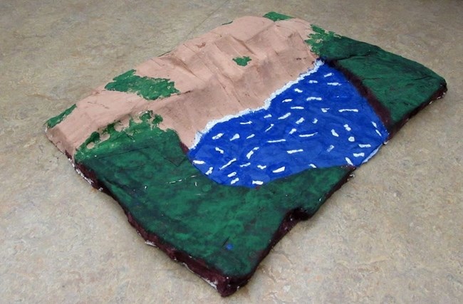
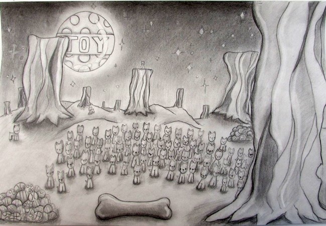
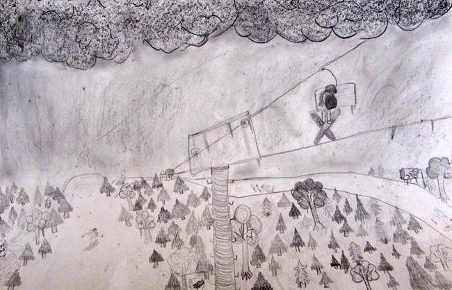
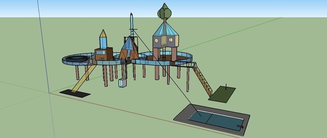
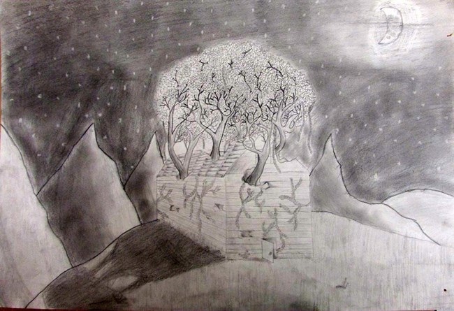
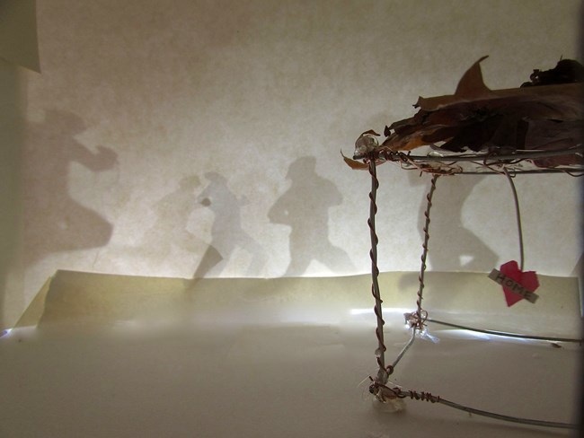
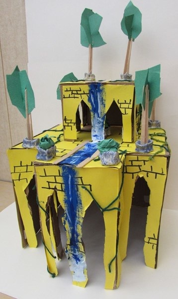
This past week, we finished up our latest theme in class: Environment, Space, and Place. Students really pushed themselves with a variety of media and outcomes. It was fun to see the evolving pieces over time and how students adapted their pieces based on feedback and learning new skills in class. I am excited to move onto our next theme which will deal with objects, but before we do, here are some highlights from the completed works (all of which can be seen on our Artsonia gallery):  Nate: For this project, I made a model of the silver lake sand dunes. I made this because I spend a lot of time up there in the summer and it is a really cool place to be. I made It with out any houses or building to show how it might look like without any people. To make this, first I made the shape of the sand dunes with foam. After this, I covered the whole thing in plaster. I then painted it with acrylic paint. To make the water sparkle, I mixed blue paint with sparkly silver paint. After that, I painted white in the lake to make it look like waves.  Gracie: For this piece, I chose to use pencils and experiment with different values. I think the dark values I used in the piece really made it different from other pencil drawing I’ve done before. I also used texture in my artwork. For example the bacon trees added a lot of texture to the piece and make it look different than what you would typically see. Lastly, I incorporated contrast between the elements to show my Ideas. There is definitely contrast between the smooth bone and the rough and ridged bacon trees.  Corrina: I decided to use pencil dark and light colors. These shades had started out with a simply regular pencil shade and darken the sky as the drawing continued. I also used graphite sticks to shade in the drawing. This skiing wonderland has trees, snowblowers, ski lift, and yes skiers. The darker sky and clouds made the affect that it was snowing and the snow blowers added to the snowing effect. The girl on the ski lift is stopped and looking at the beautiful snowing ski with the absence of light.  Colton: For this projects I decided to use Google Sketchup to make an architectural piece. I used the computer again because I feel a lot more confident using it instead of a pencil and paper. Using the computer helped a lot because I can create 3D pictures and sculptures and use my imagination with the tools provided on the computer. I didn't use any tutorials or help to create this. I simply played around with the different tools until I got the hang of it. I decided to make a giant tree house with a main cabin,(Middle) and two guest cabins for visitors. On the far left deck there is also a hot tub. To get in/out of the tree house you can use the stairs, elevator, slide, or zip-line. The zip-line leads to the Olympic-sized swimming pool. The stairs lead you to a large putting green.  Josh: I used pencils because I felt they were an easy material to use for an early project. They helped me show many details and shading with ease which is what I was aiming for. Elements and principles I used mainly were value and texture. The value helps communicate by adding depth and shadowing to have a good point of view. Texture like the leaves and the grass helps the viewer by showing more detail of the environment and what it is like.  Jewel: I created this artwork to signify environment, space or place. I was trying to communicate that you can only run away from things and feel safe in your home, which is your environment of where ever you feel safe, you can call home. I choose these materials because I realized I couldn't get my point across with a simple drawing. I wanted to go beyond. The contrast and the colors help make the piece stand out and show the important parts of my piece. Like how the heart is pink and one of the only colors in the piece. I used the leaves on the roof to represent that your home doesn't have to be perfect to be you're home. Its just a place where your heart may find peace.  Damien: In my piece of art, used various materials to achieve the texture and balance I did. The materials I used were construction paper, clay, temper paint, hot glue, cardboard, and markers. I tried to achieve the concept of balance with putting the pots on corners and in multiples of three. I also tried to achieve the concept of texture with the bricks I drew on the walls and the vines sort of growing out of the ground and the waterfall even having bubbles. I wanted to make my mini replica of the hanging gardens of Babylon look almost alive even though it isn’t even made of living plants.
0 Comments
Your comment will be posted after it is approved.
Leave a Reply. |
Archives
August 2018
Janine CampbellTeaching Visual Arts since 2004 and making images since picking up a crayon. Categories
All
|