
| BCWMS VISUAL ART & DESIGN |
|
|
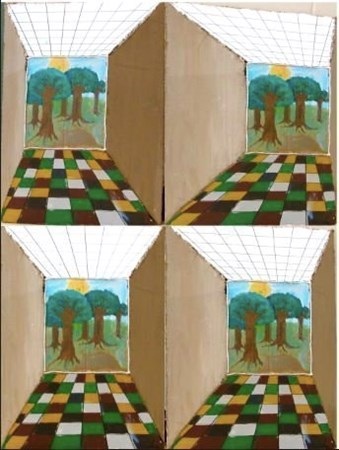
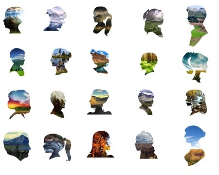
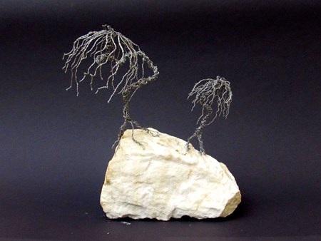
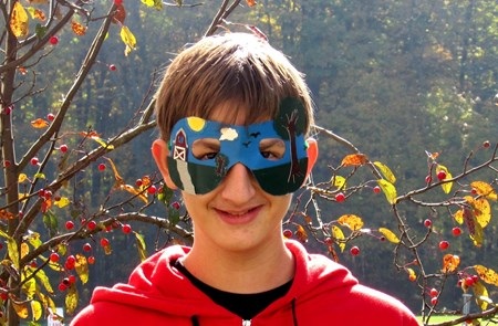
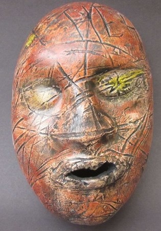
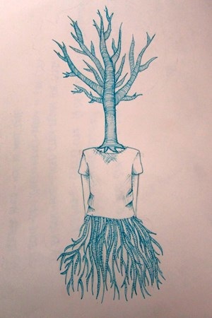
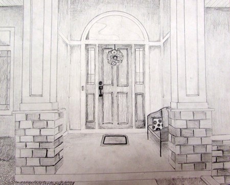
For project theme two, we worked on the concept of Environments, Spaces, and Places. It has been a rewarding experience for me to see the amount of creative ideas and variety of outcomes based on student interested and interpretation of the assignment. Before we move on from this completely, here are some final images created and posted to our online gallery on Artsonia.  Anna P: I chose to create a 3D perspective piece based on the ArtPrize 2014 entry "Michigan in Motion," by Dominic Pangborn. I was very intrigued by the illusion of depth and perspective created by his piece and wanted to create something similar. While this piece may look flat, it is actually 3D and as you walk the perspective changes. I used images from several different angles here. The center rectangle is supported up by the walls. I used cardboard, hot glue, and paint to make my composition because they seemed like the most sensible materials to use to make this easily and realistic-looking. I chose to checkerboard the floor and ceiling to make the illusion harder to see through by making them look like they are going back into space. There are two other sections, or hallways, to this composition that I was unable to finish in time. At the end of the middle hallway was going to be a city and the last panel was to depict a destroyed city. This progression is meant to represent the past, present, and future. I hope to be able to complete these panels with as much success as I did this first one.  Keegan D: In order to build this project I used Photoshop and some images from Google. It has many elements of design. One of which is the rule of thirds I tried to place my fav pictures in the places where the would be more noticeable. After doing this it is supposed to show that our environments are a reflection of us. I also alternated the way that the faces were pointing to try to create a small variation between each.  Jon Z:This piece was created out of silver wire placed on a rock and a pair of pliers (along with the mind of me, the artist). I choose this bright white rock as my base because it would contrast with the dark, spooky, and twisted, eery trees. The concept of halloween and the deforestation of trees to make this work. The piece communicates how ugly, and dead it would be without nature.  Harrison K: I Made this mask for two reasons- one is because I love masks, and the other is to show that the environment you are in can change who you are and your identity, and depending on the different environments you are in, your personality or behavior itself may change. Again I chose to use the idea and create it into a mask, because mask are the easiest way to represent identity, which was an important role in the idea.  Kat w: This projects theme evolved around our environment (space and place). As one of my projects I decided to do two clay faces. One face represents what nature would look like if we if we constantly took care of it and kept it clean. Therefore the other face represents what happens to nature when we treat it like trash. I wanted to use clay because I felt it makes it easier to show the textures and small details of the faces. I also thought that by using faces it would make the viewer realize that when we don’t take care of our outdoors it also affects us. If we keep harming the organisms that give us oxygen, food, water, and shelter…then what’s going to happen to us if they all go extinct, because of how poorly we took care of them. I used a new technique to give this face color. I used oil red, orange, and yellow oil pastels to color the face, and then I used, watered-down, black tempera paint to give the face a dirty, antique look and feel. I wanted the other face to, not be perfect, but look more clean and elegant. I used glaze and followed the carvings in the face. I wanted the messiness to portray that there are going to be things wrong with nature, but if we take care of it it’s still beautiful.  I used pen do draw this piece. I used pen because I wanted to be able to get all of the little details into my drawing. I used crosshatching to shade the shirt and the arms. I used lines to shade the tree and the roots. I think that this represents people as one with their environments. People need to get off of their phones and computers and go outside and enjoy nature sometimes.  Jordan C: For this project, I used photography and a window cling I created to represent the environment and how it can impact a person. I decided to use the window cling because it added a twist to my pictures. My mom and I drove around Byron Center and placed the cling on the car window so it appeared to be on signs, barns, and in so many more locations. This project was a lot of fun because I was able to explore different compositions and angles. I also had to experiment with the rule of thirds and many different perspectives. The window cling had to be placed in a certain way, so it fit into the picture just right. The techniques I used included using different positions and camera angles. When I was taking these pictures, I had to pay attention to space and unity. The window cling is reminiscent of where I’ve been and how Byron Center has impacted my life. In conclusion, this project made me realize how blessed I am to live in a town with so much scenery and such a small town atmosphere.  Nolan B:This perspective drawing of the front door of my house represents environment in a variety of ways. I decided to use a pencil to create my work because it allows me to make more of a realistic and dramatic effect on my art. When people think of old they think of black and white. The black and white of my pencil helped me show that houses are environments that go back to the beginning of human kind. A home is an environment that should be it's owner's safest place to go. Since the place you sleep in at night is your house, you better trust that it will keep you secure. I used value in my art to show the places in the image that aren't exposed to as much sun as others. This gives a real look to my drawing. Also, I put emphasis on my front door by making it in the center of my piece and slightly darker than the rest of my art. Overall, this image of my front door represents environment in many ways.
2 Comments
10/28/2014 12:55:09 am
These projects and statements are awesome! Thanks for sharing them, I intend on using Harrison's statement as an example for our student artist's here in PA. Viva la #TAB!
Reply
Mrs. C
10/28/2014 08:56:37 am
Thanks for the feedback! We appreciate the support and kind words! Please share your student's work when complete.
Reply
Leave a Reply. |
Archives
August 2018
Janine CampbellTeaching Visual Arts since 2004 and making images since picking up a crayon. Categories
All
|