It is nice to see so much color during these winter months!
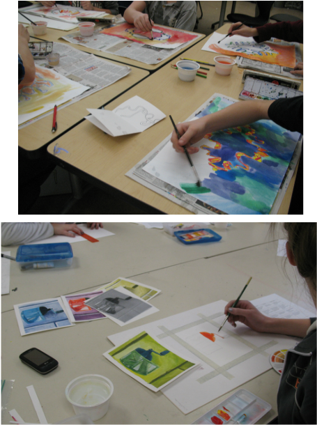
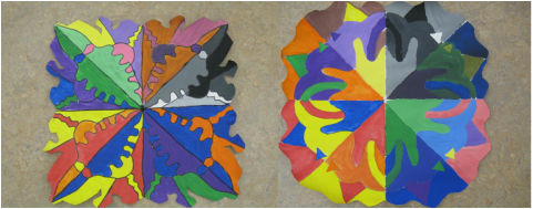
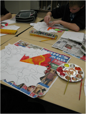
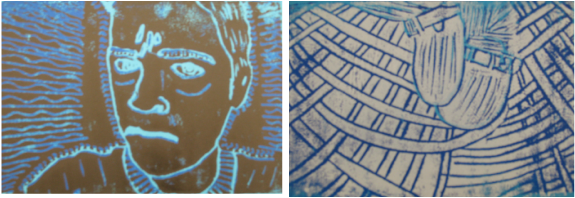
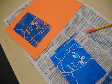
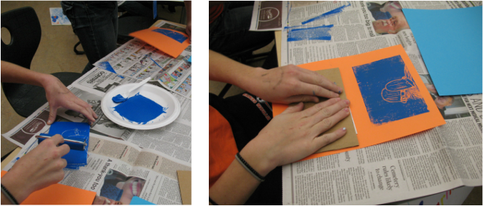
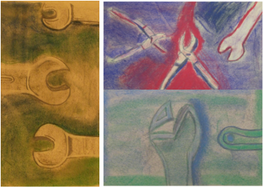
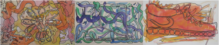
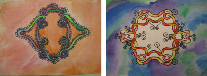
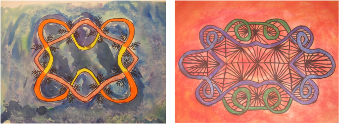
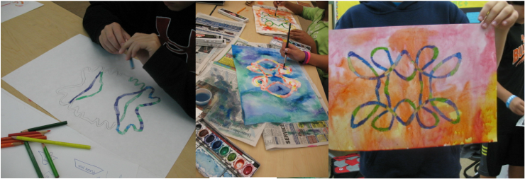
BCWMS students are working with color today as they explore the differences between warm and cool colors and using different materials to apply. I love working with color and I am also teaching Color through the DE program for Kendall College of Art and Design. The Image on the top is my 7th grade students working with color and the image below are 11th and 12th grade students exploring various color arrangements (Achromatic, Monochromatic, Analogous, Complementary, Split Complementary, Triads, and Tetrads).
It is nice to see so much color during these winter months!
0 Comments
7th grade students finished up their Mandalas today to show what they know about color. Each of the mirrored designs express an aspect of color theory. To see the rest of the projects, check out our online art gallery.
7th grade students finished transferring their organic and geometric line designs (showing radial symmetry) before applying their understanding of color. Students are using each divided space to explore a color concept in art. Warm, Cool, Complementary, Tint, Shade, Primary, Secondary, and Gray Scale are all being used in this piece. I adapted this assignment from an Arts and Activities magazine article where they used rectangles instead of the circle to divide the space and create their designs. This last project will help students study for their final exam, which will cover these color concepts as well as organic and geometric shapes and symmetry. Check out the process students used to create their prints by watching the video above. Students should be finished with this project on Monday and uploading to Moodle by Tuesday for me to put on Artsonia. This was a really fun project and students are going to do some more prints next week...
8th grade students continued to work on their prints today by creating more line designs and textures to print over their first color from yesterday. Using complementary colors and monochromatic color schemes, students were able to compare and contrast the variances resulting from the uses of value and color. This project has been a great success so far! I look forward to continuing the tradition of printmaking with the help of funding from Office Depot and Kids in Need. 8th grade students are starting to create their prints today based on their photographs they took of their faces, hands, or feet that showed a sense of expression. This is the first time I have really done printmaking with students, so I am excited to bring this new expression of art creation to them and really thrilled with the results so far. We are doing a 2 color reduction print, so today students only used their primary color choice from their complement set to create prints. Tomorrow students who are ready to move on will make a second print with more color removed and add black and white over top of today's print. 8th grade students finished their projects and turned them in using Moodle today. Students worked on two different projects that both used ordinary objects as inspiration. First students worked on the abstract contour line drawings in glue shown below. They used warm or cool watercolor paint to create an abstract wash over the glue and then outlined the changes in value with sharpie. Students then used Jim Dine as inspiration to create the tool drawings featured on the left. We used our erasers as a drawing tool as well as chalk pastels to activate the negative spaces around the object. You can see both projects on our class gallery. 7th grade students finished their Celtic inspired symmetrical knots today and turned them in using Moodle. Students explored concepts of line, pattern, color, and balance in this work. We also learned some art history and using mixed media. This was a fun project and our class gallery shows the hard work and creativity tied together in this neat little knot.
I love COLOR. I love CRAYONS. I love music that includes BOTH! So, enjoy this song and I dare you to try not to smile at the lyrics and graphics included... 7th grade students applied their knowlege of color by choosing between warm and cool colors to contrast their knot and background. They also mixed media by using colored pencil for the knot and watercolor for the background. I first saw this lesson in an issue of Arts and Activities Magazine for High School - but as you can see, my 7th graders are definitely rockin' the knot!
|
Archives
August 2018
Janine CampbellTeaching Visual Arts since 2004 and making images since picking up a crayon. Categories
All
|